Willkommen bei den Top‑Schriften – hier treffen Beliebtheit und Qualität aufeinander. Das sind die in diesem Jahr am häufigsten heruntergeladenen und genutzten Fonts. Wenn Sie sichere Optionen für Logo, Web oder Social suchen, starten Sie hier.
Jeder Top‑Font überzeugt durch Balance, Lesbarkeit und Vielseitigkeit. Sie finden moderne Sans‑Serifs, elegante Scripts, Vintage‑Serifs und minimalistische Displays.
-
 Herunterladen 851 Downloads@WebFont
 -
( Fonts by Dieter Steffmann )
A bold, ornate Blackletter font with intricate, angular letterforms.
![Missal Frei Schriftart Herunterladen]() Herunterladen 851 Downloads@WebFont
Herunterladen 851 Downloads@WebFont -
( Fonts by www.smeltery.net )
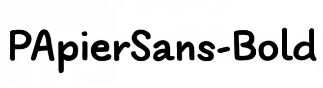
A playful, bold font with rounded edges and a hand-drawn feel.
![PApierSans-Bold Frei Schriftart Herunterladen]() Herunterladen 851 Downloads@WebFont
Herunterladen 851 Downloads@WebFont -
( Fonts by Steve Ferrera )
Bold, condensed, slanted sans-serif with high energy and impact.
![Pro Wrestling Logos Frei Schriftart Herunterladen]() Herunterladen 851 Downloads@WebFont
Herunterladen 851 Downloads@WebFont -
( Please check the owner website: http://www.billie.grosse.is-a-geek.com )
A bold, decorative font with abstract and artistic letterforms.
![Rupe Heavy Frei Schriftart Herunterladen]() Herunterladen 851 Downloads@WebFont
Herunterladen 851 Downloads@WebFont -
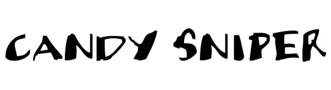
-
![Candy Sniper Frei Schriftart Herunterladen]() Herunterladen 851 Downloads@WebFont
Herunterladen 851 Downloads@WebFont -
( Fonts by Gesang Khoiron - Personal-use only. For commercial use please contact owner. )
A bold, high-contrast font with sharp angles and dynamic style.
![-KOGOK Frei Schriftart Herunterladen]() Herunterladen 850 Downloads@WebFont
Herunterladen 850 Downloads@WebFont -
( Fonts by Ahmad Syarif Afandi - https://delapan.studio - Personal-use only. For commercial use please contact owner. )
A playful, bold handwritten font with rounded strokes and a casual, dynamic feel.
![Macadamia Frei Schriftart Herunterladen]() Herunterladen 850 Downloads@WebFont
Herunterladen 850 Downloads@WebFont -
( Fonts by Universitas Gadjah Mada Yogyakarta - Personal-use only. For commercial use please contact owner. )
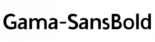
A bold, modern sans-serif font with clean lines and balanced proportions.
![Gama-Sans Bold Frei Schriftart Herunterladen]() Herunterladen 850 Downloads@WebFont
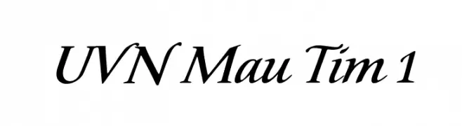
Herunterladen 850 Downloads@WebFont -
![UVN Mau Tim 1 Frei Schriftart Herunterladen]() Herunterladen 850 Downloads@WebFont
Herunterladen 850 Downloads@WebFont -
( Zetafonts - www.zetafonts.com )
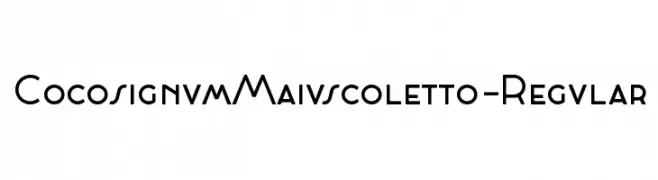
A modern, geometric sans-serif font with bold, clean lines.
![CocosignumMaiuscoletto-Regular Frei Schriftart Herunterladen]() Herunterladen 850 Downloads@WebFont
Herunterladen 850 Downloads@WebFont -
( Fonts by Chris Vile )
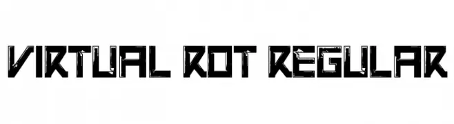
A bold, futuristic font with a distressed, grunge texture.
![Virtual Rot Regular Frei Schriftart Herunterladen]() Herunterladen 850 Downloads@WebFont
Herunterladen 850 Downloads@WebFont -
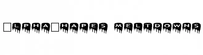
Schriftart von fontsnthings. For commercial use please contact the owner.
![AlphaShapes meltdowns Frei Schriftart Herunterladen]() Herunterladen 850 Downloads@WebFont
Herunterladen 850 Downloads@WebFont -
( Fonts by www.kimberlygeswein.com - Kimberly Geswein )
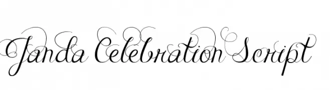
An elegant script font with intricate swirls and decorative flourishes.
![Janda Celebration Script Frei Schriftart Herunterladen]() Herunterladen 850 Downloads@WebFont
Herunterladen 850 Downloads@WebFont -
( Public domain / GPL / OFL - jlhfonts.blogspot.com/ )
Bold geometric arrow symbols in multiple directions and styles.
![Arrows Frei Schriftart Herunterladen]() Herunterladen 850 Downloads@WebFont
Herunterladen 850 Downloads@WebFont -
( Copyright (c) 2011, Dan Sayers (i@iotic.com) )
A bold, italicized font with a smooth, rounded, and modern appearance.
![Averia Sans Libre Bold Italic Frei Schriftart Herunterladen]() Herunterladen 850 Downloads@WebFont
Herunterladen 850 Downloads@WebFont -
( Fonts by www.woodardworks.com )
A bold, rounded font with a playful and modern style.
![Veggieburger-Bold Frei Schriftart Herunterladen]() Herunterladen 850 Downloads@WebFont
Herunterladen 850 Downloads@WebFont -
( Fonts by weknow - Wino S Kadir )
A playful, bubbly font with rounded, cartoonish letterforms.
![smile Frei Schriftart Herunterladen]() Herunterladen 850 Downloads@WebFont
Herunterladen 850 Downloads@WebFont -
( - www.facebook.com/luqmantechno )
A bold, pixelated font with a retro digital aesthetic.
![luqman Regular Frei Schriftart Herunterladen]() Herunterladen 850 Downloads@WebFont
Herunterladen 850 Downloads@WebFont -
( Fonts by Manfred Klein. Free for private and charity use. Free for commercial with donation to organizations )
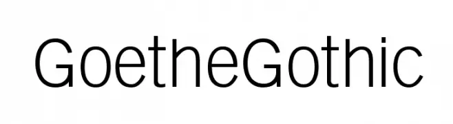
A modern, geometric sans-serif font with uniform strokes and excellent readability.
![GoetheGothic Frei Schriftart Herunterladen]() Herunterladen 850 Downloads@WebFont
Herunterladen 850 Downloads@WebFont -
( Fonts by Manfred Klein. Free for private and charity use. Free for commercial with donation to organizations )
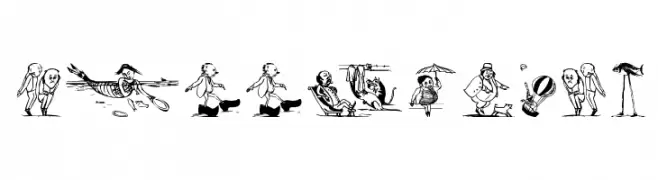
Surreal, illustrated display font with narrative scenes for each character.
![SurrealisM Frei Schriftart Herunterladen]() Herunterladen 850 Downloads@WebFont
Herunterladen 850 Downloads@WebFont -
![zemiakovy salat CE Frei Schriftart Herunterladen]() Herunterladen 850 Downloads@WebFont
Herunterladen 850 Downloads@WebFont -
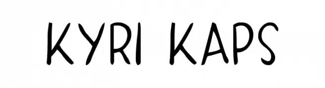
![KYRI KAPS Frei Schriftart Herunterladen]() Herunterladen 850 Downloads@WebFont
Herunterladen 850 Downloads@WebFont -
( Fonts by Bright Ideas )
A bold, gothic blackletter font with sharp, angular lines and dramatic flourishes.
![Griffin Frei Schriftart Herunterladen]() Herunterladen 850 Downloads@WebFont
Herunterladen 850 Downloads@WebFont -
( Fonts by www.typodermicfonts.com - Ray Larabie )
A bold, futuristic font with sharp angles and a geometric structure.
![Vibrocentric-Bold Frei Schriftart Herunterladen]() Herunterladen 850 Downloads@WebFont
Herunterladen 850 Downloads@WebFont -
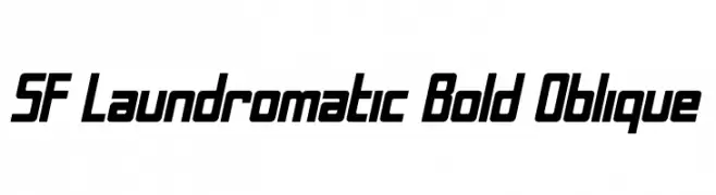
![SF Laundromatic Bold Oblique Frei Schriftart Herunterladen]() Herunterladen 850 Downloads@WebFont
Herunterladen 850 Downloads@WebFont -
( Fonts by David Rakowski )
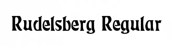
A bold, dynamic font with medieval influences and artistic flair.
![Rudelsberg Regular Frei Schriftart Herunterladen]() Herunterladen 850 Downloads@WebFont
Herunterladen 850 Downloads@WebFont -
( Fonts by armenia.renderforest.com - Personal-use only. For commercial use please contact owner. )
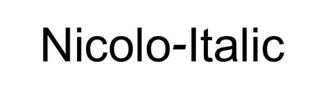
A modern, italic sans-serif font with clean lines and balanced proportions.
![Nicolo-Italic Frei Schriftart Herunterladen]() Herunterladen 849 Downloads@WebFont
Herunterladen 849 Downloads@WebFont -
( Fonts by Vladimir Nikolic - https://www.creativefabrica.com/product/educated-deers/ref/144265/ - Personal-use only. For commercial use please contact owner. )
A bold, shadowed font with a playful, three-dimensional look.
![Impressum Shadow Regular Frei Schriftart Herunterladen]() Herunterladen 849 Downloads@WebFont
Herunterladen 849 Downloads@WebFont -
( 9031 - www.9031.com/p-font/ )
A modern, geometric monospaced font with rounded edges.
![UHF Frei Schriftart Herunterladen]() Herunterladen 849 Downloads@WebFont
Herunterladen 849 Downloads@WebFont -
( imagex - www.imagex-fonts.com )
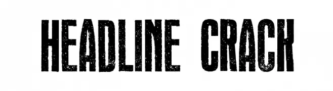
A bold, distressed font with a rugged, vintage appearance.
![Headline Crack Frei Schriftart Herunterladen]() Herunterladen 849 Downloads@WebFont
Herunterladen 849 Downloads@WebFont -
( Iconian Fonts - Daniel Zadorozny - www.iconian.com )
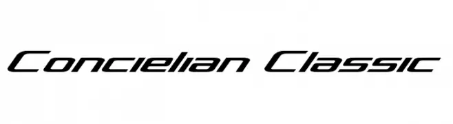
A sleek, modern font with a futuristic and dynamic design.
![Concielian Classic Frei Schriftart Herunterladen]() Herunterladen 849 Downloads@WebFont
Herunterladen 849 Downloads@WebFont -
Schriftart von spideraysfonts. For commercial use please contact the owner.
( NASA CONSOLE )
A modern, geometric font with rounded edges and excellent readability.
![NASA CONSOLE Frei Schriftart Herunterladen]() Herunterladen 849 Downloads@WebFont
Herunterladen 849 Downloads@WebFont -
( Fonts by www.omnibus-type.com )
A modern, narrow, bold italic font with a sleek and dynamic style.
![ArchivoNarrow-BoldItalic Frei Schriftart Herunterladen]() Herunterladen 849 Downloads@WebFont
Herunterladen 849 Downloads@WebFont -
![Gimcracks Frei Schriftart Herunterladen]() Herunterladen 849 Downloads@WebFont
Herunterladen 849 Downloads@WebFont


Welche Schriften sind gerade am populärsten?
Poppins, Roboto, Montserrat, Open Sans und Lato sind wegen ihrer klaren Formen und breiten Einsetzbarkeit sehr gefragt – von Markenauftritt über Landingpages bis hin zu Postern.
Welche Fonts eignen sich für Logos?
Geometrische Sans‑Serifs (z. B. Poppins, Familien im Gotham‑Stil) sind ein häufiger Griff für sauberes, skalierbares Branding. Für eine persönlichere Note bleiben Scripts und Handschrift‑Stile beliebt. Kombinieren Sie einen prägnanten Headline‑Font mit einer neutralen Brotschrift für Wiedererkennung und Harmonie.
Wie oft wird die Top‑Liste aktualisiert?
Regelmäßig – basierend auf realen Downloads und Interaktionen. Schauen Sie öfter vorbei, um aufstrebende Favoriten früh zu entdecken.
💡 Tipp: Seite bookmarken – Trends wechseln schnell, und heutige Top‑Schriften inspirieren morgen vielleicht das Rebranding.