Willkommen bei den Top‑Schriften – hier treffen Beliebtheit und Qualität aufeinander. Das sind die in diesem Jahr am häufigsten heruntergeladenen und genutzten Fonts. Wenn Sie sichere Optionen für Logo, Web oder Social suchen, starten Sie hier.
Jeder Top‑Font überzeugt durch Balance, Lesbarkeit und Vielseitigkeit. Sie finden moderne Sans‑Serifs, elegante Scripts, Vintage‑Serifs und minimalistische Displays.
-
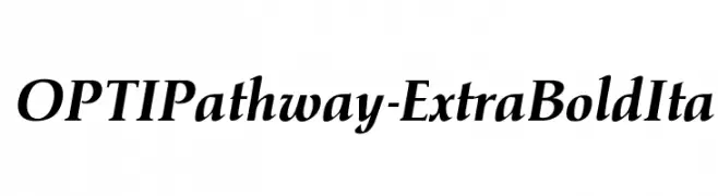
( Fonts by Castcraft Software - OPTI Fonts Archive - opti.netii.net - Personal-use only. For commercial use please contact owner. )
A bold, italic serif font with high contrast and dynamic elegance.
 Herunterladen 201 Downloads@WebFont
 -
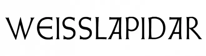
( Fonts by Dieter Steffmann )
A classic serif font with elegant tapering and refined style.
![WeissLapidar Frei Schriftart Herunterladen]() Herunterladen 201 Downloads@WebFont
Herunterladen 201 Downloads@WebFont -
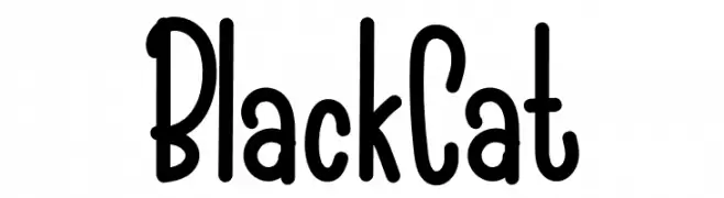
( Fonts by Haksen Letters )
A playful, hand-drawn font with a bold, whimsical style.
![Black Cat Frei Schriftart Herunterladen]() Herunterladen 201 Downloads@WebFont
Herunterladen 201 Downloads@WebFont -
![Reckless Catfish Bold Frei Schriftart Herunterladen]() Herunterladen 201 Downloads@WebFont
Herunterladen 201 Downloads@WebFont -
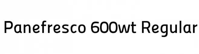
( Fonts by www.chank.com. Personal-use only. For commercial use please contact owner. )
A modern, geometric sans-serif font with clean lines and uniform strokes.
![Panefresco 600wt Regular Frei Schriftart Herunterladen]() Herunterladen 201 Downloads@WebFont
Herunterladen 201 Downloads@WebFont -
-
( Fonts by ShyFonts )
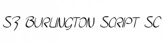
A lively, cursive script font with smooth, interconnected strokes.
![SF Burlington Script SC Frei Schriftart Herunterladen]() Herunterladen 201 Downloads@WebFont
Herunterladen 201 Downloads@WebFont -
( Fonts by Iconian Fonts )
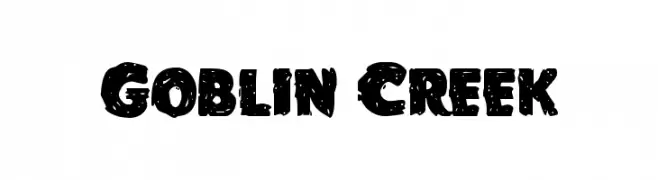
A bold, textured font with a playful and distressed appearance.
![Goblin Creek Frei Schriftart Herunterladen]() Herunterladen 201 Downloads@WebFont
Herunterladen 201 Downloads@WebFont -
( Sronstudio - Yusron Billah )
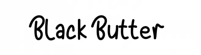
A playful handwritten font with bold, rounded characters and a whimsical style.
![Black Butter Frei Schriftart Herunterladen]() Herunterladen 201 Downloads@WebFont
Herunterladen 201 Downloads@WebFont -
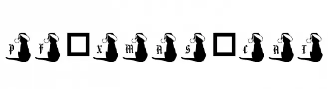
![pf_xmas_cat Frei Schriftart Herunterladen]() Herunterladen 201 Downloads@WebFont
Herunterladen 201 Downloads@WebFont -
![pimper Frei Schriftart Herunterladen]() Herunterladen 201 Downloads@WebFont
Herunterladen 201 Downloads@WebFont

Welche Schriften sind gerade am populärsten?
Poppins, Roboto, Montserrat, Open Sans und Lato sind wegen ihrer klaren Formen und breiten Einsetzbarkeit sehr gefragt – von Markenauftritt über Landingpages bis hin zu Postern.
Welche Fonts eignen sich für Logos?
Geometrische Sans‑Serifs (z. B. Poppins, Familien im Gotham‑Stil) sind ein häufiger Griff für sauberes, skalierbares Branding. Für eine persönlichere Note bleiben Scripts und Handschrift‑Stile beliebt. Kombinieren Sie einen prägnanten Headline‑Font mit einer neutralen Brotschrift für Wiedererkennung und Harmonie.
Wie oft wird die Top‑Liste aktualisiert?
Regelmäßig – basierend auf realen Downloads und Interaktionen. Schauen Sie öfter vorbei, um aufstrebende Favoriten früh zu entdecken.
💡 Tipp: Seite bookmarken – Trends wechseln schnell, und heutige Top‑Schriften inspirieren morgen vielleicht das Rebranding.