Willkommen bei den Top‑Schriften – hier treffen Beliebtheit und Qualität aufeinander. Das sind die in diesem Jahr am häufigsten heruntergeladenen und genutzten Fonts. Wenn Sie sichere Optionen für Logo, Web oder Social suchen, starten Sie hier.
Jeder Top‑Font überzeugt durch Balance, Lesbarkeit und Vielseitigkeit. Sie finden moderne Sans‑Serifs, elegante Scripts, Vintage‑Serifs und minimalistische Displays.
-
( Fonts by Chris Vile - fontmonger.com - Personal-use only. For commercial use please contact owner. )
A bold, futuristic font with sharp, angular lines and a techno-inspired design.
 Herunterladen 200 Downloads@WebFont
 -
( Fonts by Woodcutter Manero - http://www.woodcutter.es - Personal-use only. For commercial use please contact owner. )
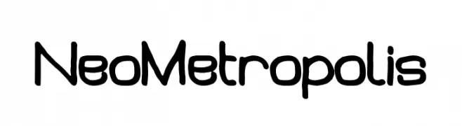
A futuristic, rounded font with smooth curves and consistent stroke width.
![Neo Metropolis Frei Schriftart Herunterladen]() Herunterladen 200 Downloads@WebFont
Herunterladen 200 Downloads@WebFont -
( Fonts by Daniel Zadorozny - www.iconian.com - Personal-use only. For commercial use please contact owner. )
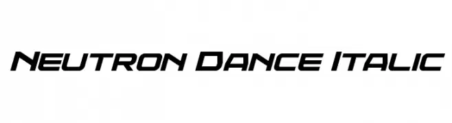
A bold, italic font with a futuristic and dynamic design.
![Neutron Dance Italic Frei Schriftart Herunterladen]() Herunterladen 200 Downloads@WebFont
Herunterladen 200 Downloads@WebFont -
( Fonts by Adien Gunarta - fontasticindonesia.blogspot.com )
A modern, artistic font with geometric and calligraphic elements.
![SitiMaesaroh Frei Schriftart Herunterladen]() Herunterladen 200 Downloads@WebFont
Herunterladen 200 Downloads@WebFont -
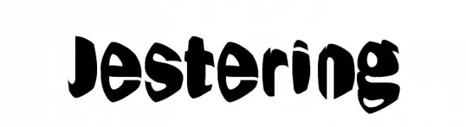
![Jestering Frei Schriftart Herunterladen]() Herunterladen 200 Downloads@WebFont
Herunterladen 200 Downloads@WebFont -
-
( Fonts by Douglas Vitkauskas - www.vtksdesign.com. Personal-use only. For commercial use please contact owner. )
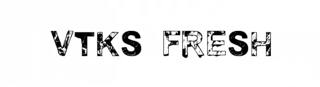
A bold, distressed font with a grunge texture and rugged appearance.
![vtks fresh Frei Schriftart Herunterladen]() Herunterladen 200 Downloads@WebFont
Herunterladen 200 Downloads@WebFont -
( Atjcloth Studio - Hanif Syahputra - creativemarket.com/Atjcloth?u=Atjcloth )
A delicate, flowing script font with thin lines and graceful curves.
![Longhair Frei Schriftart Herunterladen]() Herunterladen 200 Downloads@WebFont
Herunterladen 200 Downloads@WebFont -
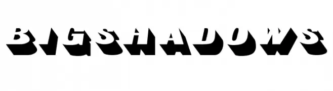
( Fonts by Manfred Klein. Free for private and charity use. Free for commercial with donation to organizations )
A bold, three-dimensional font with deep shadows for a dramatic effect.
![BigShadows Frei Schriftart Herunterladen]() Herunterladen 200 Downloads@WebFont
Herunterladen 200 Downloads@WebFont -
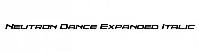
( Fonts by Daniel Zadorozny - www.iconian.com - Personal-use only. For commercial use please contact owner. )
A bold, italicized, and expanded font with a futuristic and dynamic style.
![Neutron Dance Expanded Italic Frei Schriftart Herunterladen]() Herunterladen 200 Downloads@WebFont
Herunterladen 200 Downloads@WebFont -
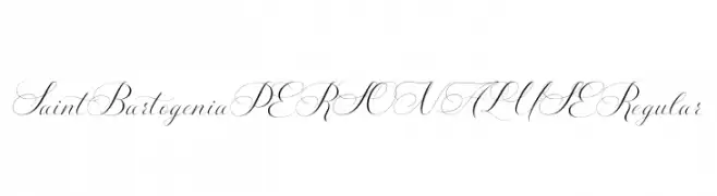
( Fonts by Mans Greback - www.mansgreback.com - Personal-use only. For commercial use please contact owner. )
An elegant script font with flowing, interconnected characters and intricate swashes.
![Saint Bartogenia PERSONAL USE Regular Frei Schriftart Herunterladen]() Herunterladen 200 Downloads@WebFont
Herunterladen 200 Downloads@WebFont


Welche Schriften sind gerade am populärsten?
Poppins, Roboto, Montserrat, Open Sans und Lato sind wegen ihrer klaren Formen und breiten Einsetzbarkeit sehr gefragt – von Markenauftritt über Landingpages bis hin zu Postern.
Welche Fonts eignen sich für Logos?
Geometrische Sans‑Serifs (z. B. Poppins, Familien im Gotham‑Stil) sind ein häufiger Griff für sauberes, skalierbares Branding. Für eine persönlichere Note bleiben Scripts und Handschrift‑Stile beliebt. Kombinieren Sie einen prägnanten Headline‑Font mit einer neutralen Brotschrift für Wiedererkennung und Harmonie.
Wie oft wird die Top‑Liste aktualisiert?
Regelmäßig – basierend auf realen Downloads und Interaktionen. Schauen Sie öfter vorbei, um aufstrebende Favoriten früh zu entdecken.
💡 Tipp: Seite bookmarken – Trends wechseln schnell, und heutige Top‑Schriften inspirieren morgen vielleicht das Rebranding.