Willkommen bei den Top‑Schriften – hier treffen Beliebtheit und Qualität aufeinander. Das sind die in diesem Jahr am häufigsten heruntergeladenen und genutzten Fonts. Wenn Sie sichere Optionen für Logo, Web oder Social suchen, starten Sie hier.
Jeder Top‑Font überzeugt durch Balance, Lesbarkeit und Vielseitigkeit. Sie finden moderne Sans‑Serifs, elegante Scripts, Vintage‑Serifs und minimalistische Displays.
-
Schriftart von defharo. For commercial use please contact the owner.
 Herunterladen 198 Downloads@WebFont
 -
( Sifat Ahmed )
A playful, hand-drawn font with smooth curves and an organic feel.
![Nillima Frei Schriftart Herunterladen]() Herunterladen 198 Downloads@WebFont
Herunterladen 198 Downloads@WebFont -
( Fonts by a Typeface Leone - www.tipografialeone.net. Personal-use only. For commercial use please contact owner. )
A modern, geometric sans-serif font with clean lines and balanced proportions.
![Urban Elegance Bold Frei Schriftart Herunterladen]() Herunterladen 198 Downloads@WebFont
Herunterladen 198 Downloads@WebFont -
( Fonts by Jacob English )
A playful, hand-drawn font with a casual and friendly vibe.
![Doodle_Head Frei Schriftart Herunterladen]() Herunterladen 198 Downloads@WebFont
Herunterladen 198 Downloads@WebFont -
![LikeLegit Frei Schriftart Herunterladen]() Herunterladen 198 Downloads@WebFont
Herunterladen 198 Downloads@WebFont -
-
( Fonts by Daniel Zadorozny - www.iconian.com )
A bold, futuristic font with sharp angles and geometric shapes.
![Nightrunner Frei Schriftart Herunterladen]() Herunterladen 198 Downloads@WebFont
Herunterladen 198 Downloads@WebFont -
( Fonts by bob istheowl http://luc.devroye.org/bobistheowl.html )
Decorative, graphic-heavy font with unique artwork for each character.
![ObeyFavesCaps Frei Schriftart Herunterladen]() Herunterladen 198 Downloads@WebFont
Herunterladen 198 Downloads@WebFont -
( Fonts by Taylor Baybutt - ikon3.com - Free for personal use only )
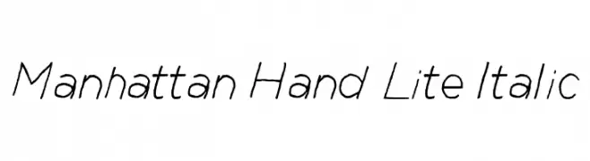
A sleek, handwritten italic font with a light and elegant style.
![Manhattan Hand Lite Italic Frei Schriftart Herunterladen]() Herunterladen 198 Downloads@WebFont
Herunterladen 198 Downloads@WebFont -
( Fonts by Graham Meade - GemFonts )
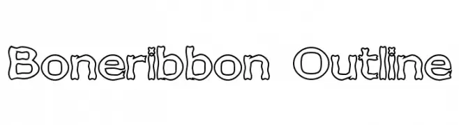
A playful, outlined font with a hand-drawn, whimsical style.
![Boneribbon Outline Frei Schriftart Herunterladen]() Herunterladen 198 Downloads@WebFont
Herunterladen 198 Downloads@WebFont -
( Fonts by Nicholas Kruse - Personal-use only. For commercial use please contact owner. )
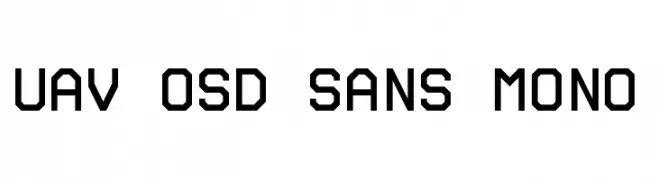
A modern, monospaced font with a technical and geometric design.
![UAV OSD Sans Mono Frei Schriftart Herunterladen]() Herunterladen 198 Downloads@WebFont
Herunterladen 198 Downloads@WebFont


Welche Schriften sind gerade am populärsten?
Poppins, Roboto, Montserrat, Open Sans und Lato sind wegen ihrer klaren Formen und breiten Einsetzbarkeit sehr gefragt – von Markenauftritt über Landingpages bis hin zu Postern.
Welche Fonts eignen sich für Logos?
Geometrische Sans‑Serifs (z. B. Poppins, Familien im Gotham‑Stil) sind ein häufiger Griff für sauberes, skalierbares Branding. Für eine persönlichere Note bleiben Scripts und Handschrift‑Stile beliebt. Kombinieren Sie einen prägnanten Headline‑Font mit einer neutralen Brotschrift für Wiedererkennung und Harmonie.
Wie oft wird die Top‑Liste aktualisiert?
Regelmäßig – basierend auf realen Downloads und Interaktionen. Schauen Sie öfter vorbei, um aufstrebende Favoriten früh zu entdecken.
💡 Tipp: Seite bookmarken – Trends wechseln schnell, und heutige Top‑Schriften inspirieren morgen vielleicht das Rebranding.