Willkommen bei den Top‑Schriften – hier treffen Beliebtheit und Qualität aufeinander. Das sind die in diesem Jahr am häufigsten heruntergeladenen und genutzten Fonts. Wenn Sie sichere Optionen für Logo, Web oder Social suchen, starten Sie hier.
Jeder Top‑Font überzeugt durch Balance, Lesbarkeit und Vielseitigkeit. Sie finden moderne Sans‑Serifs, elegante Scripts, Vintage‑Serifs und minimalistische Displays.
-
( Fonts by Altsys Metamorphosis )
A modern, sleek font with a futuristic and geometric design.
 Herunterladen 845 Downloads@WebFont
 -
( Fonts by Daniel Zadorozny - www.iconian.com )
A bold, geometric font with a strong, industrial aesthetic.
![Interceptor Frei Schriftart Herunterladen]() Herunterladen 845 Downloads@WebFont
Herunterladen 845 Downloads@WebFont -
( Fonts by SnailFonts )
A bold, condensed font with a modern, industrial style.
![sugar [dissolve] Frei Schriftart Herunterladen]() Herunterladen 845 Downloads@WebFont
Herunterladen 845 Downloads@WebFont -
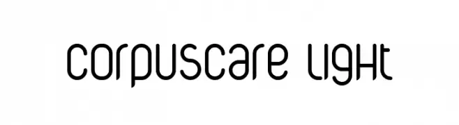
![CorpusCare Light Frei Schriftart Herunterladen]() Herunterladen 845 Downloads@WebFont
Herunterladen 845 Downloads@WebFont -
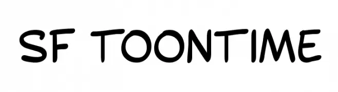
( Fonts by ShyFonts )
A playful, cartoon-like font with rounded, hand-drawn characters.
![SF Toontime Frei Schriftart Herunterladen]() Herunterladen 845 Downloads@WebFont
Herunterladen 845 Downloads@WebFont -
![Tiffy Frei Schriftart Herunterladen]() Herunterladen 845 Downloads
Herunterladen 845 Downloads -
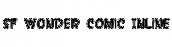
( Fonts by ShyFonts )
A bold, comic-inspired font with outlined, playful characters.
![SF Wonder Comic Inline Frei Schriftart Herunterladen]() Herunterladen 845 Downloads@WebFont
Herunterladen 845 Downloads@WebFont -
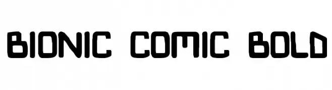
![Bionic Comic Bold Frei Schriftart Herunterladen]() Herunterladen 845 Downloads
Herunterladen 845 Downloads -
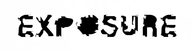
![Exposure Frei Schriftart Herunterladen]() Herunterladen 845 Downloads@WebFont
Herunterladen 845 Downloads@WebFont -
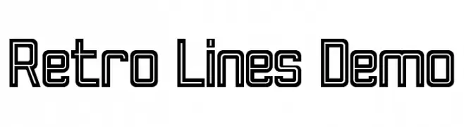
( Fonts by Noah Type - noahtype.com - Personal-use only. For commercial use please contact owner. )
A retro, geometric font with double-line outlines and sharp angles.
![Retro Lines Demo Frei Schriftart Herunterladen]() Herunterladen 844 Downloads@WebFont
Herunterladen 844 Downloads@WebFont -
( Fonts by Khurasan )
A bold, playful font with a hand-drawn, dynamic style.
![Ponari Frei Schriftart Herunterladen]() Herunterladen 844 Downloads@WebFont
Herunterladen 844 Downloads@WebFont -
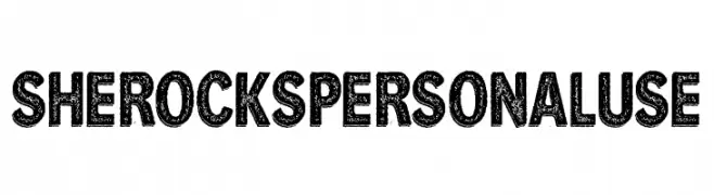
( Fonts by Guaraldo Fonts - Personal-use only. For commercial use please contact owner. )
A bold, distressed font with a vintage, textured appearance.
![She Rocks Personal Use Frei Schriftart Herunterladen]() Herunterladen 844 Downloads@WebFont
Herunterladen 844 Downloads@WebFont -
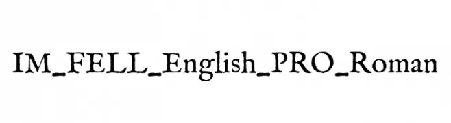
( Fonts by Igino Marini )
A classic serif font with a historical and handcrafted feel.
![IM_FELL_English_PRO_Roman Frei Schriftart Herunterladen]() Herunterladen 844 Downloads@WebFont
Herunterladen 844 Downloads@WebFont -
( Fonts by TypeFaithFonts - Personal-use only. For commercial use please contact owner. )
A bold, modern sans-serif font with clean lines and a strong presence.
![PaloAlto Frei Schriftart Herunterladen]() Herunterladen 844 Downloads@WebFont
Herunterladen 844 Downloads@WebFont -
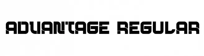
( Fonts by vladimirnikolic - Personal-use only. For commercial use please contact owner. )
A bold, geometric font with a futuristic and tech-inspired design.
![Advantage Regular Frei Schriftart Herunterladen]() Herunterladen 844 Downloads@WebFont
Herunterladen 844 Downloads@WebFont -
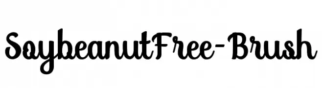
( fey design - Fey Design - www.creativemarket.com/feydesign )
A bold and playful brush script font with dynamic strokes.
![SoybeanutFree-Brush Frei Schriftart Herunterladen]() Herunterladen 844 Downloads@WebFont
Herunterladen 844 Downloads@WebFont -
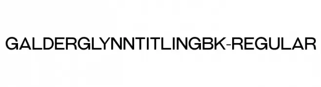
( Typodermic Fonts - Ray Larabie - www.typodermicfonts.com/ )
A modern, geometric sans-serif font with a clean and balanced design.
![GalderglynnTitlingBk-Regular Frei Schriftart Herunterladen]() Herunterladen 844 Downloads@WebFont
Herunterladen 844 Downloads@WebFont -
( Fonts by CannotIntoSpaceFonts - KineticPlasma Fonts - Personal-use only. For commercial use please contact owner. )
A bold, condensed font with high contrast and strong visual impact.
![Warsaw Gothic Condensed Frei Schriftart Herunterladen]() Herunterladen 844 Downloads@WebFont
Herunterladen 844 Downloads@WebFont -
( Copyright (c) 2011 by Anna GiedryÅ› (http://ancymonic.com) )
A modern, rounded sans-serif font with excellent readability.
![Signika Regular Frei Schriftart Herunterladen]() Herunterladen 844 Downloads@WebFont
Herunterladen 844 Downloads@WebFont -
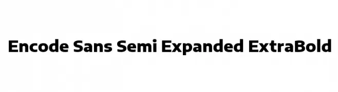
( Copyright 2012 The Encode Project Authors (impallari@gmail.com), with Reserved Font Name "Encode Sansâ€. )
A bold, semi-expanded sans-serif font with a modern and clean design.
![Encode Sans Semi Expanded ExtraBold Frei Schriftart Herunterladen]() Herunterladen 844 Downloads@WebFont
Herunterladen 844 Downloads@WebFont -
( Fonts by Shiro Ngampus )
A bold, textured font with a distressed, vintage style.
![ZEMBOOD Frei Schriftart Herunterladen]() Herunterladen 844 Downloads@WebFont
Herunterladen 844 Downloads@WebFont -
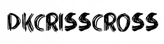
( Fonts by David Kerkhoff - www.hanodedphotography.com )
A bold, hand-drawn font with a textured, sketch-like appearance.
![DKCrissCross Frei Schriftart Herunterladen]() Herunterladen 844 Downloads@WebFont
Herunterladen 844 Downloads@WebFont -
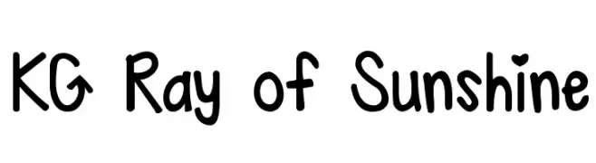
( Fonts by www.kimberlygeswein.com - Kimberly Geswein )
A playful handwritten font with rounded, friendly characters and heart-shaped details.
![KG Ray of Sunshine Frei Schriftart Herunterladen]() Herunterladen 844 Downloads@WebFont
Herunterladen 844 Downloads@WebFont -
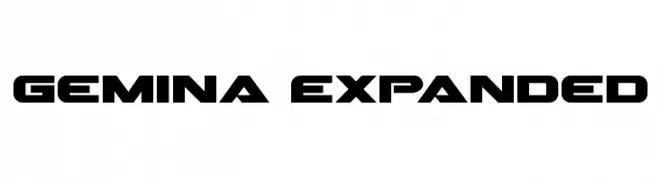
( Fonts by Daniel Zadorozny - www.iconian.com - Free for personal use )
A bold, modern font with a geometric and expansive design.
![Gemina Expanded Frei Schriftart Herunterladen]() Herunterladen 844 Downloads@WebFont
Herunterladen 844 Downloads@WebFont -
( Fonts by www.koenhachmang.com - Glitch )
A modern, geometric font with rounded edges and uniform stroke width.
![Base4 Frei Schriftart Herunterladen]() Herunterladen 844 Downloads@WebFont
Herunterladen 844 Downloads@WebFont -
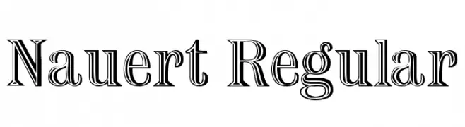
( Fonts by David Rakowski )
A bold, decorative font with a three-dimensional outline effect.
![Nauert Regular Frei Schriftart Herunterladen]() Herunterladen 844 Downloads@WebFont
Herunterladen 844 Downloads@WebFont -
( Fonts by Levi Halmos )
A modern, geometric font with elongated, narrow characters and a stylish appearance.
![Smart and Sexy Frei Schriftart Herunterladen]() Herunterladen 844 Downloads@WebFont
Herunterladen 844 Downloads@WebFont -
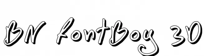
( Font by Ben Nathan - www.hafontia.com )
A playful, 3D-effect font with a hand-drawn, whimsical style.
![BN FontBoy 3D Frei Schriftart Herunterladen]() Herunterladen 844 Downloads@WebFont
Herunterladen 844 Downloads@WebFont -
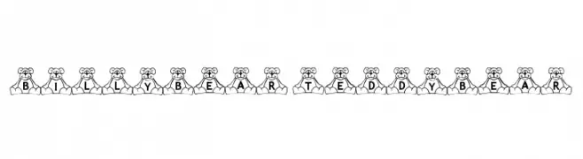
( Fonts by Loraine Wauer Ferus www.billybear4kids.com )
A playful font with characters embedded in teddy bear designs, perfect for children's projects.
![BillyBear TeddyBear Frei Schriftart Herunterladen]() Herunterladen 844 Downloads@WebFont
Herunterladen 844 Downloads@WebFont -
( Fonts by Levi Halmos )
A bold, geometric font with a strong, modern presence.
![Niobium Frei Schriftart Herunterladen]() Herunterladen 844 Downloads@WebFont
Herunterladen 844 Downloads@WebFont -
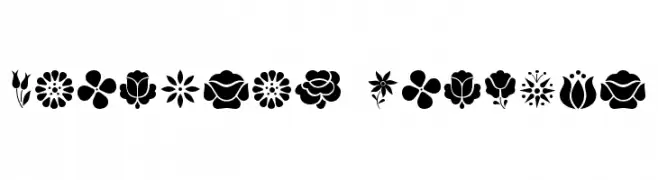
( Fonts by Levi Halmos )
Ornamental floral dingbat set with folk art influence.
![Kalocsai Flowers Frei Schriftart Herunterladen]() Herunterladen 844 Downloads@WebFont
Herunterladen 844 Downloads@WebFont -
( Fonts by Muhammad Afif )
A bold, playful font with rounded edges and a cohesive, solid appearance.
![AKIKA Frei Schriftart Herunterladen]() Herunterladen 843 Downloads@WebFont
Herunterladen 843 Downloads@WebFont -
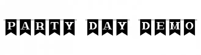
( Fonts by Calligraphy Fonts )
A bold, decorative font with letters in flag-like banners, ideal for festive occasions.
![Party Day Demo Frei Schriftart Herunterladen]() Herunterladen 843 Downloads@WebFont
Herunterladen 843 Downloads@WebFont -
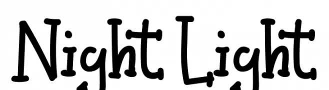
( Fonts by share font )
A playful, hand-drawn font with a whimsical and dynamic style.
![Night Light Frei Schriftart Herunterladen]() Herunterladen 843 Downloads@WebFont
Herunterladen 843 Downloads@WebFont -
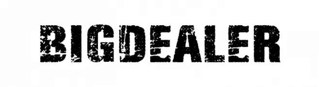
( Fonts by Woodcutter Manero - www.woodcutter.es - Personal-use only. For commercial use please contact owner. )
A bold, distressed font with a rugged, vintage appearance.
![Big Dealer Frei Schriftart Herunterladen]() Herunterladen 843 Downloads@WebFont
Herunterladen 843 Downloads@WebFont

![sugar [dissolve] Frei Schriftart Herunterladen](https://d144mzi0q5mijx.cloudfront.net/img/S/U/sugar-dissolve.webp)


Welche Schriften sind gerade am populärsten?
Poppins, Roboto, Montserrat, Open Sans und Lato sind wegen ihrer klaren Formen und breiten Einsetzbarkeit sehr gefragt – von Markenauftritt über Landingpages bis hin zu Postern.
Welche Fonts eignen sich für Logos?
Geometrische Sans‑Serifs (z. B. Poppins, Familien im Gotham‑Stil) sind ein häufiger Griff für sauberes, skalierbares Branding. Für eine persönlichere Note bleiben Scripts und Handschrift‑Stile beliebt. Kombinieren Sie einen prägnanten Headline‑Font mit einer neutralen Brotschrift für Wiedererkennung und Harmonie.
Wie oft wird die Top‑Liste aktualisiert?
Regelmäßig – basierend auf realen Downloads und Interaktionen. Schauen Sie öfter vorbei, um aufstrebende Favoriten früh zu entdecken.
💡 Tipp: Seite bookmarken – Trends wechseln schnell, und heutige Top‑Schriften inspirieren morgen vielleicht das Rebranding.