Willkommen bei den Top‑Schriften – hier treffen Beliebtheit und Qualität aufeinander. Das sind die in diesem Jahr am häufigsten heruntergeladenen und genutzten Fonts. Wenn Sie sichere Optionen für Logo, Web oder Social suchen, starten Sie hier.
Jeder Top‑Font überzeugt durch Balance, Lesbarkeit und Vielseitigkeit. Sie finden moderne Sans‑Serifs, elegante Scripts, Vintage‑Serifs und minimalistische Displays.
-
 Herunterladen 821 Downloads@WebFont
 -
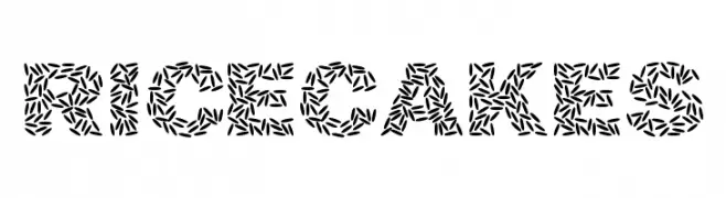
![Ricecakes Frei Schriftart Herunterladen]() Herunterladen 821 Downloads@WebFont
Herunterladen 821 Downloads@WebFont -
![Anarchist Bible Frei Schriftart Herunterladen]() Herunterladen 821 Downloads@WebFont
Herunterladen 821 Downloads@WebFont -
( Fonts by Khurasan )
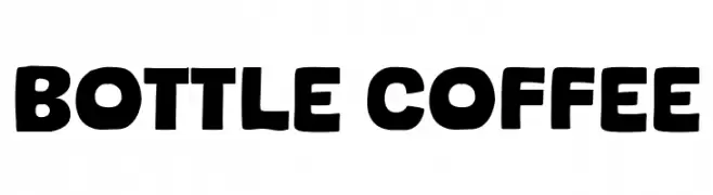
A bold, playful font with rounded strokes and a friendly appearance.
![Bottle Coffee Frei Schriftart Herunterladen]() Herunterladen 820 Downloads@WebFont
Herunterladen 820 Downloads@WebFont -
( Fonts by Khurasan )
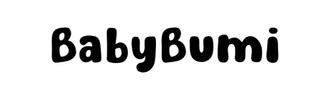
A playful, bold font with rounded, thick strokes and a whimsical touch.
![Baby Bumi Frei Schriftart Herunterladen]() Herunterladen 820 Downloads@WebFont
Herunterladen 820 Downloads@WebFont -
( Fonts by Pustudio )
A bold, handwritten font with a casual and playful style.
![DailyNoted Frei Schriftart Herunterladen]() Herunterladen 820 Downloads@WebFont
Herunterladen 820 Downloads@WebFont -
( Fonts by EssentialsStudio - Personal-use only. For commercial use please contact owner. )
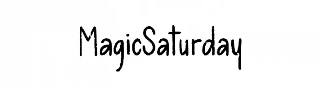
A playful, handwritten font with a casual and whimsical style.
![Magic Saturday Frei Schriftart Herunterladen]() Herunterladen 820 Downloads@WebFont
Herunterladen 820 Downloads@WebFont -
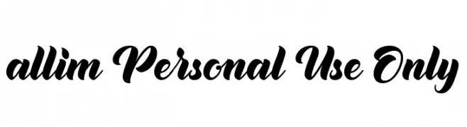
( Fonts by Ahmad Rofingi - AR Studio - Personal-use only. For commercial use please contact owner. )
A bold, expressive script font with elegant, flowing cursive letters.
![allim Personal Use Only Frei Schriftart Herunterladen]() Herunterladen 820 Downloads@WebFont
Herunterladen 820 Downloads@WebFont -
Schriftart von typotopia. For commercial use please contact the owner.
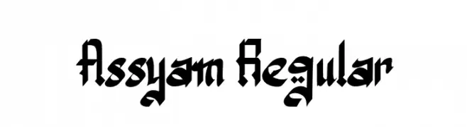
( Fonts bt Typotopia - Typotopia.co - Personal Use Only, for Commercial Use, please contact us )
A bold, blackletter-inspired font with sharp, angular lines and intricate detailing.
![Assyam Regular Frei Schriftart Herunterladen]() Herunterladen 820 Downloads@WebFont
Herunterladen 820 Downloads@WebFont -
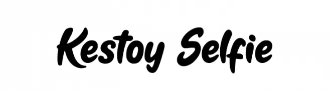
( Fonts by Tan Cundrawan - cove703 - creativemarket.com/cove703 - Personal-use only. For commercial use please contact owner. )
A bold, flowing script font with a handwritten style.
![Kestoy Selfie Frei Schriftart Herunterladen]() Herunterladen 820 Downloads@WebFont
Herunterladen 820 Downloads@WebFont -
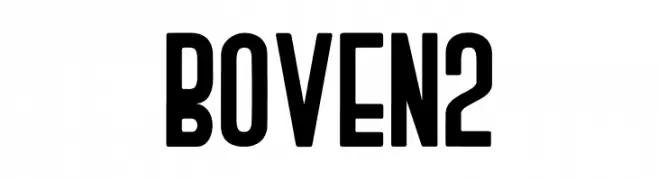
( Muhammad Romzul Khoir )
A bold, condensed font with uniform strokes and a strong presence.
![BOVEN 2 Frei Schriftart Herunterladen]() Herunterladen 820 Downloads@WebFont
Herunterladen 820 Downloads@WebFont -
( Fonts by Billy Argel - www.billyargel.com - Personal-use only. For commercial use please contact owner. )
A bold, italicized font with high contrast and a modern, dynamic style.
![Secret Agent Personal Use Frei Schriftart Herunterladen]() Herunterladen 820 Downloads@WebFont
Herunterladen 820 Downloads@WebFont -
( Fonts by a Neale Davidson - www.pixelsagas.com. Personal-use only. For commercial use please contact owner. )
A bold, italic font with strong, angular lines and a modern aesthetic.
![Virtucorp Italic Frei Schriftart Herunterladen]() Herunterladen 820 Downloads@WebFont
Herunterladen 820 Downloads@WebFont -
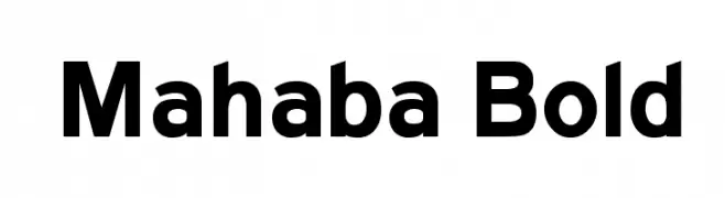
![Mahaba Bold Frei Schriftart Herunterladen]() Herunterladen 820 Downloads@WebFont
Herunterladen 820 Downloads@WebFont -
( Fonts by Jonathan S. Harris - www.tattoowoo.com. Personal-use only. For commercial use please contact owner. )
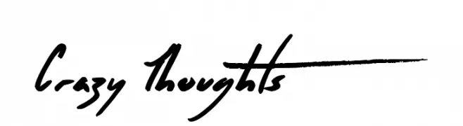
A bold, hand-drawn font with a dynamic and expressive brush-like texture.
![Crazy Thoughts Frei Schriftart Herunterladen]() Herunterladen 820 Downloads@WebFont
Herunterladen 820 Downloads@WebFont -
( Fonts by Douglas Vitkauskas - www.vtksdesign.com. Personal-use only. For commercial use please contact owner. )
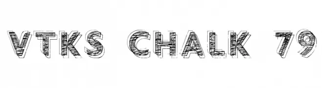
A bold, chalk-textured font with a hand-drawn, artistic style.
![vtks chalk 79 Frei Schriftart Herunterladen]() Herunterladen 820 Downloads@WebFont
Herunterladen 820 Downloads@WebFont -
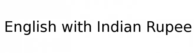
![English with Indian Rupee Frei Schriftart Herunterladen]() Herunterladen 820 Downloads@WebFont
Herunterladen 820 Downloads@WebFont -
( This font is freeware. www.thenorthernblock.co.uk )
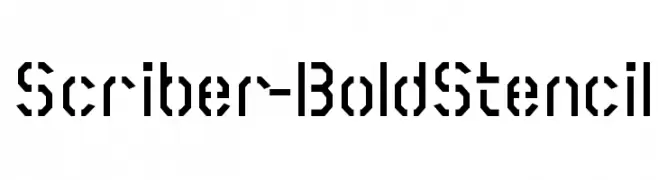
A bold, geometric stencil font with sharp angles and cut-out sections.
![Scriber-BoldStencil Frei Schriftart Herunterladen]() Herunterladen 820 Downloads@WebFont
Herunterladen 820 Downloads@WebFont -
( Fonts by Manfred Klein - manfred-klein.ina-mar.com )
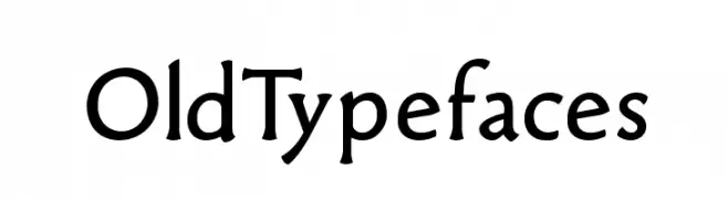
A classic serif typeface with elegant curves and strong readability.
![OldTypefaces Frei Schriftart Herunterladen]() Herunterladen 820 Downloads@WebFont
Herunterladen 820 Downloads@WebFont -
( Fonts by Masato Shimojima - Personal-use only. For commercial use please contact owner. )
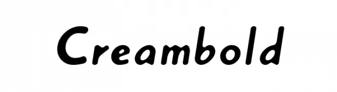
A playful, bold font with rounded edges and a dynamic slant.
![Creambold Frei Schriftart Herunterladen]() Herunterladen 820 Downloads@WebFont
Herunterladen 820 Downloads@WebFont -
![Transmaidens Normal Frei Schriftart Herunterladen]() Herunterladen 820 Downloads@WebFont
Herunterladen 820 Downloads@WebFont -
( Fonts by www.typodermicfonts.com - Ray Larabie )
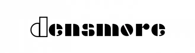
A bold, modern font with geometric shapes and contrasting solid and outlined segments.
![Densmore Frei Schriftart Herunterladen]() Herunterladen 820 Downloads@WebFont
Herunterladen 820 Downloads@WebFont -
![FederationDS9Title Frei Schriftart Herunterladen]() Herunterladen 820 Downloads@WebFont
Herunterladen 820 Downloads@WebFont -
( Fonts by Nick Curtis - www.nicksfonts.com )
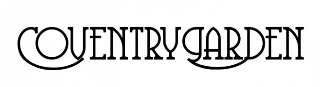
A decorative serif font with elegant, flowing uppercase and classic lowercase letters.
![CoventryGarden Frei Schriftart Herunterladen]() Herunterladen 820 Downloads@WebFont
Herunterladen 820 Downloads@WebFont -
( Fonts by Omnibus Type )
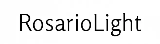
A modern, light-weight font with elegant curvature and excellent readability.
![Rosario Light Frei Schriftart Herunterladen]() Herunterladen 819 Downloads@WebFont
Herunterladen 819 Downloads@WebFont -
( Fonts by wep )
A bold, playful, hand-drawn font with dynamic, irregular characters.
![Dengerin Frei Schriftart Herunterladen]() Herunterladen 819 Downloads@WebFont
Herunterladen 819 Downloads@WebFont -
( Fonts by Google - Personal-use only. For commercial use please contact owner. )
A bold, italic font with a dynamic and modern style.
![Franko Black Italic Frei Schriftart Herunterladen]() Herunterladen 819 Downloads@WebFont
Herunterladen 819 Downloads@WebFont -
( Copyright 2018 The K2D Project Authors (https://github.com/cadsondemak/K2D) )
A modern, geometric typeface with thin strokes and balanced spacing.
![K2D Thin Frei Schriftart Herunterladen]() Herunterladen 819 Downloads@WebFont
Herunterladen 819 Downloads@WebFont -
( imagex - www.imagex-fonts.com )
A bold, distressed font with a vintage, industrial style.
![Astounding news Frei Schriftart Herunterladen]() Herunterladen 819 Downloads@WebFont
Herunterladen 819 Downloads@WebFont -
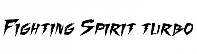
( Press Gang Studios - Andeh Pinkard - comicfontsby.tehandeh.com )
A bold, angular font with sharp, dynamic lines and an energetic style.
![Fighting Spirit turbo Frei Schriftart Herunterladen]() Herunterladen 819 Downloads@WebFont
Herunterladen 819 Downloads@WebFont -
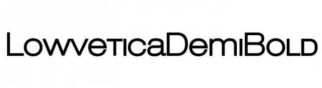
( Mario Arturo - www.marioarturotype.com )
A modern, geometric sans-serif font with uniform width and clean lines.
![LowveticaDemiBold Frei Schriftart Herunterladen]() Herunterladen 819 Downloads@WebFont
Herunterladen 819 Downloads@WebFont -
( Chequered Ink - chequered.ink/ )
A bold, modern font with thick strokes and high contrast.
![Under the Weather Frei Schriftart Herunterladen]() Herunterladen 819 Downloads@WebFont
Herunterladen 819 Downloads@WebFont -
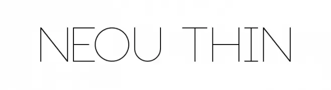
( André Uenojo - www.behance.net/AndreUenojo )
A thin, geometric font with a modern, minimalist style.
![Neou Thin Frei Schriftart Herunterladen]() Herunterladen 819 Downloads@WebFont
Herunterladen 819 Downloads@WebFont -
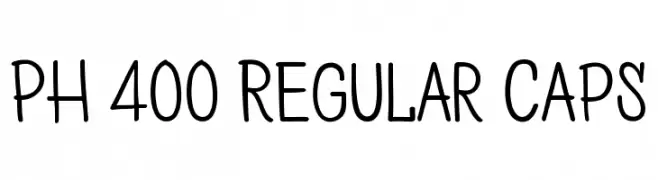
( Fonts by a www.fontfabric.com. Personal-use only. For commercial use please contact owner. )
A playful, handwritten font with rounded, informal letterforms.
![PH 400 Regular Caps Frei Schriftart Herunterladen]() Herunterladen 819 Downloads@WebFont
Herunterladen 819 Downloads@WebFont -
( Fonts by Andrew McCluskey - nalgames.com. Personal-use only. For commercial use please contact owner. )
A futuristic, bold font with rounded edges and geometric structure.
![Vermin Vibes 2 EDM XTC Frei Schriftart Herunterladen]() Herunterladen 819 Downloads@WebFont
Herunterladen 819 Downloads@WebFont


Welche Schriften sind gerade am populärsten?
Poppins, Roboto, Montserrat, Open Sans und Lato sind wegen ihrer klaren Formen und breiten Einsetzbarkeit sehr gefragt – von Markenauftritt über Landingpages bis hin zu Postern.
Welche Fonts eignen sich für Logos?
Geometrische Sans‑Serifs (z. B. Poppins, Familien im Gotham‑Stil) sind ein häufiger Griff für sauberes, skalierbares Branding. Für eine persönlichere Note bleiben Scripts und Handschrift‑Stile beliebt. Kombinieren Sie einen prägnanten Headline‑Font mit einer neutralen Brotschrift für Wiedererkennung und Harmonie.
Wie oft wird die Top‑Liste aktualisiert?
Regelmäßig – basierend auf realen Downloads und Interaktionen. Schauen Sie öfter vorbei, um aufstrebende Favoriten früh zu entdecken.
💡 Tipp: Seite bookmarken – Trends wechseln schnell, und heutige Top‑Schriften inspirieren morgen vielleicht das Rebranding.