Willkommen bei den Top‑Schriften – hier treffen Beliebtheit und Qualität aufeinander. Das sind die in diesem Jahr am häufigsten heruntergeladenen und genutzten Fonts. Wenn Sie sichere Optionen für Logo, Web oder Social suchen, starten Sie hier.
Jeder Top‑Font überzeugt durch Balance, Lesbarkeit und Vielseitigkeit. Sie finden moderne Sans‑Serifs, elegante Scripts, Vintage‑Serifs und minimalistische Displays.
-
( Fonts by Alex Squack - http://twitter.com/NoGoodToMe )
A textured, distressed font with a rugged, urban feel.
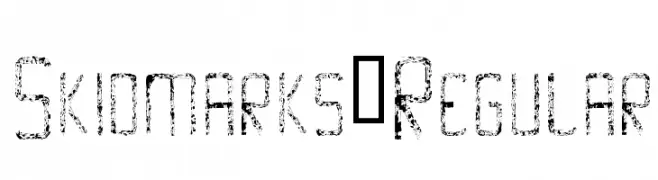 Herunterladen 187 Downloads@WebFont
 -
( Fonts by Cristiano Sobral - Personal-use only. For commercial use please contact owner. )
A bold and italic font with strong, dynamic strokes and a slight slant.
![Luna Bold Italic Frei Schriftart Herunterladen]() Herunterladen 187 Downloads@WebFont
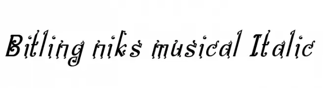
Herunterladen 187 Downloads@WebFont -
( Fonts by Rajendra Bitling )
A decorative, musical-themed italic font with playful, artistic details.
![Bitling niks musical Italic Frei Schriftart Herunterladen]() Herunterladen 187 Downloads@WebFont
Herunterladen 187 Downloads@WebFont -
![Endgame DEMO Regular Frei Schriftart Herunterladen]() Herunterladen 187 Downloads@WebFont
Herunterladen 187 Downloads@WebFont -
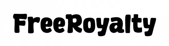
( Fonts by Khurasan™ )
Bold and playful font with rounded edges.
![Free Royalty Frei Schriftart Herunterladen]() Herunterladen 187 Downloads@WebFont
Herunterladen 187 Downloads@WebFont -
-
( Fonts by Woodcutter Manero - http://www.woodcutter.es - Personal-use only. For commercial use please contact owner. )
A bold, dripping font perfect for horror or Halloween themes.
![Doctor Terror Frei Schriftart Herunterladen]() Herunterladen 187 Downloads@WebFont
Herunterladen 187 Downloads@WebFont -
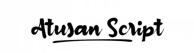
( Fonts by wepfont - Wahyu Eka Prasetya - Personal-use only. For commercial use please contact owner. )
A bold, flowing script font with elegant curves and artistic flair.
![Atusan_Script Frei Schriftart Herunterladen]() Herunterladen 187 Downloads@WebFont
Herunterladen 187 Downloads@WebFont -
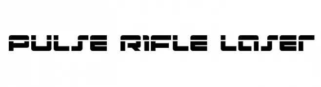
( Fonts by Daniel Zadorozny - www.iconian.com )
A futuristic, angular font with a bold, geometric style.
![Pulse Rifle Laser Frei Schriftart Herunterladen]() Herunterladen 187 Downloads@WebFont
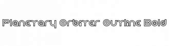
Herunterladen 187 Downloads@WebFont -
![Planetary Orbiter Outline Bold Frei Schriftart Herunterladen]() Herunterladen 187 Downloads@WebFont
Herunterladen 187 Downloads@WebFont -
( Fonts by www.houseoflime.com )
A decorative frame set with both ornate and minimalist rectangular designs.
![Frames Frei Schriftart Herunterladen]() Herunterladen 187 Downloads@WebFont
Herunterladen 187 Downloads@WebFont


Welche Schriften sind gerade am populärsten?
Poppins, Roboto, Montserrat, Open Sans und Lato sind wegen ihrer klaren Formen und breiten Einsetzbarkeit sehr gefragt – von Markenauftritt über Landingpages bis hin zu Postern.
Welche Fonts eignen sich für Logos?
Geometrische Sans‑Serifs (z. B. Poppins, Familien im Gotham‑Stil) sind ein häufiger Griff für sauberes, skalierbares Branding. Für eine persönlichere Note bleiben Scripts und Handschrift‑Stile beliebt. Kombinieren Sie einen prägnanten Headline‑Font mit einer neutralen Brotschrift für Wiedererkennung und Harmonie.
Wie oft wird die Top‑Liste aktualisiert?
Regelmäßig – basierend auf realen Downloads und Interaktionen. Schauen Sie öfter vorbei, um aufstrebende Favoriten früh zu entdecken.
💡 Tipp: Seite bookmarken – Trends wechseln schnell, und heutige Top‑Schriften inspirieren morgen vielleicht das Rebranding.