Willkommen bei den Top‑Schriften – hier treffen Beliebtheit und Qualität aufeinander. Das sind die in diesem Jahr am häufigsten heruntergeladenen und genutzten Fonts. Wenn Sie sichere Optionen für Logo, Web oder Social suchen, starten Sie hier.
Jeder Top‑Font überzeugt durch Balance, Lesbarkeit und Vielseitigkeit. Sie finden moderne Sans‑Serifs, elegante Scripts, Vintage‑Serifs und minimalistische Displays.
-
( Fonts by Vladimir Nikolic - www.creativefabrica.com/designer/vladimirnikolic/ - Personal-use only. For commercial use please contact owner. )
A geometric, outlined font with a modern, futuristic style.
 Herunterladen 188 Downloads@WebFont
 -
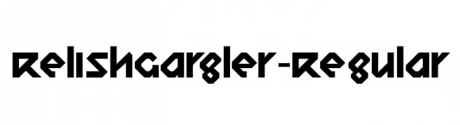
( Fonts by www.typodermicfonts.com - Ray Larabie )
A bold, geometric font with sharp angles and a futuristic look.
![RelishGargler-Regular Frei Schriftart Herunterladen]() Herunterladen 188 Downloads@WebFont
Herunterladen 188 Downloads@WebFont -
( Fonts by Khrys Bosland )
A playful, handwritten font with whimsical loops and curls.
![KBBrightandMerry Frei Schriftart Herunterladen]() Herunterladen 188 Downloads@WebFont
Herunterladen 188 Downloads@WebFont -
( Fonts by Katie Grove )
A bold, playful handwritten font with rounded, irregular characters.
![azaura Frei Schriftart Herunterladen]() Herunterladen 188 Downloads@WebFont
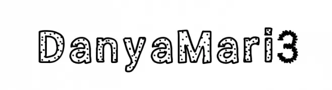
Herunterladen 188 Downloads@WebFont -
![DanyaMari3 Frei Schriftart Herunterladen]() Herunterladen 188 Downloads@WebFont
Herunterladen 188 Downloads@WebFont -
-
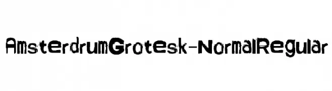
( Fonts by Bumbayo Font Fabrik )
A bold, distressed font with a rough, textured appearance.
![AmsterdrumGrotesk-NormalRegular Frei Schriftart Herunterladen]() Herunterladen 188 Downloads@WebFont
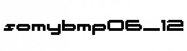
Herunterladen 188 Downloads@WebFont -
![somybmp06_12 Frei Schriftart Herunterladen]() Herunterladen 188 Downloads@WebFont
Herunterladen 188 Downloads@WebFont -
![Schnitger_1680_Regular.TTF Frei Schriftart Herunterladen]() Herunterladen 188 Downloads@WebFont
Herunterladen 188 Downloads@WebFont -
( Personal-use only. For commercial use please contact owner. )
A playful, hand-drawn font with thin, elegant strokes.
![Binz Frei Schriftart Herunterladen]() Herunterladen 188 Downloads@WebFont
Herunterladen 188 Downloads@WebFont -
( Fonts by Vladimir Nikolic - www.creativefabrica.com/designer/vladimirnikolic/ - Personal-use only. For commercial use please contact owner. )
A bold, geometric font with a modern, industrial aesthetic.
![Depot Regular Frei Schriftart Herunterladen]() Herunterladen 188 Downloads@WebFont
Herunterladen 188 Downloads@WebFont


Welche Schriften sind gerade am populärsten?
Poppins, Roboto, Montserrat, Open Sans und Lato sind wegen ihrer klaren Formen und breiten Einsetzbarkeit sehr gefragt – von Markenauftritt über Landingpages bis hin zu Postern.
Welche Fonts eignen sich für Logos?
Geometrische Sans‑Serifs (z. B. Poppins, Familien im Gotham‑Stil) sind ein häufiger Griff für sauberes, skalierbares Branding. Für eine persönlichere Note bleiben Scripts und Handschrift‑Stile beliebt. Kombinieren Sie einen prägnanten Headline‑Font mit einer neutralen Brotschrift für Wiedererkennung und Harmonie.
Wie oft wird die Top‑Liste aktualisiert?
Regelmäßig – basierend auf realen Downloads und Interaktionen. Schauen Sie öfter vorbei, um aufstrebende Favoriten früh zu entdecken.
💡 Tipp: Seite bookmarken – Trends wechseln schnell, und heutige Top‑Schriften inspirieren morgen vielleicht das Rebranding.