Willkommen bei den Top‑Schriften – hier treffen Beliebtheit und Qualität aufeinander. Das sind die in diesem Jahr am häufigsten heruntergeladenen und genutzten Fonts. Wenn Sie sichere Optionen für Logo, Web oder Social suchen, starten Sie hier.
Jeder Top‑Font überzeugt durch Balance, Lesbarkeit und Vielseitigkeit. Sie finden moderne Sans‑Serifs, elegante Scripts, Vintage‑Serifs und minimalistische Displays.
-
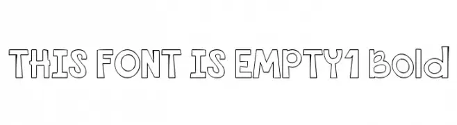
( Fonts by Darcy Baldwin - darcybaldwin.com. Free for personal use only )
A playful, bold, and hollow outlined font with a whimsical style.
 Herunterladen 187 Downloads@WebFont
 -
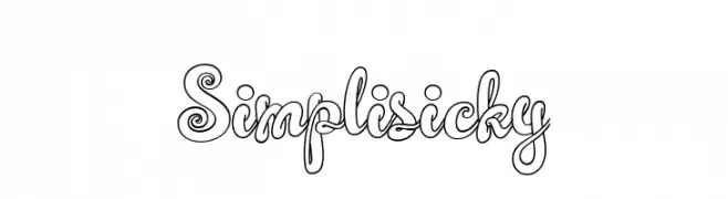
( Fonts by Darwinoo )
A playful, outlined font with a whimsical, hand-drawn style.
![Simplisicky Frei Schriftart Herunterladen]() Herunterladen 187 Downloads@WebFont
Herunterladen 187 Downloads@WebFont -
![JessyHeart Frei Schriftart Herunterladen]() Herunterladen 187 Downloads@WebFont
Herunterladen 187 Downloads@WebFont -
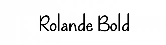
( Lauren Thompson - www.nymfont.com/ )
A playful, rounded font with a whimsical and informal style.
![Rolande Bold Frei Schriftart Herunterladen]() Herunterladen 187 Downloads@WebFont
Herunterladen 187 Downloads@WebFont -
![Smush Italic Frei Schriftart Herunterladen]() Herunterladen 187 Downloads@WebFont
Herunterladen 187 Downloads@WebFont -
-
( Fonts by Nirmala Creative - Personal-use only. For commercial use please contact owner. )
Playful, bold handwritten font.
![Donitha Frei Schriftart Herunterladen]() Herunterladen 187 Downloads@WebFont
Herunterladen 187 Downloads@WebFont -
( Fonts by Dan P. Lyons - Personal-use only. For commercial use please contact owner. )
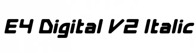
A bold, italicized font with a futuristic, digital design.
![E4 Digital V2 Italic Frei Schriftart Herunterladen]() Herunterladen 187 Downloads@WebFont
Herunterladen 187 Downloads@WebFont -
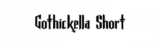
( Fonts by Dirt2.com )
A bold, gothic-inspired font with sharp, angular lines and dramatic serifs.
![Gothickella Short Frei Schriftart Herunterladen]() Herunterladen 187 Downloads@WebFont
Herunterladen 187 Downloads@WebFont -
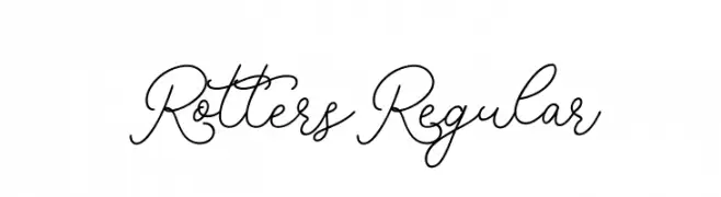
( Fonts by monocotype - Personal-use only. For commercial use please contact owner. )
An elegant script font with flowing, continuous strokes and decorative flair.
![RottersRegular Frei Schriftart Herunterladen]() Herunterladen 187 Downloads@WebFont
Herunterladen 187 Downloads@WebFont -
![PopticsOne Frei Schriftart Herunterladen]() Herunterladen 187 Downloads@WebFont
Herunterladen 187 Downloads@WebFont


Welche Schriften sind gerade am populärsten?
Poppins, Roboto, Montserrat, Open Sans und Lato sind wegen ihrer klaren Formen und breiten Einsetzbarkeit sehr gefragt – von Markenauftritt über Landingpages bis hin zu Postern.
Welche Fonts eignen sich für Logos?
Geometrische Sans‑Serifs (z. B. Poppins, Familien im Gotham‑Stil) sind ein häufiger Griff für sauberes, skalierbares Branding. Für eine persönlichere Note bleiben Scripts und Handschrift‑Stile beliebt. Kombinieren Sie einen prägnanten Headline‑Font mit einer neutralen Brotschrift für Wiedererkennung und Harmonie.
Wie oft wird die Top‑Liste aktualisiert?
Regelmäßig – basierend auf realen Downloads und Interaktionen. Schauen Sie öfter vorbei, um aufstrebende Favoriten früh zu entdecken.
💡 Tipp: Seite bookmarken – Trends wechseln schnell, und heutige Top‑Schriften inspirieren morgen vielleicht das Rebranding.