Willkommen bei den Top‑Schriften – hier treffen Beliebtheit und Qualität aufeinander. Das sind die in diesem Jahr am häufigsten heruntergeladenen und genutzten Fonts. Wenn Sie sichere Optionen für Logo, Web oder Social suchen, starten Sie hier.
Jeder Top‑Font überzeugt durch Balance, Lesbarkeit und Vielseitigkeit. Sie finden moderne Sans‑Serifs, elegante Scripts, Vintage‑Serifs und minimalistische Displays.
-
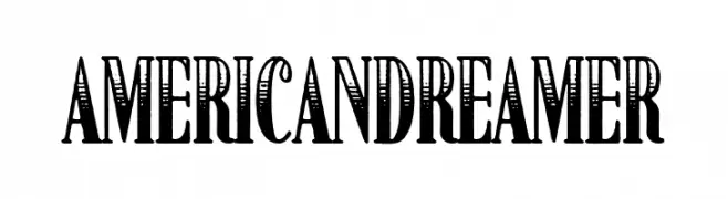
( Fonts by Woodcutter Manero - http://www.woodcutter.es - Personal-use only. For commercial use please contact owner. )
A bold, decorative typeface with vintage, ornate serifs and a handcrafted feel.
 Herunterladen 185 Downloads@WebFont
 -
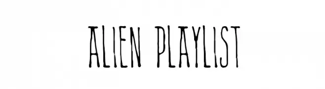
( Fonts by a The Branded Quotes - https://sellfy.com/thebrandedquotes. Personal-use only. For commercial use please contact owner. )
A quirky, hand-drawn font with elongated, narrow characters.
![Alien Playlist Frei Schriftart Herunterladen]() Herunterladen 185 Downloads@WebFont
Herunterladen 185 Downloads@WebFont -
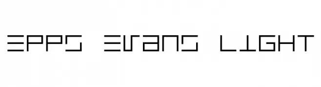
![Epps Evans Light Frei Schriftart Herunterladen]() Herunterladen 185 Downloads@WebFont
Herunterladen 185 Downloads@WebFont -
![LVDC Common Pix2 Frei Schriftart Herunterladen]() Herunterladen 185 Downloads@WebFont
Herunterladen 185 Downloads@WebFont -
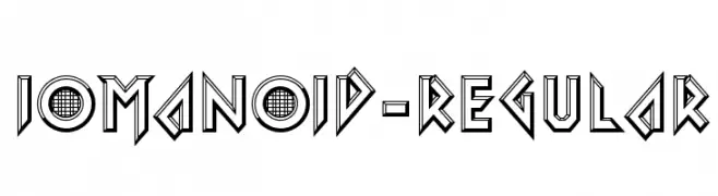
( Fonts by www.typodermicfonts.com - Ray Larabie )
A bold, geometric font with a 3D effect and futuristic style.
![Iomanoid-Regular Frei Schriftart Herunterladen]() Herunterladen 185 Downloads@WebFont
Herunterladen 185 Downloads@WebFont -
-
![Baljit Thin Frei Schriftart Herunterladen]() Herunterladen 185 Downloads@WebFont
Herunterladen 185 Downloads@WebFont -
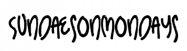
( Fonts by PremiereGraphics )
A bold, hand-drawn font with a playful and energetic style.
![Sundaes on Mondays Frei Schriftart Herunterladen]() Herunterladen 185 Downloads@WebFont
Herunterladen 185 Downloads@WebFont -
![Summers Country Jars Frei Schriftart Herunterladen]() Herunterladen 185 Downloads@WebFont
Herunterladen 185 Downloads@WebFont -
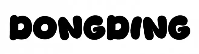
( Fonts by Khurasan )
A bold, playful font with rounded, bubble-like characters.
![Dongding Frei Schriftart Herunterladen]() Herunterladen 185 Downloads@WebFont
Herunterladen 185 Downloads@WebFont -
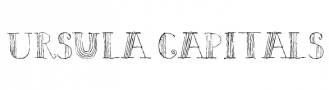
![Ursula Capitals Frei Schriftart Herunterladen]() Herunterladen 185 Downloads@WebFont
Herunterladen 185 Downloads@WebFont


Welche Schriften sind gerade am populärsten?
Poppins, Roboto, Montserrat, Open Sans und Lato sind wegen ihrer klaren Formen und breiten Einsetzbarkeit sehr gefragt – von Markenauftritt über Landingpages bis hin zu Postern.
Welche Fonts eignen sich für Logos?
Geometrische Sans‑Serifs (z. B. Poppins, Familien im Gotham‑Stil) sind ein häufiger Griff für sauberes, skalierbares Branding. Für eine persönlichere Note bleiben Scripts und Handschrift‑Stile beliebt. Kombinieren Sie einen prägnanten Headline‑Font mit einer neutralen Brotschrift für Wiedererkennung und Harmonie.
Wie oft wird die Top‑Liste aktualisiert?
Regelmäßig – basierend auf realen Downloads und Interaktionen. Schauen Sie öfter vorbei, um aufstrebende Favoriten früh zu entdecken.
💡 Tipp: Seite bookmarken – Trends wechseln schnell, und heutige Top‑Schriften inspirieren morgen vielleicht das Rebranding.