Willkommen bei den Top‑Schriften – hier treffen Beliebtheit und Qualität aufeinander. Das sind die in diesem Jahr am häufigsten heruntergeladenen und genutzten Fonts. Wenn Sie sichere Optionen für Logo, Web oder Social suchen, starten Sie hier.
Jeder Top‑Font überzeugt durch Balance, Lesbarkeit und Vielseitigkeit. Sie finden moderne Sans‑Serifs, elegante Scripts, Vintage‑Serifs und minimalistische Displays.
-
( Fonts by Nico Rützel - Personal-use only. For commercial use please contact owner. )
A modern, rounded sans-serif font with uniform strokes and high legibility.
 Herunterladen 183 Downloads@WebFont
 -
( Eka Becoñado )
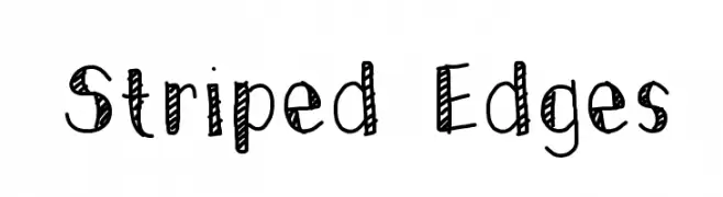
A playful, hand-drawn font with striped edges and a whimsical style.
![Striped Edges Frei Schriftart Herunterladen]() Herunterladen 183 Downloads@WebFont
Herunterladen 183 Downloads@WebFont -
( Fonts by Syifa Fauzia Zazuli )
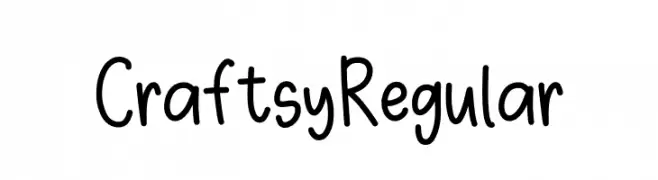
A playful, casual handwritten font with rounded, consistent strokes.
![Craftsy Regular Frei Schriftart Herunterladen]() Herunterladen 183 Downloads@WebFont
Herunterladen 183 Downloads@WebFont -
( Angst )
A whimsical, playful font with rounded, elongated letterforms.
![Magic Mush Frei Schriftart Herunterladen]() Herunterladen 183 Downloads
Herunterladen 183 Downloads -
( Letterhend Studio - Hendry Juanda - creativemarket.com/letterhend )
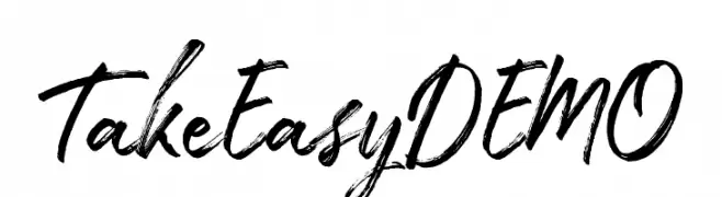
A bold, expressive handwritten font with dynamic strokes and a brush-like texture.
![TakeEasyDEMO Frei Schriftart Herunterladen]() Herunterladen 183 Downloads@WebFont
Herunterladen 183 Downloads@WebFont -
-
( Fonts by Daniel Zadorozny - www.iconian.com - Free for personal use )
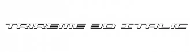
A dynamic, 3D italic font with a futuristic and geometric design.
![Trireme 3D Italic Frei Schriftart Herunterladen]() Herunterladen 183 Downloads@WebFont
Herunterladen 183 Downloads@WebFont -
( Fonts by Alex Tomlinson - Skyhaven Fonts - shfonts.com )
A modern, elongated font with high contrast and narrow characters.
![DillFrancis-Regular Frei Schriftart Herunterladen]() Herunterladen 183 Downloads@WebFont
Herunterladen 183 Downloads@WebFont -
( Fonts by Andrew McCluskey - nalgames.com. Personal-use only. For commercial use please contact owner. )
A tall, narrow, hand-drawn font with a playful yet sophisticated style.
![Cisgender Frei Schriftart Herunterladen]() Herunterladen 183 Downloads@WebFont
Herunterladen 183 Downloads@WebFont -
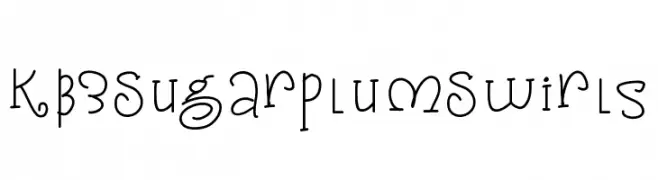
( Fonts by KB3Teach )
A whimsical, playful font with swirls and curls, perfect for creative projects.
![KB3SugarplumSwirls Frei Schriftart Herunterladen]() Herunterladen 183 Downloads@WebFont
Herunterladen 183 Downloads@WebFont -
( Fonts by Burhan Afif - hanscostudio.com - Personal-use only. For commercial use please contact owner. )
A sophisticated script font with flowing, cursive letterforms.
![Platinum Signature Frei Schriftart Herunterladen]() Herunterladen 183 Downloads@WebFont
Herunterladen 183 Downloads@WebFont


Welche Schriften sind gerade am populärsten?
Poppins, Roboto, Montserrat, Open Sans und Lato sind wegen ihrer klaren Formen und breiten Einsetzbarkeit sehr gefragt – von Markenauftritt über Landingpages bis hin zu Postern.
Welche Fonts eignen sich für Logos?
Geometrische Sans‑Serifs (z. B. Poppins, Familien im Gotham‑Stil) sind ein häufiger Griff für sauberes, skalierbares Branding. Für eine persönlichere Note bleiben Scripts und Handschrift‑Stile beliebt. Kombinieren Sie einen prägnanten Headline‑Font mit einer neutralen Brotschrift für Wiedererkennung und Harmonie.
Wie oft wird die Top‑Liste aktualisiert?
Regelmäßig – basierend auf realen Downloads und Interaktionen. Schauen Sie öfter vorbei, um aufstrebende Favoriten früh zu entdecken.
💡 Tipp: Seite bookmarken – Trends wechseln schnell, und heutige Top‑Schriften inspirieren morgen vielleicht das Rebranding.