Willkommen bei den Top‑Schriften – hier treffen Beliebtheit und Qualität aufeinander. Das sind die in diesem Jahr am häufigsten heruntergeladenen und genutzten Fonts. Wenn Sie sichere Optionen für Logo, Web oder Social suchen, starten Sie hier.
Jeder Top‑Font überzeugt durch Balance, Lesbarkeit und Vielseitigkeit. Sie finden moderne Sans‑Serifs, elegante Scripts, Vintage‑Serifs und minimalistische Displays.
-
 Herunterladen 182 Downloads@WebFont
 -
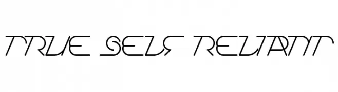
![True Self Reliant Frei Schriftart Herunterladen]() Herunterladen 182 Downloads@WebFont
Herunterladen 182 Downloads@WebFont -
( Fonts by Manfred Klein. Free for private and charity use. Free for commercial with donation to organizations )
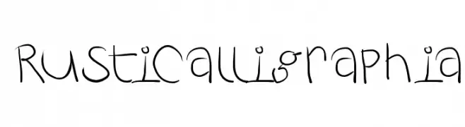
A whimsical, hand-drawn font with playful and irregular strokes.
![RustiCalligraphia Frei Schriftart Herunterladen]() Herunterladen 182 Downloads@WebFont
Herunterladen 182 Downloads@WebFont -
( Fonts by Billy Argel )
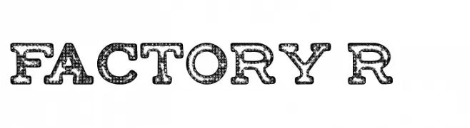
A bold, textured font with a vintage industrial style.
![FACTORY-Regular Frei Schriftart Herunterladen]() Herunterladen 182 Downloads@WebFont
Herunterladen 182 Downloads@WebFont -
( Fonts by Manfred Klein. Free for private and charity use. Free for commercial with donation to organizations )
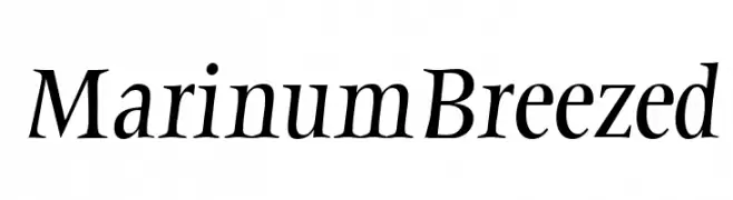
A classic serif font with modern elegance and medium contrast.
![MarinumBreezed Frei Schriftart Herunterladen]() Herunterladen 182 Downloads@WebFont
Herunterladen 182 Downloads@WebFont -
-
( Fonts by Wahyu Eka Prasetya - wepfont.com - Personal-use only. For commercial use please contact owner. )
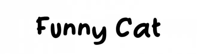
A playful, hand-drawn font with bold, rounded characters.
![Funny Cat Frei Schriftart Herunterladen]() Herunterladen 182 Downloads@WebFont
Herunterladen 182 Downloads@WebFont -
( Fonts by Nirmala Creative )
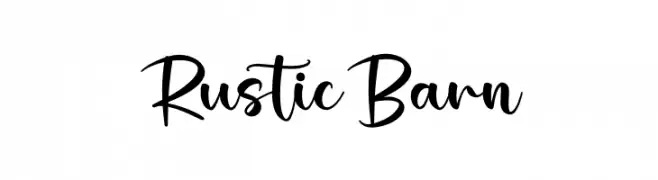
A charming, rustic handwritten font with a casual yet elegant script style.
![Rustic Barn Frei Schriftart Herunterladen]() Herunterladen 182 Downloads@WebFont
Herunterladen 182 Downloads@WebFont -
( Fonts by DM Studio )
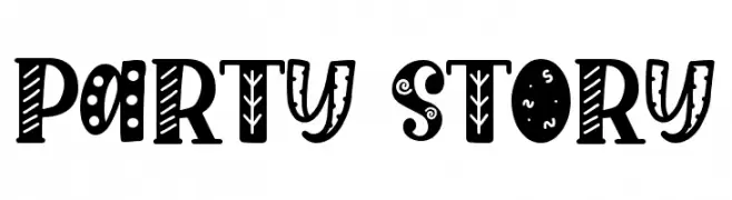
A playful, decorative font with whimsical patterns and bold, rounded characters.
![Party Story Frei Schriftart Herunterladen]() Herunterladen 182 Downloads@WebFont
Herunterladen 182 Downloads@WebFont -
( Fonts by Chequered Ink - chequered.ink - Personal-use only. For commercial use please contact owner. )
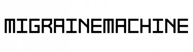
A geometric, angular font with a futuristic and mechanical style.
![Migraine Machine Frei Schriftart Herunterladen]() Herunterladen 182 Downloads@WebFont
Herunterladen 182 Downloads@WebFont -
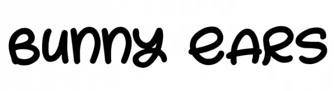
![Bunny Ears Frei Schriftart Herunterladen]() Herunterladen 182 Downloads@WebFont
Herunterladen 182 Downloads@WebFont
Welche Schriften sind gerade am populärsten?
Poppins, Roboto, Montserrat, Open Sans und Lato sind wegen ihrer klaren Formen und breiten Einsetzbarkeit sehr gefragt – von Markenauftritt über Landingpages bis hin zu Postern.
Welche Fonts eignen sich für Logos?
Geometrische Sans‑Serifs (z. B. Poppins, Familien im Gotham‑Stil) sind ein häufiger Griff für sauberes, skalierbares Branding. Für eine persönlichere Note bleiben Scripts und Handschrift‑Stile beliebt. Kombinieren Sie einen prägnanten Headline‑Font mit einer neutralen Brotschrift für Wiedererkennung und Harmonie.
Wie oft wird die Top‑Liste aktualisiert?
Regelmäßig – basierend auf realen Downloads und Interaktionen. Schauen Sie öfter vorbei, um aufstrebende Favoriten früh zu entdecken.
💡 Tipp: Seite bookmarken – Trends wechseln schnell, und heutige Top‑Schriften inspirieren morgen vielleicht das Rebranding.