Willkommen bei den Top‑Schriften – hier treffen Beliebtheit und Qualität aufeinander. Das sind die in diesem Jahr am häufigsten heruntergeladenen und genutzten Fonts. Wenn Sie sichere Optionen für Logo, Web oder Social suchen, starten Sie hier.
Jeder Top‑Font überzeugt durch Balance, Lesbarkeit und Vielseitigkeit. Sie finden moderne Sans‑Serifs, elegante Scripts, Vintage‑Serifs und minimalistische Displays.
-
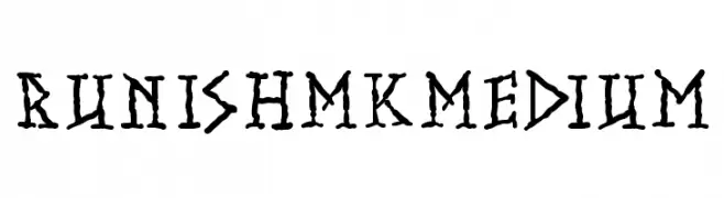
( Fonts by Manfred Klein - manfred-klein.ina-mar.com )
A rugged, hand-drawn font with an ancient, runic appearance.
 Herunterladen 181 Downloads@WebFont
 -
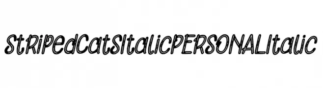
( Fonts by Mans Greback )
A playful, striped italic font with bold strokes and rounded edges.
![Striped Cats Italic PERSONAL Italic Frei Schriftart Herunterladen]() Herunterladen 181 Downloads@WebFont
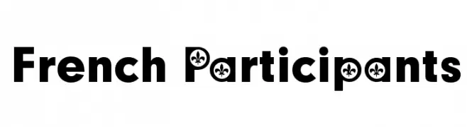
Herunterladen 181 Downloads@WebFont -
![French Participants Frei Schriftart Herunterladen]() Herunterladen 181 Downloads@WebFont
Herunterladen 181 Downloads@WebFont -
( Personal-use only. For commercial use please contact owner. )
A modern sans-serif font with clean lines and excellent legibility.
![M+ 1p Frei Schriftart Herunterladen]() Herunterladen 181 Downloads@WebFont
Herunterladen 181 Downloads@WebFont -
( Fonts by Daniel Zadorozny - www.iconian.com )
A bold, Gothic-inspired font with sharp, angular lines.
![Empire Crown Regular Frei Schriftart Herunterladen]() Herunterladen 181 Downloads@WebFont
Herunterladen 181 Downloads@WebFont -
-
![BDRamen Frei Schriftart Herunterladen]() Herunterladen 181 Downloads@WebFont
Herunterladen 181 Downloads@WebFont -
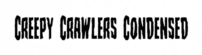
( Fonts by Iconian Fonts )
A condensed, eerie font with irregular, jagged letterforms perfect for horror themes.
![Creepy Crawlers Condensed Frei Schriftart Herunterladen]() Herunterladen 181 Downloads@WebFont
Herunterladen 181 Downloads@WebFont -
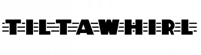
( Fonts by Daniel Gauthier )
A bold, playful font with horizontal stripes and a vintage flair.
![TiltAWhirl Frei Schriftart Herunterladen]() Herunterladen 181 Downloads@WebFont
Herunterladen 181 Downloads@WebFont -
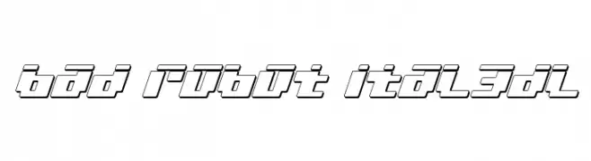
( Fonts by Daniel Zadorozny - www.iconian.com - Free for personal use )
A futuristic, 3D-outlined font with angular, geometric shapes and a consistent slant.
![bad robot ital3dl Frei Schriftart Herunterladen]() Herunterladen 181 Downloads@WebFont
Herunterladen 181 Downloads@WebFont -
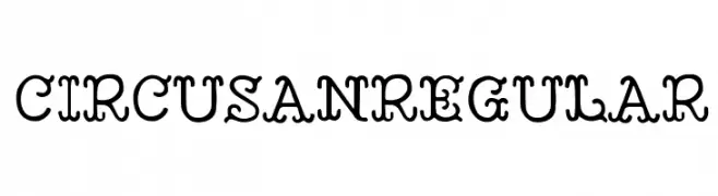
![Circusan Regular Frei Schriftart Herunterladen]() Herunterladen 181 Downloads@WebFont
Herunterladen 181 Downloads@WebFont


Welche Schriften sind gerade am populärsten?
Poppins, Roboto, Montserrat, Open Sans und Lato sind wegen ihrer klaren Formen und breiten Einsetzbarkeit sehr gefragt – von Markenauftritt über Landingpages bis hin zu Postern.
Welche Fonts eignen sich für Logos?
Geometrische Sans‑Serifs (z. B. Poppins, Familien im Gotham‑Stil) sind ein häufiger Griff für sauberes, skalierbares Branding. Für eine persönlichere Note bleiben Scripts und Handschrift‑Stile beliebt. Kombinieren Sie einen prägnanten Headline‑Font mit einer neutralen Brotschrift für Wiedererkennung und Harmonie.
Wie oft wird die Top‑Liste aktualisiert?
Regelmäßig – basierend auf realen Downloads und Interaktionen. Schauen Sie öfter vorbei, um aufstrebende Favoriten früh zu entdecken.
💡 Tipp: Seite bookmarken – Trends wechseln schnell, und heutige Top‑Schriften inspirieren morgen vielleicht das Rebranding.