Willkommen bei den Top‑Schriften – hier treffen Beliebtheit und Qualität aufeinander. Das sind die in diesem Jahr am häufigsten heruntergeladenen und genutzten Fonts. Wenn Sie sichere Optionen für Logo, Web oder Social suchen, starten Sie hier.
Jeder Top‑Font überzeugt durch Balance, Lesbarkeit und Vielseitigkeit. Sie finden moderne Sans‑Serifs, elegante Scripts, Vintage‑Serifs und minimalistische Displays.
-
 Herunterladen 791 Downloads@WebFont
 -
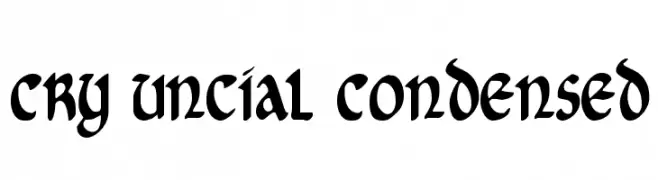
( Fonts by Daniel Zadorozny - www.iconian.com )
A bold, condensed uncial-style font with a historical yet modern appeal.
![Cry Uncial Condensed Frei Schriftart Herunterladen]() Herunterladen 791 Downloads@WebFont
Herunterladen 791 Downloads@WebFont -
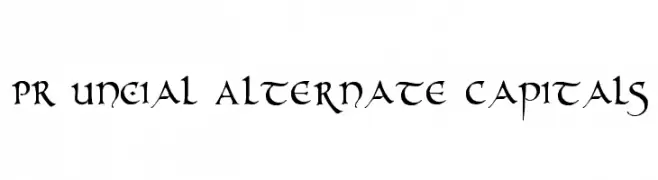
( Fonts by Peter Rempel - www.prfonts.com )
A decorative, medieval-style font with ornate and historical elements.
![PR Uncial Alternate Capitals Frei Schriftart Herunterladen]() Herunterladen 791 Downloads@WebFont
Herunterladen 791 Downloads@WebFont -
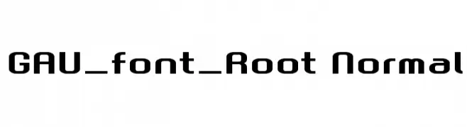
![GAU_font_Root Normal Frei Schriftart Herunterladen]() Herunterladen 791 Downloads@WebFont
Herunterladen 791 Downloads@WebFont -
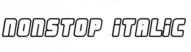
( Fonts by Jacob Fisher - www.pizzadude.dk )
A bold, outlined, and slightly italicized font with a modern, dynamic style.
![Nonstop italic Frei Schriftart Herunterladen]() Herunterladen 791 Downloads@WebFont
Herunterladen 791 Downloads@WebFont -
![Chancellerie Moderne Tryout Frei Schriftart Herunterladen]() Herunterladen 791 Downloads@WebFont
Herunterladen 791 Downloads@WebFont -
( Fonts by Daniel Zadorozny - www.iconian.com )
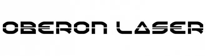
A futuristic, geometric font with bold lines and stencil-like cutouts.
![Oberon Laser Frei Schriftart Herunterladen]() Herunterladen 791 Downloads@WebFont
Herunterladen 791 Downloads@WebFont -
( Fonts by Apostrophic Lab )
A bold, gothic-style font with intricate, medieval-inspired details.
![Endor Frei Schriftart Herunterladen]() Herunterladen 791 Downloads@WebFont
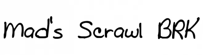
Herunterladen 791 Downloads@WebFont -
![Mad's Scrawl BRK Frei Schriftart Herunterladen]() Herunterladen 791 Downloads@WebFont
Herunterladen 791 Downloads@WebFont -
( Fonts by MJType )
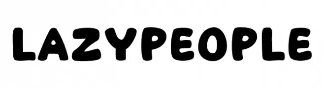
A playful, bold font with rounded, thick strokes and a friendly appearance.
![Lazy People Frei Schriftart Herunterladen]() Herunterladen 790 Downloads@WebFont
Herunterladen 790 Downloads@WebFont -
( Fonts by fsuarez913 )
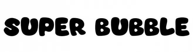
A playful, bubble-like font with bold, rounded characters ideal for fun and informal designs.
![Super Bubble Frei Schriftart Herunterladen]() Herunterladen 790 Downloads@WebFont
Herunterladen 790 Downloads@WebFont -
( Fonts by nomlimofont )
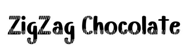
A playful font with bold, rounded letters and a zigzag pattern.
![ZigZag Chocolate Frei Schriftart Herunterladen]() Herunterladen 790 Downloads@WebFont
Herunterladen 790 Downloads@WebFont -
( Fonts by Syaf Rizal - www.creativefabrica.com/ref/53/ - Personal-use only. For commercial use please contact owner. )
A dynamic, fluid script font with an elegant, handwritten style.
![Anjhay Frei Schriftart Herunterladen]() Herunterladen 790 Downloads@WebFont
Herunterladen 790 Downloads@WebFont -
( Roger White - web.archive.org/web/20120416090521/www.rogersfonts.org.uk/ )
A modern, slightly condensed font with dynamic slanted uppercase and rounded lowercase letters.
![Jana Frei Schriftart Herunterladen]() Herunterladen 790 Downloads@WebFont
Herunterladen 790 Downloads@WebFont -
( weknow - Wino S Kadir - www.creativefabrica.com/designer/weknow/ )
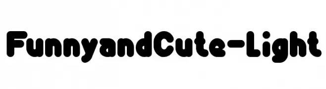
A playful, rounded font with a bold and friendly appearance.
![Funny and Cute-Light Frei Schriftart Herunterladen]() Herunterladen 790 Downloads@WebFont
Herunterladen 790 Downloads@WebFont -
( Iconian Fonts - Daniel Zadorozny - www.iconian.com )
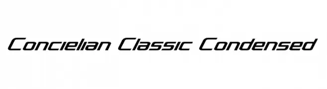
A sleek, modern, and condensed font with a dynamic, italicized style.
![Concielian Classic Condensed Frei Schriftart Herunterladen]() Herunterladen 790 Downloads@WebFont
Herunterladen 790 Downloads@WebFont -
( Austin Signs )
A bold, oblique font with a modern and dynamic style.
![DISPLAYEDOblique Frei Schriftart Herunterladen]() Herunterladen 790 Downloads@WebFont
Herunterladen 790 Downloads@WebFont -
![Shrewdy Frei Schriftart Herunterladen]() Herunterladen 790 Downloads@WebFont
Herunterladen 790 Downloads@WebFont -
![IFoundMyValentine Frei Schriftart Herunterladen]() Herunterladen 790 Downloads@WebFont
Herunterladen 790 Downloads@WebFont -
( Fonts by fey design )
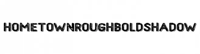
A bold, rough-textured font with a vintage shadow effect.
![HometownRoughBoldShadow Frei Schriftart Herunterladen]() Herunterladen 790 Downloads@WebFont
Herunterladen 790 Downloads@WebFont -
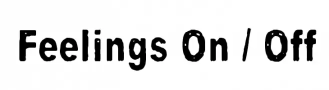
( Fonts by junkohanhero )
A bold, textured font with a hand-crafted, artistic style.
![Feelings On / Off Frei Schriftart Herunterladen]() Herunterladen 790 Downloads@WebFont
Herunterladen 790 Downloads@WebFont -
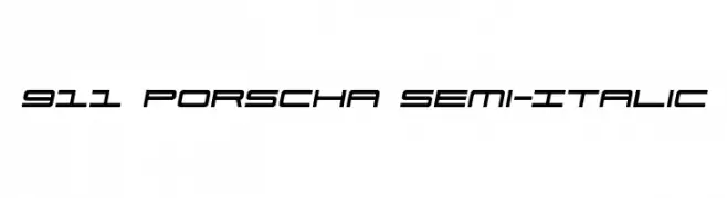
( Fonts by Daniel Zadorozny - www.iconian.com )
A sleek, semi-italic font with a modern, futuristic design.
![911 Porscha Semi-Italic Frei Schriftart Herunterladen]() Herunterladen 790 Downloads@WebFont
Herunterladen 790 Downloads@WebFont -
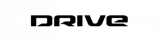
( Fonts by Daniel Zadorozny - www.iconian.com )
A futuristic, angular font with sharp edges and geometric shapes.
![Drive Frei Schriftart Herunterladen]() Herunterladen 790 Downloads@WebFont
Herunterladen 790 Downloads@WebFont -
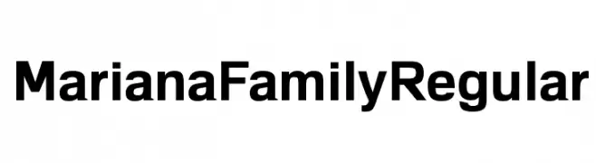
( Fonts by Alvaro Thomaz - alvarothomaz.com )
A bold, modern sans-serif font with a clean and professional appearance.
![MarianaFamilyRegular Frei Schriftart Herunterladen]() Herunterladen 790 Downloads@WebFont
Herunterladen 790 Downloads@WebFont -
( گالری فانت فارسی پژوهش آريانا - only compatible with Farsi and Arabic )
A playful, italicized font with medium contrast and a dynamic feel.
![Toy Frei Schriftart Herunterladen]() Herunterladen 790 Downloads@WebFont
Herunterladen 790 Downloads@WebFont -
( Fonts by a Adrian Candela - http://www.behance.net/takuminokami . Personal-use only. For commercial use please contact owner. )
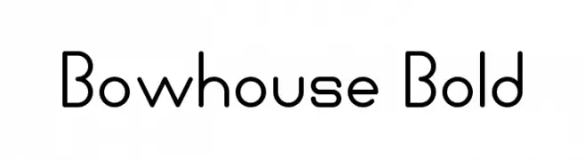
A modern, geometric font with rounded edges and consistent stroke widths.
![Bowhouse Bold Frei Schriftart Herunterladen]() Herunterladen 790 Downloads@WebFont
Herunterladen 790 Downloads@WebFont -
![DavidEurofanEurovision-Bold Frei Schriftart Herunterladen]() Herunterladen 790 Downloads@WebFont
Herunterladen 790 Downloads@WebFont -
( Fonts by a Max Infeld - XEROGRAPHER FONTS - xerographer.blogspot.com . Personal-use only. For commercial use please contact owner. )
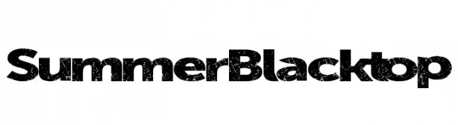
A bold, distressed font with a vintage, rugged appearance.
![SummerBlacktop Frei Schriftart Herunterladen]() Herunterladen 790 Downloads@WebFont
Herunterladen 790 Downloads@WebFont -
( Copyright (c) 2010-2011, Rubén Prol (ipanemagrafica@gmail.com|www.ipanemagrafica.com) )
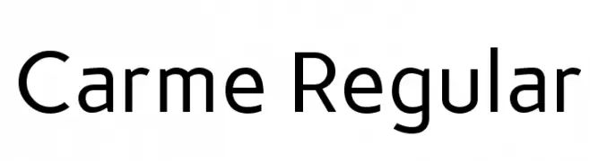
A clean, modern sans-serif font with balanced proportions and consistent stroke width.
![Carme Regular Frei Schriftart Herunterladen]() Herunterladen 790 Downloads@WebFont
Herunterladen 790 Downloads@WebFont -
( Fonts by www.gust.org.pl )
An elegant italic serif font with smooth, flowing curves and a classic style.
![LMRoman10-Italic Frei Schriftart Herunterladen]() Herunterladen 790 Downloads@WebFont
Herunterladen 790 Downloads@WebFont -
( Copyright (c) 2010, Danh Hong (khmertype.blogspot.com) )
A modern, geometric sans-serif font with uniform stroke width.
![Battambang Frei Schriftart Herunterladen]() Herunterladen 790 Downloads@WebFont
Herunterladen 790 Downloads@WebFont -
( Font by kingthingsfonts.co.uk )
A bold, medieval-inspired font with sharp serifs and dramatic angles.
![Kingthings Foundation Frei Schriftart Herunterladen]() Herunterladen 790 Downloads@WebFont
Herunterladen 790 Downloads@WebFont -
( Fonts by Grzegorz l - www.glukfonts.pl )
A modern, bold sans-serif font with geometric lines and a professional appearance.
![ResagnictoBold Frei Schriftart Herunterladen]() Herunterladen 790 Downloads@WebFont
Herunterladen 790 Downloads@WebFont -
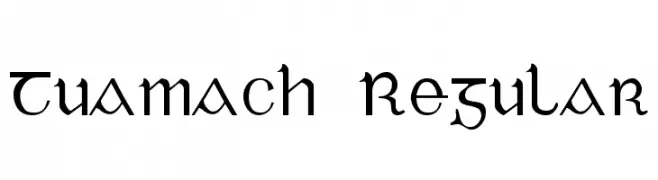
![Tuamach Regular Frei Schriftart Herunterladen]() Herunterladen 790 Downloads@WebFont
Herunterladen 790 Downloads@WebFont -
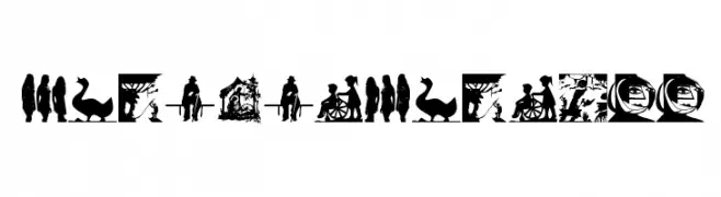
( Fonts by Manfred Klein. Free for private and charity use. Free for commercial with donation to organizations )
A decorative collection of intricate silhouette designs inspired by scherenschnitt.
![Scherenschnitt Frei Schriftart Herunterladen]() Herunterladen 790 Downloads@WebFont
Herunterladen 790 Downloads@WebFont


Welche Schriften sind gerade am populärsten?
Poppins, Roboto, Montserrat, Open Sans und Lato sind wegen ihrer klaren Formen und breiten Einsetzbarkeit sehr gefragt – von Markenauftritt über Landingpages bis hin zu Postern.
Welche Fonts eignen sich für Logos?
Geometrische Sans‑Serifs (z. B. Poppins, Familien im Gotham‑Stil) sind ein häufiger Griff für sauberes, skalierbares Branding. Für eine persönlichere Note bleiben Scripts und Handschrift‑Stile beliebt. Kombinieren Sie einen prägnanten Headline‑Font mit einer neutralen Brotschrift für Wiedererkennung und Harmonie.
Wie oft wird die Top‑Liste aktualisiert?
Regelmäßig – basierend auf realen Downloads und Interaktionen. Schauen Sie öfter vorbei, um aufstrebende Favoriten früh zu entdecken.
💡 Tipp: Seite bookmarken – Trends wechseln schnell, und heutige Top‑Schriften inspirieren morgen vielleicht das Rebranding.