Willkommen bei den Top‑Schriften – hier treffen Beliebtheit und Qualität aufeinander. Das sind die in diesem Jahr am häufigsten heruntergeladenen und genutzten Fonts. Wenn Sie sichere Optionen für Logo, Web oder Social suchen, starten Sie hier.
Jeder Top‑Font überzeugt durch Balance, Lesbarkeit und Vielseitigkeit. Sie finden moderne Sans‑Serifs, elegante Scripts, Vintage‑Serifs und minimalistische Displays.
-
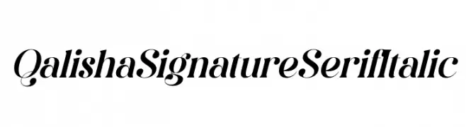
( Fonts by Storytype Studio )
Elegant serif font with italic style.
 Herunterladen 180 Downloads@WebFont
 -
![Country Cuties Frei Schriftart Herunterladen]() Herunterladen 180 Downloads@WebFont
Herunterladen 180 Downloads@WebFont -
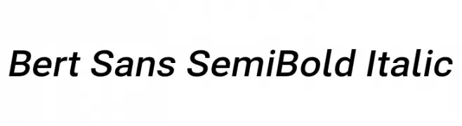
( Fonts by Christian Robertson, Adam Twardoch, & Cristiano Sobral - Personal-use only. For commercial use please contact owner. )
A modern, semi-bold, italic sans-serif font with clean lines and a dynamic style.
![Bert Sans SemiBold Italic Frei Schriftart Herunterladen]() Herunterladen 180 Downloads@WebFont
Herunterladen 180 Downloads@WebFont -
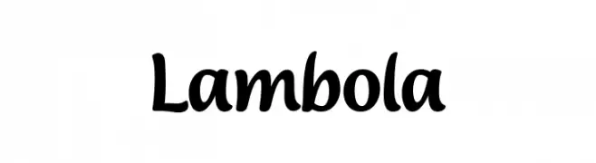
( Fonts by ARToni - Anthonie Van Hayu - Personal-use only. For commercial use please contact owner. )
A playful, hand-drawn font with smooth curves and a whimsical style.
![Lambola Frei Schriftart Herunterladen]() Herunterladen 180 Downloads@WebFont
Herunterladen 180 Downloads@WebFont -
( Fonts by Utopiafonts )
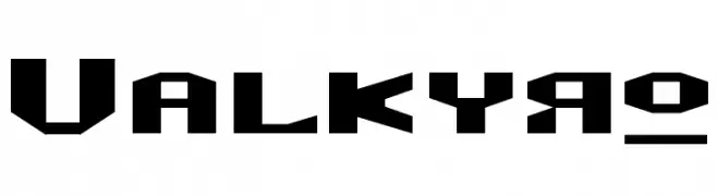
A bold, geometric font with a futuristic and angular design.
![Valkyro Frei Schriftart Herunterladen]() Herunterladen 180 Downloads@WebFont
Herunterladen 180 Downloads@WebFont -
-
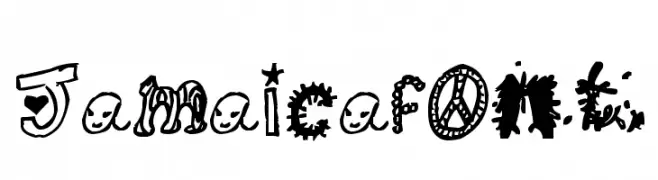
![Jamaicafont Frei Schriftart Herunterladen]() Herunterladen 180 Downloads@WebFont
Herunterladen 180 Downloads@WebFont -
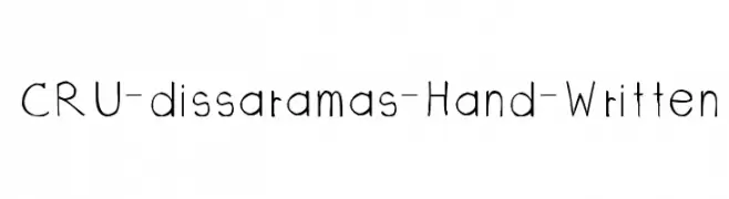
![CRU-dissaramas-Hand-Written Frei Schriftart Herunterladen]() Herunterladen 180 Downloads@WebFont
Herunterladen 180 Downloads@WebFont -
( Fonts by Mr Fisk - Mike Larsson - fontorama.net )
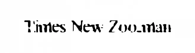
A decorative font with intricate cut-out patterns and a bold, artistic style.
![Times New Zoo-man Frei Schriftart Herunterladen]() Herunterladen 180 Downloads@WebFont
Herunterladen 180 Downloads@WebFont -
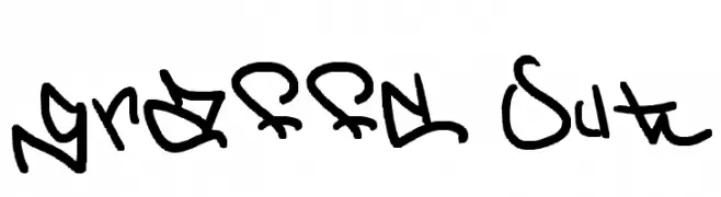
![graffd Out Frei Schriftart Herunterladen]() Herunterladen 180 Downloads@WebFont
Herunterladen 180 Downloads@WebFont -
( Fonts by Delip Nugraha - Personal-use only. For commercial use please contact owner. )
A modern, high-contrast font with geometric elements and stylish flair.
![Doky Frei Schriftart Herunterladen]() Herunterladen 180 Downloads@WebFont
Herunterladen 180 Downloads@WebFont

Welche Schriften sind gerade am populärsten?
Poppins, Roboto, Montserrat, Open Sans und Lato sind wegen ihrer klaren Formen und breiten Einsetzbarkeit sehr gefragt – von Markenauftritt über Landingpages bis hin zu Postern.
Welche Fonts eignen sich für Logos?
Geometrische Sans‑Serifs (z. B. Poppins, Familien im Gotham‑Stil) sind ein häufiger Griff für sauberes, skalierbares Branding. Für eine persönlichere Note bleiben Scripts und Handschrift‑Stile beliebt. Kombinieren Sie einen prägnanten Headline‑Font mit einer neutralen Brotschrift für Wiedererkennung und Harmonie.
Wie oft wird die Top‑Liste aktualisiert?
Regelmäßig – basierend auf realen Downloads und Interaktionen. Schauen Sie öfter vorbei, um aufstrebende Favoriten früh zu entdecken.
💡 Tipp: Seite bookmarken – Trends wechseln schnell, und heutige Top‑Schriften inspirieren morgen vielleicht das Rebranding.