Willkommen bei den Top‑Schriften – hier treffen Beliebtheit und Qualität aufeinander. Das sind die in diesem Jahr am häufigsten heruntergeladenen und genutzten Fonts. Wenn Sie sichere Optionen für Logo, Web oder Social suchen, starten Sie hier.
Jeder Top‑Font überzeugt durch Balance, Lesbarkeit und Vielseitigkeit. Sie finden moderne Sans‑Serifs, elegante Scripts, Vintage‑Serifs und minimalistische Displays.
-
( Font by kingthingsfonts.co.uk )
A bold, medieval-inspired font with sharp serifs and dramatic angles.
 Herunterladen 791 Downloads@WebFont
 -
( Fonts by Grzegorz l - www.glukfonts.pl )
A modern, bold sans-serif font with geometric lines and a professional appearance.
![ResagnictoBold Frei Schriftart Herunterladen]() Herunterladen 791 Downloads@WebFont
Herunterladen 791 Downloads@WebFont -
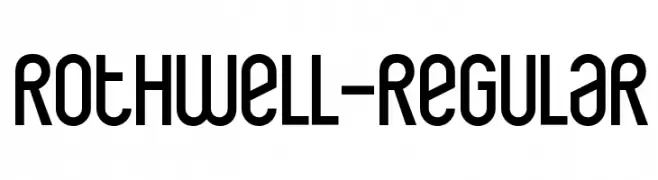
( Fonts by www.typodermicfonts.com - Ray Larabie )
A modern, geometric font with clean lines and a sleek, minimalist design.
![Rothwell-Regular Frei Schriftart Herunterladen]() Herunterladen 791 Downloads@WebFont
Herunterladen 791 Downloads@WebFont -
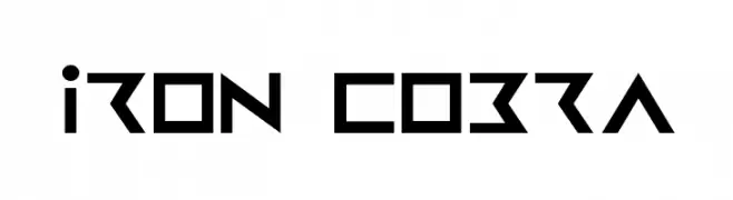
( Fonts by Daniel Zadorozny - www.iconian.com )
A bold, geometric font with a futuristic and angular design.
![Iron Cobra Frei Schriftart Herunterladen]() Herunterladen 791 Downloads@WebFont
Herunterladen 791 Downloads@WebFont -
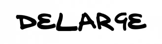
( Fonts by Paul Burgess - www.delarge.co.uk )
A bold, energetic handwritten font with thick strokes and dynamic flow.
![delarge Frei Schriftart Herunterladen]() Herunterladen 791 Downloads@WebFont
Herunterladen 791 Downloads@WebFont -
![Karelia Frei Schriftart Herunterladen]() Herunterladen 791 Downloads@WebFont
Herunterladen 791 Downloads@WebFont -
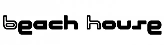
( Fonts by Dieter Schumacher )
A bold, geometric font with a modern and playful style.
![Beach House Frei Schriftart Herunterladen]() Herunterladen 791 Downloads@WebFont
Herunterladen 791 Downloads@WebFont -
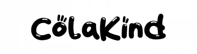
( Fonts by Khurasan )
A playful, bold font with rounded, bubbly characters and a whimsical style.
![ColaKind Frei Schriftart Herunterladen]() Herunterladen 790 Downloads@WebFont
Herunterladen 790 Downloads@WebFont -
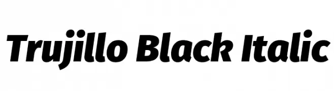
( Fonts by Fira Sans original fonts by bBox Type GmbH, Carrois Corporate GbR, & Edenspiekermann AG / Changes by Cristiano Sobral - Personal-use only. For commercial use please contact owner. )
A bold, italic font with strong strokes and dynamic style.
![Trujillo Black Italic Frei Schriftart Herunterladen]() Herunterladen 790 Downloads@WebFont
Herunterladen 790 Downloads@WebFont -
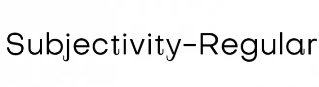
( Fonts by Alex Slobzheninov - Personal-use only. For commercial use please contact owner. )
A modern, geometric sans-serif font with clean lines and balanced spacing.
![Subjectivity-Regular Frei Schriftart Herunterladen]() Herunterladen 790 Downloads@WebFont
Herunterladen 790 Downloads@WebFont -
( weknow - Wino S Kadir - www.creativefabrica.com/designer/weknow/ )
A bold, outlined sans-serif font with a neon light effect.
![NEON GLOW Bold Frei Schriftart Herunterladen]() Herunterladen 790 Downloads@WebFont
Herunterladen 790 Downloads@WebFont -
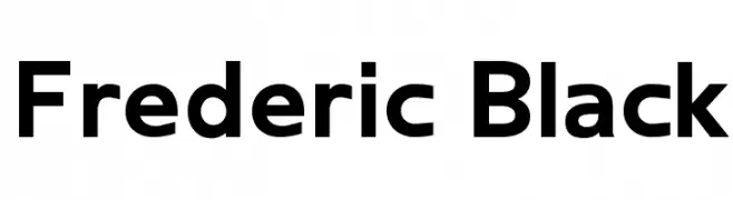
( Matthieu Lonton )
A bold, modern sans-serif font with clean lines and strong presence.
![Frederic Black Frei Schriftart Herunterladen]() Herunterladen 790 Downloads@WebFont
Herunterladen 790 Downloads@WebFont -
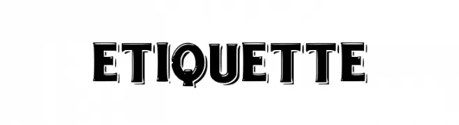
( Fonts by dee signator )
A bold, shadowed font with a three-dimensional effect, ideal for impactful designs.
![etiquette Frei Schriftart Herunterladen]() Herunterladen 790 Downloads@WebFont
Herunterladen 790 Downloads@WebFont -
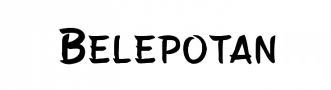
( Fonts by Arwan Sutanto www.locomotype.com - Personal-use only. For commercial use please contact owner. )
A playful, bold font with a hand-drawn, whimsical style.
![Belepotan Frei Schriftart Herunterladen]() Herunterladen 790 Downloads@WebFont
Herunterladen 790 Downloads@WebFont -
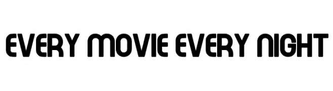
![Every Movie Every Night Frei Schriftart Herunterladen]() Herunterladen 790 Downloads@WebFont
Herunterladen 790 Downloads@WebFont -
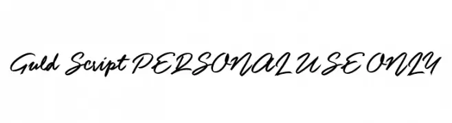
![Guld Script PERSONAL USE ONLY Frei Schriftart Herunterladen]() Herunterladen 790 Downloads@WebFont
Herunterladen 790 Downloads@WebFont -
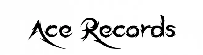
( Fonts by Jonathan S. Harris - www.tattoowoo.com. Personal-use only. For commercial use please contact owner. )
A bold, dynamic font with sharp, angular lines and dramatic curves.
![Ace Records Frei Schriftart Herunterladen]() Herunterladen 790 Downloads@WebFont
Herunterladen 790 Downloads@WebFont -
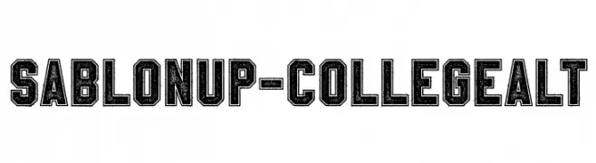
( Fonts by a Youssef Habchi - youssef-habchi.com. Personal-use only. For commercial use please contact owner. )
A bold, distressed collegiate-style font with a vintage feel.
![SablonUp-CollegeAlt Frei Schriftart Herunterladen]() Herunterladen 790 Downloads@WebFont
Herunterladen 790 Downloads@WebFont -
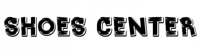
![Shoes center Frei Schriftart Herunterladen]() Herunterladen 790 Downloads@WebFont
Herunterladen 790 Downloads@WebFont -
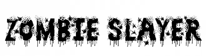
( Font by Jonathan Harris - www.tattoowoo.com )
A bold, grunge-style font with dripping effects, ideal for horror-themed projects.
![Zombie Slayer Frei Schriftart Herunterladen]() Herunterladen 790 Downloads@WebFont
Herunterladen 790 Downloads@WebFont -
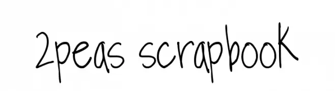
( Fonts by www.twopeasinabucket.com )
A playful, handwritten-style font with a casual and whimsical feel.
![2peas scrapbook Frei Schriftart Herunterladen]() Herunterladen 790 Downloads@WebFont
Herunterladen 790 Downloads@WebFont -
( Fonts by Luedecke Design Font Co. - ldfonts.weebly.com )
A playful, handwritten font with tall, narrow characters.
![University Frei Schriftart Herunterladen]() Herunterladen 790 Downloads@WebFont
Herunterladen 790 Downloads@WebFont -
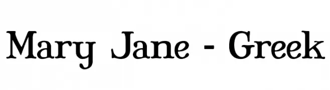
( Fonts by Apostrophic Lab )
A classic serif typeface with elegant flared serifs and balanced proportions.
![Mary Jane - Greek Frei Schriftart Herunterladen]() Herunterladen 790 Downloads@WebFont
Herunterladen 790 Downloads@WebFont -
( Free for a personal use. For a commercial use please visit www.kevinandamanda.com )
A playful, dotted font with bold, rounded characters.
![Tonight's the Night Frei Schriftart Herunterladen]() Herunterladen 790 Downloads@WebFont
Herunterladen 790 Downloads@WebFont -
( Fonts by Rokas Cicenas - www.roci.lt )
A playful font designed to resemble interconnected puzzle pieces.
![Puzzle Frei Schriftart Herunterladen]() Herunterladen 790 Downloads@WebFont
Herunterladen 790 Downloads@WebFont -
![Spinstee Frei Schriftart Herunterladen]() Herunterladen 790 Downloads@WebFont
Herunterladen 790 Downloads@WebFont -
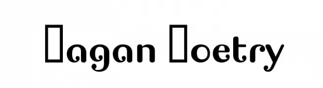
![Pagan Poetry Frei Schriftart Herunterladen]() Herunterladen 790 Downloads@WebFont
Herunterladen 790 Downloads@WebFont -
![Punjabi Bold Italic Frei Schriftart Herunterladen]() Herunterladen 790 Downloads@WebFont
Herunterladen 790 Downloads@WebFont -
( Fonts by Harold Lohner - www.haroldsfonts.com )
An elegant italic serif font with smooth, flowing lines and moderate contrast.
![MEAN 26 Italic Frei Schriftart Herunterladen]() Herunterladen 790 Downloads@WebFont
Herunterladen 790 Downloads@WebFont -
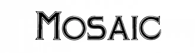
( Fonts by Paul Lloyd )
A bold, decorative font with a three-dimensional effect and geometric influence.
![Mosaic Frei Schriftart Herunterladen]() Herunterladen 790 Downloads@WebFont
Herunterladen 790 Downloads@WebFont -
![Car Frei Schriftart Herunterladen]() Herunterladen 790 Downloads@WebFont
Herunterladen 790 Downloads@WebFont -
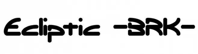
![Ecliptic -BRK- Frei Schriftart Herunterladen]() Herunterladen 790 Downloads@WebFont
Herunterladen 790 Downloads@WebFont -
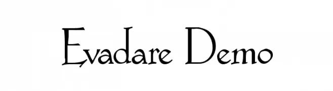
![Evadare Demo Frei Schriftart Herunterladen]() Herunterladen 790 Downloads@WebFont
Herunterladen 790 Downloads@WebFont -
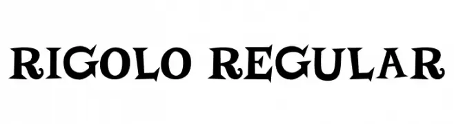
( Fonts by Vladimir Nikolic )
A bold, playful font with whimsical serifs and a vintage flair.
![Rigolo Regular Frei Schriftart Herunterladen]() Herunterladen 789 Downloads@WebFont
Herunterladen 789 Downloads@WebFont -
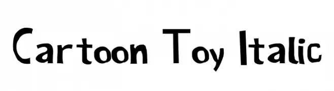
( Fonts by Galdino Otten Fonts - www.galdinootten.com - Personal-use only. For commercial use please contact owner. )
A playful, hand-drawn font with a cartoon-like, italicized style.
![Cartoon Toy Italic Frei Schriftart Herunterladen]() Herunterladen 789 Downloads@WebFont
Herunterladen 789 Downloads@WebFont


Welche Schriften sind gerade am populärsten?
Poppins, Roboto, Montserrat, Open Sans und Lato sind wegen ihrer klaren Formen und breiten Einsetzbarkeit sehr gefragt – von Markenauftritt über Landingpages bis hin zu Postern.
Welche Fonts eignen sich für Logos?
Geometrische Sans‑Serifs (z. B. Poppins, Familien im Gotham‑Stil) sind ein häufiger Griff für sauberes, skalierbares Branding. Für eine persönlichere Note bleiben Scripts und Handschrift‑Stile beliebt. Kombinieren Sie einen prägnanten Headline‑Font mit einer neutralen Brotschrift für Wiedererkennung und Harmonie.
Wie oft wird die Top‑Liste aktualisiert?
Regelmäßig – basierend auf realen Downloads und Interaktionen. Schauen Sie öfter vorbei, um aufstrebende Favoriten früh zu entdecken.
💡 Tipp: Seite bookmarken – Trends wechseln schnell, und heutige Top‑Schriften inspirieren morgen vielleicht das Rebranding.