Willkommen bei den Top‑Schriften – hier treffen Beliebtheit und Qualität aufeinander. Das sind die in diesem Jahr am häufigsten heruntergeladenen und genutzten Fonts. Wenn Sie sichere Optionen für Logo, Web oder Social suchen, starten Sie hier.
Jeder Top‑Font überzeugt durch Balance, Lesbarkeit und Vielseitigkeit. Sie finden moderne Sans‑Serifs, elegante Scripts, Vintage‑Serifs und minimalistische Displays.
-
( Fonts by Darrell Flood )
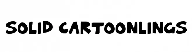
A bold, playful font with a cartoonish, hand-drawn style.
 Herunterladen 179 Downloads@WebFont
 -
![Martian Hull Markings Gloopy Frei Schriftart Herunterladen]() Herunterladen 179 Downloads@WebFont
Herunterladen 179 Downloads@WebFont -
( Fonts by Chris Vile - fontmonger.com - Personal-use only. For commercial use please contact owner. )
A bold, outlined font with a modern, geometric style.
![Genesee St Regular Frei Schriftart Herunterladen]() Herunterladen 179 Downloads@WebFont
Herunterladen 179 Downloads@WebFont -
( Fonts by Andrew Hart - dirt2.com )
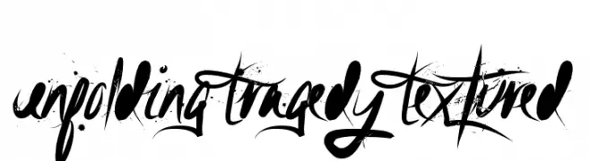
A bold, textured, and expressive font with a hand-drawn style.
![Unfolding Tragedy Textured Frei Schriftart Herunterladen]() Herunterladen 179 Downloads@WebFont
Herunterladen 179 Downloads@WebFont -
( Fonts by Riyadh Rahman - Personal-use only. For commercial use please contact owner. )
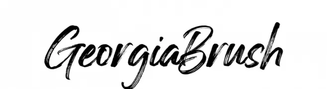
A bold, brush-style font with dynamic, handwritten strokes.
![Georgia Brush Frei Schriftart Herunterladen]() Herunterladen 179 Downloads@WebFont
Herunterladen 179 Downloads@WebFont -
-
( Fonts by james kilfiger - Personal-use only. For commercial use please contact owner. )
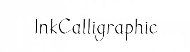
A calligraphic font with elegant, flowing strokes and dynamic line thickness.
![Ink Calligraphic Frei Schriftart Herunterladen]() Herunterladen 179 Downloads@WebFont
Herunterladen 179 Downloads@WebFont -
( monkeyroodlesfonts.weebly.com/ )
A playful, handwritten font with thin, slightly uneven strokes and a casual feel.
![Leaning on Everlasting Arms Frei Schriftart Herunterladen]() Herunterladen 179 Downloads@WebFont
Herunterladen 179 Downloads@WebFont -
( Fonts by David Espinosa [Type Sailor] - www.facebook.com/typesailor - Personal-use only. For commercial use please contact owner. )
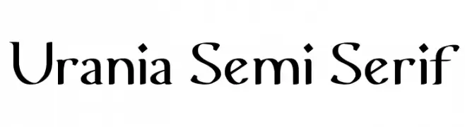
A semi-serif font combining classic elegance with modern style.
![Urania Semi Serif Frei Schriftart Herunterladen]() Herunterladen 179 Downloads@WebFont
Herunterladen 179 Downloads@WebFont -
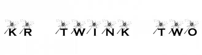
![KR Twink Two Frei Schriftart Herunterladen]() Herunterladen 179 Downloads@WebFont
Herunterladen 179 Downloads@WebFont -
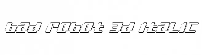
( Fonts by Daniel Zadorozny - www.iconian.com - Free for personal use )
A bold, 3D italic font with a futuristic, geometric design.
![bad robot 3d italic Frei Schriftart Herunterladen]() Herunterladen 179 Downloads@WebFont
Herunterladen 179 Downloads@WebFont


Welche Schriften sind gerade am populärsten?
Poppins, Roboto, Montserrat, Open Sans und Lato sind wegen ihrer klaren Formen und breiten Einsetzbarkeit sehr gefragt – von Markenauftritt über Landingpages bis hin zu Postern.
Welche Fonts eignen sich für Logos?
Geometrische Sans‑Serifs (z. B. Poppins, Familien im Gotham‑Stil) sind ein häufiger Griff für sauberes, skalierbares Branding. Für eine persönlichere Note bleiben Scripts und Handschrift‑Stile beliebt. Kombinieren Sie einen prägnanten Headline‑Font mit einer neutralen Brotschrift für Wiedererkennung und Harmonie.
Wie oft wird die Top‑Liste aktualisiert?
Regelmäßig – basierend auf realen Downloads und Interaktionen. Schauen Sie öfter vorbei, um aufstrebende Favoriten früh zu entdecken.
💡 Tipp: Seite bookmarken – Trends wechseln schnell, und heutige Top‑Schriften inspirieren morgen vielleicht das Rebranding.