Willkommen bei den Top‑Schriften – hier treffen Beliebtheit und Qualität aufeinander. Das sind die in diesem Jahr am häufigsten heruntergeladenen und genutzten Fonts. Wenn Sie sichere Optionen für Logo, Web oder Social suchen, starten Sie hier.
Jeder Top‑Font überzeugt durch Balance, Lesbarkeit und Vielseitigkeit. Sie finden moderne Sans‑Serifs, elegante Scripts, Vintage‑Serifs und minimalistische Displays.
-
( Fonts by LyonsType - Daniel Lyons - Personal-use only. For commercial use please contact owner. )
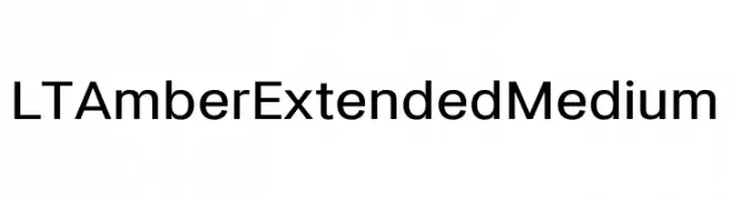
A modern, extended sans-serif typeface with clean lines and balanced proportions.
 Herunterladen 178 Downloads@WebFont
 -
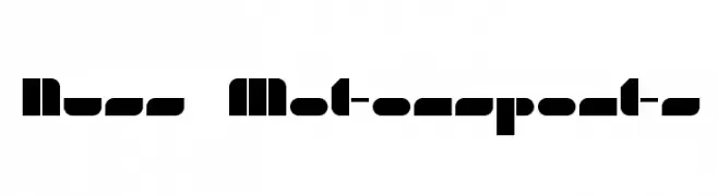
![Nuss Motorsports Frei Schriftart Herunterladen]() Herunterladen 178 Downloads@WebFont
Herunterladen 178 Downloads@WebFont -
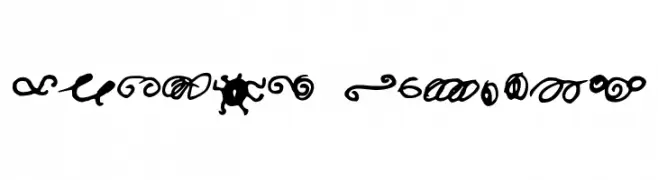
![Random Swirls Frei Schriftart Herunterladen]() Herunterladen 178 Downloads@WebFont
Herunterladen 178 Downloads@WebFont -
( Fonts by Vladimir Nikolic - www.creativefabrica.com/designer/vladimirnikolic/ - Personal-use only. For commercial use please contact owner. )
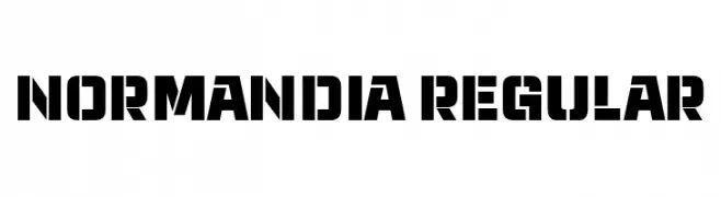
A bold, geometric font with an industrial and modern feel.
![Normandia Regular Frei Schriftart Herunterladen]() Herunterladen 178 Downloads@WebFont
Herunterladen 178 Downloads@WebFont -
( Fonts by PremiereGraphics )
A dynamic, handwritten-style font with expressive, bold characters.
![theAmbience Frei Schriftart Herunterladen]() Herunterladen 178 Downloads@WebFont
Herunterladen 178 Downloads@WebFont -
-
( Fonts by Winter Design Studio - winty5.wixsite.com/noahtheawesome/ - Personal-use only. For commercial use please contact owner. )
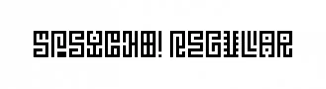
A bold, geometric font with a maze-like, digital appearance.
![5Psycho! Regular Frei Schriftart Herunterladen]() Herunterladen 178 Downloads@WebFont
Herunterladen 178 Downloads@WebFont -
( Fonts by Jayde Garrow - GarrowGlitch - http://jaydegarrow.wix.com/jaydefonts. Personal-use only. For commercial use please contact owner. )
A bold, geometric stencil font with a modern, industrial style.
![EXP FONT Frei Schriftart Herunterladen]() Herunterladen 178 Downloads@WebFont
Herunterladen 178 Downloads@WebFont -
![THE FONT Frei Schriftart Herunterladen]() Herunterladen 178 Downloads@WebFont
Herunterladen 178 Downloads@WebFont -
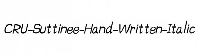
![CRU-Suttinee-Hand-Written-Italic Frei Schriftart Herunterladen]() Herunterladen 178 Downloads@WebFont
Herunterladen 178 Downloads@WebFont -
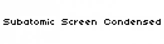
![Subatomic Screen Condensed Frei Schriftart Herunterladen]() Herunterladen 178 Downloads@WebFont
Herunterladen 178 Downloads@WebFont


Welche Schriften sind gerade am populärsten?
Poppins, Roboto, Montserrat, Open Sans und Lato sind wegen ihrer klaren Formen und breiten Einsetzbarkeit sehr gefragt – von Markenauftritt über Landingpages bis hin zu Postern.
Welche Fonts eignen sich für Logos?
Geometrische Sans‑Serifs (z. B. Poppins, Familien im Gotham‑Stil) sind ein häufiger Griff für sauberes, skalierbares Branding. Für eine persönlichere Note bleiben Scripts und Handschrift‑Stile beliebt. Kombinieren Sie einen prägnanten Headline‑Font mit einer neutralen Brotschrift für Wiedererkennung und Harmonie.
Wie oft wird die Top‑Liste aktualisiert?
Regelmäßig – basierend auf realen Downloads und Interaktionen. Schauen Sie öfter vorbei, um aufstrebende Favoriten früh zu entdecken.
💡 Tipp: Seite bookmarken – Trends wechseln schnell, und heutige Top‑Schriften inspirieren morgen vielleicht das Rebranding.