Willkommen bei den Top‑Schriften – hier treffen Beliebtheit und Qualität aufeinander. Das sind die in diesem Jahr am häufigsten heruntergeladenen und genutzten Fonts. Wenn Sie sichere Optionen für Logo, Web oder Social suchen, starten Sie hier.
Jeder Top‑Font überzeugt durch Balance, Lesbarkeit und Vielseitigkeit. Sie finden moderne Sans‑Serifs, elegante Scripts, Vintage‑Serifs und minimalistische Displays.
-
( Fonts by Mans Greback - www.mawns.com )
A bold and expressive script font with dynamic curves and strong visual impact.
![Clipper Script Fat [Personal Use] Frei Schriftart Herunterladen](https://d144mzi0q5mijx.cloudfront.net/img/C/L/Clipper-Script-Fat-Personal-Use.webp) Herunterladen 763 Downloads@WebFont
Herunterladen 763 Downloads@WebFont -
![Z-Most Critter Frei Schriftart Herunterladen]() Herunterladen 763 Downloads@WebFont
Herunterladen 763 Downloads@WebFont -
![AntPoltCond-BoldItalic Frei Schriftart Herunterladen]() Herunterladen 763 Downloads@WebFont
Herunterladen 763 Downloads@WebFont -
( Fonts by Heath Kane Sponsoren Schriftart )
A rugged, distressed font with a bold, chalk-like appearance.
![ArmyChalk Frei Schriftart Herunterladen]() Herunterladen 763 Downloads
Herunterladen 763 Downloads -
( Fonts by www.aenigmafonts.com )
A bold, gothic-inspired font with intricate detailing and a medieval flair.
![Gesture BRK Frei Schriftart Herunterladen]() Herunterladen 763 Downloads@WebFont
Herunterladen 763 Downloads@WebFont -
-
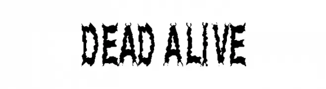
( Fonts by Spork Thug Typography - Josh Wilhelm - www.lifewithouttaffy.com/taffy/blog )
A decorative, horror-themed font with jagged, distressed characters.
![Dead Alive Frei Schriftart Herunterladen]() Herunterladen 763 Downloads@WebFont
Herunterladen 763 Downloads@WebFont -
( Fonts by Manfred Klein. Free for private and charity use. Free for commercial with donation to organizations )
An abstract, decorative font with geometric line patterns.
![Graphis Frei Schriftart Herunterladen]() Herunterladen 763 Downloads@WebFont
Herunterladen 763 Downloads@WebFont -
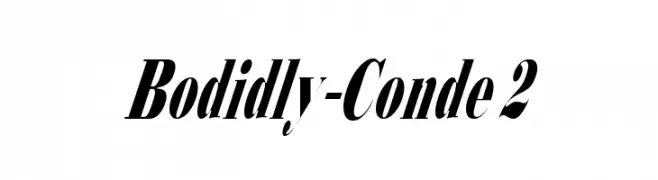
![Bodidly-Conde 2 Frei Schriftart Herunterladen]() Herunterladen 763 Downloads
Herunterladen 763 Downloads -
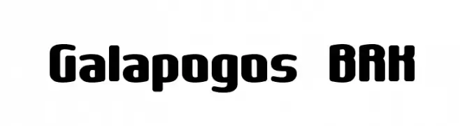
( Fonts by AEnigma - www.aenigmafonts.com )
A bold, rounded font with a playful and modern style.
![Galapogos BRK Frei Schriftart Herunterladen]() Herunterladen 763 Downloads@WebFont
Herunterladen 763 Downloads@WebFont -
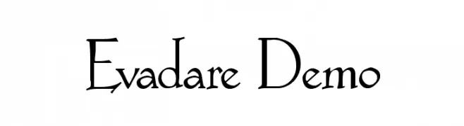
![Evadare Demo Frei Schriftart Herunterladen]() Herunterladen 763 Downloads@WebFont
Herunterladen 763 Downloads@WebFont -
( Fonts by Khurasan )
A bold, playful font with rounded, hand-drawn characters.
![Silvertones Frei Schriftart Herunterladen]() Herunterladen 762 Downloads@WebFont
Herunterladen 762 Downloads@WebFont -
( Fonts by Hanoded )
A casual, handwritten font with a playful and informal style.
![Identity Check DEMO Regular Frei Schriftart Herunterladen]() Herunterladen 762 Downloads@WebFont
Herunterladen 762 Downloads@WebFont -
( Fonts by Syaf Rizal - Khurasan - Personal-use only. For commercial use please contact owner. )
A dynamic and elegant script font with fluid, sweeping letterforms.
![Tempe! Frei Schriftart Herunterladen]() Herunterladen 762 Downloads@WebFont
Herunterladen 762 Downloads@WebFont -
( aldedesign - Alde Saputro - creativemarket.com/aldedesign?u=aldedesign )
A sophisticated, slanted script font with flowing, interconnected letters and elegant flourishes.
![Letternisa Slant Frei Schriftart Herunterladen]() Herunterladen 762 Downloads@WebFont
Herunterladen 762 Downloads@WebFont -
( Rajendra Bitling - www.rbitling.com )
A bold, italic calligraphic font with fluid, interconnected strokes.
![bits indian calligra Bold Italic Frei Schriftart Herunterladen]() Herunterladen 762 Downloads@WebFont
Herunterladen 762 Downloads@WebFont -
( Jeronimo - Jeroen Kant )
A modern sans-serif font with clean lines and geometric structure.
![EpicFusion Frei Schriftart Herunterladen]() Herunterladen 762 Downloads@WebFont
Herunterladen 762 Downloads@WebFont -
( Fonts by fey design )
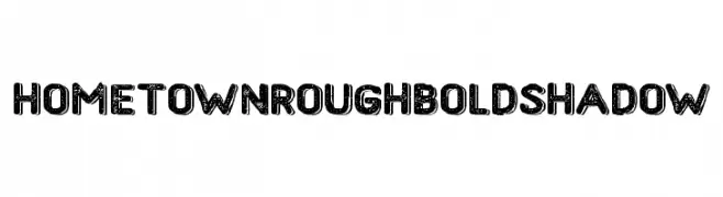
A bold, rough-textured font with a vintage shadow effect.
![HometownRoughBoldShadow Frei Schriftart Herunterladen]() Herunterladen 762 Downloads@WebFont
Herunterladen 762 Downloads@WebFont -
( Fonts by Daniel Zadorozny - www.iconian.com )
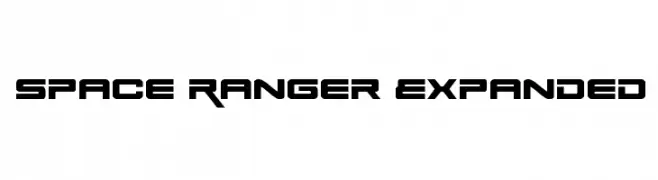
A futuristic, bold font with sharp angles and geometric shapes.
![Space Ranger Expanded Frei Schriftart Herunterladen]() Herunterladen 762 Downloads@WebFont
Herunterladen 762 Downloads@WebFont -
![Prida02Calt Frei Schriftart Herunterladen]() Herunterladen 762 Downloads@WebFont
Herunterladen 762 Downloads@WebFont -
![Antique Font by Marta van Eck CU Frei Schriftart Herunterladen]() Herunterladen 762 Downloads@WebFont
Herunterladen 762 Downloads@WebFont -
( Fonts by Vanessa Bays - bythebutterfly.com )
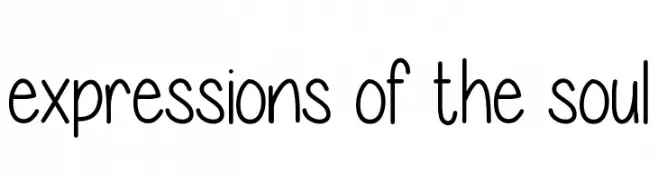
A playful, casual handwritten font with smooth, rounded edges.
![expressions of the soul Frei Schriftart Herunterladen]() Herunterladen 762 Downloads@WebFont
Herunterladen 762 Downloads@WebFont -
( Fonts by Castcraft Software - opti.netii.net - check the website before use )
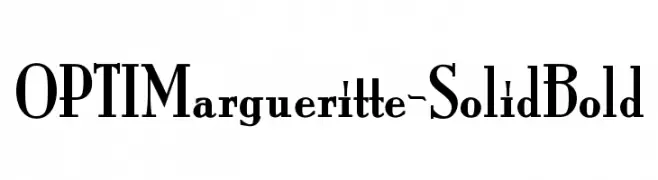
A bold, high-contrast serif font with a classic yet modern appeal.
![OPTIMargueritte-SolidBold Frei Schriftart Herunterladen]() Herunterladen 762 Downloads@WebFont
Herunterladen 762 Downloads@WebFont -
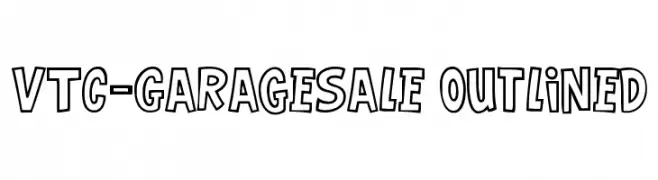
![VTC-GarageSale Outlined Frei Schriftart Herunterladen]() Herunterladen 762 Downloads@WebFont
Herunterladen 762 Downloads@WebFont -
( Fonts by Antonio Bucu - AdamAnt Designs )
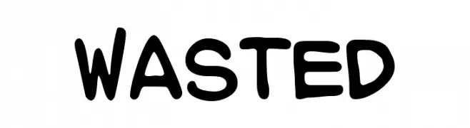
A playful, bold font with rounded, thick strokes and a whimsical touch.
![WASTED Frei Schriftart Herunterladen]() Herunterladen 762 Downloads@WebFont
Herunterladen 762 Downloads@WebFont -
( Fonts by www.kontrapunkt.com )
A modern, geometric sans-serif font with clean lines and balanced proportions.
![KontrapunktLight Frei Schriftart Herunterladen]() Herunterladen 762 Downloads@WebFont
Herunterladen 762 Downloads@WebFont -
![AveriaSans-Light Frei Schriftart Herunterladen]() Herunterladen 762 Downloads@WebFont
Herunterladen 762 Downloads@WebFont -
![MobyRegular Frei Schriftart Herunterladen]() Herunterladen 762 Downloads@WebFont
Herunterladen 762 Downloads@WebFont -
![Blackout Italic Frei Schriftart Herunterladen]() Herunterladen 762 Downloads@WebFont
Herunterladen 762 Downloads@WebFont -
![Moon-Runes Frei Schriftart Herunterladen]() Herunterladen 762 Downloads@WebFont
Herunterladen 762 Downloads@WebFont -
( Fonts by Kreative Korporation - www.kreativekorp.com )
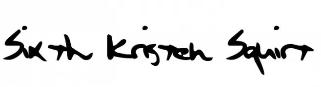
A bold, playful handwritten font with dynamic strokes.
![Sixth Kristen Squirt Frei Schriftart Herunterladen]() Herunterladen 762 Downloads@WebFont
Herunterladen 762 Downloads@WebFont -
![PFHALL Frei Schriftart Herunterladen]() Herunterladen 762 Downloads@WebFont
Herunterladen 762 Downloads@WebFont -
( Fonts by Daniel Zadorozny - www.iconian.com )
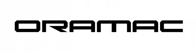
A futuristic, geometric font with bold, angular design.
![Oramac Frei Schriftart Herunterladen]() Herunterladen 762 Downloads@WebFont
Herunterladen 762 Downloads@WebFont -
( Fonts by www.peter-wiegel.de. Personal-use only. For commercial use please contact owner. )
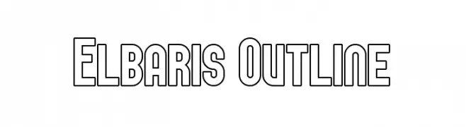
A bold, geometric outline font with a modern and futuristic style.
![Elbaris Outline Frei Schriftart Herunterladen]() Herunterladen 762 Downloads@WebFont
Herunterladen 762 Downloads@WebFont -
( Fonts by Press Gang Studios - Andeh Pinkard - www.pressgang-studios.com )
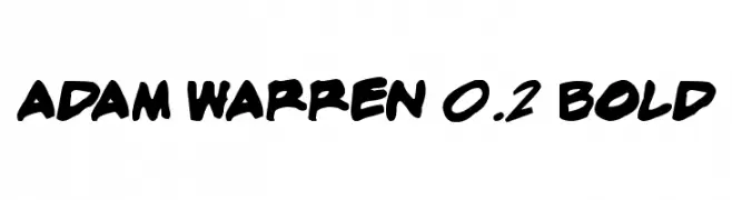
A bold, handwritten font with dynamic strokes and a playful style.
![adam warren 0.2 Bold Frei Schriftart Herunterladen]() Herunterladen 762 Downloads@WebFont
Herunterladen 762 Downloads@WebFont -
![PR Uncial Alt Caps Frei Schriftart Herunterladen]() Herunterladen 762 Downloads@WebFont
Herunterladen 762 Downloads@WebFont


Welche Schriften sind gerade am populärsten?
Poppins, Roboto, Montserrat, Open Sans und Lato sind wegen ihrer klaren Formen und breiten Einsetzbarkeit sehr gefragt – von Markenauftritt über Landingpages bis hin zu Postern.
Welche Fonts eignen sich für Logos?
Geometrische Sans‑Serifs (z. B. Poppins, Familien im Gotham‑Stil) sind ein häufiger Griff für sauberes, skalierbares Branding. Für eine persönlichere Note bleiben Scripts und Handschrift‑Stile beliebt. Kombinieren Sie einen prägnanten Headline‑Font mit einer neutralen Brotschrift für Wiedererkennung und Harmonie.
Wie oft wird die Top‑Liste aktualisiert?
Regelmäßig – basierend auf realen Downloads und Interaktionen. Schauen Sie öfter vorbei, um aufstrebende Favoriten früh zu entdecken.
💡 Tipp: Seite bookmarken – Trends wechseln schnell, und heutige Top‑Schriften inspirieren morgen vielleicht das Rebranding.