Willkommen bei den Top‑Schriften – hier treffen Beliebtheit und Qualität aufeinander. Das sind die in diesem Jahr am häufigsten heruntergeladenen und genutzten Fonts. Wenn Sie sichere Optionen für Logo, Web oder Social suchen, starten Sie hier.
Jeder Top‑Font überzeugt durch Balance, Lesbarkeit und Vielseitigkeit. Sie finden moderne Sans‑Serifs, elegante Scripts, Vintage‑Serifs und minimalistische Displays.
-
 Herunterladen 760 Downloads@WebFont
 -
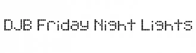
![DJB Friday Night Lights Frei Schriftart Herunterladen]() Herunterladen 760 Downloads@WebFont
Herunterladen 760 Downloads@WebFont -
( Fonts by a Max Infeld - XEROGRAPHER FONTS - xerographer.blogspot.com . Personal-use only. For commercial use please contact owner. )
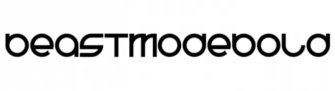
A bold, futuristic font with geometric shapes and smooth curves.
![BeastModeBold Frei Schriftart Herunterladen]() Herunterladen 760 Downloads@WebFont
Herunterladen 760 Downloads@WebFont -
( Fonts by a Neale Davidson - www.pixelsagas.com. Personal-use only. For commercial use please contact owner. )
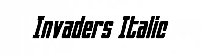
A bold, italic font with a futuristic and dynamic style.
![Invaders Italic Frei Schriftart Herunterladen]() Herunterladen 760 Downloads@WebFont
Herunterladen 760 Downloads@WebFont -
( Fonts by David Kerkhoff - www.hanodedphotography.com )
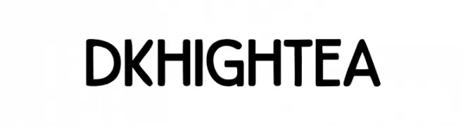
A playful, rounded font with a bold and friendly appearance.
![DKHighTea Frei Schriftart Herunterladen]() Herunterladen 760 Downloads@WebFont
Herunterladen 760 Downloads@WebFont -
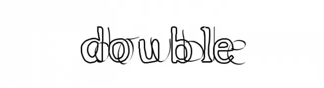
![double Frei Schriftart Herunterladen]() Herunterladen 760 Downloads@WebFont
Herunterladen 760 Downloads@WebFont -
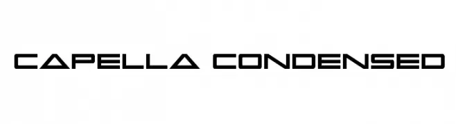
( Fonts by Daniel Zadorozny - www.iconian.com )
A futuristic, geometric, and condensed font with bold, angular characters.
![Capella Condensed Frei Schriftart Herunterladen]() Herunterladen 760 Downloads@WebFont
Herunterladen 760 Downloads@WebFont -
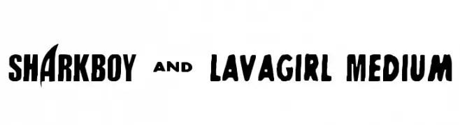
( - www.kiddiefonts.com/ )
A bold, playful font with chunky, rounded letters and a whimsical style.
![SHARKBOY & lavagirl Medium Frei Schriftart Herunterladen]() Herunterladen 760 Downloads@WebFont
Herunterladen 760 Downloads@WebFont -
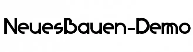
( Fonts by David Kerkhoff - www.hanodedphotography.com )
A modern, geometric font with bold, clean lines and a cohesive design.
![NeuesBauen-Demo Frei Schriftart Herunterladen]() Herunterladen 760 Downloads@WebFont
Herunterladen 760 Downloads@WebFont -
![Storch Frei Schriftart Herunterladen]() Herunterladen 760 Downloads@WebFont
Herunterladen 760 Downloads@WebFont -
![Devil's Snare Frei Schriftart Herunterladen]() Herunterladen 760 Downloads@WebFont
Herunterladen 760 Downloads@WebFont -
![machine Frei Schriftart Herunterladen]() Herunterladen 760 Downloads@WebFont
Herunterladen 760 Downloads@WebFont -
( Fonts by Sinister Visions - Chad Savage - www.sinisterfonts.com )
A gothic, elongated font with sharp serifs and a dramatic presence.
![Nosferotica Frei Schriftart Herunterladen]() Herunterladen 760 Downloads@WebFont
Herunterladen 760 Downloads@WebFont -
( Fonts by Rafael Dinner )
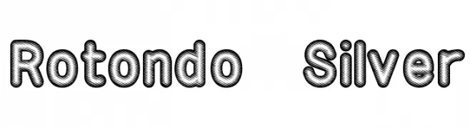
A bold, decorative font with a unique diagonal striped pattern.
![Rotondo Silver Frei Schriftart Herunterladen]() Herunterladen 760 Downloads@WebFont
Herunterladen 760 Downloads@WebFont -
( Fonts by Nick Curtis - www.nicksfonts.com )
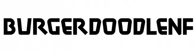
A bold, geometric font with a playful, retro vibe.
![BurgerDoodleNF Frei Schriftart Herunterladen]() Herunterladen 760 Downloads@WebFont
Herunterladen 760 Downloads@WebFont -
( Fonts by Graham Meade - GemFonts )
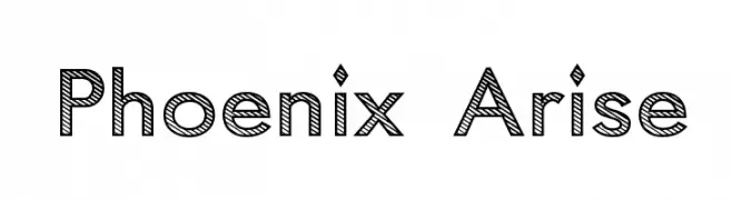
A bold, decorative font with diagonal stripe patterns and a modern, geometric style.
![Phoenix Arise Frei Schriftart Herunterladen]() Herunterladen 760 Downloads@WebFont
Herunterladen 760 Downloads@WebFont -
![Cicero 1 Frei Schriftart Herunterladen]() Herunterladen 760 Downloads@WebFont
Herunterladen 760 Downloads@WebFont -
![Minnesota Normal Frei Schriftart Herunterladen]() Herunterladen 760 Downloads@WebFont
Herunterladen 760 Downloads@WebFont -
( Fonts by Levi Halmos )
A modern, geometric font with elongated, narrow letterforms and consistent stroke width.
![Sulphur Frei Schriftart Herunterladen]() Herunterladen 760 Downloads@WebFont
Herunterladen 760 Downloads@WebFont -
![Backlash BRK Frei Schriftart Herunterladen]() Herunterladen 760 Downloads@WebFont
Herunterladen 760 Downloads@WebFont -
( Fonts by www.koenhachmang.com - Glitch )
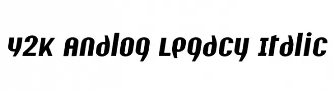
A bold, italic font with a modern and dynamic style.
![Y2K Analog Legacy Italic Frei Schriftart Herunterladen]() Herunterladen 760 Downloads@WebFont
Herunterladen 760 Downloads@WebFont -
( Fonts by Woodcutter )
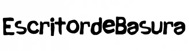
A playful, bold handwritten font with irregular, organic shapes.
![Escritor de Basura Frei Schriftart Herunterladen]() Herunterladen 759 Downloads@WebFont
Herunterladen 759 Downloads@WebFont -
( Fonts by Wojciech Kalinowski )
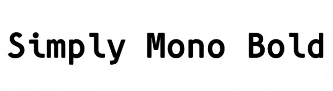
A bold, monospaced font with rounded, uniform characters.
![Simply Mono Bold Frei Schriftart Herunterladen]() Herunterladen 759 Downloads@WebFont
Herunterladen 759 Downloads@WebFont -
( Fonts by HENRIavecunK - Henrik - Personal-use only. For commercial use please contact owner. )
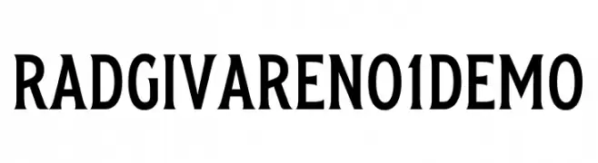
A bold, impactful font with strong strokes and a modern yet classic style.
![Radgivare No 1 Demo Frei Schriftart Herunterladen]() Herunterladen 759 Downloads@WebFont
Herunterladen 759 Downloads@WebFont -
( Fonts by AthayaDZN - Personal-use only. For commercial use please contact owner. )
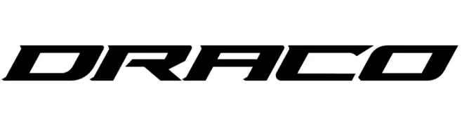
A bold, angular font with a futuristic and dynamic style.
![Draco Frei Schriftart Herunterladen]() Herunterladen 759 Downloads@WebFont
Herunterladen 759 Downloads@WebFont -
( Fonts by ErikYin )
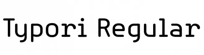
A modern, rounded sans-serif font with clean lines and balanced spacing.
![Typori Regular Frei Schriftart Herunterladen]() Herunterladen 759 Downloads@WebFont
Herunterladen 759 Downloads@WebFont -
( Deffeyes Design - www.deffeyes.com/ )
A classic, high-contrast serif font with sharp, angular serifs.
![Roman Caps Frei Schriftart Herunterladen]() Herunterladen 759 Downloads@WebFont
Herunterladen 759 Downloads@WebFont -
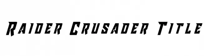
![Raider Crusader Title Frei Schriftart Herunterladen]() Herunterladen 759 Downloads@WebFont
Herunterladen 759 Downloads@WebFont -
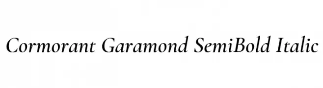
( Copyright (c) 2015, Christian Thalmann and the Cormorant Project Authors (github.com/CatharsisFonts/Cormorant) )
A classic serif font with semi-bold weight and italic style, offering medium contrast and elegant curves.
![Cormorant Garamond SemiBold Italic Frei Schriftart Herunterladen]() Herunterladen 759 Downloads@WebFont
Herunterladen 759 Downloads@WebFont -
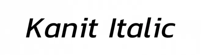
( Copyright (c) 2015, Cadson Demak (info@cadsondemak.com) )
A modern, italic font with a sleek and dynamic style.
![Kanit Italic Frei Schriftart Herunterladen]() Herunterladen 759 Downloads@WebFont
Herunterladen 759 Downloads@WebFont -
![Forky Frei Schriftart Herunterladen]() Herunterladen 759 Downloads@WebFont
Herunterladen 759 Downloads@WebFont -
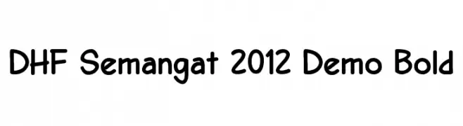
![DHF Semangat 2012 Demo Bold Frei Schriftart Herunterladen]() Herunterladen 759 Downloads@WebFont
Herunterladen 759 Downloads@WebFont -
( Copyright (c) 2011 by Sorkin Type Co (www.sorkintype.com) )
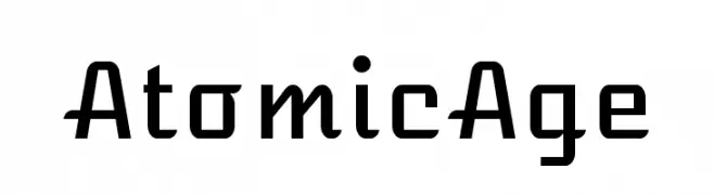
A futuristic, geometric font with bold, angular letterforms.
![AtomicAge Frei Schriftart Herunterladen]() Herunterladen 759 Downloads@WebFont
Herunterladen 759 Downloads@WebFont -
( Fonts by Mans Greback - www.mawns.com )
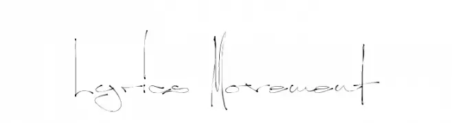
A dynamic, handwritten font with fluid, elongated strokes and artistic flair.
![Lyrics Movement Frei Schriftart Herunterladen]() Herunterladen 759 Downloads@WebFont
Herunterladen 759 Downloads@WebFont -
( Fonts by www.houseoflime.com )
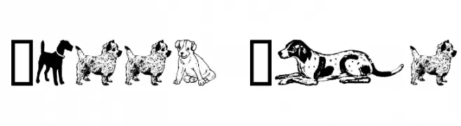
Dog-themed dingbat font with detailed canine illustrations.
![Doggy Bag Frei Schriftart Herunterladen]() Herunterladen 759 Downloads@WebFont
Herunterladen 759 Downloads@WebFont


Welche Schriften sind gerade am populärsten?
Poppins, Roboto, Montserrat, Open Sans und Lato sind wegen ihrer klaren Formen und breiten Einsetzbarkeit sehr gefragt – von Markenauftritt über Landingpages bis hin zu Postern.
Welche Fonts eignen sich für Logos?
Geometrische Sans‑Serifs (z. B. Poppins, Familien im Gotham‑Stil) sind ein häufiger Griff für sauberes, skalierbares Branding. Für eine persönlichere Note bleiben Scripts und Handschrift‑Stile beliebt. Kombinieren Sie einen prägnanten Headline‑Font mit einer neutralen Brotschrift für Wiedererkennung und Harmonie.
Wie oft wird die Top‑Liste aktualisiert?
Regelmäßig – basierend auf realen Downloads und Interaktionen. Schauen Sie öfter vorbei, um aufstrebende Favoriten früh zu entdecken.
💡 Tipp: Seite bookmarken – Trends wechseln schnell, und heutige Top‑Schriften inspirieren morgen vielleicht das Rebranding.