Willkommen bei den Top‑Schriften – hier treffen Beliebtheit und Qualität aufeinander. Das sind die in diesem Jahr am häufigsten heruntergeladenen und genutzten Fonts. Wenn Sie sichere Optionen für Logo, Web oder Social suchen, starten Sie hier.
Jeder Top‑Font überzeugt durch Balance, Lesbarkeit und Vielseitigkeit. Sie finden moderne Sans‑Serifs, elegante Scripts, Vintage‑Serifs und minimalistische Displays.
-
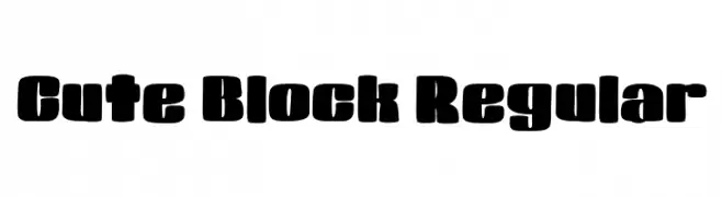
( Fonts by Nico Muslib )
A bold, playful font with rounded, blocky letters and a modern, fun style.
 Herunterladen 168 Downloads@WebFont
 -
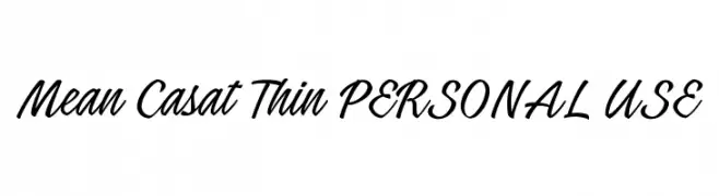
( Måns Grebäck - www.mansgreback.com )
A dynamic and flowing script font with elegant, cursive letterforms.
![Mean Casat Thin PERSONAL USE Frei Schriftart Herunterladen]() Herunterladen 168 Downloads@WebFont
Herunterladen 168 Downloads@WebFont -
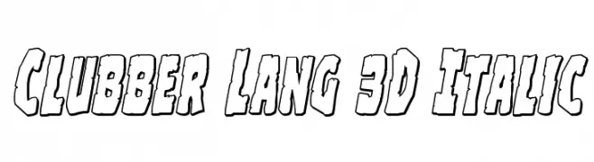
( Fonts by Daniel Zadorozny - www.iconian.com - Free for personal use )
A bold, 3D italic font with rugged outlines and dynamic style.
![Clubber Lang 3D Italic Frei Schriftart Herunterladen]() Herunterladen 168 Downloads@WebFont
Herunterladen 168 Downloads@WebFont -
( Fonts by Madatype Studio )
A playful and whimsical font with bold, flowing strokes and dynamic shapes.
![Cattino Frei Schriftart Herunterladen]() Herunterladen 168 Downloads@WebFont
Herunterladen 168 Downloads@WebFont -
![Warrior's Destiny Frei Schriftart Herunterladen]() Herunterladen 168 Downloads@WebFont
Herunterladen 168 Downloads@WebFont -
-
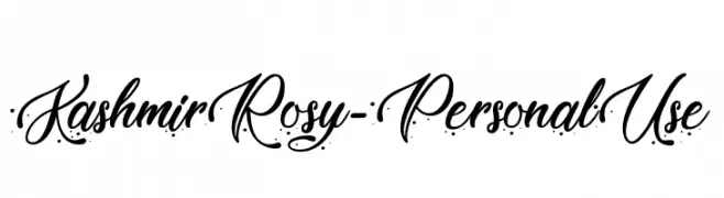
( Fonts by Typhoon Type - Suthi Srisopha - www.typhoontype.net - Personal-use only. For commercial use please contact owner. )
An elegant script font with flowing cursive letters and intricate swashes.
![KashmirRosy-PersonalUse Frei Schriftart Herunterladen]() Herunterladen 168 Downloads@WebFont
Herunterladen 168 Downloads@WebFont -
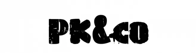
( Fonts by www.paintblackeditions.org - Free for personal use only )
A bold, distressed font with a grunge texture and rugged appearance.
![PK&co Frei Schriftart Herunterladen]() Herunterladen 168 Downloads@WebFont
Herunterladen 168 Downloads@WebFont -
( Font by kingthingsfonts.co.uk )
An ornate and decorative font with intricate, fantasy-inspired designs.
![Kingthings Tendrylle Frei Schriftart Herunterladen]() Herunterladen 168 Downloads@WebFont
Herunterladen 168 Downloads@WebFont -
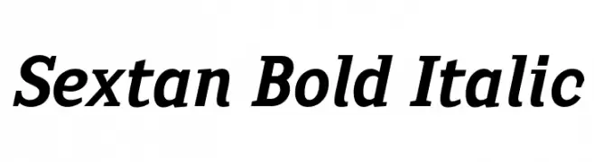
( deFharo - Fernando Haro - defharo.com )
A bold, italicized font with strong, dynamic strokes and a modern classic appeal.
![Sextan Bold Italic Frei Schriftart Herunterladen]() Herunterladen 168 Downloads@WebFont
Herunterladen 168 Downloads@WebFont -
![Christmas Fancy Frei Schriftart Herunterladen]() Herunterladen 168 Downloads@WebFont
Herunterladen 168 Downloads@WebFont


Welche Schriften sind gerade am populärsten?
Poppins, Roboto, Montserrat, Open Sans und Lato sind wegen ihrer klaren Formen und breiten Einsetzbarkeit sehr gefragt – von Markenauftritt über Landingpages bis hin zu Postern.
Welche Fonts eignen sich für Logos?
Geometrische Sans‑Serifs (z. B. Poppins, Familien im Gotham‑Stil) sind ein häufiger Griff für sauberes, skalierbares Branding. Für eine persönlichere Note bleiben Scripts und Handschrift‑Stile beliebt. Kombinieren Sie einen prägnanten Headline‑Font mit einer neutralen Brotschrift für Wiedererkennung und Harmonie.
Wie oft wird die Top‑Liste aktualisiert?
Regelmäßig – basierend auf realen Downloads und Interaktionen. Schauen Sie öfter vorbei, um aufstrebende Favoriten früh zu entdecken.
💡 Tipp: Seite bookmarken – Trends wechseln schnell, und heutige Top‑Schriften inspirieren morgen vielleicht das Rebranding.