Willkommen bei den Top‑Schriften – hier treffen Beliebtheit und Qualität aufeinander. Das sind die in diesem Jahr am häufigsten heruntergeladenen und genutzten Fonts. Wenn Sie sichere Optionen für Logo, Web oder Social suchen, starten Sie hier.
Jeder Top‑Font überzeugt durch Balance, Lesbarkeit und Vielseitigkeit. Sie finden moderne Sans‑Serifs, elegante Scripts, Vintage‑Serifs und minimalistische Displays.
-
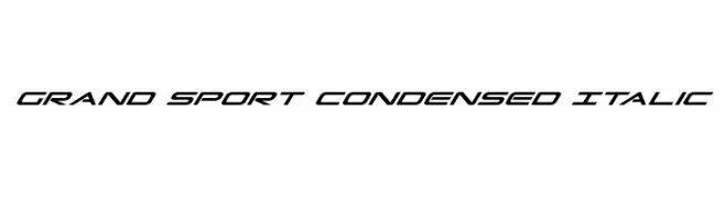
( Fonts by Daniel Zadorozny - www.iconian.com )
A sleek, italicized, and condensed font with a modern, dynamic style.
 Herunterladen 752 Downloads@WebFont
 -
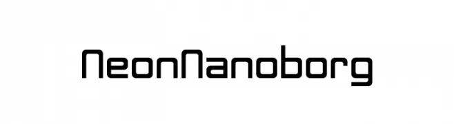
( Fonts by Darrell Flood )
A futuristic, geometric font with clean lines and squared edges.
![Neon Nanoborg Frei Schriftart Herunterladen]() Herunterladen 752 Downloads@WebFont
Herunterladen 752 Downloads@WebFont -
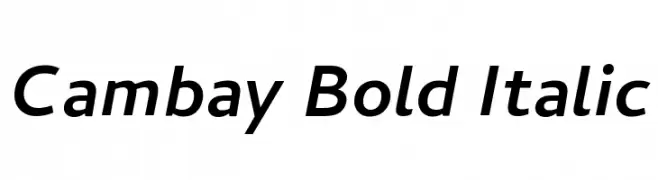
( Copyright (c) 2014 Pooja Saxena (www.poojasaxena.in) )
A bold, italicized sans-serif font with a modern and clean design.
![Cambay Bold Italic Frei Schriftart Herunterladen]() Herunterladen 752 Downloads@WebFont
Herunterladen 752 Downloads@WebFont -
( Fonts by Castcraft Software - opti.netii.net - check the website before use )
A dynamic, cursive script font with a personal and artistic touch.
![OPTIChampion-Script Frei Schriftart Herunterladen]() Herunterladen 752 Downloads@WebFont
Herunterladen 752 Downloads@WebFont -
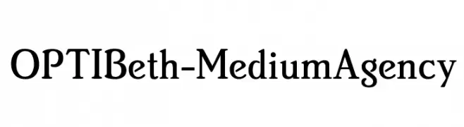
( Fonts by Castcraft Software - opti.netii.net - check the website before use )
A classic serif font with elegant strokes and balanced proportions.
![OPTIBeth-MediumAgency Frei Schriftart Herunterladen]() Herunterladen 752 Downloads@WebFont
Herunterladen 752 Downloads@WebFont -
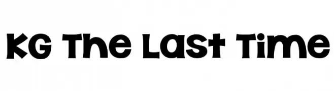
( Fonts by www.kimberlygeswein.com - Kimberly Geswein )
A bold, playful font with rounded edges and a whimsical style.
![KG The Last Time Frei Schriftart Herunterladen]() Herunterladen 752 Downloads@WebFont
Herunterladen 752 Downloads@WebFont -
( Fonts by Vanessa Bays - bythebutterfly.com )
A bold, rounded, and playful hand-drawn font with a friendly aesthetic.
![Bigness Frei Schriftart Herunterladen]() Herunterladen 752 Downloads@WebFont
Herunterladen 752 Downloads@WebFont -
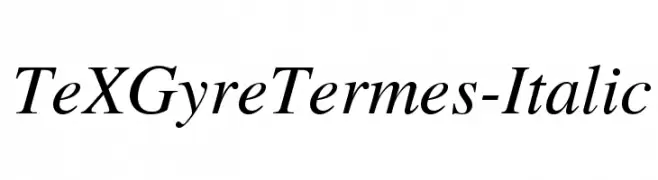
![TeXGyreTermes-Italic Frei Schriftart Herunterladen]() Herunterladen 752 Downloads@WebFont
Herunterladen 752 Downloads@WebFont -
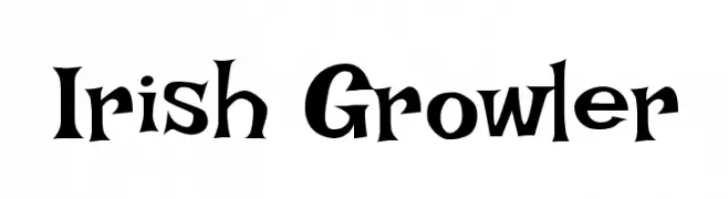
( Google Web Fonts )
A bold, gothic-inspired font with sharp serifs and thick strokes.
![Irish Growler Frei Schriftart Herunterladen]() Herunterladen 752 Downloads@WebFont
Herunterladen 752 Downloads@WebFont -
( - www.bordijol.net )
A playful, bold handwritten font with a dynamic and casual style.
![BillyBop_maj_tag Frei Schriftart Herunterladen]() Herunterladen 752 Downloads@WebFont
Herunterladen 752 Downloads@WebFont -
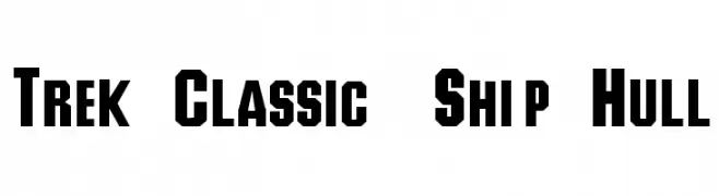
![Trek Classic Ship Hull Frei Schriftart Herunterladen]() Herunterladen 752 Downloads@WebFont
Herunterladen 752 Downloads@WebFont -
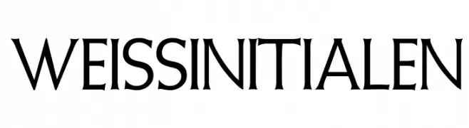
( Fonts by Dieter Steffmann )
A classic serif font with sharp serifs and elegant, elongated forms.
![WeissInitialen Frei Schriftart Herunterladen]() Herunterladen 752 Downloads@WebFont
Herunterladen 752 Downloads@WebFont -
( Fonts by Fernando Carvente - serifdechocolate.wordpress.com )
A bold, modern font with strong, uniform strokes and excellent readability.
![Knema Bold Frei Schriftart Herunterladen]() Herunterladen 752 Downloads@WebFont
Herunterladen 752 Downloads@WebFont -
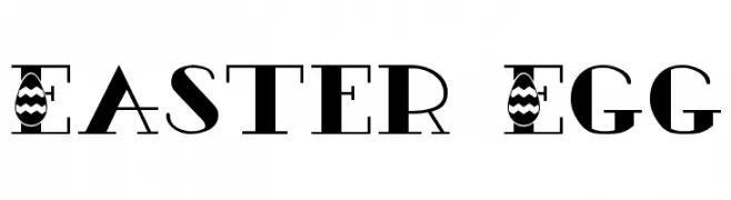
( Fonts by Dieter Steffmann )
A decorative font with Easter egg patterns, perfect for festive projects.
![Easter Egg Frei Schriftart Herunterladen]() Herunterladen 752 Downloads@WebFont
Herunterladen 752 Downloads@WebFont -
![VI Phong Lan Hoa Frei Schriftart Herunterladen]() Herunterladen 752 Downloads@WebFont
Herunterladen 752 Downloads@WebFont -
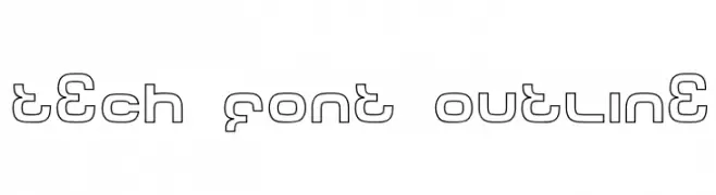
( Fonts by dustBUST - Andreas Nylin )
A modern, geometric outline font with a tech-inspired design.
![Tech Font Outline Frei Schriftart Herunterladen]() Herunterladen 752 Downloads@WebFont
Herunterladen 752 Downloads@WebFont -
( Fonts by Andrew Hart - dirt2.com )
A futuristic, geometric font with angular lines and a robotic feel.
![Robot!Head Frei Schriftart Herunterladen]() Herunterladen 752 Downloads@WebFont
Herunterladen 752 Downloads@WebFont -
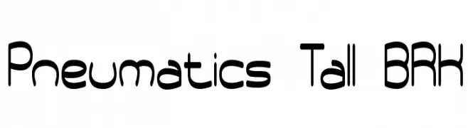
( Fonts by www.aenigmafonts.com )
A futuristic, tall, and narrow font with rounded edges and a modern aesthetic.
![Pneumatics Tall BRK Frei Schriftart Herunterladen]() Herunterladen 752 Downloads@WebFont
Herunterladen 752 Downloads@WebFont -
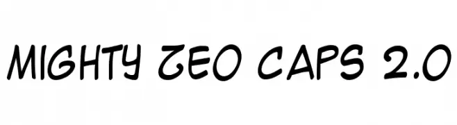
( Fonts by www.blambot.com )
A playful, handwritten-style font with smooth, rounded edges.
![Mighty Zeo Caps 2.0 Frei Schriftart Herunterladen]() Herunterladen 752 Downloads@WebFont
Herunterladen 752 Downloads@WebFont -
![red shirt Frei Schriftart Herunterladen]() Herunterladen 752 Downloads@WebFont
Herunterladen 752 Downloads@WebFont -
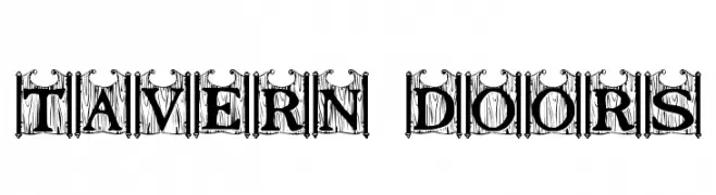
![Tavern Doors Frei Schriftart Herunterladen]() Herunterladen 752 Downloads@WebFont
Herunterladen 752 Downloads@WebFont -
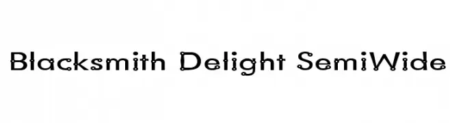
( Fonts by Graham Meade - GemFonts )
A playful, decorative font with circular embellishments and bold, expanded characters.
![Blacksmith Delight SemiWide Frei Schriftart Herunterladen]() Herunterladen 752 Downloads@WebFont
Herunterladen 752 Downloads@WebFont -
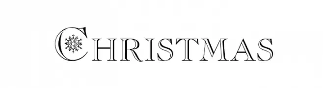
( Fonts by ARRF Designs )
A festive serif font with snowflake embellishments, ideal for holiday themes.
![Christmas Frei Schriftart Herunterladen]() Herunterladen 752 Downloads@WebFont
Herunterladen 752 Downloads@WebFont -
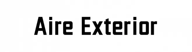
( Fonts by Jayvee Enaguas - Personal-use only. For commercial use please contact owner. )
A bold, modern font with geometric and angular characteristics.
![Aire Exterior Frei Schriftart Herunterladen]() Herunterladen 751 Downloads@WebFont
Herunterladen 751 Downloads@WebFont -
( Fonts by Khurasan )
A playful, bold font with a hand-drawn, whimsical style.
![Pamit Frei Schriftart Herunterladen]() Herunterladen 751 Downloads@WebFont
Herunterladen 751 Downloads@WebFont -
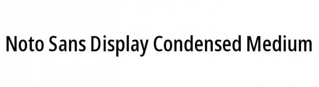
( Noto is a trademark of Google Inc. Noto fonts are open source. All Noto fonts are published under the SIL Open Font License, Version 1.1 )
A modern, condensed sans-serif font with medium weight and excellent readability.
![Noto Sans Display Condensed Medium Frei Schriftart Herunterladen]() Herunterladen 751 Downloads@WebFont
Herunterladen 751 Downloads@WebFont -
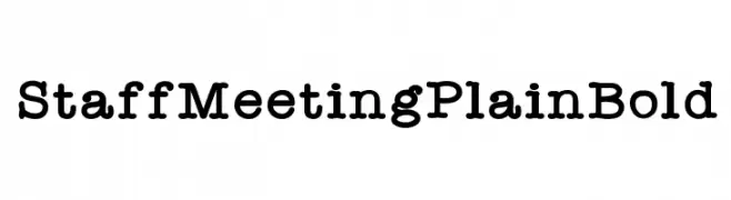
( Shara Weber - sharasfonts.com )
A bold slab serif font with strong, block-like serifs and consistent stroke width.
![StaffMeetingPlainBold Frei Schriftart Herunterladen]() Herunterladen 751 Downloads@WebFont
Herunterladen 751 Downloads@WebFont -
( imagex - www.imagex-fonts.com )
A bold, graffiti-style font with sharp, angular letterforms and a dynamic, street-art aesthetic.
![Next Ups Frei Schriftart Herunterladen]() Herunterladen 751 Downloads@WebFont
Herunterladen 751 Downloads@WebFont -
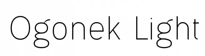
( Levi Szekeres - www.loremipsum.ro )
A modern, light sans-serif font with low contrast and balanced proportions.
![Ogonek Light Frei Schriftart Herunterladen]() Herunterladen 751 Downloads@WebFont
Herunterladen 751 Downloads@WebFont -
( Fonts by Billy Argel )
A dynamic and elegant script font with fluid, cursive strokes.
![Desert Queen Personal Use Frei Schriftart Herunterladen]() Herunterladen 751 Downloads@WebFont
Herunterladen 751 Downloads@WebFont -
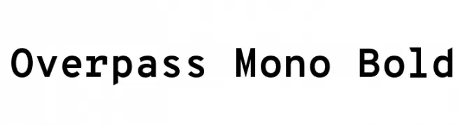
( Copyright (c) 2016 by Red Hat, Inc. All rights reserved. )
A bold, monospaced font with a modern and structured design.
![Overpass Mono Bold Frei Schriftart Herunterladen]() Herunterladen 751 Downloads@WebFont
Herunterladen 751 Downloads@WebFont -
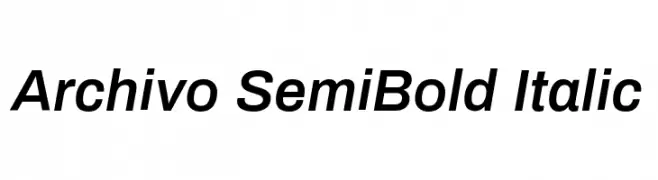
( Copyright 2016 The Archivo Project Authors (omnibus.type@gmail.com) )
A modern, semi-bold, italic sans-serif font with clean lines and low contrast.
![Archivo SemiBold Italic Frei Schriftart Herunterladen]() Herunterladen 751 Downloads@WebFont
Herunterladen 751 Downloads@WebFont -
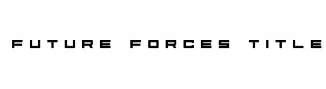
( Fonts by Daniel Zadorozny - www.iconian.com - Free for personal use )
A futuristic, geometric font with bold, angular letterforms.
![Future Forces Title Frei Schriftart Herunterladen]() Herunterladen 751 Downloads@WebFont
Herunterladen 751 Downloads@WebFont -
( illustrateddaydreams.tumblr.com/ )
A playful, handwritten font with an informal and friendly style.
![AlwaysRight Frei Schriftart Herunterladen]() Herunterladen 751 Downloads@WebFont
Herunterladen 751 Downloads@WebFont -
( Fonts by a Brice You [Bibliopolæ] - bibliopolae.tictail.com . Personal-use only. For commercial use please contact owner. )
A slender, hand-drawn font with elongated strokes and a whimsical style.
![ThinFingers-ThinFingers Frei Schriftart Herunterladen]() Herunterladen 751 Downloads@WebFont
Herunterladen 751 Downloads@WebFont


Welche Schriften sind gerade am populärsten?
Poppins, Roboto, Montserrat, Open Sans und Lato sind wegen ihrer klaren Formen und breiten Einsetzbarkeit sehr gefragt – von Markenauftritt über Landingpages bis hin zu Postern.
Welche Fonts eignen sich für Logos?
Geometrische Sans‑Serifs (z. B. Poppins, Familien im Gotham‑Stil) sind ein häufiger Griff für sauberes, skalierbares Branding. Für eine persönlichere Note bleiben Scripts und Handschrift‑Stile beliebt. Kombinieren Sie einen prägnanten Headline‑Font mit einer neutralen Brotschrift für Wiedererkennung und Harmonie.
Wie oft wird die Top‑Liste aktualisiert?
Regelmäßig – basierend auf realen Downloads und Interaktionen. Schauen Sie öfter vorbei, um aufstrebende Favoriten früh zu entdecken.
💡 Tipp: Seite bookmarken – Trends wechseln schnell, und heutige Top‑Schriften inspirieren morgen vielleicht das Rebranding.