Willkommen bei den Top‑Schriften – hier treffen Beliebtheit und Qualität aufeinander. Das sind die in diesem Jahr am häufigsten heruntergeladenen und genutzten Fonts. Wenn Sie sichere Optionen für Logo, Web oder Social suchen, starten Sie hier.
Jeder Top‑Font überzeugt durch Balance, Lesbarkeit und Vielseitigkeit. Sie finden moderne Sans‑Serifs, elegante Scripts, Vintage‑Serifs und minimalistische Displays.
-
( Fonts by Astigmatic One Eye Typographic Institute - Brian J. Bonislawsky - astigmatic.com )
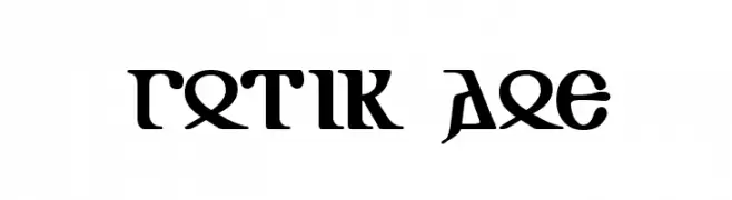
A classic Gothic font with sharp, angular lines and intricate detailing.
 Herunterladen 165 Downloads@WebFont
 -
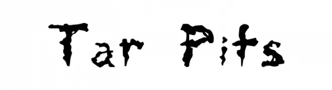
![Tar Pits Frei Schriftart Herunterladen]() Herunterladen 165 Downloads@WebFont
Herunterladen 165 Downloads@WebFont -
( Fonts by www.koenhachmang.com - Glitch )
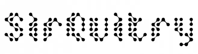
A playful, dot-based font with a modern, digital aesthetic.
![SirQuitry Frei Schriftart Herunterladen]() Herunterladen 165 Downloads@WebFont
Herunterladen 165 Downloads@WebFont -
( Fonts by Manfred Klein. Free for private and charity use. Free for commercial with donation to organizations )
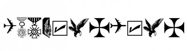
Military and aviation icon dingbat font with bold, detailed symbols.
![OldBoysToys Frei Schriftart Herunterladen]() Herunterladen 165 Downloads@WebFont
Herunterladen 165 Downloads@WebFont -
![DJB Rubia's Tiny Script Frei Schriftart Herunterladen]() Herunterladen 165 Downloads@WebFont
Herunterladen 165 Downloads@WebFont -
-
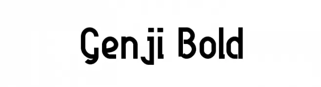
( Fonts by a Harry Wakamatsu - http://behance.net/japanyoshi . Personal-use only. For commercial use please contact owner. )
A bold, geometric font with a modern and futuristic style.
![Genji Bold Frei Schriftart Herunterladen]() Herunterladen 165 Downloads@WebFont
Herunterladen 165 Downloads@WebFont -
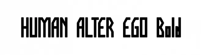
( Fonts by weknow )
A bold, geometric font with a modern, futuristic style.
![HUMAN ALTER EGO Bold Frei Schriftart Herunterladen]() Herunterladen 165 Downloads@WebFont
Herunterladen 165 Downloads@WebFont -
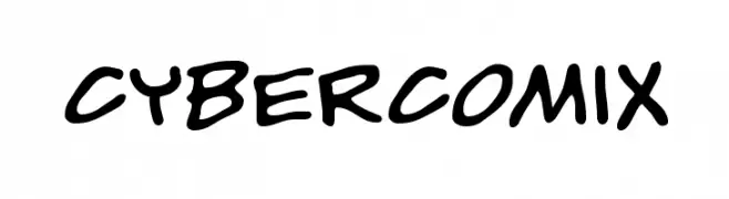
( Just In Type - www.justintype.com.br/home_content.html )
A playful, comic-style font with bold, hand-drawn strokes.
![CyberComix Frei Schriftart Herunterladen]() Herunterladen 165 Downloads@WebFont
Herunterladen 165 Downloads@WebFont -
( Fonts by Khrys Bosland )
A playful, hand-drawn font with a whimsical and informal style.
![KBhearmeplay Frei Schriftart Herunterladen]() Herunterladen 165 Downloads@WebFont
Herunterladen 165 Downloads@WebFont -
( Fonts by zone108.main.jp - Personal-use only. For commercial use please contact owner. )
A dynamic, sports-themed font featuring baseball player silhouettes.
![HB17 Frei Schriftart Herunterladen]() Herunterladen 165 Downloads@WebFont
Herunterladen 165 Downloads@WebFont


Welche Schriften sind gerade am populärsten?
Poppins, Roboto, Montserrat, Open Sans und Lato sind wegen ihrer klaren Formen und breiten Einsetzbarkeit sehr gefragt – von Markenauftritt über Landingpages bis hin zu Postern.
Welche Fonts eignen sich für Logos?
Geometrische Sans‑Serifs (z. B. Poppins, Familien im Gotham‑Stil) sind ein häufiger Griff für sauberes, skalierbares Branding. Für eine persönlichere Note bleiben Scripts und Handschrift‑Stile beliebt. Kombinieren Sie einen prägnanten Headline‑Font mit einer neutralen Brotschrift für Wiedererkennung und Harmonie.
Wie oft wird die Top‑Liste aktualisiert?
Regelmäßig – basierend auf realen Downloads und Interaktionen. Schauen Sie öfter vorbei, um aufstrebende Favoriten früh zu entdecken.
💡 Tipp: Seite bookmarken – Trends wechseln schnell, und heutige Top‑Schriften inspirieren morgen vielleicht das Rebranding.