Willkommen bei den Top‑Schriften – hier treffen Beliebtheit und Qualität aufeinander. Das sind die in diesem Jahr am häufigsten heruntergeladenen und genutzten Fonts. Wenn Sie sichere Optionen für Logo, Web oder Social suchen, starten Sie hier.
Jeder Top‑Font überzeugt durch Balance, Lesbarkeit und Vielseitigkeit. Sie finden moderne Sans‑Serifs, elegante Scripts, Vintage‑Serifs und minimalistische Displays.
-
 Herunterladen 166 Downloads@WebFont
 -
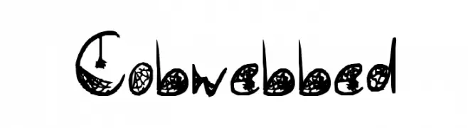
( Fonts by Des Gomez )
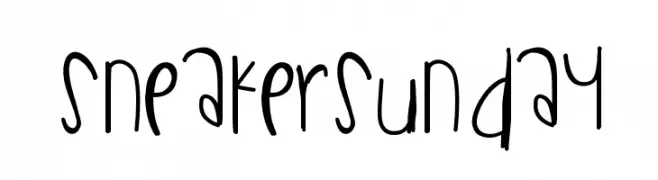
A playful, hand-drawn font with tall, narrow letters and a whimsical style.
![SneakerSunday Frei Schriftart Herunterladen]() Herunterladen 166 Downloads@WebFont
Herunterladen 166 Downloads@WebFont -
( Fonts by Billy Argel - www.billyargel.com - Personal-use only. For commercial use please contact owner. )
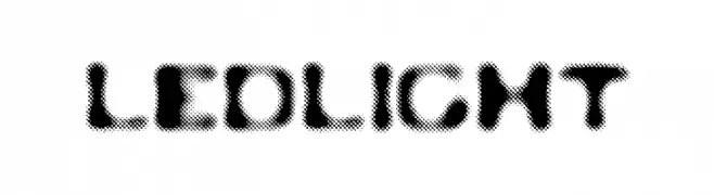
A bold, decorative font with a halftone pattern, ideal for creative projects.
![LEDLIGHT Frei Schriftart Herunterladen]() Herunterladen 166 Downloads@WebFont
Herunterladen 166 Downloads@WebFont -
( Fonts by Regulerstudio )
A dynamic, cursive-like font with flowing strokes and a sense of movement.
![Dinamica Star Frei Schriftart Herunterladen]() Herunterladen 166 Downloads@WebFont
Herunterladen 166 Downloads@WebFont -
Schriftart von vidka. For commercial use please contact the owner.
![Bad Calligraphic Frei Schriftart Herunterladen]() Herunterladen 166 Downloads@WebFont
Herunterladen 166 Downloads@WebFont -
-
![Ancient Glyph Frei Schriftart Herunterladen]() Herunterladen 166 Downloads@WebFont
Herunterladen 166 Downloads@WebFont -
( Buzzbum - buzzbum.tripod.com/ )
A bold, playful font with a hand-drawn, quirky style.
![Student Headline Frei Schriftart Herunterladen]() Herunterladen 166 Downloads@WebFont
Herunterladen 166 Downloads@WebFont -
![HomegirlGetAtMe Frei Schriftart Herunterladen]() Herunterladen 166 Downloads@WebFont
Herunterladen 166 Downloads@WebFont -
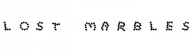
![Lost Marbles Frei Schriftart Herunterladen]() Herunterladen 166 Downloads
Herunterladen 166 Downloads -
( Douglas Day )
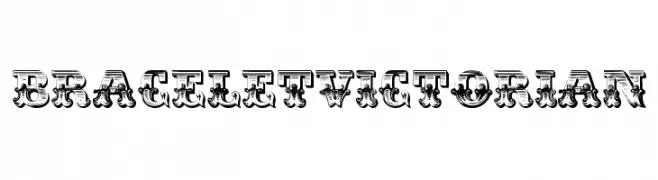
An ornate, Victorian-style decorative font with intricate details.
![BraceletVictorian Frei Schriftart Herunterladen]() Herunterladen 166 Downloads@WebFont
Herunterladen 166 Downloads@WebFont


Welche Schriften sind gerade am populärsten?
Poppins, Roboto, Montserrat, Open Sans und Lato sind wegen ihrer klaren Formen und breiten Einsetzbarkeit sehr gefragt – von Markenauftritt über Landingpages bis hin zu Postern.
Welche Fonts eignen sich für Logos?
Geometrische Sans‑Serifs (z. B. Poppins, Familien im Gotham‑Stil) sind ein häufiger Griff für sauberes, skalierbares Branding. Für eine persönlichere Note bleiben Scripts und Handschrift‑Stile beliebt. Kombinieren Sie einen prägnanten Headline‑Font mit einer neutralen Brotschrift für Wiedererkennung und Harmonie.
Wie oft wird die Top‑Liste aktualisiert?
Regelmäßig – basierend auf realen Downloads und Interaktionen. Schauen Sie öfter vorbei, um aufstrebende Favoriten früh zu entdecken.
💡 Tipp: Seite bookmarken – Trends wechseln schnell, und heutige Top‑Schriften inspirieren morgen vielleicht das Rebranding.