Willkommen bei den Top‑Schriften – hier treffen Beliebtheit und Qualität aufeinander. Das sind die in diesem Jahr am häufigsten heruntergeladenen und genutzten Fonts. Wenn Sie sichere Optionen für Logo, Web oder Social suchen, starten Sie hier.
Jeder Top‑Font überzeugt durch Balance, Lesbarkeit und Vielseitigkeit. Sie finden moderne Sans‑Serifs, elegante Scripts, Vintage‑Serifs und minimalistische Displays.
-
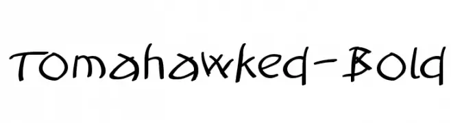
( Fonts by Manfred Klein. Free for private and charity use. Free for commercial with donation to organizations )
A bold, hand-drawn font with a playful and energetic style.
 Herunterladen 165 Downloads@WebFont
 -
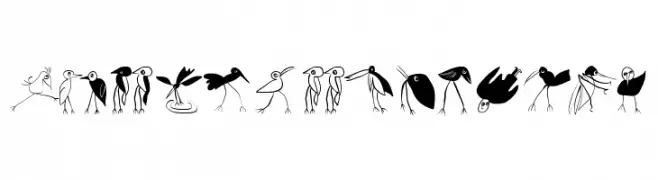
( Fonts by Manfred Klein. Free for private and charity use. Free for commercial with donation to organizations )
A collection of whimsical bird illustrations in various playful styles.
![Birds-Relaunch Frei Schriftart Herunterladen]() Herunterladen 165 Downloads@WebFont
Herunterladen 165 Downloads@WebFont -
( Fonts by Arkandis Digital Foundry )
An elegant italic typeface with smooth curves and a refined, classic appearance.
![AccanthisADFStdNo3-Italic Frei Schriftart Herunterladen]() Herunterladen 165 Downloads@WebFont
Herunterladen 165 Downloads@WebFont -
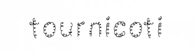
![tournicoti Frei Schriftart Herunterladen]() Herunterladen 165 Downloads@WebFont
Herunterladen 165 Downloads@WebFont -
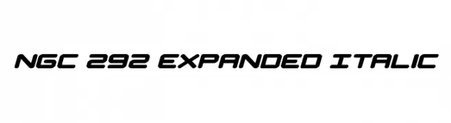
( Fonts by Daniel Zadorozny - www.iconian.com - Personal-use only. For commercial use please contact owner. )
A modern, expanded, and italicized font with a futuristic geometric style.
![NGC 292 Expanded Italic Frei Schriftart Herunterladen]() Herunterladen 165 Downloads@WebFont
Herunterladen 165 Downloads@WebFont -
-
![Lucker Frei Schriftart Herunterladen]() Herunterladen 165 Downloads@WebFont
Herunterladen 165 Downloads@WebFont -
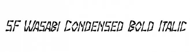
( Fonts by ShyFonts )
A bold, italic, and condensed font with a brush-like, dynamic style.
![SF Wasabi Condensed Bold Italic Frei Schriftart Herunterladen]() Herunterladen 165 Downloads@WebFont
Herunterladen 165 Downloads@WebFont -
Schriftart von jlog3000. For commercial use please contact the owner.
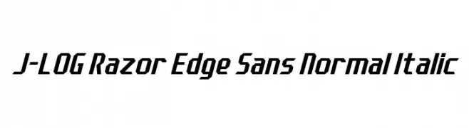
( Fonts by John Ocasio. Free for personal use only )
A sharp, angular sans-serif font with a dynamic, italicized style.
![J-LOG Razor Edge Sans Normal Italic Frei Schriftart Herunterladen]() Herunterladen 165 Downloads@WebFont
Herunterladen 165 Downloads@WebFont -
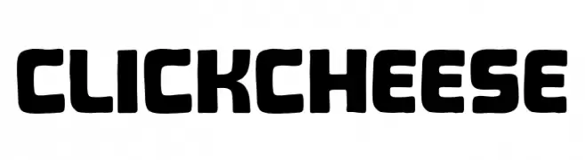
( Fonts by Khurasan™ )
A bold, rounded font with a playful and friendly style.
![Click Cheese Frei Schriftart Herunterladen]() Herunterladen 165 Downloads@WebFont
Herunterladen 165 Downloads@WebFont -
( Fonts by MJType )
A casual, handwritten font with a friendly and approachable style.
![Block Script Frei Schriftart Herunterladen]() Herunterladen 165 Downloads@WebFont
Herunterladen 165 Downloads@WebFont


Welche Schriften sind gerade am populärsten?
Poppins, Roboto, Montserrat, Open Sans und Lato sind wegen ihrer klaren Formen und breiten Einsetzbarkeit sehr gefragt – von Markenauftritt über Landingpages bis hin zu Postern.
Welche Fonts eignen sich für Logos?
Geometrische Sans‑Serifs (z. B. Poppins, Familien im Gotham‑Stil) sind ein häufiger Griff für sauberes, skalierbares Branding. Für eine persönlichere Note bleiben Scripts und Handschrift‑Stile beliebt. Kombinieren Sie einen prägnanten Headline‑Font mit einer neutralen Brotschrift für Wiedererkennung und Harmonie.
Wie oft wird die Top‑Liste aktualisiert?
Regelmäßig – basierend auf realen Downloads und Interaktionen. Schauen Sie öfter vorbei, um aufstrebende Favoriten früh zu entdecken.
💡 Tipp: Seite bookmarken – Trends wechseln schnell, und heutige Top‑Schriften inspirieren morgen vielleicht das Rebranding.