Willkommen bei den Top‑Schriften – hier treffen Beliebtheit und Qualität aufeinander. Das sind die in diesem Jahr am häufigsten heruntergeladenen und genutzten Fonts. Wenn Sie sichere Optionen für Logo, Web oder Social suchen, starten Sie hier.
Jeder Top‑Font überzeugt durch Balance, Lesbarkeit und Vielseitigkeit. Sie finden moderne Sans‑Serifs, elegante Scripts, Vintage‑Serifs und minimalistische Displays.
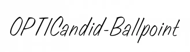
-
( Fonts by Castcraft Software - opti.netii.net - check the website before use )
A casual, handwritten-style font with fluid, slanted strokes.
 Herunterladen 738 Downloads@WebFont
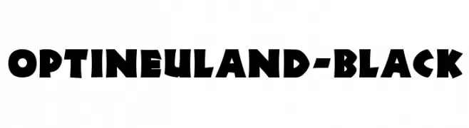
 -
( Fonts by Castcraft Software - opti.netii.net - check the website before use )
A bold, angular font with a vintage, impactful style.
![OPTINeuland-Black Frei Schriftart Herunterladen]() Herunterladen 738 Downloads@WebFont
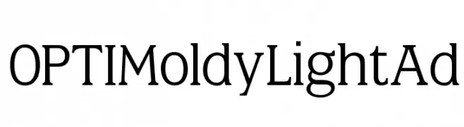
Herunterladen 738 Downloads@WebFont -
( Fonts by Castcraft Software - opti.netii.net - check the website before use )
A modern serif typeface with elegant proportions and a sophisticated style.
![OPTIMoldyLightAd Frei Schriftart Herunterladen]() Herunterladen 738 Downloads@WebFont
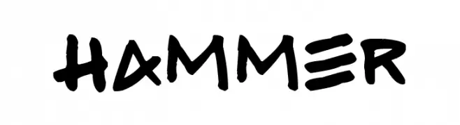
Herunterladen 738 Downloads@WebFont -
( Fonts by www.fontpanda.com. Personal-use only. For commercial use please contact owner. )
A bold, hand-drawn font with a playful and energetic style.
![Hammer Frei Schriftart Herunterladen]() Herunterladen 738 Downloads@WebFont
Herunterladen 738 Downloads@WebFont -
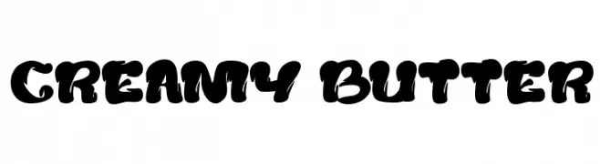
( fontm.com/author/weknow/ )
A bold, playful font with a rounded, bubbly design ideal for retro-themed projects.
![creamy butter Frei Schriftart Herunterladen]() Herunterladen 738 Downloads@WebFont
Herunterladen 738 Downloads@WebFont -
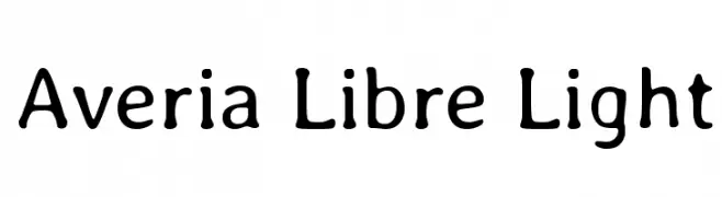
( Copyright (c) 2011, Dan Sayers (i@iotic.com) )
A playful, hand-drawn style font with rounded, soft characters and subtle stroke variations.
![Averia Libre Light Frei Schriftart Herunterladen]() Herunterladen 738 Downloads@WebFont
Herunterladen 738 Downloads@WebFont -
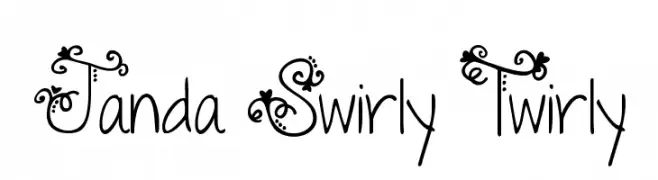
( Fonts by www.kimberlygeswein.com - Kimberly Geswein )
A whimsical and decorative font with intricate swirls and flourishes.
![Janda Swirly Twirly Frei Schriftart Herunterladen]() Herunterladen 738 Downloads@WebFont
Herunterladen 738 Downloads@WebFont -
( Fonts by ingoFonts. http://www.ingofonts.de )
A clean, modern typeface with uniform stroke width and excellent readability.
![JosefPro-Lightreduced Frei Schriftart Herunterladen]() Herunterladen 738 Downloads@WebFont
Herunterladen 738 Downloads@WebFont -
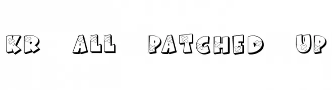
( Fonts by Kat`s Fun Fonts - Personal-use only. For commercial use please contact owner. )
A bold, playful font with a patched-up, three-dimensional design.
![KR All Patched Up Frei Schriftart Herunterladen]() Herunterladen 738 Downloads@WebFont
Herunterladen 738 Downloads@WebFont -
( Fonts by Dieter Steffmann )
A bold, decorative font with a wave-like pattern and 3D shadow effect.
![Cardiff Frei Schriftart Herunterladen]() Herunterladen 738 Downloads@WebFont
Herunterladen 738 Downloads@WebFont -
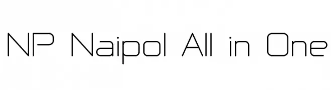
( Fonts by Pol Udomwittayanukul - webnaipol.atspace.com )
A modern, geometric font with clean lines and a minimalist style.
![NP Naipol All in One Frei Schriftart Herunterladen]() Herunterladen 738 Downloads@WebFont
Herunterladen 738 Downloads@WebFont -
( Fonts by Dieter Steffmann )
A bold, three-dimensional serif font with a striking and modern design.
![Plastische Plakat-Antiqua Frei Schriftart Herunterladen]() Herunterladen 738 Downloads@WebFont
Herunterladen 738 Downloads@WebFont -
![Soda Frei Schriftart Herunterladen]() Herunterladen 738 Downloads@WebFont
Herunterladen 738 Downloads@WebFont -
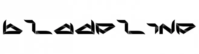
( Fonts by DesignStation - designstation.deviantart.com - Personal-use only. For commercial use please contact owner. )
A futuristic, angular font with sharp, geometric shapes.
![bladeline Frei Schriftart Herunterladen]() Herunterladen 738 Downloads@WebFont
Herunterladen 738 Downloads@WebFont -
![ArcadeAmerica Frei Schriftart Herunterladen]() Herunterladen 738 Downloads@WebFont
Herunterladen 738 Downloads@WebFont -
( Fonts by SDFonts - Ritzy )
A bold, geometric font with strong, thick strokes and high contrast.
![Donnie Frei Schriftart Herunterladen]() Herunterladen 738 Downloads@WebFont
Herunterladen 738 Downloads@WebFont -
( Fonts by Typography in Decay )
A bold, rounded font with a futuristic and playful design.
![Seeds Frei Schriftart Herunterladen]() Herunterladen 738 Downloads@WebFont
Herunterladen 738 Downloads@WebFont -
![Conformity Normal Frei Schriftart Herunterladen]() Herunterladen 738 Downloads@WebFont
Herunterladen 738 Downloads@WebFont -
( Fonts by Daniel Zadorozny - www.iconian.com )
A bold, playful, and hand-drawn style font with thick, rounded characters.
![Whatafont Frei Schriftart Herunterladen]() Herunterladen 738 Downloads@WebFont
Herunterladen 738 Downloads@WebFont -
![Numberpile Frei Schriftart Herunterladen]() Herunterladen 738 Downloads@WebFont
Herunterladen 738 Downloads@WebFont -
( Fonts by Letterena Studios )
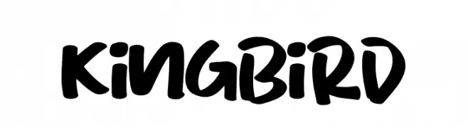
A bold, handwritten font with a playful and energetic style.
![King Bird Frei Schriftart Herunterladen]() Herunterladen 737 Downloads@WebFont
Herunterladen 737 Downloads@WebFont -
( Fonts by DigitypeStudio - Personal-use only. For commercial use please contact owner. )
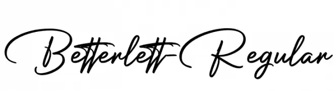
A dynamic and elegant script font with fluid strokes and a handwritten charm.
![Betterlett-Regular Frei Schriftart Herunterladen]() Herunterladen 737 Downloads@WebFont
Herunterladen 737 Downloads@WebFont -
( Fonts by CalligraphyFonts - Personal-use only. For commercial use please contact owner. )
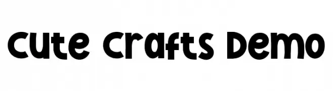
A playful and bold font with rounded edges and uniform strokes.
![Cute Crafts Demo Frei Schriftart Herunterladen]() Herunterladen 737 Downloads@WebFont
Herunterladen 737 Downloads@WebFont -
( Fonts by Kong Font )
A playful, rounded font with a whimsical, childlike style.
![Bubblekids Frei Schriftart Herunterladen]() Herunterladen 737 Downloads@WebFont
Herunterladen 737 Downloads@WebFont -
( Fonts by Daniel Zadorozny - www.iconian.com - Personal-use only. For commercial use please contact owner. )
A bold, geometric font with strong, angular lines and a modern aesthetic.
![Drive Corps Frei Schriftart Herunterladen]() Herunterladen 737 Downloads@WebFont
Herunterladen 737 Downloads@WebFont -
( Fonts by Michael Sharanda - Personal-use only. For commercial use please contact owner. )
A bold, modern sans-serif font with clean lines and strong presence.
![Vladivostok Bold Frei Schriftart Herunterladen]() Herunterladen 737 Downloads@WebFont
Herunterladen 737 Downloads@WebFont -
( Elo Marc - www.artshop.elodesigns.com/ )
A bold, slab serif font with strong, impactful characters.
![Wood Print Frei Schriftart Herunterladen]() Herunterladen 737 Downloads@WebFont
Herunterladen 737 Downloads@WebFont -
( Fonts by Måns Grebäck )
A graceful script font with flowing, interconnected letters and elegant flourishes.
![Honeymoon PERSONAL USE Frei Schriftart Herunterladen]() Herunterladen 737 Downloads@WebFont
Herunterladen 737 Downloads@WebFont -
( Fonts by Heinrich Lischka www.fontboutique.de - Personal-use only. For commercial use please contact owner. )
A modern, geometric font with consistent stroke width and rounded edges.
![NeoRetroFill Frei Schriftart Herunterladen]() Herunterladen 737 Downloads@WebFont
Herunterladen 737 Downloads@WebFont -
( Copyright (c) 2012-2015, The Mozilla Foundation and Telefonica S.A. )
A light, italic sans-serif font with a modern and elegant style.
![Fira Sans Light Italic Frei Schriftart Herunterladen]() Herunterladen 737 Downloads@WebFont
Herunterladen 737 Downloads@WebFont -
( Copyright (c) 2012, vernon adams (vern@newtypography.co.uk), with Reserved Font Name 'BenchNine'. )
A modern, light, and condensed sans-serif font with smooth strokes.
![BenchNine Light Frei Schriftart Herunterladen]() Herunterladen 737 Downloads@WebFont
Herunterladen 737 Downloads@WebFont -
( Fonts by exe.vis.ne.jp )
A bold, geometric font with excellent readability and a modern design.
![Registration Number ANA.ttf Frei Schriftart Herunterladen]() Herunterladen 737 Downloads@WebFont
Herunterladen 737 Downloads@WebFont -
( Font by Jonathan Harris - www.tattoowoo.com )
An elegant, decorative script font with intricate, swirling strokes.
![the Daily Bread Frei Schriftart Herunterladen]() Herunterladen 737 Downloads@WebFont
Herunterladen 737 Downloads@WebFont -
![Funky&Bould Frei Schriftart Herunterladen]() Herunterladen 737 Downloads@WebFont
Herunterladen 737 Downloads@WebFont -
![Mocha Java Frei Schriftart Herunterladen]() Herunterladen 737 Downloads@WebFont
Herunterladen 737 Downloads@WebFont


Welche Schriften sind gerade am populärsten?
Poppins, Roboto, Montserrat, Open Sans und Lato sind wegen ihrer klaren Formen und breiten Einsetzbarkeit sehr gefragt – von Markenauftritt über Landingpages bis hin zu Postern.
Welche Fonts eignen sich für Logos?
Geometrische Sans‑Serifs (z. B. Poppins, Familien im Gotham‑Stil) sind ein häufiger Griff für sauberes, skalierbares Branding. Für eine persönlichere Note bleiben Scripts und Handschrift‑Stile beliebt. Kombinieren Sie einen prägnanten Headline‑Font mit einer neutralen Brotschrift für Wiedererkennung und Harmonie.
Wie oft wird die Top‑Liste aktualisiert?
Regelmäßig – basierend auf realen Downloads und Interaktionen. Schauen Sie öfter vorbei, um aufstrebende Favoriten früh zu entdecken.
💡 Tipp: Seite bookmarken – Trends wechseln schnell, und heutige Top‑Schriften inspirieren morgen vielleicht das Rebranding.