Willkommen bei den Top‑Schriften – hier treffen Beliebtheit und Qualität aufeinander. Das sind die in diesem Jahr am häufigsten heruntergeladenen und genutzten Fonts. Wenn Sie sichere Optionen für Logo, Web oder Social suchen, starten Sie hier.
Jeder Top‑Font überzeugt durch Balance, Lesbarkeit und Vielseitigkeit. Sie finden moderne Sans‑Serifs, elegante Scripts, Vintage‑Serifs und minimalistische Displays.
-
( Fonts by www.DigitalDreamDesign.net )
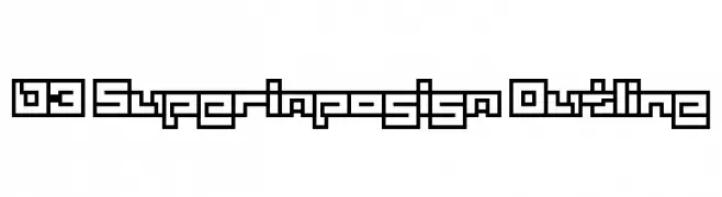
A geometric, maze-like font with bold outlines and a futuristic style.
 Herunterladen 163 Downloads@WebFont
 -
![ThunderCaps Frei Schriftart Herunterladen]() Herunterladen 163 Downloads@WebFont
Herunterladen 163 Downloads@WebFont -
( Fonts by www.kimberlygeswein.com - Kimberly Geswein )
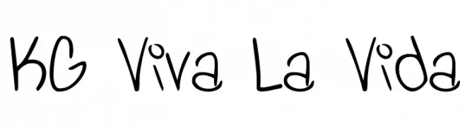
A playful, handwritten font with a casual and friendly appearance.
![KG Viva La Vida Frei Schriftart Herunterladen]() Herunterladen 163 Downloads@WebFont
Herunterladen 163 Downloads@WebFont -
( Fonts by Scratchones )
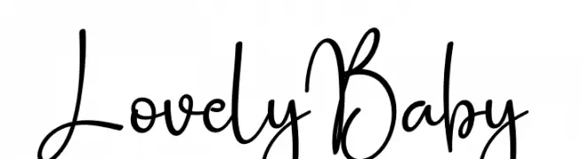
A playful, whimsical handwritten font with flowing, interconnected letterforms.
![Lovely Baby Frei Schriftart Herunterladen]() Herunterladen 163 Downloads@WebFont
Herunterladen 163 Downloads@WebFont -
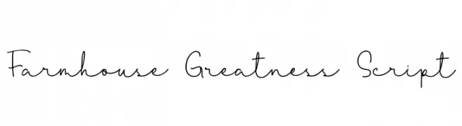
( Fonts by Qwrtype Foundry )
Playful handwritten script font.
![Farmhouse Greatness Script Frei Schriftart Herunterladen]() Herunterladen 163 Downloads@WebFont
Herunterladen 163 Downloads@WebFont -
-
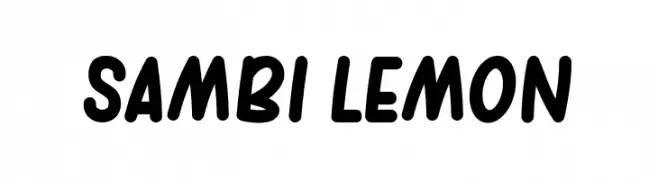
( Fonts by Rahagita Type )
A playful, bold font with rounded edges and a dynamic slant.
![sambi lemon Frei Schriftart Herunterladen]() Herunterladen 163 Downloads@WebFont
Herunterladen 163 Downloads@WebFont -
( Fonts by wep )
A bold, distressed font with a pixelated, rugged texture.
![Cubic Pixel Frei Schriftart Herunterladen]() Herunterladen 163 Downloads@WebFont
Herunterladen 163 Downloads@WebFont -
( Fonts by Daniel Zadorozny - www.iconian.com - Free for personal use )
A dynamic italic font with elegant curves and sharp angles.
![Justinian 2 Italic Frei Schriftart Herunterladen]() Herunterladen 163 Downloads@WebFont
Herunterladen 163 Downloads@WebFont -
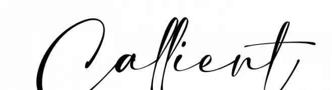
( Fonts by Riyadh Rahman )
Elegant handwritten script font.
![Callient Frei Schriftart Herunterladen]() Herunterladen 163 Downloads@WebFont
Herunterladen 163 Downloads@WebFont -
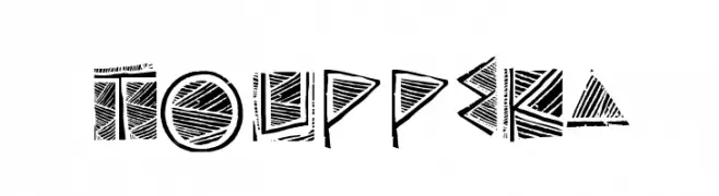
( Fonts by Galdino Otten - galdinootten.com )
A bold, geometric font with a tribal aesthetic and intricate line patterns.
![Touppeka Frei Schriftart Herunterladen]() Herunterladen 163 Downloads@WebFont
Herunterladen 163 Downloads@WebFont

Welche Schriften sind gerade am populärsten?
Poppins, Roboto, Montserrat, Open Sans und Lato sind wegen ihrer klaren Formen und breiten Einsetzbarkeit sehr gefragt – von Markenauftritt über Landingpages bis hin zu Postern.
Welche Fonts eignen sich für Logos?
Geometrische Sans‑Serifs (z. B. Poppins, Familien im Gotham‑Stil) sind ein häufiger Griff für sauberes, skalierbares Branding. Für eine persönlichere Note bleiben Scripts und Handschrift‑Stile beliebt. Kombinieren Sie einen prägnanten Headline‑Font mit einer neutralen Brotschrift für Wiedererkennung und Harmonie.
Wie oft wird die Top‑Liste aktualisiert?
Regelmäßig – basierend auf realen Downloads und Interaktionen. Schauen Sie öfter vorbei, um aufstrebende Favoriten früh zu entdecken.
💡 Tipp: Seite bookmarken – Trends wechseln schnell, und heutige Top‑Schriften inspirieren morgen vielleicht das Rebranding.