Willkommen bei den Top‑Schriften – hier treffen Beliebtheit und Qualität aufeinander. Das sind die in diesem Jahr am häufigsten heruntergeladenen und genutzten Fonts. Wenn Sie sichere Optionen für Logo, Web oder Social suchen, starten Sie hier.
Jeder Top‑Font überzeugt durch Balance, Lesbarkeit und Vielseitigkeit. Sie finden moderne Sans‑Serifs, elegante Scripts, Vintage‑Serifs und minimalistische Displays.
-
( Fonts by Galdino Otten - galdinootten.com )
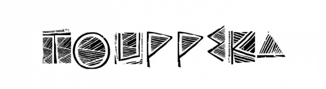
A bold, geometric font with a tribal aesthetic and intricate line patterns.
 Herunterladen 164 Downloads@WebFont
 -
( Fonts by Manfred Klein. Free for private and charity use. Free for commercial with donation to organizations )
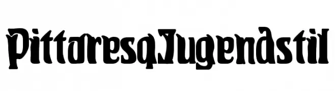
A bold, decorative font inspired by the Jugendstil movement, featuring intricate and artistic letterforms.
![PittoresqJugendstil Frei Schriftart Herunterladen]() Herunterladen 164 Downloads@WebFont
Herunterladen 164 Downloads@WebFont -
( Fonts by www.chequered.ink - Chequered Ink - Personal-use only. For commercial use please contact owner. )
A bold, geometric font with sharp angles and a blocky design.
![Qui Finn Frei Schriftart Herunterladen]() Herunterladen 164 Downloads@WebFont
Herunterladen 164 Downloads@WebFont -
( Fonts by Manfred Klein. Free for private and charity use. Free for commercial with donation to organizations )
Silhouette font using animals and humans to form each character.
![AnimalsMeetings Frei Schriftart Herunterladen]() Herunterladen 164 Downloads@WebFont
Herunterladen 164 Downloads@WebFont -
( Typodermic Fonts - Ray Larabie - www.typodermicfonts.com/ )
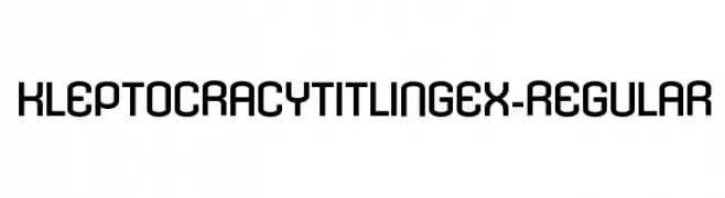
A bold, geometric font with a modern and balanced design.
![KleptocracyTitlingEx-Regular Frei Schriftart Herunterladen]() Herunterladen 164 Downloads@WebFont
Herunterladen 164 Downloads@WebFont -
-
![Dopefish Frei Schriftart Herunterladen]() Herunterladen 164 Downloads@WebFont
Herunterladen 164 Downloads@WebFont -
![cannon ball Frei Schriftart Herunterladen]() Herunterladen 164 Downloads@WebFont
Herunterladen 164 Downloads@WebFont -
( Fonts by share font )
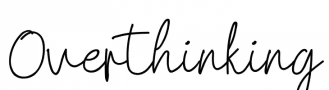
Casual handwritten script font.
![Overthinking Frei Schriftart Herunterladen]() Herunterladen 164 Downloads@WebFont
Herunterladen 164 Downloads@WebFont -
( Fonts by Des Gomez )
A playful, handwritten font with tall, narrow letters and a whimsical style.
![GuiltTrip Frei Schriftart Herunterladen]() Herunterladen 164 Downloads@WebFont
Herunterladen 164 Downloads@WebFont -
![CrashNumbering-Serif Frei Schriftart Herunterladen]() Herunterladen 164 Downloads@WebFont
Herunterladen 164 Downloads@WebFont


Welche Schriften sind gerade am populärsten?
Poppins, Roboto, Montserrat, Open Sans und Lato sind wegen ihrer klaren Formen und breiten Einsetzbarkeit sehr gefragt – von Markenauftritt über Landingpages bis hin zu Postern.
Welche Fonts eignen sich für Logos?
Geometrische Sans‑Serifs (z. B. Poppins, Familien im Gotham‑Stil) sind ein häufiger Griff für sauberes, skalierbares Branding. Für eine persönlichere Note bleiben Scripts und Handschrift‑Stile beliebt. Kombinieren Sie einen prägnanten Headline‑Font mit einer neutralen Brotschrift für Wiedererkennung und Harmonie.
Wie oft wird die Top‑Liste aktualisiert?
Regelmäßig – basierend auf realen Downloads und Interaktionen. Schauen Sie öfter vorbei, um aufstrebende Favoriten früh zu entdecken.
💡 Tipp: Seite bookmarken – Trends wechseln schnell, und heutige Top‑Schriften inspirieren morgen vielleicht das Rebranding.