Willkommen bei den Top‑Schriften – hier treffen Beliebtheit und Qualität aufeinander. Das sind die in diesem Jahr am häufigsten heruntergeladenen und genutzten Fonts. Wenn Sie sichere Optionen für Logo, Web oder Social suchen, starten Sie hier.
Jeder Top‑Font überzeugt durch Balance, Lesbarkeit und Vielseitigkeit. Sie finden moderne Sans‑Serifs, elegante Scripts, Vintage‑Serifs und minimalistische Displays.
-
( Fonts by Castcraft Software - opti.netii.net - check the website before use )
A modern, clean typeface with balanced structure and excellent readability.
 Herunterladen 727 Downloads@WebFont
 -
( Fonts by Arkandis Digital Foundry )
A classic serif font with elegant strokes and refined proportions.
![AccanthisADFStd-Regular Frei Schriftart Herunterladen]() Herunterladen 727 Downloads@WebFont
Herunterladen 727 Downloads@WebFont -
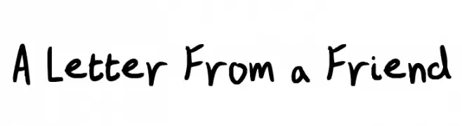
![A Letter From a Friend Frei Schriftart Herunterladen]() Herunterladen 727 Downloads@WebFont
Herunterladen 727 Downloads@WebFont -
( https://www.facebook.com/lina.mache )
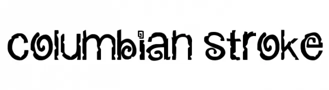
A bold, decorative font with intricate and artistic design elements.
![columbian stroke Frei Schriftart Herunterladen]() Herunterladen 727 Downloads@WebFont
Herunterladen 727 Downloads@WebFont -
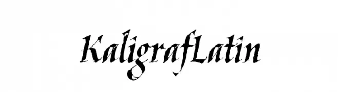
![KaligrafLatin Frei Schriftart Herunterladen]() Herunterladen 727 Downloads@WebFont
Herunterladen 727 Downloads@WebFont -
( Fonts by Bolt Cutter - www.boltcutterdesign.com - Personal-use only. For commercial use please contact owner. )
Intricate ornamental designs featuring floral motifs and elegant flourishes.
![Eutemia Ornaments Frei Schriftart Herunterladen]() Herunterladen 727 Downloads@WebFont
Herunterladen 727 Downloads@WebFont -
( Fonts by Daniel Zadorozny - www.iconian.com )
A bold, italicized font with a futuristic and dynamic design.
![Radio Space Bold Italic Frei Schriftart Herunterladen]() Herunterladen 727 Downloads@WebFont
Herunterladen 727 Downloads@WebFont -
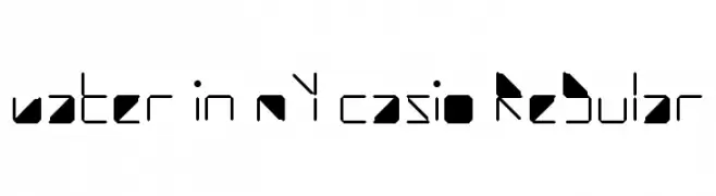
![water in my casio Regular Frei Schriftart Herunterladen]() Herunterladen 727 Downloads@WebFont
Herunterladen 727 Downloads@WebFont -
( Fonts by Andrew Hart - dirt2.com )
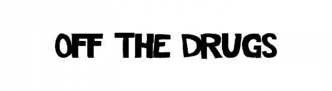
A bold, playful font with a hand-drawn, informal style.
![Off The Drugs Frei Schriftart Herunterladen]() Herunterladen 727 Downloads@WebFont
Herunterladen 727 Downloads@WebFont -
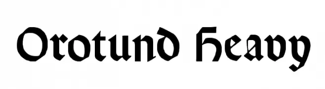
![Orotund Heavy Frei Schriftart Herunterladen]() Herunterladen 727 Downloads@WebFont
Herunterladen 727 Downloads@WebFont -
( Fonts by yusukekamiyamane.com )
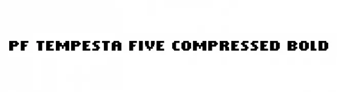
A bold, compressed, pixelated font with a modern digital aesthetic.
![PF Tempesta Five Compressed Bold Frei Schriftart Herunterladen]() Herunterladen 727 Downloads@WebFont
Herunterladen 727 Downloads@WebFont -
( THESE ARE SHAREWARE FONTS ! NOT FREEWARE ! PLEASE VISIT www.fuelfonts.com )
A bold, playful font with thick, rounded strokes and a hand-drawn feel.
![Cake! Frei Schriftart Herunterladen]() Herunterladen 727 Downloads@WebFont
Herunterladen 727 Downloads@WebFont -
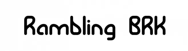
![Rambling BRK Frei Schriftart Herunterladen]() Herunterladen 727 Downloads@WebFont
Herunterladen 727 Downloads@WebFont -
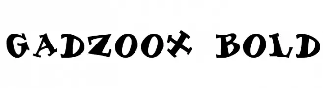
![Gadzoox Bold Frei Schriftart Herunterladen]() Herunterladen 727 Downloads@WebFont
Herunterladen 727 Downloads@WebFont -
( Fonts by AM Designs )
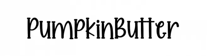
A playful, handwritten font with a whimsical and elegant style.
![Pumpkin Butter Frei Schriftart Herunterladen]() Herunterladen 726 Downloads@WebFont
Herunterladen 726 Downloads@WebFont -
( Fonts by Gilar Studio )
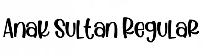
A playful, hand-drawn font with bold, rounded characters.
![Anak Sultan Regular Frei Schriftart Herunterladen]() Herunterladen 726 Downloads@WebFont
Herunterladen 726 Downloads@WebFont -
( Fonts by S. John Ross - Cumberland Fontworks - fonts.cumberlandgames.com - Personal-use only. For commercial use please contact owner. )
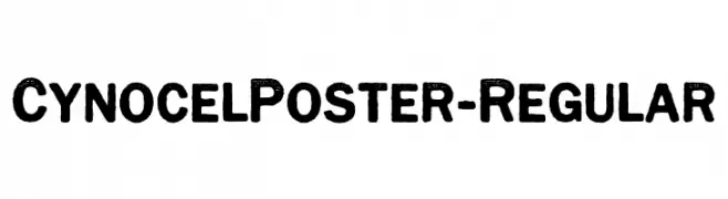
A bold, textured font with a vintage, rugged style.
![CynocelPoster-Regular Frei Schriftart Herunterladen]() Herunterladen 726 Downloads@WebFont
Herunterladen 726 Downloads@WebFont -
![Avatarock Frei Schriftart Herunterladen]() Herunterladen 726 Downloads@WebFont
Herunterladen 726 Downloads@WebFont -
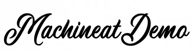
( Wacaksara Co - www.wacaksara.co )
An elegant and flowing script font with classic cursive letterforms.
![MachineatDemo Frei Schriftart Herunterladen]() Herunterladen 726 Downloads@WebFont
Herunterladen 726 Downloads@WebFont -
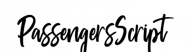
( Pathero Studio - www.patherostudio.com )
A bold, dynamic script font with flowing, interconnected strokes.
![PassengersScript Frei Schriftart Herunterladen]() Herunterladen 726 Downloads@WebFont
Herunterladen 726 Downloads@WebFont -
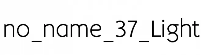
( Igor Kosinsky - www.behance.net/Pj154 )
A modern, clean sans-serif font with balanced spacing and consistent stroke width.
![no_name_37_Light Frei Schriftart Herunterladen]() Herunterladen 726 Downloads@WebFont
Herunterladen 726 Downloads@WebFont -
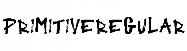
![Primitive Regular Frei Schriftart Herunterladen]() Herunterladen 726 Downloads@WebFont
Herunterladen 726 Downloads@WebFont -
( Fonts by www.peter-wiegel.de. Personal-use only. For commercial use please contact owner. )
A playful, decorative font with bold, rounded characters and whimsical flair.
![Gloria Frei Schriftart Herunterladen]() Herunterladen 726 Downloads@WebFont
Herunterladen 726 Downloads@WebFont -
( Fonts by Chris Simpkins )
A bold, oblique font with a modern and dynamic appearance.
![Hack Bold Oblique Frei Schriftart Herunterladen]() Herunterladen 726 Downloads@WebFont
Herunterladen 726 Downloads@WebFont -
( Fonts by Daniel Zadorozny - www.iconian.com - Free for personal use )
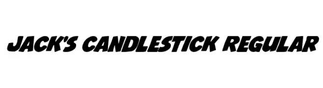
A bold, dynamic font with rounded edges and a playful, energetic style.
![Jack's Candlestick Regular Frei Schriftart Herunterladen]() Herunterladen 726 Downloads@WebFont
Herunterladen 726 Downloads@WebFont -
( Fonts by Sam Wang )
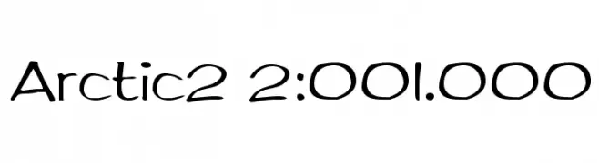
A playful, hand-drawn style font with rounded, flowing characters.
![Arctic2 2:001.000 Frei Schriftart Herunterladen]() Herunterladen 726 Downloads@WebFont
Herunterladen 726 Downloads@WebFont -
( Fonts by Arkandis Digital Foundry )
A bold, modern font with clean lines and a strong presence.
![UniversalisADFStd-BoldCond Frei Schriftart Herunterladen]() Herunterladen 726 Downloads@WebFont
Herunterladen 726 Downloads@WebFont -
( fb.me/dexsar.harry )
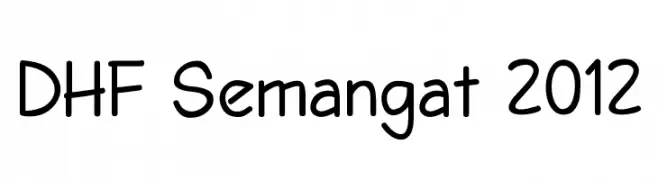
A playful, rounded font with smooth curves and a casual, friendly appearance.
![DHF Semangat 2012 Frei Schriftart Herunterladen]() Herunterladen 726 Downloads@WebFont
Herunterladen 726 Downloads@WebFont -
( Fonts by www.kimberlygeswein.com - Kimberly Geswein )
A playful and whimsical font with quirky, irregular letterforms and unique flair.
![Janda Quirkygirl Frei Schriftart Herunterladen]() Herunterladen 726 Downloads@WebFont
Herunterladen 726 Downloads@WebFont -
( Copyright (c) 2011, Dario Manuel Muhafara (http://www.tipo.net.ar) )
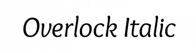
A playful, italicized font with smooth, rounded characters.
![Overlock Italic Frei Schriftart Herunterladen]() Herunterladen 726 Downloads@WebFont
Herunterladen 726 Downloads@WebFont -
![Kylie X Font Frei Schriftart Herunterladen]() Herunterladen 726 Downloads@WebFont
Herunterladen 726 Downloads@WebFont -
( Fonts by www.blambot.com )
A bold, italic font with sharp angles and dynamic energy.
![CrashLanding BB Italic Frei Schriftart Herunterladen]() Herunterladen 726 Downloads@WebFont
Herunterladen 726 Downloads@WebFont -
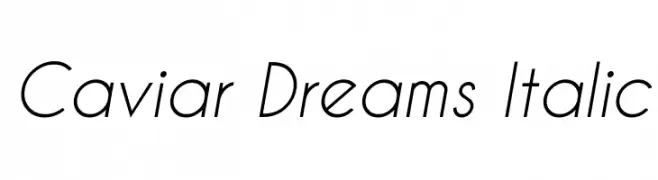
( Fonts by Lauren Thompson - www.nymfont.com )
A sleek, modern italic font with clean lines and balanced proportions.
![Caviar Dreams Italic Frei Schriftart Herunterladen]() Herunterladen 726 Downloads@WebFont
Herunterladen 726 Downloads@WebFont -
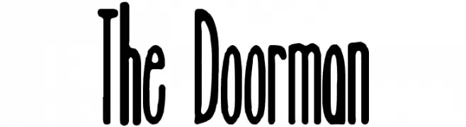
( Free for a personal use. For a commercial use please visit www.kevinandamanda.com )
A decorative font with elongated, narrow letterforms and high contrast strokes.
![The Doorman Frei Schriftart Herunterladen]() Herunterladen 726 Downloads@WebFont
Herunterladen 726 Downloads@WebFont -
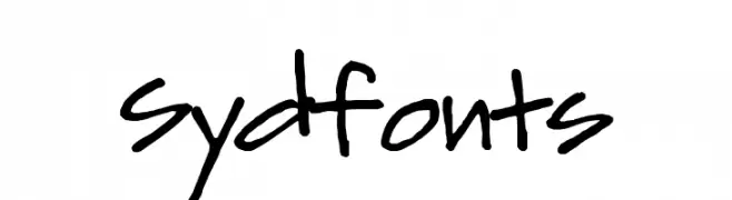
( Fonts by Syed Hakim Omar )
A bold, energetic handwritten font with playful, irregular strokes.
![Sydfonts Frei Schriftart Herunterladen]() Herunterladen 726 Downloads@WebFont
Herunterladen 726 Downloads@WebFont


Welche Schriften sind gerade am populärsten?
Poppins, Roboto, Montserrat, Open Sans und Lato sind wegen ihrer klaren Formen und breiten Einsetzbarkeit sehr gefragt – von Markenauftritt über Landingpages bis hin zu Postern.
Welche Fonts eignen sich für Logos?
Geometrische Sans‑Serifs (z. B. Poppins, Familien im Gotham‑Stil) sind ein häufiger Griff für sauberes, skalierbares Branding. Für eine persönlichere Note bleiben Scripts und Handschrift‑Stile beliebt. Kombinieren Sie einen prägnanten Headline‑Font mit einer neutralen Brotschrift für Wiedererkennung und Harmonie.
Wie oft wird die Top‑Liste aktualisiert?
Regelmäßig – basierend auf realen Downloads und Interaktionen. Schauen Sie öfter vorbei, um aufstrebende Favoriten früh zu entdecken.
💡 Tipp: Seite bookmarken – Trends wechseln schnell, und heutige Top‑Schriften inspirieren morgen vielleicht das Rebranding.