Willkommen bei den Top‑Schriften – hier treffen Beliebtheit und Qualität aufeinander. Das sind die in diesem Jahr am häufigsten heruntergeladenen und genutzten Fonts. Wenn Sie sichere Optionen für Logo, Web oder Social suchen, starten Sie hier.
Jeder Top‑Font überzeugt durch Balance, Lesbarkeit und Vielseitigkeit. Sie finden moderne Sans‑Serifs, elegante Scripts, Vintage‑Serifs und minimalistische Displays.
-
( Fonts by www.DigitalDreamDesign.net )
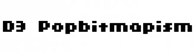
A bold, pixelated font with a retro, 8-bit style.
 Herunterladen 159 Downloads@WebFont
 -
( Fonts by a Max Infeld - XEROGRAPHER FONTS - xerographer.blogspot.com . Personal-use only. For commercial use please contact owner. )
A bold, playful font with a 3D cartoonish style and thick outlines.
![ThirdHand Frei Schriftart Herunterladen]() Herunterladen 159 Downloads@WebFont
Herunterladen 159 Downloads@WebFont -
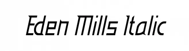
![Eden Mills Italic Frei Schriftart Herunterladen]() Herunterladen 159 Downloads@WebFont
Herunterladen 159 Downloads@WebFont -
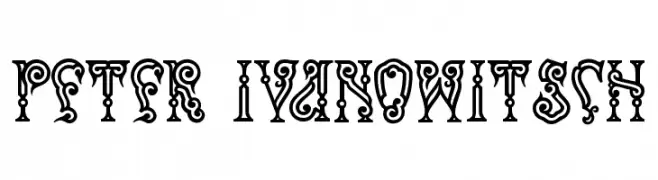
( Fonts by Peter Wiegel - www.peter-wiegel.de - Personal-use only. For commercial use please contact owner. )
An ornate, decorative font with intricate details and bold outlines.
![Peter Ivanowitsch Frei Schriftart Herunterladen]() Herunterladen 159 Downloads@WebFont
Herunterladen 159 Downloads@WebFont -
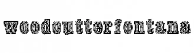
( www.woodcutter.es )
A decorative display typeface with intricate, ornamental patterns.
![woodcutter fontana Frei Schriftart Herunterladen]() Herunterladen 159 Downloads@WebFont
Herunterladen 159 Downloads@WebFont -
-
( Fonts by Misti`s Fonts - mistifonts.com - Personal-use only. For commercial use please contact owner. )
A playful, rounded handwritten font with smooth, consistent strokes.
![Are You Freakin' Serious Frei Schriftart Herunterladen]() Herunterladen 159 Downloads@WebFont
Herunterladen 159 Downloads@WebFont -
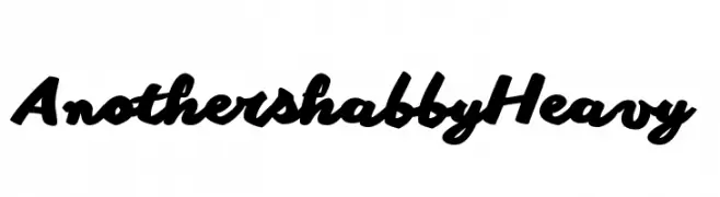
( Fonts by Zetafonts - Personal-use only. For commercial use please contact owner. )
A bold, dynamic script font with a handwritten, fluid style.
![Another shabby Heavy Frei Schriftart Herunterladen]() Herunterladen 159 Downloads@WebFont
Herunterladen 159 Downloads@WebFont -
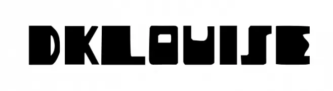
( Fonts by David Kerkhoff - www.hanodedphotography.com )
A bold, geometric font with sharp, angular characters.
![DKLouise Frei Schriftart Herunterladen]() Herunterladen 159 Downloads@WebFont
Herunterladen 159 Downloads@WebFont -
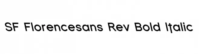
![SF Florencesans Rev Bold Italic Frei Schriftart Herunterladen]() Herunterladen 159 Downloads@WebFont
Herunterladen 159 Downloads@WebFont -
( Fonts by Chris Simpson - Personal-use only. For commercial use please contact owner. )
A sleek, modern, and thin italic font with a sophisticated style.
![Metropolis Thin Italic Frei Schriftart Herunterladen]() Herunterladen 159 Downloads@WebFont
Herunterladen 159 Downloads@WebFont


Welche Schriften sind gerade am populärsten?
Poppins, Roboto, Montserrat, Open Sans und Lato sind wegen ihrer klaren Formen und breiten Einsetzbarkeit sehr gefragt – von Markenauftritt über Landingpages bis hin zu Postern.
Welche Fonts eignen sich für Logos?
Geometrische Sans‑Serifs (z. B. Poppins, Familien im Gotham‑Stil) sind ein häufiger Griff für sauberes, skalierbares Branding. Für eine persönlichere Note bleiben Scripts und Handschrift‑Stile beliebt. Kombinieren Sie einen prägnanten Headline‑Font mit einer neutralen Brotschrift für Wiedererkennung und Harmonie.
Wie oft wird die Top‑Liste aktualisiert?
Regelmäßig – basierend auf realen Downloads und Interaktionen. Schauen Sie öfter vorbei, um aufstrebende Favoriten früh zu entdecken.
💡 Tipp: Seite bookmarken – Trends wechseln schnell, und heutige Top‑Schriften inspirieren morgen vielleicht das Rebranding.