Willkommen bei den Top‑Schriften – hier treffen Beliebtheit und Qualität aufeinander. Das sind die in diesem Jahr am häufigsten heruntergeladenen und genutzten Fonts. Wenn Sie sichere Optionen für Logo, Web oder Social suchen, starten Sie hier.
Jeder Top‑Font überzeugt durch Balance, Lesbarkeit und Vielseitigkeit. Sie finden moderne Sans‑Serifs, elegante Scripts, Vintage‑Serifs und minimalistische Displays.
-
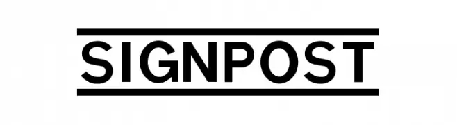
Schriftart von spideraysfonts. For commercial use please contact the owner.
( SIGNPOST )
A bold, geometric font with strong, uniform strokes and modern appeal.
 Herunterladen 719 Downloads@WebFont
 -
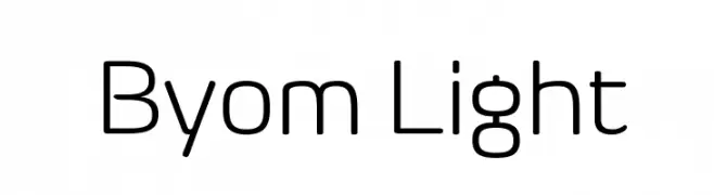
![Byom Light Frei Schriftart Herunterladen]() Herunterladen 719 Downloads@WebFont
Herunterladen 719 Downloads@WebFont -
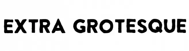
( Fonts by www.fontpanda.com. Personal-use only. For commercial use please contact owner. )
A bold, hand-drawn font with an expressive and artistic style.
![Extra Grotesque Frei Schriftart Herunterladen]() Herunterladen 719 Downloads@WebFont
Herunterladen 719 Downloads@WebFont -
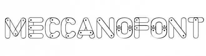
( www.woodcutter.es )
A playful, mechanical-themed font with interconnected lines and nodes.
![Meccano Font Frei Schriftart Herunterladen]() Herunterladen 719 Downloads@WebFont
Herunterladen 719 Downloads@WebFont -
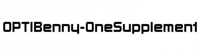
( Fonts by Castcraft Software - opti.netii.net - check the website before use )
A bold, geometric font with a modern and digital aesthetic.
![OPTIBenny-OneSupplement Frei Schriftart Herunterladen]() Herunterladen 719 Downloads@WebFont
Herunterladen 719 Downloads@WebFont -
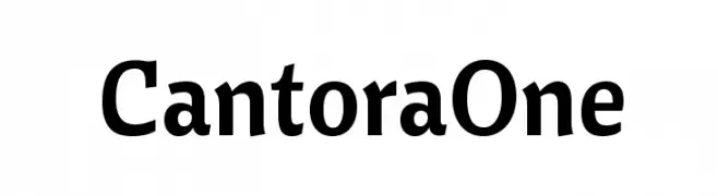
( Copyright (c) 2011, Pablo Impallari (www.impallari.com|impallari@gmail.com) )
A bold, modern font with a strong presence and classic elegance.
![CantoraOne Frei Schriftart Herunterladen]() Herunterladen 719 Downloads@WebFont
Herunterladen 719 Downloads@WebFont -
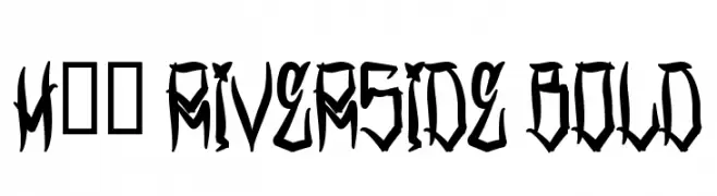
( Fonts by www.legacyofdefeat.com )
A bold, edgy font with sharp, angular lines and a gothic influence.
![H74 Riverside Bold Frei Schriftart Herunterladen]() Herunterladen 719 Downloads@WebFont
Herunterladen 719 Downloads@WebFont -
( Fonts by Mans Greback - www.mawns.com )
An elegant script font with flowing, interconnected letters and intricate swashes.
![Shipped Goods 2 [Personal Use] Frei Schriftart Herunterladen]() Herunterladen 719 Downloads@WebFont
Herunterladen 719 Downloads@WebFont -
( Fonts by softerviews.org )
A classic serif typeface with elegant proportions and refined details.
![Garava Frei Schriftart Herunterladen]() Herunterladen 719 Downloads@WebFont
Herunterladen 719 Downloads@WebFont -
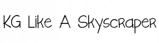
( Fonts by www.kimberlygeswein.com - Kimberly Geswein )
A playful, handwritten font with a tall, narrow structure and consistent stroke thickness.
![KG Like A Skyscraper Frei Schriftart Herunterladen]() Herunterladen 719 Downloads@WebFont
Herunterladen 719 Downloads@WebFont -
( Fonts by www.gust.org.pl )
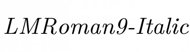
An elegant italic serif font with refined curves and classic style.
![LMRoman9-Italic Frei Schriftart Herunterladen]() Herunterladen 719 Downloads@WebFont
Herunterladen 719 Downloads@WebFont -
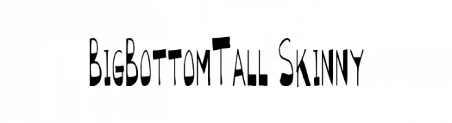
![BigBottomTall Skinny Frei Schriftart Herunterladen]() Herunterladen 719 Downloads@WebFont
Herunterladen 719 Downloads@WebFont -
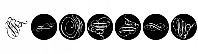
( Fonts by Manfred Klein. Free for private and charity use. Free for commercial with donation to organizations )
An artistic and decorative font with intricate loops and swirls.
![Kringel Frei Schriftart Herunterladen]() Herunterladen 719 Downloads@WebFont
Herunterladen 719 Downloads@WebFont -
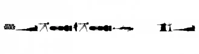
![StarWars Kit Frei Schriftart Herunterladen]() Herunterladen 719 Downloads@WebFont
Herunterladen 719 Downloads@WebFont -
( Fonts by Emeralda Noor Achni Halilintar - emeraldanoorachni.tk )
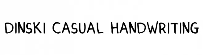
A casual, playful handwriting-style font with rounded characters.
![DINSKI CASUAL HANDWRITING Frei Schriftart Herunterladen]() Herunterladen 719 Downloads@WebFont
Herunterladen 719 Downloads@WebFont -
![Sickness Frei Schriftart Herunterladen]() Herunterladen 719 Downloads@WebFont
Herunterladen 719 Downloads@WebFont -
( Fonts by ShyFonts )
A bold, pixelated font with a retro digital aesthetic.
![SF Pixelate Bold Frei Schriftart Herunterladen]() Herunterladen 719 Downloads@WebFont
Herunterladen 719 Downloads@WebFont -
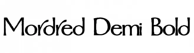
![Mordred Demi Bold Frei Schriftart Herunterladen]() Herunterladen 719 Downloads
Herunterladen 719 Downloads -
( Fonts by Graham Meade - GemFonts )
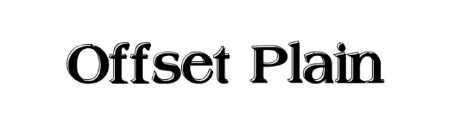
A bold, three-dimensional font with strong shadowing effects.
![Offset Plain Frei Schriftart Herunterladen]() Herunterladen 719 Downloads@WebFont
Herunterladen 719 Downloads@WebFont -
( Fonts by Spork Thug Typography - Josh Wilhelm - www.lifewithouttaffy.com/taffy/blog )
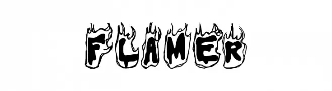
A bold, flame-themed decorative font perfect for dynamic and energetic designs.
![Flamer Frei Schriftart Herunterladen]() Herunterladen 719 Downloads@WebFont
Herunterladen 719 Downloads@WebFont -
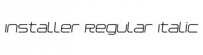
![Installer Regular Italic Frei Schriftart Herunterladen]() Herunterladen 719 Downloads@WebFont
Herunterladen 719 Downloads@WebFont -
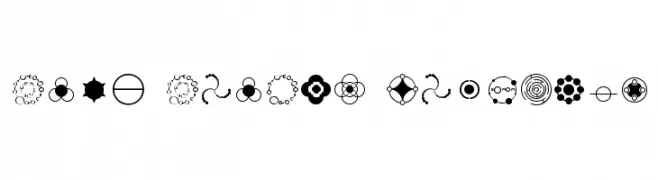
![Crop Circle Dingbats Frei Schriftart Herunterladen]() Herunterladen 719 Downloads@WebFont
Herunterladen 719 Downloads@WebFont -
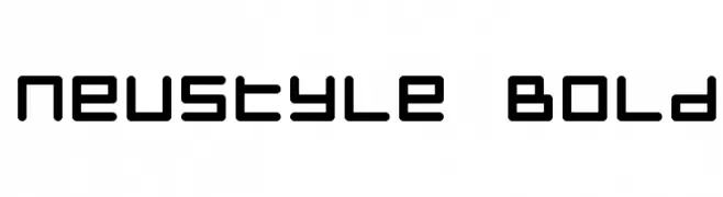
![Neustyle Bold Frei Schriftart Herunterladen]() Herunterladen 719 Downloads@WebFont
Herunterladen 719 Downloads@WebFont -
( Fonts by Rob Dobi - Toxic Type - www.dobi.nu )
A distressed, grunge-style font with a textured, weathered appearance.
![Blasphemy Frei Schriftart Herunterladen]() Herunterladen 719 Downloads@WebFont
Herunterladen 719 Downloads@WebFont -
( Fonts by BLKBK Fonts - www.blkbk.shop - Personal-use only. For commercial use please contact owner. Sponsoren Schriftart )
A dynamic and energetic handwritten font with fluid cursive strokes.
![Free Spirit Frei Schriftart Herunterladen]() Herunterladen 718 Downloads
Herunterladen 718 Downloads -
( Fonts by Namara Creative Studio - Personal-use only. For commercial use please contact owner. )
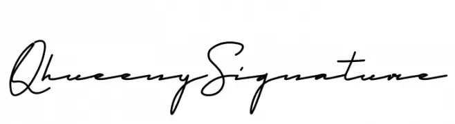
A sophisticated, elegant handwritten font with fluid, connected letterforms.
![Qhueeny Signature Frei Schriftart Herunterladen]() Herunterladen 718 Downloads@WebFont
Herunterladen 718 Downloads@WebFont -
( Fonts by Philipp Nurullin )
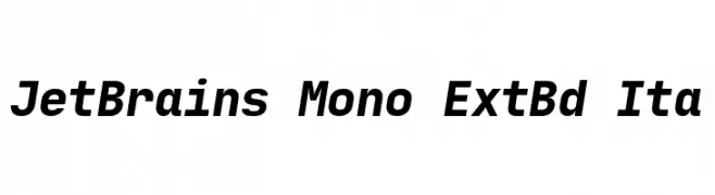
A modern, monospaced font with bold, italic styling and high contrast.
![JetBrains Mono ExtBd Ita Frei Schriftart Herunterladen]() Herunterladen 718 Downloads@WebFont
Herunterladen 718 Downloads@WebFont -
( Fonts by Bangkit Tri Setiadi )
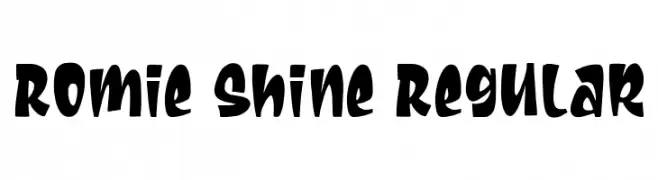
A playful, bold font with thick, rounded strokes and whimsical curves.
![Romie Shine Regular Frei Schriftart Herunterladen]() Herunterladen 718 Downloads@WebFont
Herunterladen 718 Downloads@WebFont -
( weknow - Wino S Kadir - www.creativefabrica.com/designer/weknow/ )
A modern, hollow font with a neon glow effect and rounded edges.
![NEON GLOW-Hollow Frei Schriftart Herunterladen]() Herunterladen 718 Downloads@WebFont
Herunterladen 718 Downloads@WebFont -
( Fonts by Luke Owens - Personal-use only. For commercial use please contact owner. )
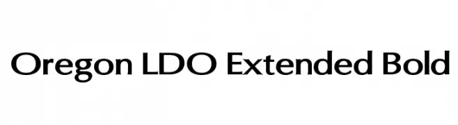
A bold, extended font with a modern and clean design, perfect for impactful headlines and branding.
![Oregon LDO Extended Bold Frei Schriftart Herunterladen]() Herunterladen 718 Downloads@WebFont
Herunterladen 718 Downloads@WebFont -
![NCAA Hawaii Rainbow Warriors 2 Frei Schriftart Herunterladen]() Herunterladen 718 Downloads@WebFont
Herunterladen 718 Downloads@WebFont -
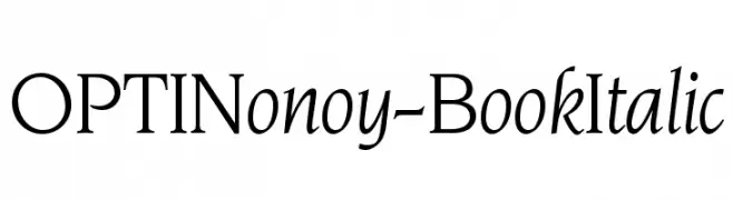
( Fonts by Castcraft Software - OPTI Fonts Archive - opti.netii.net - Personal-use only. For commercial use please contact owner. )
An elegant serif font with a classic italic style, perfect for formal use.
![OPTINonoy-BookItalic Frei Schriftart Herunterladen]() Herunterladen 718 Downloads@WebFont
Herunterladen 718 Downloads@WebFont -
![Saarland Frei Schriftart Herunterladen]() Herunterladen 718 Downloads@WebFont
Herunterladen 718 Downloads@WebFont -
![KaBoom New Frei Schriftart Herunterladen]() Herunterladen 718 Downloads@WebFont
Herunterladen 718 Downloads@WebFont -
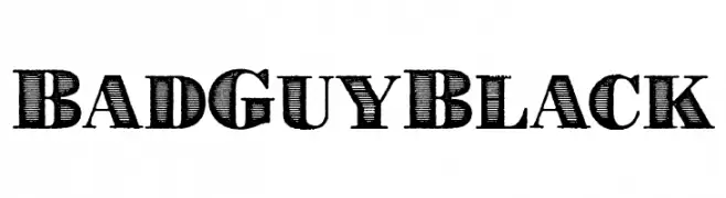
( Fonts by Cumberland Fontworks )
A bold, vintage serif font with intricate line details and a classic appeal.
![BadGuyBlack Frei Schriftart Herunterladen]() Herunterladen 718 Downloads@WebFont
Herunterladen 718 Downloads@WebFont
![Shipped Goods 2 [Personal Use] Frei Schriftart Herunterladen](https://d144mzi0q5mijx.cloudfront.net/img/S/H/Shipped-Goods-2-Personal-Use.webp)


Welche Schriften sind gerade am populärsten?
Poppins, Roboto, Montserrat, Open Sans und Lato sind wegen ihrer klaren Formen und breiten Einsetzbarkeit sehr gefragt – von Markenauftritt über Landingpages bis hin zu Postern.
Welche Fonts eignen sich für Logos?
Geometrische Sans‑Serifs (z. B. Poppins, Familien im Gotham‑Stil) sind ein häufiger Griff für sauberes, skalierbares Branding. Für eine persönlichere Note bleiben Scripts und Handschrift‑Stile beliebt. Kombinieren Sie einen prägnanten Headline‑Font mit einer neutralen Brotschrift für Wiedererkennung und Harmonie.
Wie oft wird die Top‑Liste aktualisiert?
Regelmäßig – basierend auf realen Downloads und Interaktionen. Schauen Sie öfter vorbei, um aufstrebende Favoriten früh zu entdecken.
💡 Tipp: Seite bookmarken – Trends wechseln schnell, und heutige Top‑Schriften inspirieren morgen vielleicht das Rebranding.