Willkommen bei den Top‑Schriften – hier treffen Beliebtheit und Qualität aufeinander. Das sind die in diesem Jahr am häufigsten heruntergeladenen und genutzten Fonts. Wenn Sie sichere Optionen für Logo, Web oder Social suchen, starten Sie hier.
Jeder Top‑Font überzeugt durch Balance, Lesbarkeit und Vielseitigkeit. Sie finden moderne Sans‑Serifs, elegante Scripts, Vintage‑Serifs und minimalistische Displays.
-
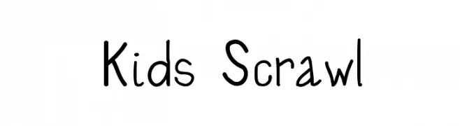
( Fonts by Bree Gorton )
A playful, childlike font with uneven lines and a whimsical style.
 Herunterladen 712 Downloads@WebFont
 -
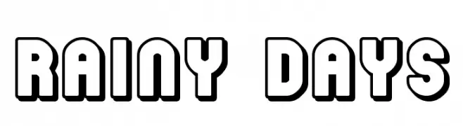
( Fonts by Jacob Fisher - www.pizzadude.dk )
A bold, playful font with rounded, outlined characters.
![Rainy Days Frei Schriftart Herunterladen]() Herunterladen 712 Downloads@WebFont
Herunterladen 712 Downloads@WebFont -
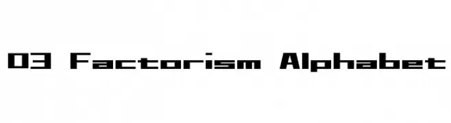
( Fonts by www.DigitalDreamDesign.net )
A bold, geometric font with a modern, futuristic style.
![D3 Factorism Alphabet Frei Schriftart Herunterladen]() Herunterladen 712 Downloads@WebFont
Herunterladen 712 Downloads@WebFont -
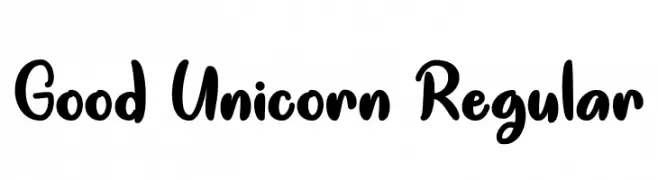
( Fonts by Misti Hammers - mistifonts.com - Personal-use only. For commercial use please contact owner. )
A playful, bold, handwritten-style font with rounded characters.
![Good Unicorn Regular Frei Schriftart Herunterladen]() Herunterladen 711 Downloads@WebFont
Herunterladen 711 Downloads@WebFont -
( Fonts by Fachranheit )
A bold, dramatic font with a strong, comic book-inspired aesthetic.
![BREAKING SPAWN SOLID DEMO Frei Schriftart Herunterladen]() Herunterladen 711 Downloads@WebFont
Herunterladen 711 Downloads@WebFont -
( Fonts by Khurasan )
A playful, rounded font with a hand-drawn, friendly appearance.
![Bulu Kaki Frei Schriftart Herunterladen]() Herunterladen 711 Downloads@WebFont
Herunterladen 711 Downloads@WebFont -
( Fonts by Burhan Afif - hanscostudio.com - Personal-use only. For commercial use please contact owner. )
A bold, playful font with rounded edges and a friendly appearance.
![Stabillo Medium Frei Schriftart Herunterladen]() Herunterladen 711 Downloads@WebFont
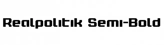
Herunterladen 711 Downloads@WebFont -
![Realpolitik Semi-Bold Frei Schriftart Herunterladen]() Herunterladen 711 Downloads@WebFont
Herunterladen 711 Downloads@WebFont -
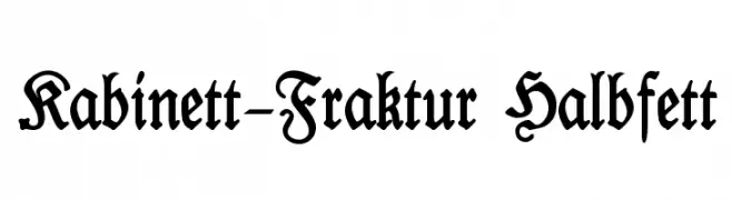
( Fonts by Typographer Mediengestaltung - Personal-use only. For commercial use please contact owner. )
A bold, ornate blackletter font with intricate details and a historical flair.
![Kabinett-Fraktur Halbfett Frei Schriftart Herunterladen]() Herunterladen 711 Downloads@WebFont
Herunterladen 711 Downloads@WebFont -
( LeD - none )
A bold, geometric font with a futuristic and angular design.
![GRADIUS Frei Schriftart Herunterladen]() Herunterladen 711 Downloads@WebFont
Herunterladen 711 Downloads@WebFont -
( Olly Wood - cargocollective.com/ollywood )
A bold, geometric font with sharp angles and a modern style.
![Rodondo Frei Schriftart Herunterladen]() Herunterladen 711 Downloads@WebFont
Herunterladen 711 Downloads@WebFont -
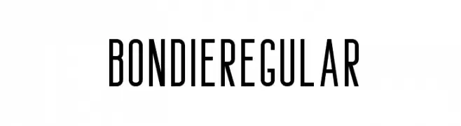
( Craft Supply Co. - creativemarket.com/craftsupplyco )
A tall, narrow, and modern font with clean lines and uniform stroke width.
![Bondie-Regular Frei Schriftart Herunterladen]() Herunterladen 711 Downloads@WebFont
Herunterladen 711 Downloads@WebFont -
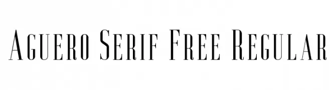
( Craft Supply Co. - creativemarket.com/craftsupplyco )
A refined serif font with tall, narrow letterforms and high contrast strokes.
![Aguero Serif Free Regular Frei Schriftart Herunterladen]() Herunterladen 711 Downloads@WebFont
Herunterladen 711 Downloads@WebFont -
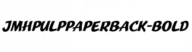
![JMHPulpPaperback-Bold Frei Schriftart Herunterladen]() Herunterladen 711 Downloads@WebFont
Herunterladen 711 Downloads@WebFont -
![Neon Feel Frei Schriftart Herunterladen]() Herunterladen 711 Downloads@WebFont
Herunterladen 711 Downloads@WebFont -
![Memory Inline Frei Schriftart Herunterladen]() Herunterladen 711 Downloads@WebFont
Herunterladen 711 Downloads@WebFont -
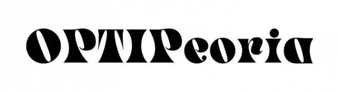
( Fonts by Castcraft Software - OPTI Fonts Archive - opti.netii.net - Personal-use only. For commercial use please contact owner. )
A bold, decorative font with high contrast and intricate details.
![OPTIPeoria Frei Schriftart Herunterladen]() Herunterladen 711 Downloads@WebFont
Herunterladen 711 Downloads@WebFont -
( Fonts by Jonathan S. Harris - www.tattoowoo.com. Personal-use only. For commercial use please contact owner. )
A dynamic, cursive script font with high contrast and elegant flow.
![Early Bird Frei Schriftart Herunterladen]() Herunterladen 711 Downloads@WebFont
Herunterladen 711 Downloads@WebFont -
( Fonts by Daniel Zadorozny - www.iconian.com )
A bold, geometric font with a futuristic and technical aesthetic.
![Eurofighter Title Frei Schriftart Herunterladen]() Herunterladen 711 Downloads@WebFont
Herunterladen 711 Downloads@WebFont -
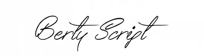
( www.tattoowoo.com )
A flowing, cursive script font with elegant, connected letters and dramatic flourishes.
![Berty Script Frei Schriftart Herunterladen]() Herunterladen 711 Downloads@WebFont
Herunterladen 711 Downloads@WebFont -
( Fonts by Castcraft Software - opti.netii.net - check the website before use )
A classic serif font with elegant details and balanced proportions.
![OPTIHobble-OldStyle Frei Schriftart Herunterladen]() Herunterladen 711 Downloads@WebFont
Herunterladen 711 Downloads@WebFont -
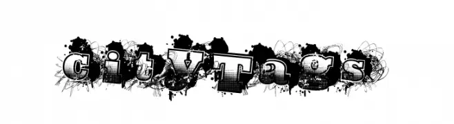
( Fonts by a Max Infeld - XEROGRAPHER FONTS - xerographer.blogspot.com . Personal-use only. For commercial use please contact owner. )
A bold, graffiti-inspired font with an urban, artistic style.
![CityTags Frei Schriftart Herunterladen]() Herunterladen 711 Downloads@WebFont
Herunterladen 711 Downloads@WebFont -
![curved Frei Schriftart Herunterladen]() Herunterladen 711 Downloads@WebFont
Herunterladen 711 Downloads@WebFont -
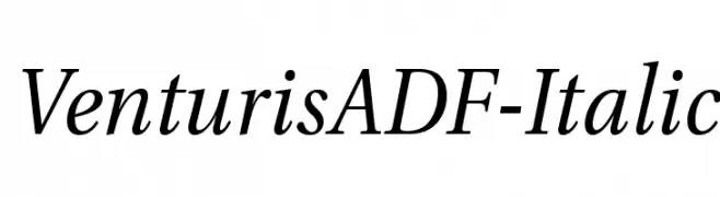
( Fonts by Arkandis Digital Foundry )
An elegant serif italic font with moderate contrast and refined serifs.
![VenturisADF-Italic Frei Schriftart Herunterladen]() Herunterladen 711 Downloads@WebFont
Herunterladen 711 Downloads@WebFont -
( dirtylittlecards.etsy.com )
A dynamic handwritten font with elongated, expressive characters.
![Little SparrowRegular Frei Schriftart Herunterladen]() Herunterladen 711 Downloads@WebFont
Herunterladen 711 Downloads@WebFont -
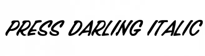
( Fonts by Daniel Zadorozny - www.iconian.com - Free for personal use )
A bold, italicized handwritten font with smooth curves and dynamic slant.
![Press Darling Italic Frei Schriftart Herunterladen]() Herunterladen 711 Downloads@WebFont
Herunterladen 711 Downloads@WebFont -
![Rowling Stone Frei Schriftart Herunterladen]() Herunterladen 711 Downloads@WebFont
Herunterladen 711 Downloads@WebFont -
![Ghost Theory Frei Schriftart Herunterladen]() Herunterladen 711 Downloads@WebFont
Herunterladen 711 Downloads@WebFont -
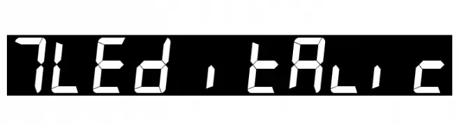
( Fonts by www.philing.net )
A digital display-inspired font with a segmented, italicized style.
![7LED italic Frei Schriftart Herunterladen]() Herunterladen 711 Downloads@WebFont
Herunterladen 711 Downloads@WebFont -
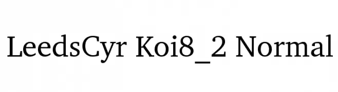
![LeedsCyr Koi8_2 Normal Frei Schriftart Herunterladen]() Herunterladen 711 Downloads
Herunterladen 711 Downloads -
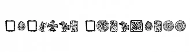
( Fonts by Klaus Johansen - www.listemageren.dK )
A collection of bold, intricate Mexican-inspired ornamental designs.
![Mexican Ornaments Frei Schriftart Herunterladen]() Herunterladen 711 Downloads@WebFont
Herunterladen 711 Downloads@WebFont -
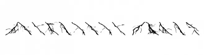
Schriftart von foopy. For commercial use please contact the owner.
![Lightning Bolts Frei Schriftart Herunterladen]() Herunterladen 711 Downloads@WebFont
Herunterladen 711 Downloads@WebFont -
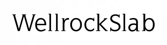
( Fonts by Manfred Klein - manfred-klein.ina-mar.com )
A robust slab serif font with strong, squared serifs and clear readability.
![WellrockSlab Frei Schriftart Herunterladen]() Herunterladen 711 Downloads@WebFont
Herunterladen 711 Downloads@WebFont -
![VladTepes II [Vlads Dad] Frei Schriftart Herunterladen]() Herunterladen 711 Downloads@WebFont
Herunterladen 711 Downloads@WebFont -
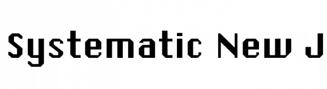
![Systematic New J Frei Schriftart Herunterladen]() Herunterladen 711 Downloads@WebFont
Herunterladen 711 Downloads@WebFont


![VladTepes II [Vlads Dad] Frei Schriftart Herunterladen](https://d144mzi0q5mijx.cloudfront.net/img/V/L/VladTepes-II-Vlads-Dad.webp)
Welche Schriften sind gerade am populärsten?
Poppins, Roboto, Montserrat, Open Sans und Lato sind wegen ihrer klaren Formen und breiten Einsetzbarkeit sehr gefragt – von Markenauftritt über Landingpages bis hin zu Postern.
Welche Fonts eignen sich für Logos?
Geometrische Sans‑Serifs (z. B. Poppins, Familien im Gotham‑Stil) sind ein häufiger Griff für sauberes, skalierbares Branding. Für eine persönlichere Note bleiben Scripts und Handschrift‑Stile beliebt. Kombinieren Sie einen prägnanten Headline‑Font mit einer neutralen Brotschrift für Wiedererkennung und Harmonie.
Wie oft wird die Top‑Liste aktualisiert?
Regelmäßig – basierend auf realen Downloads und Interaktionen. Schauen Sie öfter vorbei, um aufstrebende Favoriten früh zu entdecken.
💡 Tipp: Seite bookmarken – Trends wechseln schnell, und heutige Top‑Schriften inspirieren morgen vielleicht das Rebranding.