Willkommen bei den Top‑Schriften – hier treffen Beliebtheit und Qualität aufeinander. Das sind die in diesem Jahr am häufigsten heruntergeladenen und genutzten Fonts. Wenn Sie sichere Optionen für Logo, Web oder Social suchen, starten Sie hier.
Jeder Top‑Font überzeugt durch Balance, Lesbarkeit und Vielseitigkeit. Sie finden moderne Sans‑Serifs, elegante Scripts, Vintage‑Serifs und minimalistische Displays.
-
 Herunterladen 154 Downloads@WebFont
 -
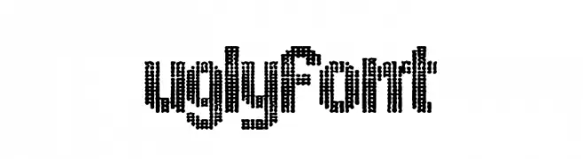
( Fonts by Woodcutter )
A bold, pixelated decorative font with a retro digital aesthetic.
![ugly font Frei Schriftart Herunterladen]() Herunterladen 154 Downloads@WebFont
Herunterladen 154 Downloads@WebFont -
( Fonts by Miss Tiina at www.misstiina.com (please check the website before use) )
A playful, rounded font with smooth curves and a friendly aesthetic.
![MTF Kim Frei Schriftart Herunterladen]() Herunterladen 154 Downloads@WebFont
Herunterladen 154 Downloads@WebFont -
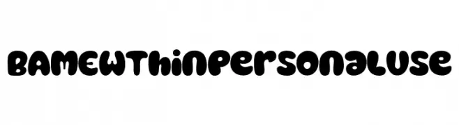
( Fonts by twinletter )
A playful, bold font with rounded, bubble-like characters ideal for fun designs.
![BAMEW Thin Personal Use Frei Schriftart Herunterladen]() Herunterladen 154 Downloads@WebFont
Herunterladen 154 Downloads@WebFont -
![testi Frei Schriftart Herunterladen]() Herunterladen 154 Downloads@WebFont
Herunterladen 154 Downloads@WebFont -
-
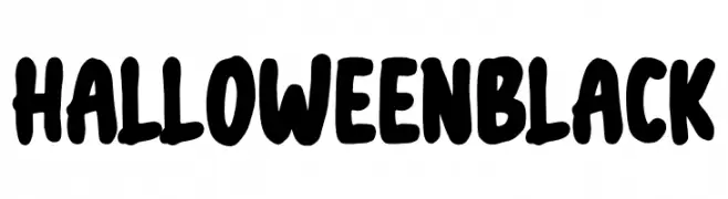
( Fonts by NJ Studio - Personal-use only. For commercial use please contact owner. )
A bold, rounded font with a playful, spooky aesthetic.
![Halloween black Frei Schriftart Herunterladen]() Herunterladen 154 Downloads@WebFont
Herunterladen 154 Downloads@WebFont -
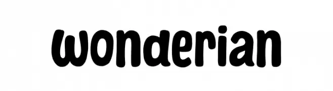
( Fonts by Khurasan™ )
Bold, playful font with rounded edges.
![Wonderian Frei Schriftart Herunterladen]() Herunterladen 154 Downloads@WebFont
Herunterladen 154 Downloads@WebFont -
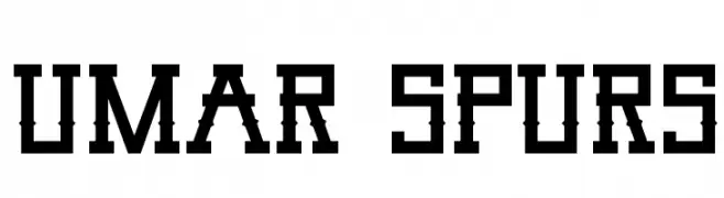
( Mikrojihad Font - fontbundles.net/mikrojihad )
A bold, geometric font with a western-inspired, angular design.
![Umar Spurs Frei Schriftart Herunterladen]() Herunterladen 154 Downloads@WebFont
Herunterladen 154 Downloads@WebFont -
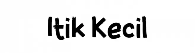
( Fonts by wep )
A bold, playful handwritten font with thick, uneven strokes and a casual style.
![Itik Kecil Frei Schriftart Herunterladen]() Herunterladen 154 Downloads@WebFont
Herunterladen 154 Downloads@WebFont -
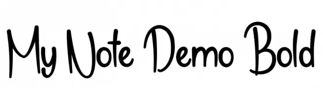
( Fonts by NihStudio )
A playful, casual handwritten font with bold strokes and smooth curves.
![My Note Demo Bold Frei Schriftart Herunterladen]() Herunterladen 154 Downloads@WebFont
Herunterladen 154 Downloads@WebFont


Welche Schriften sind gerade am populärsten?
Poppins, Roboto, Montserrat, Open Sans und Lato sind wegen ihrer klaren Formen und breiten Einsetzbarkeit sehr gefragt – von Markenauftritt über Landingpages bis hin zu Postern.
Welche Fonts eignen sich für Logos?
Geometrische Sans‑Serifs (z. B. Poppins, Familien im Gotham‑Stil) sind ein häufiger Griff für sauberes, skalierbares Branding. Für eine persönlichere Note bleiben Scripts und Handschrift‑Stile beliebt. Kombinieren Sie einen prägnanten Headline‑Font mit einer neutralen Brotschrift für Wiedererkennung und Harmonie.
Wie oft wird die Top‑Liste aktualisiert?
Regelmäßig – basierend auf realen Downloads und Interaktionen. Schauen Sie öfter vorbei, um aufstrebende Favoriten früh zu entdecken.
💡 Tipp: Seite bookmarken – Trends wechseln schnell, und heutige Top‑Schriften inspirieren morgen vielleicht das Rebranding.