Willkommen bei den Top‑Schriften – hier treffen Beliebtheit und Qualität aufeinander. Das sind die in diesem Jahr am häufigsten heruntergeladenen und genutzten Fonts. Wenn Sie sichere Optionen für Logo, Web oder Social suchen, starten Sie hier.
Jeder Top‑Font überzeugt durch Balance, Lesbarkeit und Vielseitigkeit. Sie finden moderne Sans‑Serifs, elegante Scripts, Vintage‑Serifs und minimalistische Displays.
-
( گالری فانت فارسی پژوهش آريانا - only compatible with Farsi and Arabic )
A calligraphic script font with elegant curves and artistic flair.
 Herunterladen 154 Downloads@WebFont
 -
( Fonts by www.woodcutter.es - woodcutter Manero - Personal-use only. For commercial use please contact owner. )
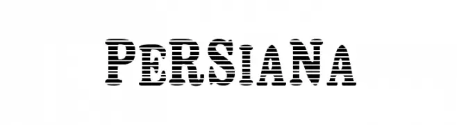
A bold, decorative font with a unique horizontal striped pattern.
![Persiana Frei Schriftart Herunterladen]() Herunterladen 154 Downloads@WebFont
Herunterladen 154 Downloads@WebFont -
( Fonts by Almaz Studio - Anang Widyasworo - Personal-use only. For commercial use please contact owner. )
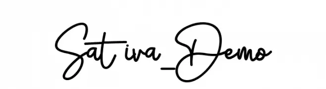
A lively, expressive handwritten font with fluid strokes and a modern feel.
![Sativa_Demo Frei Schriftart Herunterladen]() Herunterladen 154 Downloads@WebFont
Herunterladen 154 Downloads@WebFont -
( Fonts by a Max Infeld - XEROGRAPHER FONTS - xerographer.blogspot.com . Personal-use only. For commercial use please contact owner. )
A bold, handwritten font with a dynamic, brush-like style.
![SmokingParadise Frei Schriftart Herunterladen]() Herunterladen 154 Downloads@WebFont
Herunterladen 154 Downloads@WebFont -
( Fonts by Tan Cundrawan - cove703 - creativemarket.com/cove703 - Personal-use only. For commercial use please contact owner. )
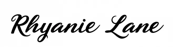
An elegant script font with flowing, connected letters and a classic, sophisticated style.
![Rhyanie Lane Frei Schriftart Herunterladen]() Herunterladen 154 Downloads@WebFont
Herunterladen 154 Downloads@WebFont -
-
( Fonts by Maelle.K - Thomas Boucherie )
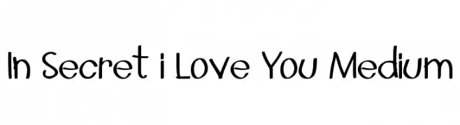
A playful, handwritten font with a casual and informal style.
![In Secret i Love You Medium Frei Schriftart Herunterladen]() Herunterladen 154 Downloads@WebFont
Herunterladen 154 Downloads@WebFont -
( Fonts by CannotIntoSpaceFonts - KineticPlasma Fonts - Personal-use only. For commercial use please contact owner. )
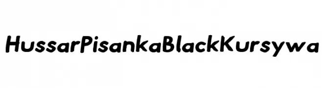
A bold, playful, and slightly cursive font with a handwritten feel.
![Hussar Pisanka Black Kursywa Frei Schriftart Herunterladen]() Herunterladen 154 Downloads@WebFont
Herunterladen 154 Downloads@WebFont -
( TwoNineFive - Maximillian Limpo )
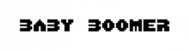
A bold, pixelated font with a retro digital aesthetic.
![Baby Boomer Frei Schriftart Herunterladen]() Herunterladen 154 Downloads@WebFont
Herunterladen 154 Downloads@WebFont -
( Fonts by Arkandis Digital Foundry )
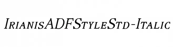
An elegant italic serif font with flowing lines and traditional charm.
![IrianisADFStyleStd-Italic Frei Schriftart Herunterladen]() Herunterladen 154 Downloads@WebFont
Herunterladen 154 Downloads@WebFont -
( Fonts by Wahyu Eka Prasetya - wepfont.com - Personal-use only. For commercial use please contact owner. )
A bold, playful font with a hand-drawn, whimsical style.
![Entah Frei Schriftart Herunterladen]() Herunterladen 154 Downloads@WebFont
Herunterladen 154 Downloads@WebFont


Welche Schriften sind gerade am populärsten?
Poppins, Roboto, Montserrat, Open Sans und Lato sind wegen ihrer klaren Formen und breiten Einsetzbarkeit sehr gefragt – von Markenauftritt über Landingpages bis hin zu Postern.
Welche Fonts eignen sich für Logos?
Geometrische Sans‑Serifs (z. B. Poppins, Familien im Gotham‑Stil) sind ein häufiger Griff für sauberes, skalierbares Branding. Für eine persönlichere Note bleiben Scripts und Handschrift‑Stile beliebt. Kombinieren Sie einen prägnanten Headline‑Font mit einer neutralen Brotschrift für Wiedererkennung und Harmonie.
Wie oft wird die Top‑Liste aktualisiert?
Regelmäßig – basierend auf realen Downloads und Interaktionen. Schauen Sie öfter vorbei, um aufstrebende Favoriten früh zu entdecken.
💡 Tipp: Seite bookmarken – Trends wechseln schnell, und heutige Top‑Schriften inspirieren morgen vielleicht das Rebranding.