Willkommen bei den Top‑Schriften – hier treffen Beliebtheit und Qualität aufeinander. Das sind die in diesem Jahr am häufigsten heruntergeladenen und genutzten Fonts. Wenn Sie sichere Optionen für Logo, Web oder Social suchen, starten Sie hier.
Jeder Top‑Font überzeugt durch Balance, Lesbarkeit und Vielseitigkeit. Sie finden moderne Sans‑Serifs, elegante Scripts, Vintage‑Serifs und minimalistische Displays.
-
( Free for a personal use. For a commercial use please visit www.kevinandamanda.com )
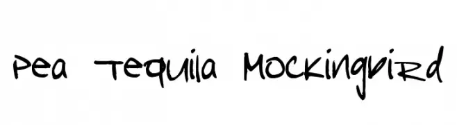
A playful, bold handwritten font with an energetic and casual style.
 Herunterladen 152 Downloads@WebFont
 -
![PIXgothic_7 Frei Schriftart Herunterladen]() Herunterladen 152 Downloads@WebFont
Herunterladen 152 Downloads@WebFont -
( Fonts by Graham Meade - GemFonts )
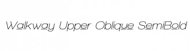
A modern, oblique semi-bold font with geometric precision and low contrast.
![Walkway Upper Oblique SemiBold Frei Schriftart Herunterladen]() Herunterladen 152 Downloads@WebFont
Herunterladen 152 Downloads@WebFont -
( Fonts by Yoga Letter )
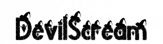
A horror-themed, decorative font with thorny edges and devilish motifs.
![Devil Scream Frei Schriftart Herunterladen]() Herunterladen 152 Downloads@WebFont
Herunterladen 152 Downloads@WebFont -
![CRU-Saowalak-Italic Frei Schriftart Herunterladen]() Herunterladen 152 Downloads@WebFont
Herunterladen 152 Downloads@WebFont -
-
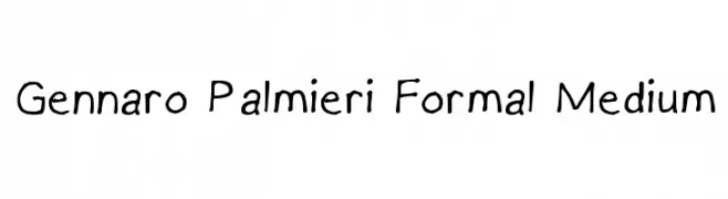
![Gennaro Palmieri Formal Medium Frei Schriftart Herunterladen]() Herunterladen 152 Downloads@WebFont
Herunterladen 152 Downloads@WebFont -
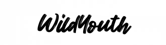
( Fonts by FatmaStudio - Fatmawati - Personal-use only. For commercial use please contact owner. )
A bold, brush-style font with dynamic, expressive strokes.
![Wild Youth Frei Schriftart Herunterladen]() Herunterladen 152 Downloads@WebFont
Herunterladen 152 Downloads@WebFont -
( laritelanjang.net )
A bold, distressed font with a rugged, industrial aesthetic.
![rustyfatty Frei Schriftart Herunterladen]() Herunterladen 152 Downloads@WebFont
Herunterladen 152 Downloads@WebFont -
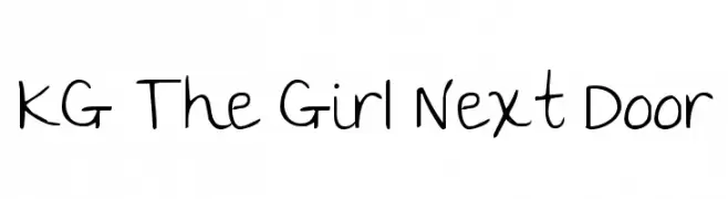
( Fonts by www.kimberlygeswein.com - Kimberly Geswein )
A playful, casual handwritten font with smooth, flowing lines and charming irregularities.
![KG The Girl Next Door Frei Schriftart Herunterladen]() Herunterladen 152 Downloads@WebFont
Herunterladen 152 Downloads@WebFont -
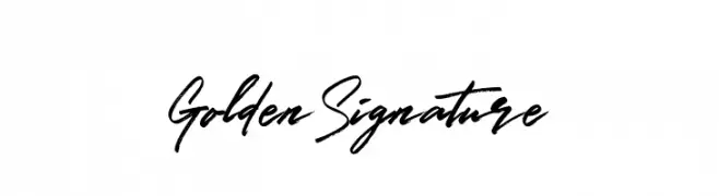
( Fonts by www.selawetype.com - Personal-use only. FOR DONATION https://www.paypal.me/selawe . For commercial use please contact owner. )
A dynamic and elegant handwritten script with fluid, cursive strokes.
![GoldenSignature Frei Schriftart Herunterladen]() Herunterladen 152 Downloads@WebFont
Herunterladen 152 Downloads@WebFont


Welche Schriften sind gerade am populärsten?
Poppins, Roboto, Montserrat, Open Sans und Lato sind wegen ihrer klaren Formen und breiten Einsetzbarkeit sehr gefragt – von Markenauftritt über Landingpages bis hin zu Postern.
Welche Fonts eignen sich für Logos?
Geometrische Sans‑Serifs (z. B. Poppins, Familien im Gotham‑Stil) sind ein häufiger Griff für sauberes, skalierbares Branding. Für eine persönlichere Note bleiben Scripts und Handschrift‑Stile beliebt. Kombinieren Sie einen prägnanten Headline‑Font mit einer neutralen Brotschrift für Wiedererkennung und Harmonie.
Wie oft wird die Top‑Liste aktualisiert?
Regelmäßig – basierend auf realen Downloads und Interaktionen. Schauen Sie öfter vorbei, um aufstrebende Favoriten früh zu entdecken.
💡 Tipp: Seite bookmarken – Trends wechseln schnell, und heutige Top‑Schriften inspirieren morgen vielleicht das Rebranding.