Willkommen bei den Top‑Schriften – hier treffen Beliebtheit und Qualität aufeinander. Das sind die in diesem Jahr am häufigsten heruntergeladenen und genutzten Fonts. Wenn Sie sichere Optionen für Logo, Web oder Social suchen, starten Sie hier.
Jeder Top‑Font überzeugt durch Balance, Lesbarkeit und Vielseitigkeit. Sie finden moderne Sans‑Serifs, elegante Scripts, Vintage‑Serifs und minimalistische Displays.
-
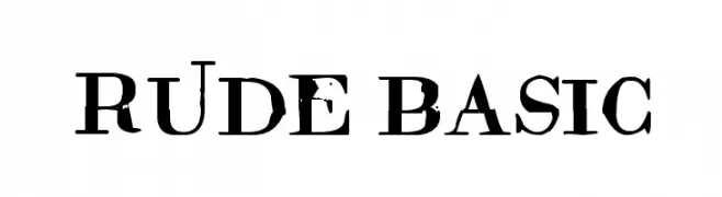
( Fonts by Woodcutter )
A bold, distressed serif font with a rugged, grunge-like appearance.
 Herunterladen 151 Downloads@WebFont
 -
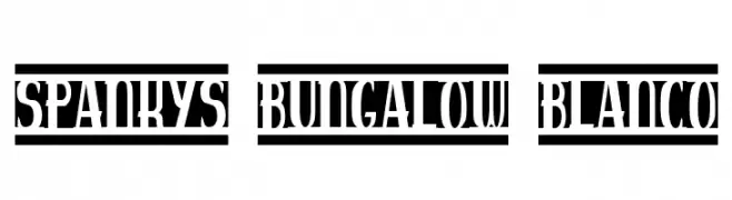
( Fonts by Emerald City Fontwerks )
A bold, stencil-like font with thick, blocky strokes and sharp edges.
![spankys bungalow blanco Frei Schriftart Herunterladen]() Herunterladen 151 Downloads@WebFont
Herunterladen 151 Downloads@WebFont -
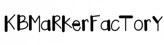
( Fonts by Khrys Bosland )
A playful, bold handwritten font with a casual and friendly appearance.
![KBMaRkerFacTorY Frei Schriftart Herunterladen]() Herunterladen 151 Downloads@WebFont
Herunterladen 151 Downloads@WebFont -
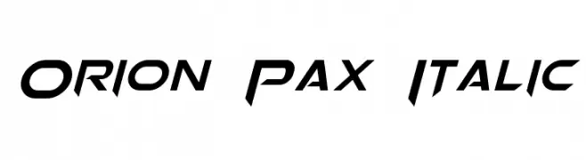
( Fonts by a Neale Davidson - www.pixelsagas.com. Personal-use only. For commercial use please contact owner. )
A bold, italic, and futuristic font with sharp, angular lines.
![Orion Pax Italic Frei Schriftart Herunterladen]() Herunterladen 151 Downloads@WebFont
Herunterladen 151 Downloads@WebFont -
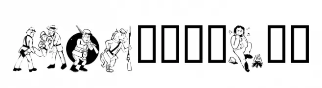
( Fonts by Kat`s Fun Fonts - Personal-use only. For commercial use please contact owner. )
A collection of illustrative characters with a historical theme.
![KR Civil War Frei Schriftart Herunterladen]() Herunterladen 151 Downloads@WebFont
Herunterladen 151 Downloads@WebFont -
-
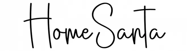
( Fonts by Scratchones )
Tall, narrow, handwritten script with playful, casual strokes.
![Home Santa Frei Schriftart Herunterladen]() Herunterladen 151 Downloads@WebFont
Herunterladen 151 Downloads@WebFont -
![Feeble minded Frei Schriftart Herunterladen]() Herunterladen 151 Downloads@WebFont
Herunterladen 151 Downloads@WebFont -
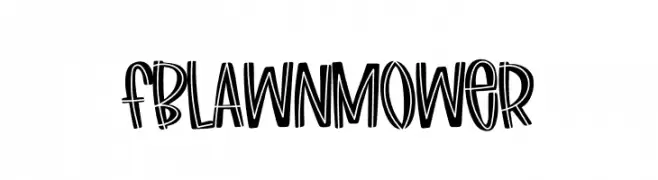
( Fonts by Font Bundles )
A playful, hand-drawn font with bold, outlined characters.
![FBLawnmower Frei Schriftart Herunterladen]() Herunterladen 151 Downloads@WebFont
Herunterladen 151 Downloads@WebFont -
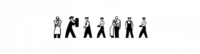
( Fonts by Manfred Klein. Free for private and charity use. Free for commercial with donation to organizations )
Minimalist pictogram icons representing people and activities.
![Persons Frei Schriftart Herunterladen]() Herunterladen 151 Downloads@WebFont
Herunterladen 151 Downloads@WebFont -
( Fonts by Wahyu Eka Prasetya - wepfont.com - Personal-use only. For commercial use please contact owner. )
A dynamic, fiery font with sharp, jagged edges and bold strokes.
![Fire Blast Frei Schriftart Herunterladen]() Herunterladen 151 Downloads@WebFont
Herunterladen 151 Downloads@WebFont

Welche Schriften sind gerade am populärsten?
Poppins, Roboto, Montserrat, Open Sans und Lato sind wegen ihrer klaren Formen und breiten Einsetzbarkeit sehr gefragt – von Markenauftritt über Landingpages bis hin zu Postern.
Welche Fonts eignen sich für Logos?
Geometrische Sans‑Serifs (z. B. Poppins, Familien im Gotham‑Stil) sind ein häufiger Griff für sauberes, skalierbares Branding. Für eine persönlichere Note bleiben Scripts und Handschrift‑Stile beliebt. Kombinieren Sie einen prägnanten Headline‑Font mit einer neutralen Brotschrift für Wiedererkennung und Harmonie.
Wie oft wird die Top‑Liste aktualisiert?
Regelmäßig – basierend auf realen Downloads und Interaktionen. Schauen Sie öfter vorbei, um aufstrebende Favoriten früh zu entdecken.
💡 Tipp: Seite bookmarken – Trends wechseln schnell, und heutige Top‑Schriften inspirieren morgen vielleicht das Rebranding.