Willkommen bei den Top‑Schriften – hier treffen Beliebtheit und Qualität aufeinander. Das sind die in diesem Jahr am häufigsten heruntergeladenen und genutzten Fonts. Wenn Sie sichere Optionen für Logo, Web oder Social suchen, starten Sie hier.
Jeder Top‑Font überzeugt durch Balance, Lesbarkeit und Vielseitigkeit. Sie finden moderne Sans‑Serifs, elegante Scripts, Vintage‑Serifs und minimalistische Displays.
-
Schriftart von danny91194. For commercial use please contact the owner.
( m )
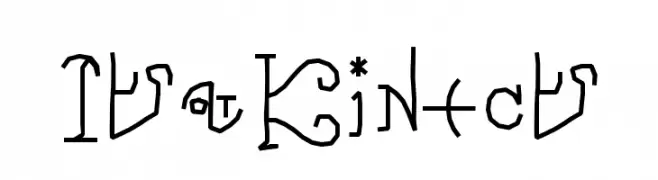
An artistic and decorative font with abstract, symbol-like characters.
 Herunterladen 151 Downloads@WebFont
 -
( Fonts by Universitas Gadjah Mada Yogyakarta - Personal-use only. For commercial use please contact owner. )
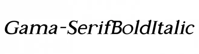
A bold, italic serif font with a classic and elegant style.
![Gama-Serif Bold Italic Frei Schriftart Herunterladen]() Herunterladen 151 Downloads@WebFont
Herunterladen 151 Downloads@WebFont -
( Fonts by Zanatlija - Personal-use only. For commercial use please contact owner. )
A geometric, patterned font with characters enclosed in squares.
![11vator tfb Frei Schriftart Herunterladen]() Herunterladen 151 Downloads@WebFont
Herunterladen 151 Downloads@WebFont -
( Fonts by or from www.graffitifonts.net )
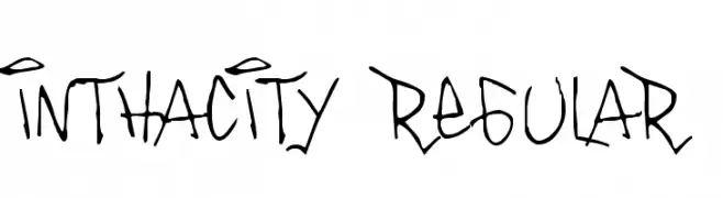
A graffiti-inspired font with a dynamic, hand-drawn style.
![Inthacity Regular Frei Schriftart Herunterladen]() Herunterladen 151 Downloads@WebFont
Herunterladen 151 Downloads@WebFont -
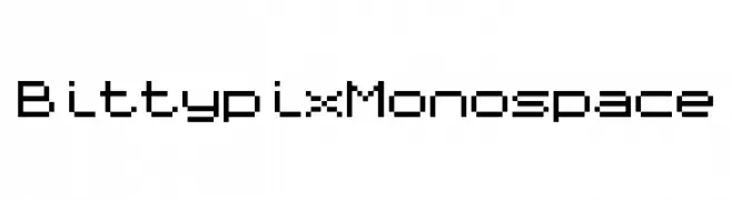
![Bittypix Monospace Frei Schriftart Herunterladen]() Herunterladen 151 Downloads@WebFont
Herunterladen 151 Downloads@WebFont -
-
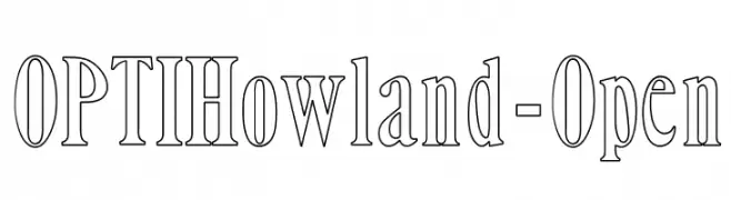
( Fonts by Castcraft Software - opti.netii.net - check the website before use )
An elegant outline font with a modern yet classic appeal.
![OPTIHowland-Open Frei Schriftart Herunterladen]() Herunterladen 151 Downloads@WebFont
Herunterladen 151 Downloads@WebFont -
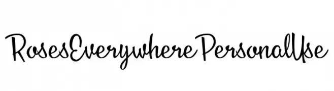
( Fonts by Billy Argel Fonts - www.billyargel.com - Personal-use only. For commercial use please contact owner. )
A playful, hand-drawn font with tall, narrow letters and artistic flair.
![Roses Everywhere Personal Use Frei Schriftart Herunterladen]() Herunterladen 151 Downloads@WebFont
Herunterladen 151 Downloads@WebFont -
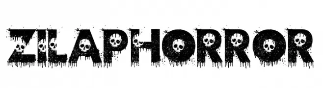
![Zilap Horror Frei Schriftart Herunterladen]() Herunterladen 151 Downloads@WebFont
Herunterladen 151 Downloads@WebFont -
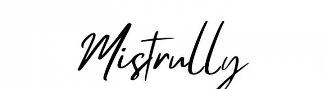
( Fonts by Creatype Studio - Rian Rahardi - Personal-use only. For commercial use please contact owner. )
A lively, handwritten script font with expressive, fluid strokes.
![Mistrully Frei Schriftart Herunterladen]() Herunterladen 151 Downloads@WebFont
Herunterladen 151 Downloads@WebFont -
( Fonts by Hanoded )
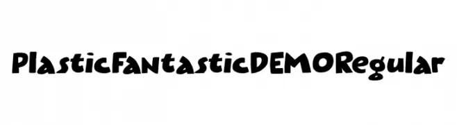
A playful, bold font with a hand-drawn, whimsical style.
![Plastic Fantastic DEMO Regular Frei Schriftart Herunterladen]() Herunterladen 151 Downloads@WebFont
Herunterladen 151 Downloads@WebFont

Welche Schriften sind gerade am populärsten?
Poppins, Roboto, Montserrat, Open Sans und Lato sind wegen ihrer klaren Formen und breiten Einsetzbarkeit sehr gefragt – von Markenauftritt über Landingpages bis hin zu Postern.
Welche Fonts eignen sich für Logos?
Geometrische Sans‑Serifs (z. B. Poppins, Familien im Gotham‑Stil) sind ein häufiger Griff für sauberes, skalierbares Branding. Für eine persönlichere Note bleiben Scripts und Handschrift‑Stile beliebt. Kombinieren Sie einen prägnanten Headline‑Font mit einer neutralen Brotschrift für Wiedererkennung und Harmonie.
Wie oft wird die Top‑Liste aktualisiert?
Regelmäßig – basierend auf realen Downloads und Interaktionen. Schauen Sie öfter vorbei, um aufstrebende Favoriten früh zu entdecken.
💡 Tipp: Seite bookmarken – Trends wechseln schnell, und heutige Top‑Schriften inspirieren morgen vielleicht das Rebranding.