Willkommen bei den Top‑Schriften – hier treffen Beliebtheit und Qualität aufeinander. Das sind die in diesem Jahr am häufigsten heruntergeladenen und genutzten Fonts. Wenn Sie sichere Optionen für Logo, Web oder Social suchen, starten Sie hier.
Jeder Top‑Font überzeugt durch Balance, Lesbarkeit und Vielseitigkeit. Sie finden moderne Sans‑Serifs, elegante Scripts, Vintage‑Serifs und minimalistische Displays.
-
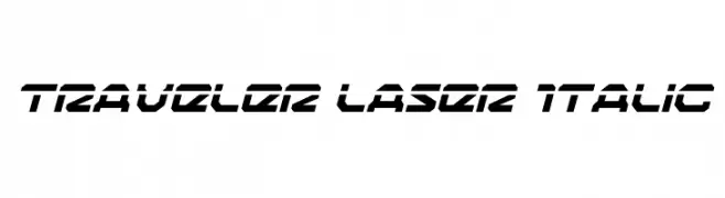
( Fonts by Daniel Zadorozny - www.iconian.com - Free for personal use )
A bold, italicized font with a futuristic, angular design.
 Herunterladen 150 Downloads@WebFont
 -
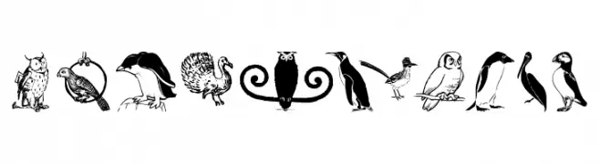
( Fonts by Manfred Klein. Free for private and charity use. Free for commercial with donation to organizations )
A display font featuring illustrated birds and owls as characters.
![OwlsAndMore Frei Schriftart Herunterladen]() Herunterladen 150 Downloads@WebFont
Herunterladen 150 Downloads@WebFont -
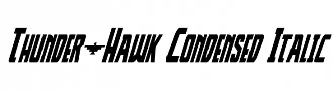
( Fonts by Daniel Zadorozny - www.iconian.com )
A bold, condensed italic font with a dynamic and futuristic style.
![Thunder-Hawk Condensed Italic Frei Schriftart Herunterladen]() Herunterladen 150 Downloads@WebFont
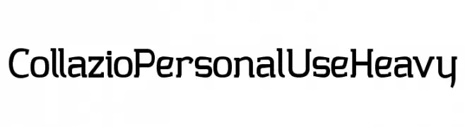
Herunterladen 150 Downloads@WebFont -
![Collazio Personal Use Heavy Frei Schriftart Herunterladen]() Herunterladen 150 Downloads@WebFont
Herunterladen 150 Downloads@WebFont -
![Seryfan Demo Frei Schriftart Herunterladen]() Herunterladen 150 Downloads@WebFont
Herunterladen 150 Downloads@WebFont -
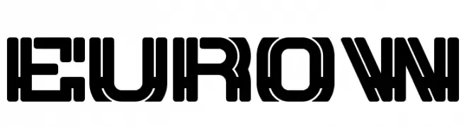
-
![EUROW Frei Schriftart Herunterladen]() Herunterladen 150 Downloads@WebFont
Herunterladen 150 Downloads@WebFont -
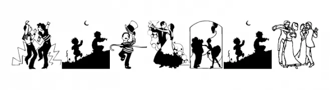
( Fonts by Manfred Klein. Free for private and charity use. Free for commercial with donation to organizations )
A dance-themed decorative dingbat font with expressive dancer illustrations.
![Tanzbar Frei Schriftart Herunterladen]() Herunterladen 150 Downloads@WebFont
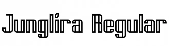
Herunterladen 150 Downloads@WebFont -
![Junglira Regular Frei Schriftart Herunterladen]() Herunterladen 150 Downloads@WebFont
Herunterladen 150 Downloads@WebFont -
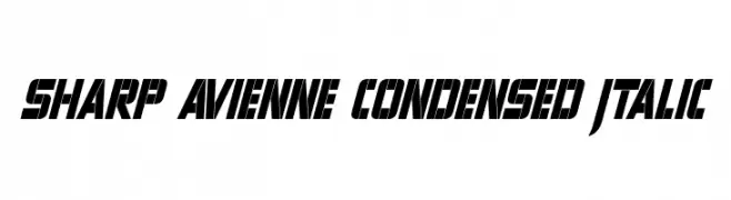
( Fonts by a Neale Davidson - www.pixelsagas.com. Personal-use only. For commercial use please contact owner. )
A bold, condensed, italicized font with sharp angles and high contrast.
![Sharp Avienne Condensed Italic Frei Schriftart Herunterladen]() Herunterladen 150 Downloads@WebFont
Herunterladen 150 Downloads@WebFont -
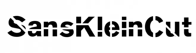
( Fonts by Manfred Klein. Free for private and charity use. Free for commercial with donation to organizations )
A bold, geometric font with unique cut-out elements for a modern, edgy look.
![SansKleinCut Frei Schriftart Herunterladen]() Herunterladen 150 Downloads@WebFont
Herunterladen 150 Downloads@WebFont

Welche Schriften sind gerade am populärsten?
Poppins, Roboto, Montserrat, Open Sans und Lato sind wegen ihrer klaren Formen und breiten Einsetzbarkeit sehr gefragt – von Markenauftritt über Landingpages bis hin zu Postern.
Welche Fonts eignen sich für Logos?
Geometrische Sans‑Serifs (z. B. Poppins, Familien im Gotham‑Stil) sind ein häufiger Griff für sauberes, skalierbares Branding. Für eine persönlichere Note bleiben Scripts und Handschrift‑Stile beliebt. Kombinieren Sie einen prägnanten Headline‑Font mit einer neutralen Brotschrift für Wiedererkennung und Harmonie.
Wie oft wird die Top‑Liste aktualisiert?
Regelmäßig – basierend auf realen Downloads und Interaktionen. Schauen Sie öfter vorbei, um aufstrebende Favoriten früh zu entdecken.
💡 Tipp: Seite bookmarken – Trends wechseln schnell, und heutige Top‑Schriften inspirieren morgen vielleicht das Rebranding.