Willkommen bei den Top‑Schriften – hier treffen Beliebtheit und Qualität aufeinander. Das sind die in diesem Jahr am häufigsten heruntergeladenen und genutzten Fonts. Wenn Sie sichere Optionen für Logo, Web oder Social suchen, starten Sie hier.
Jeder Top‑Font überzeugt durch Balance, Lesbarkeit und Vielseitigkeit. Sie finden moderne Sans‑Serifs, elegante Scripts, Vintage‑Serifs und minimalistische Displays.
-
( Copyright 2010, 2012, 2014 Adobe Systems Incorporated (http://www.adobe.com/), with Reserved Font Name ‘Source’. )
A modern, italic sans-serif font with smooth curves and excellent readability.
 Herunterladen 678 Downloads@WebFont
 -
( Copyright (c) 2011 by LatinoType Limitada (luciano@latinotype.com) )
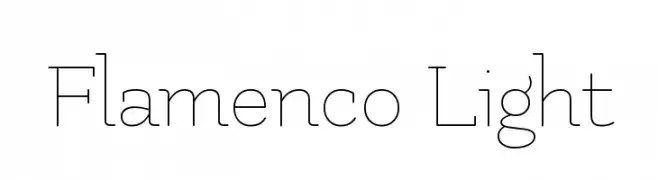
A thin, elegant font with a modern and sophisticated style.
![Flamenco Light Frei Schriftart Herunterladen]() Herunterladen 678 Downloads@WebFont
Herunterladen 678 Downloads@WebFont -
![Lizard Frei Schriftart Herunterladen]() Herunterladen 678 Downloads@WebFont
Herunterladen 678 Downloads@WebFont -
( Fonts by Ten by Twenty - tenbytwenty.com )
A pixelated, blocky font inspired by retro digital displays.
![Munro Frei Schriftart Herunterladen]() Herunterladen 678 Downloads@WebFont
Herunterladen 678 Downloads@WebFont -
( Fonts by Dieter Steffmann )
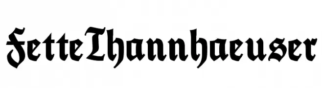
A bold, ornate blackletter typeface with a Gothic, medieval style.
![FetteThannhaeuser Frei Schriftart Herunterladen]() Herunterladen 678 Downloads@WebFont
Herunterladen 678 Downloads@WebFont -
![Smellvetica Frei Schriftart Herunterladen]() Herunterladen 678 Downloads@WebFont
Herunterladen 678 Downloads@WebFont -
( Fonts by Koczman Balint - magiquefonts.gportal.hu )
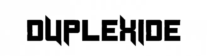
A bold, geometric font with a futuristic, angular design.
![Duplexide Frei Schriftart Herunterladen]() Herunterladen 678 Downloads@WebFont
Herunterladen 678 Downloads@WebFont -
( Fonts by LeFly Fonts - lefly.vepar.nl )
A bold, slab serif font with a vintage yet modern appeal.
![Lenteroos Frei Schriftart Herunterladen]() Herunterladen 678 Downloads@WebFont
Herunterladen 678 Downloads@WebFont -
( Fonts by Graham Meade - GemFonts )
A bold, distressed font with jagged edges and a torn appearance.
![Tear Frei Schriftart Herunterladen]() Herunterladen 678 Downloads@WebFont
Herunterladen 678 Downloads@WebFont -
![Hollywood Hills Italic Frei Schriftart Herunterladen]() Herunterladen 678 Downloads@WebFont
Herunterladen 678 Downloads@WebFont -
( Fonts by www.TomzWeb.com - Thomas E. Harvey - NOT free - Commercial use requires license )
A bold, playful font with chunky, whimsical characters.
![BeesWax Normal Frei Schriftart Herunterladen]() Herunterladen 678 Downloads@WebFont
Herunterladen 678 Downloads@WebFont -
( Fonts by www.fontalicious.com )
A bold, decorative font with characters in rounded squares and star-like embellishments.
![Technicolor Frei Schriftart Herunterladen]() Herunterladen 678 Downloads@WebFont
Herunterladen 678 Downloads@WebFont -
( Fonts by Khurasan )
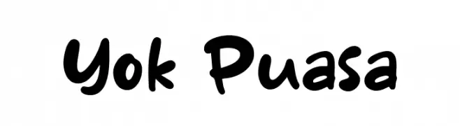
A playful, bold handwritten font with rounded, irregular letterforms.
![Yok Puasa Frei Schriftart Herunterladen]() Herunterladen 677 Downloads@WebFont
Herunterladen 677 Downloads@WebFont -
( Fonts by Almarkhatype - Abdul Malik Wisnu - Personal-use only. For commercial use please contact owner. )
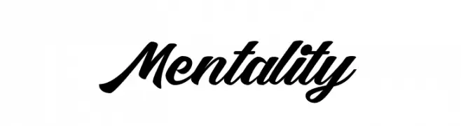
A bold, expressive script font with fluid, cursive letterforms.
![Mentality Frei Schriftart Herunterladen]() Herunterladen 677 Downloads@WebFont
Herunterladen 677 Downloads@WebFont -
( Fonts by GGBot )
A bold, rounded font with a playful and chunky style.
![Kaph Frei Schriftart Herunterladen]() Herunterladen 677 Downloads@WebFont
Herunterladen 677 Downloads@WebFont -
( Fonts by Khaled Hosny - Personal-use only. For commercial use please contact owner. )
A classic serif font with elegant curves and balanced proportions.
![Amiri Quran Colored Frei Schriftart Herunterladen]() Herunterladen 677 Downloads@WebFont
Herunterladen 677 Downloads@WebFont -
( Fonts by sronstudio )
A playful, bold handwritten font with a whimsical and friendly style.
![Pumpkin Story Frei Schriftart Herunterladen]() Herunterladen 677 Downloads@WebFont
Herunterladen 677 Downloads@WebFont -
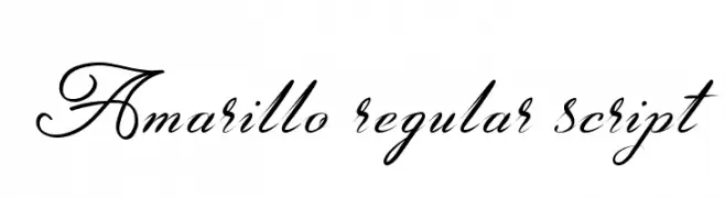
![Amarillo regular script Frei Schriftart Herunterladen]() Herunterladen 677 Downloads@WebFont
Herunterladen 677 Downloads@WebFont -
( Noto is a trademark of Google Inc. Noto fonts are open source. All Noto fonts are published under the SIL Open Font License, Version 1.1 )
A clean, modern sans-serif font with geometric letterforms.
![Noto Sans Symbols Medium Frei Schriftart Herunterladen]() Herunterladen 677 Downloads@WebFont
Herunterladen 677 Downloads@WebFont -
( Copyright 2012 The B612 Project Authors (https://github.com/polarsys/b612) )
A bold, modern sans-serif font with clean lines and strong readability.
![B612 Bold Frei Schriftart Herunterladen]() Herunterladen 677 Downloads@WebFont
Herunterladen 677 Downloads@WebFont -
( Fonts by studiostilt - Personal-use only. For commercial use please contact owner. )
A bold, distressed font with a rugged, vintage style.
![Stilt-Regular Frei Schriftart Herunterladen]() Herunterladen 677 Downloads@WebFont
Herunterladen 677 Downloads@WebFont -
( revo farisky - stripline co )
A bold, flowing script font with elegant curves and dynamic style.
![hadfield Frei Schriftart Herunterladen]() Herunterladen 677 Downloads@WebFont
Herunterladen 677 Downloads@WebFont -
( dcoxy - Greg Medina - www.dcoxy.com/ )
A bold, vintage script font with a brush-like texture and decorative style.
![Barber Street_PersonalUseOnly Frei Schriftart Herunterladen]() Herunterladen 677 Downloads@WebFont
Herunterladen 677 Downloads@WebFont -
( Amar Lettering - creativemarket.com/Amarlettering )
An elegant script font with fluid, cursive strokes and sophisticated design.
![Challista Frei Schriftart Herunterladen]() Herunterladen 677 Downloads@WebFont
Herunterladen 677 Downloads@WebFont -
( Alex Banks - www.alex-banks.com )
A bold, rounded font with a modern and playful style.
![Duster AB Thick Frei Schriftart Herunterladen]() Herunterladen 677 Downloads@WebFont
Herunterladen 677 Downloads@WebFont -
( Fonts by Hanoded )
A bold, hand-drawn font with a playful, marker-like appearance.
![DK Darker Marker Regular Frei Schriftart Herunterladen]() Herunterladen 677 Downloads@WebFont
Herunterladen 677 Downloads@WebFont -
( Fonts by Dan P. Lyons - Personal-use only. For commercial use please contact owner. )
A modern sans-serif font with geometric shapes and uniform strokes.
![POE Vetica New Frei Schriftart Herunterladen]() Herunterladen 677 Downloads@WebFont
Herunterladen 677 Downloads@WebFont -
Schriftart von HammerBro101. For commercial use please contact the owner.
![Hammer Bro Titans Font Medium Frei Schriftart Herunterladen]() Herunterladen 677 Downloads@WebFont
Herunterladen 677 Downloads@WebFont -
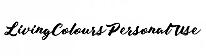
( Fonts by Billy Argel - www.billyargel.com - Personal-use only. For commercial use please contact owner. )
A bold, expressive script font with elegant, flowing letterforms.
![Living Colours Personal Use Frei Schriftart Herunterladen]() Herunterladen 677 Downloads@WebFont
Herunterladen 677 Downloads@WebFont -
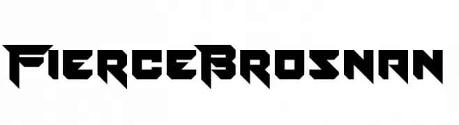
( Fonts by www.chequered.ink - Chequered Ink - Personal-use only. For commercial use please contact owner. )
A bold, angular font with a futuristic and aggressive design.
![Fierce Brosnan Frei Schriftart Herunterladen]() Herunterladen 677 Downloads@WebFont
Herunterladen 677 Downloads@WebFont -
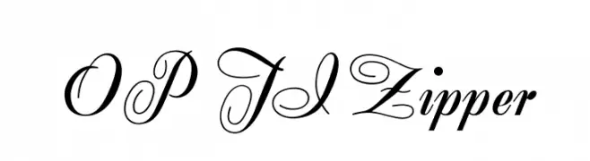
( Fonts by Castcraft Software - OPTI Fonts Archive - opti.netii.net - Personal-use only. For commercial use please contact owner. )
An elegant script font with flowing, ornate cursive letters and sophisticated numerals.
![OPTIZipper Frei Schriftart Herunterladen]() Herunterladen 677 Downloads@WebFont
Herunterladen 677 Downloads@WebFont -
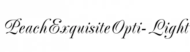
( Fonts by Castcraft Software - OPTI Fonts Archive - opti.netii.net - Personal-use only. For commercial use please contact owner. )
An elegant script font with graceful curves and delicate strokes.
![PeachExquisiteOpti-Light Frei Schriftart Herunterladen]() Herunterladen 677 Downloads@WebFont
Herunterladen 677 Downloads@WebFont -
![Carlingford Frei Schriftart Herunterladen]() Herunterladen 677 Downloads@WebFont
Herunterladen 677 Downloads@WebFont -
( Fonts by antoniorodriguesjr.com )
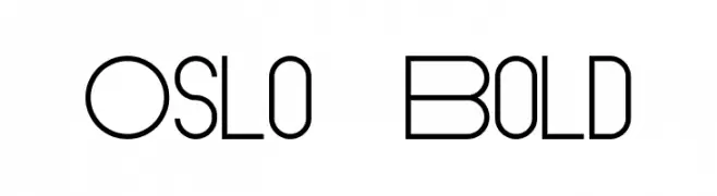
A modern, geometric font with a sleek and sophisticated design.
![Oslo Bold Frei Schriftart Herunterladen]() Herunterladen 677 Downloads@WebFont
Herunterladen 677 Downloads@WebFont -
( Fonts by Daniel Zadorozny - www.iconian.com - Free for personal use )
A bold, expanded, and italic font with a dynamic and modern style.
![Union Gray Expanded Italic Frei Schriftart Herunterladen]() Herunterladen 677 Downloads@WebFont
Herunterladen 677 Downloads@WebFont


Welche Schriften sind gerade am populärsten?
Poppins, Roboto, Montserrat, Open Sans und Lato sind wegen ihrer klaren Formen und breiten Einsetzbarkeit sehr gefragt – von Markenauftritt über Landingpages bis hin zu Postern.
Welche Fonts eignen sich für Logos?
Geometrische Sans‑Serifs (z. B. Poppins, Familien im Gotham‑Stil) sind ein häufiger Griff für sauberes, skalierbares Branding. Für eine persönlichere Note bleiben Scripts und Handschrift‑Stile beliebt. Kombinieren Sie einen prägnanten Headline‑Font mit einer neutralen Brotschrift für Wiedererkennung und Harmonie.
Wie oft wird die Top‑Liste aktualisiert?
Regelmäßig – basierend auf realen Downloads und Interaktionen. Schauen Sie öfter vorbei, um aufstrebende Favoriten früh zu entdecken.
💡 Tipp: Seite bookmarken – Trends wechseln schnell, und heutige Top‑Schriften inspirieren morgen vielleicht das Rebranding.