Willkommen bei den Top‑Schriften – hier treffen Beliebtheit und Qualität aufeinander. Das sind die in diesem Jahr am häufigsten heruntergeladenen und genutzten Fonts. Wenn Sie sichere Optionen für Logo, Web oder Social suchen, starten Sie hier.
Jeder Top‑Font überzeugt durch Balance, Lesbarkeit und Vielseitigkeit. Sie finden moderne Sans‑Serifs, elegante Scripts, Vintage‑Serifs und minimalistische Displays.
-
( Fonts by Balpirick Studio - Personal-use only. For commercial use please contact owner. )
A playful, handwritten font with a smooth, flowing style.
 Herunterladen 147 Downloads@WebFont
 -
![Technotot Frei Schriftart Herunterladen]() Herunterladen 147 Downloads@WebFont
Herunterladen 147 Downloads@WebFont -
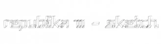
( Fonts by Apostrophic Lab )
A three-dimensional sketch font with a geometric, architectural style.
![Republika III - Sketch Frei Schriftart Herunterladen]() Herunterladen 147 Downloads@WebFont
Herunterladen 147 Downloads@WebFont -
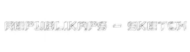
( Fonts by Apostrophic Lab )
A sketch-style, three-dimensional font with geometric and architectural elements.
![Republikaps - Sketch Frei Schriftart Herunterladen]() Herunterladen 147 Downloads@WebFont
Herunterladen 147 Downloads@WebFont -
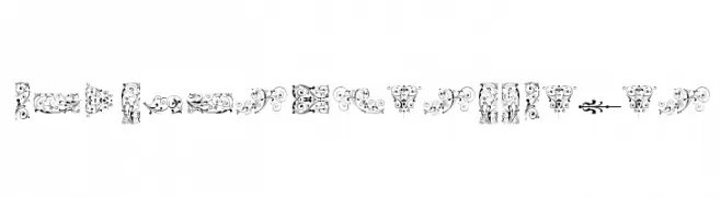
( Fonts by a Claude Pelletier . Personal-use only. For commercial use please contact owner. )
A decorative font with elegant swirls and loops, offering a modern and artistic style.
![pepinot Frei Schriftart Herunterladen]() Herunterladen 147 Downloads@WebFont
Herunterladen 147 Downloads@WebFont -
-
![SoftOrnamentsSeven Frei Schriftart Herunterladen]() Herunterladen 147 Downloads@WebFont
Herunterladen 147 Downloads@WebFont -
( Fonts by Kong Font - https://fontkong.com/ - Personal-use only. For commercial use please contact owner. )
A graceful script font with fluid, interconnected strokes.
![My Happy Frei Schriftart Herunterladen]() Herunterladen 147 Downloads@WebFont
Herunterladen 147 Downloads@WebFont -
( Fonts by AEN Creative Studio - Personal-use only. For commercial use please contact owner. )
An elegant, flowing script font with graceful loops and a sophisticated style.
![Lathi Frei Schriftart Herunterladen]() Herunterladen 147 Downloads@WebFont
Herunterladen 147 Downloads@WebFont -
![Nymonak BRK Frei Schriftart Herunterladen]() Herunterladen 147 Downloads@WebFont
Herunterladen 147 Downloads@WebFont -
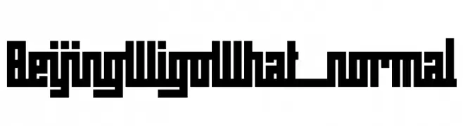
( Fonts by www.sweeep.fr - Damien Gosset )
A bold, geometric font with a blocky, monospaced appearance.
![BeijingWigoWhat_normal Frei Schriftart Herunterladen]() Herunterladen 147 Downloads@WebFont
Herunterladen 147 Downloads@WebFont


Welche Schriften sind gerade am populärsten?
Poppins, Roboto, Montserrat, Open Sans und Lato sind wegen ihrer klaren Formen und breiten Einsetzbarkeit sehr gefragt – von Markenauftritt über Landingpages bis hin zu Postern.
Welche Fonts eignen sich für Logos?
Geometrische Sans‑Serifs (z. B. Poppins, Familien im Gotham‑Stil) sind ein häufiger Griff für sauberes, skalierbares Branding. Für eine persönlichere Note bleiben Scripts und Handschrift‑Stile beliebt. Kombinieren Sie einen prägnanten Headline‑Font mit einer neutralen Brotschrift für Wiedererkennung und Harmonie.
Wie oft wird die Top‑Liste aktualisiert?
Regelmäßig – basierend auf realen Downloads und Interaktionen. Schauen Sie öfter vorbei, um aufstrebende Favoriten früh zu entdecken.
💡 Tipp: Seite bookmarken – Trends wechseln schnell, und heutige Top‑Schriften inspirieren morgen vielleicht das Rebranding.