Willkommen bei den Top‑Schriften – hier treffen Beliebtheit und Qualität aufeinander. Das sind die in diesem Jahr am häufigsten heruntergeladenen und genutzten Fonts. Wenn Sie sichere Optionen für Logo, Web oder Social suchen, starten Sie hier.
Jeder Top‑Font überzeugt durch Balance, Lesbarkeit und Vielseitigkeit. Sie finden moderne Sans‑Serifs, elegante Scripts, Vintage‑Serifs und minimalistische Displays.
-
( Fonts by billyargel.blogspot.com - Billy Argel )
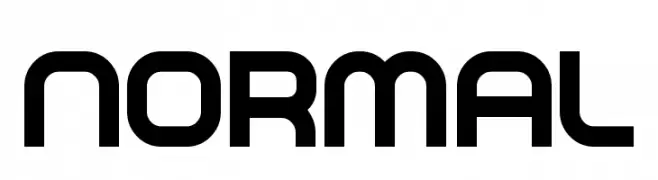
A bold, modern geometric font with a sleek and professional appearance.
 Herunterladen 677 Downloads@WebFont
 -
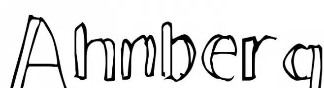
![Ahnberg Frei Schriftart Herunterladen]() Herunterladen 677 Downloads@WebFont
Herunterladen 677 Downloads@WebFont -
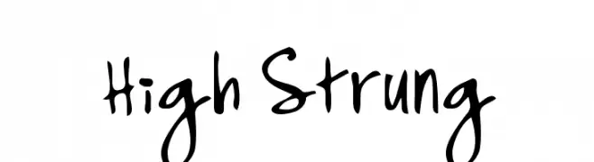
![High Strung Frei Schriftart Herunterladen]() Herunterladen 677 Downloads@WebFont
Herunterladen 677 Downloads@WebFont -
( Fonts by Graham Meade - GemFonts )
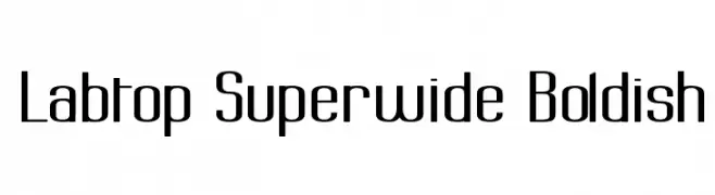
A bold, superwide font with a modern and uniform design.
![Labtop Superwide Boldish Frei Schriftart Herunterladen]() Herunterladen 677 Downloads@WebFont
Herunterladen 677 Downloads@WebFont -
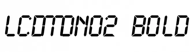
![LCDMono2 Bold Frei Schriftart Herunterladen]() Herunterladen 677 Downloads@WebFont
Herunterladen 677 Downloads@WebFont -
![Mister Pixel 16 pt - Old Style Figure Frei Schriftart Herunterladen]() Herunterladen 677 Downloads@WebFont
Herunterladen 677 Downloads@WebFont -
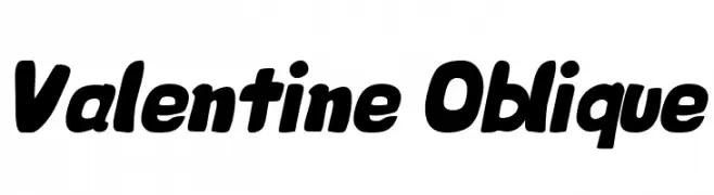
![Valentine Oblique Frei Schriftart Herunterladen]() Herunterladen 677 Downloads@WebFont
Herunterladen 677 Downloads@WebFont -
( Fonts by www.fontalicious.com )
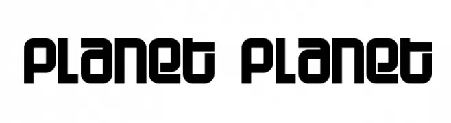
A bold, geometric font with a modern, futuristic style.
![Planet Planet Frei Schriftart Herunterladen]() Herunterladen 677 Downloads@WebFont
Herunterladen 677 Downloads@WebFont -
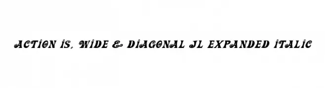
![Action Is, Wide & Diagonal JL Expanded Italic Frei Schriftart Herunterladen]() Herunterladen 677 Downloads@WebFont
Herunterladen 677 Downloads@WebFont -
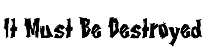
( Fonts by Tony O`Farrell )
A bold, jagged, and aggressive font with a distressed, rebellious style.
![It Must Be Destroyed Frei Schriftart Herunterladen]() Herunterladen 677 Downloads@WebFont
Herunterladen 677 Downloads@WebFont -
( Fonts by Graham Meade - GemFonts )
A bold, distressed font with jagged edges and a torn appearance.
![Tear Frei Schriftart Herunterladen]() Herunterladen 677 Downloads@WebFont
Herunterladen 677 Downloads@WebFont -
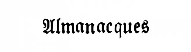
![Almanacques Frei Schriftart Herunterladen]() Herunterladen 677 Downloads@WebFont
Herunterladen 677 Downloads@WebFont -
( Fonts by Nirmala Creative )
A playful, bold, and hand-drawn style font with thick strokes and rounded edges.
![Zahra Frei Schriftart Herunterladen]() Herunterladen 676 Downloads@WebFont
Herunterladen 676 Downloads@WebFont -
( Fonts by Chloe - clofont.free.fr - Personal-use only. For commercial use please contact owner. )
A rugged, distressed font with a hand-drawn, vintage style.
![[Moving_Carton] Frei Schriftart Herunterladen]() Herunterladen 676 Downloads@WebFont
Herunterladen 676 Downloads@WebFont -
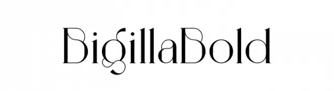
( Fonts by Jérémie Gauthier - Personal-use only. For commercial use please contact owner. )
A high-contrast, elegant font with unique curves and angles.
![Bigilla Bold Frei Schriftart Herunterladen]() Herunterladen 676 Downloads@WebFont
Herunterladen 676 Downloads@WebFont -
( Fonts by Fenotype - Emil Bertell - Personal-use only. For commercial use please contact owner. )
A modern, light sans-serif font with excellent readability and low contrast.
![Klik Light Frei Schriftart Herunterladen]() Herunterladen 676 Downloads@WebFont
Herunterladen 676 Downloads@WebFont -
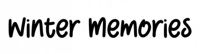
( Fonts by Alpaprana - Personal-use only. For commercial use please contact owner. )
A playful, bold handwritten font with smooth, rounded edges.
![Winter Memories Frei Schriftart Herunterladen]() Herunterladen 676 Downloads@WebFont
Herunterladen 676 Downloads@WebFont -
( Fonts by Inermedia Studio )
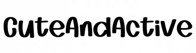
A playful, bold, and rounded hand-drawn font with a whimsical style.
![Cute And Active Frei Schriftart Herunterladen]() Herunterladen 676 Downloads@WebFont
Herunterladen 676 Downloads@WebFont -
( Fonts by Letterayu )
A bold, decorative font with star-shaped cutouts in each character.
![StarBold Frei Schriftart Herunterladen]() Herunterladen 676 Downloads@WebFont
Herunterladen 676 Downloads@WebFont -
( Fonts by Tokokoo Studio )
A playful, cloud-themed decorative font with a whimsical style.
![Cotton Cloud Frei Schriftart Herunterladen]() Herunterladen 676 Downloads@WebFont
Herunterladen 676 Downloads@WebFont -
( Fonts by Kong Font )
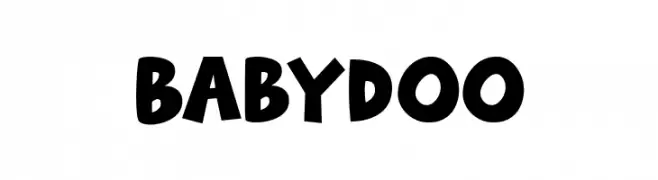
A playful, bold font with a whimsical, hand-drawn style.
![Babydoo Frei Schriftart Herunterladen]() Herunterladen 676 Downloads@WebFont
Herunterladen 676 Downloads@WebFont -
( Fonts by Tokokoo Studio )
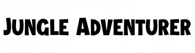
A bold, playful font with a hand-drawn, adventurous style.
![Jungle Adventurer Frei Schriftart Herunterladen]() Herunterladen 676 Downloads@WebFont
Herunterladen 676 Downloads@WebFont -
( Fonts by Rahagita )
A playful, bold font with rounded, thick strokes and a whimsical style.
![Hooliday Frei Schriftart Herunterladen]() Herunterladen 676 Downloads@WebFont
Herunterladen 676 Downloads@WebFont -
( Fonts by studiostilt - Personal-use only. For commercial use please contact owner. )
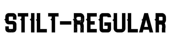
A bold, distressed font with a rugged, vintage style.
![Stilt-Regular Frei Schriftart Herunterladen]() Herunterladen 676 Downloads@WebFont
Herunterladen 676 Downloads@WebFont -
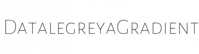
( Fonts by Figs - Personal-use only. For commercial use please contact owner. )
A sleek, modern font with a minimalist and elegant design.
![Datalegreya Gradient Frei Schriftart Herunterladen]() Herunterladen 676 Downloads@WebFont
Herunterladen 676 Downloads@WebFont -
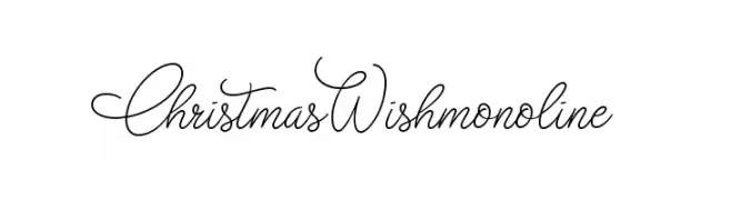
![Christmas Wish monoline Frei Schriftart Herunterladen]() Herunterladen 676 Downloads@WebFont
Herunterladen 676 Downloads@WebFont -
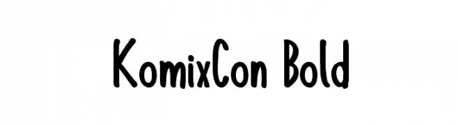
( William Jeovah de Medeiros - www.william.com.br )
A bold, playful font with rounded, thick strokes and a comic book style.
![KomixCon Bold Frei Schriftart Herunterladen]() Herunterladen 676 Downloads@WebFont
Herunterladen 676 Downloads@WebFont -
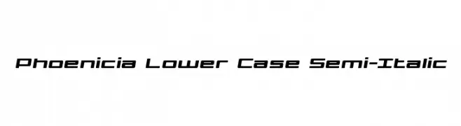
( Iconian Fonts - Daniel Zadorozny - www.iconian.com )
A modern, semi-italic font with geometric precision and balanced spacing.
![Phoenicia Lower Case Semi-Italic Frei Schriftart Herunterladen]() Herunterladen 676 Downloads@WebFont
Herunterladen 676 Downloads@WebFont -
![CheGuevara Wacky Medium Frei Schriftart Herunterladen]() Herunterladen 676 Downloads@WebFont
Herunterladen 676 Downloads@WebFont -
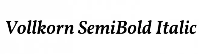
( Copyright 2017 The Vollkorn Project Authors (https://github.com/FAlthausen/Vollkorn-Typeface) )
A classic serif font with semi-bold weight and italic style, offering elegance and readability.
![Vollkorn SemiBold Italic Frei Schriftart Herunterladen]() Herunterladen 676 Downloads@WebFont
Herunterladen 676 Downloads@WebFont -
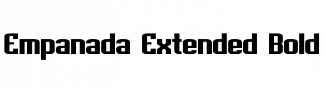
( Fonts by a Neale Davidson - www.pixelsagas.com. Personal-use only. For commercial use please contact owner. )
A bold, extended, and geometric font with a modern style.
![Empanada Extended Bold Frei Schriftart Herunterladen]() Herunterladen 676 Downloads@WebFont
Herunterladen 676 Downloads@WebFont -
( Fonts by a Neale Davidson - www.pixelsagas.com. Personal-use only. For commercial use please contact owner. )
A bold, italic, sans-serif font with a modern and dynamic style.
![Sigma Five Sans Bold Italic Frei Schriftart Herunterladen]() Herunterladen 676 Downloads@WebFont
Herunterladen 676 Downloads@WebFont -
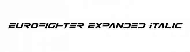
( Fonts by Daniel Zadorozny - www.iconian.com )
A modern, italicized, and expanded font with a bold, angular design.
![Eurofighter Expanded Italic Frei Schriftart Herunterladen]() Herunterladen 676 Downloads@WebFont
Herunterladen 676 Downloads@WebFont -
![aWavakii Frei Schriftart Herunterladen]() Herunterladen 676 Downloads@WebFont
Herunterladen 676 Downloads@WebFont -
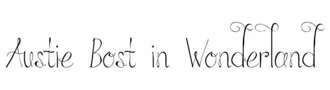
( austiebost.net )
A whimsical, fairy tale-inspired font with elegant swirls and curls.
![Austie Bost in Wonderland Frei Schriftart Herunterladen]() Herunterladen 676 Downloads@WebFont
Herunterladen 676 Downloads@WebFont


![[Moving_Carton] Frei Schriftart Herunterladen](https://d144mzi0q5mijx.cloudfront.net/img/0/M/Moving_Carton.webp)


Welche Schriften sind gerade am populärsten?
Poppins, Roboto, Montserrat, Open Sans und Lato sind wegen ihrer klaren Formen und breiten Einsetzbarkeit sehr gefragt – von Markenauftritt über Landingpages bis hin zu Postern.
Welche Fonts eignen sich für Logos?
Geometrische Sans‑Serifs (z. B. Poppins, Familien im Gotham‑Stil) sind ein häufiger Griff für sauberes, skalierbares Branding. Für eine persönlichere Note bleiben Scripts und Handschrift‑Stile beliebt. Kombinieren Sie einen prägnanten Headline‑Font mit einer neutralen Brotschrift für Wiedererkennung und Harmonie.
Wie oft wird die Top‑Liste aktualisiert?
Regelmäßig – basierend auf realen Downloads und Interaktionen. Schauen Sie öfter vorbei, um aufstrebende Favoriten früh zu entdecken.
💡 Tipp: Seite bookmarken – Trends wechseln schnell, und heutige Top‑Schriften inspirieren morgen vielleicht das Rebranding.