Willkommen bei den Top‑Schriften – hier treffen Beliebtheit und Qualität aufeinander. Das sind die in diesem Jahr am häufigsten heruntergeladenen und genutzten Fonts. Wenn Sie sichere Optionen für Logo, Web oder Social suchen, starten Sie hier.
Jeder Top‑Font überzeugt durch Balance, Lesbarkeit und Vielseitigkeit. Sie finden moderne Sans‑Serifs, elegante Scripts, Vintage‑Serifs und minimalistische Displays.
-
( Fonts by Manfred Klein. Free for private and charity use. Free for commercial with donation to organizations )
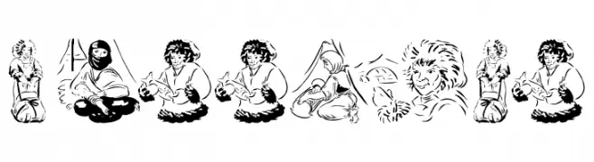
An artistic font with each letter formed by detailed illustrations of people in various activities.
 Herunterladen 146 Downloads@WebFont
 -
( Fonts by www.houseoflime.com )
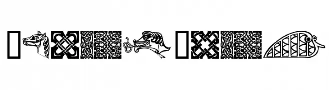
A decorative font featuring intricate Celtic motifs and symbols.
![CelticMotif Frei Schriftart Herunterladen]() Herunterladen 146 Downloads@WebFont
Herunterladen 146 Downloads@WebFont -
( Fonts by Graham Meade - GemFonts )
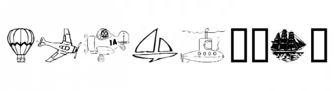
A decorative font with detailed vehicular illustrations for each character.
![Vehicular Frei Schriftart Herunterladen]() Herunterladen 146 Downloads@WebFont
Herunterladen 146 Downloads@WebFont -
( Fonts by NanaNissa - Personal-use only. For commercial use please contact owner. )
A bold, cursive font with elegant loops and a dynamic slant.
![Andina Frei Schriftart Herunterladen]() Herunterladen 146 Downloads@WebFont
Herunterladen 146 Downloads@WebFont -
( Fonts by Daniel Zadorozny - www.iconian.com - Personal-use only. For commercial use please contact owner. )
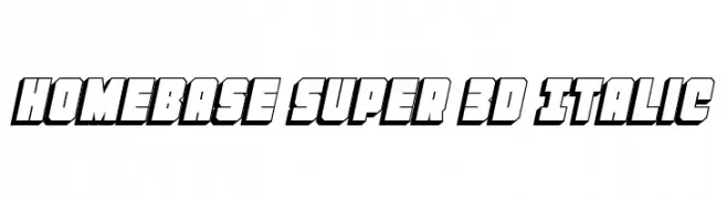
Bold 3D italic font with a dynamic and impactful style.
![Homebase Super 3D Italic Frei Schriftart Herunterladen]() Herunterladen 146 Downloads@WebFont
Herunterladen 146 Downloads@WebFont -
-
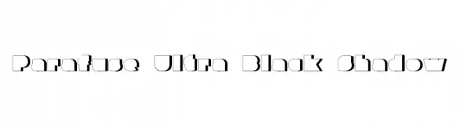
![Parafuse Ultra Black Shadow Frei Schriftart Herunterladen]() Herunterladen 146 Downloads@WebFont
Herunterladen 146 Downloads@WebFont -
( Sizimon.id - creativemarket.com/sizimon )
A bold, brush-style font with a dynamic, handcrafted appearance.
![Explore Frei Schriftart Herunterladen]() Herunterladen 146 Downloads@WebFont
Herunterladen 146 Downloads@WebFont -
![Vintage Decorative Corners 19 Frei Schriftart Herunterladen]() Herunterladen 146 Downloads@WebFont
Herunterladen 146 Downloads@WebFont -
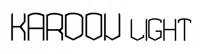
![KARDON- light Frei Schriftart Herunterladen]() Herunterladen 146 Downloads@WebFont
Herunterladen 146 Downloads@WebFont -
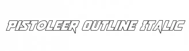
( Fonts by Daniel Zadorozny - www.iconian.com )
A bold, italic outline font with a dynamic and modern style.
![Pistoleer Outline Italic Frei Schriftart Herunterladen]() Herunterladen 146 Downloads@WebFont
Herunterladen 146 Downloads@WebFont


Welche Schriften sind gerade am populärsten?
Poppins, Roboto, Montserrat, Open Sans und Lato sind wegen ihrer klaren Formen und breiten Einsetzbarkeit sehr gefragt – von Markenauftritt über Landingpages bis hin zu Postern.
Welche Fonts eignen sich für Logos?
Geometrische Sans‑Serifs (z. B. Poppins, Familien im Gotham‑Stil) sind ein häufiger Griff für sauberes, skalierbares Branding. Für eine persönlichere Note bleiben Scripts und Handschrift‑Stile beliebt. Kombinieren Sie einen prägnanten Headline‑Font mit einer neutralen Brotschrift für Wiedererkennung und Harmonie.
Wie oft wird die Top‑Liste aktualisiert?
Regelmäßig – basierend auf realen Downloads und Interaktionen. Schauen Sie öfter vorbei, um aufstrebende Favoriten früh zu entdecken.
💡 Tipp: Seite bookmarken – Trends wechseln schnell, und heutige Top‑Schriften inspirieren morgen vielleicht das Rebranding.