Willkommen bei den Top‑Schriften – hier treffen Beliebtheit und Qualität aufeinander. Das sind die in diesem Jahr am häufigsten heruntergeladenen und genutzten Fonts. Wenn Sie sichere Optionen für Logo, Web oder Social suchen, starten Sie hier.
Jeder Top‑Font überzeugt durch Balance, Lesbarkeit und Vielseitigkeit. Sie finden moderne Sans‑Serifs, elegante Scripts, Vintage‑Serifs und minimalistische Displays.
-
( Fonts by Bangkit Tri Setiadi )
A playful, decorative font with bold, whimsical characters.
 Herunterladen 145 Downloads@WebFont
 -
![Mf Houston Paris Budapest Frei Schriftart Herunterladen]() Herunterladen 145 Downloads@WebFont
Herunterladen 145 Downloads@WebFont -
( Fonts by Peter Wiegel - www.peter-wiegel.de - Personal-use only. For commercial use please contact owner. )
A classic blackletter font with sharp, angular lines and a medieval aesthetic.
![Typographer Rotunda UNZ1 Frei Schriftart Herunterladen]() Herunterladen 145 Downloads@WebFont
Herunterladen 145 Downloads@WebFont -
( Fonts by Omega Font Labs )
A bold, angular, and decorative font with a futuristic and aggressive style.
![Morbid Fixation Frei Schriftart Herunterladen]() Herunterladen 145 Downloads
Herunterladen 145 Downloads -
( Fonts by Daniel Zadorozny - www.iconian.com - Free for personal use )
A bold, angular, and futuristic font with a compact design.
![Lightsider Compact Laser Regular Frei Schriftart Herunterladen]() Herunterladen 145 Downloads@WebFont
Herunterladen 145 Downloads@WebFont -
-
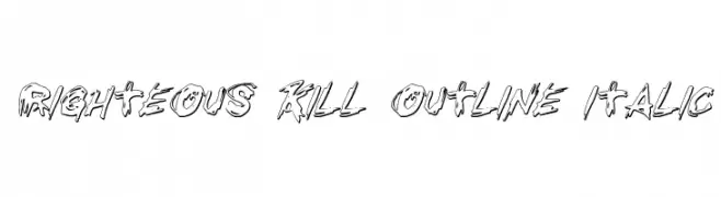
( Fonts by Daniel Zadorozny - www.iconian.com - Free for personal use )
A bold, italic outline font with a rough, hand-drawn style.
![Righteous Kill Outline Italic Frei Schriftart Herunterladen]() Herunterladen 145 Downloads@WebFont
Herunterladen 145 Downloads@WebFont -
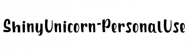
( Fonts by Attype Studio )
A playful, hand-drawn font with bold, dynamic strokes and a whimsical style.
![Shiny Unicorn - Personal Use Frei Schriftart Herunterladen]() Herunterladen 145 Downloads@WebFont
Herunterladen 145 Downloads@WebFont -
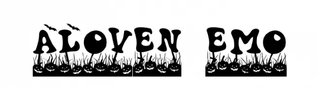
![Haloven Demo Frei Schriftart Herunterladen]() Herunterladen 145 Downloads@WebFont
Herunterladen 145 Downloads@WebFont -
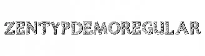
( Fonts by EvasUniqueFonts - Personal-use only. For commercial use please contact owner. )
A decorative font with intricate patterns and a vintage feel.
![Zentyp Demo Regular Frei Schriftart Herunterladen]() Herunterladen 145 Downloads@WebFont
Herunterladen 145 Downloads@WebFont -
( Fonts by junkohanhero )
A distressed, industrial-style font with a bold, mechanical appearance.
![Skriik! Electro-mechanical mach Frei Schriftart Herunterladen]() Herunterladen 145 Downloads@WebFont
Herunterladen 145 Downloads@WebFont

Welche Schriften sind gerade am populärsten?
Poppins, Roboto, Montserrat, Open Sans und Lato sind wegen ihrer klaren Formen und breiten Einsetzbarkeit sehr gefragt – von Markenauftritt über Landingpages bis hin zu Postern.
Welche Fonts eignen sich für Logos?
Geometrische Sans‑Serifs (z. B. Poppins, Familien im Gotham‑Stil) sind ein häufiger Griff für sauberes, skalierbares Branding. Für eine persönlichere Note bleiben Scripts und Handschrift‑Stile beliebt. Kombinieren Sie einen prägnanten Headline‑Font mit einer neutralen Brotschrift für Wiedererkennung und Harmonie.
Wie oft wird die Top‑Liste aktualisiert?
Regelmäßig – basierend auf realen Downloads und Interaktionen. Schauen Sie öfter vorbei, um aufstrebende Favoriten früh zu entdecken.
💡 Tipp: Seite bookmarken – Trends wechseln schnell, und heutige Top‑Schriften inspirieren morgen vielleicht das Rebranding.