Willkommen bei den Top‑Schriften – hier treffen Beliebtheit und Qualität aufeinander. Das sind die in diesem Jahr am häufigsten heruntergeladenen und genutzten Fonts. Wenn Sie sichere Optionen für Logo, Web oder Social suchen, starten Sie hier.
Jeder Top‑Font überzeugt durch Balance, Lesbarkeit und Vielseitigkeit. Sie finden moderne Sans‑Serifs, elegante Scripts, Vintage‑Serifs und minimalistische Displays.
-
 Herunterladen 669 Downloads@WebFont
 -
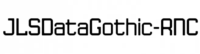
![JLSDataGothic-RNC Frei Schriftart Herunterladen]() Herunterladen 669 Downloads@WebFont
Herunterladen 669 Downloads@WebFont -
( Fonts by Mans Greback - www.mawns.com )
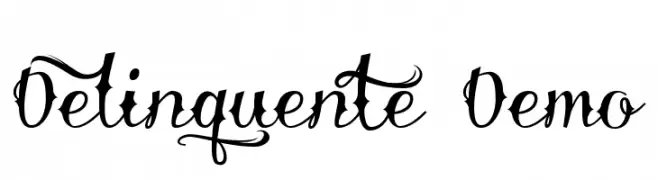
An ornate script font with elaborate swashes and decorative elements.
![Delinquente Demo Frei Schriftart Herunterladen]() Herunterladen 669 Downloads@WebFont
Herunterladen 669 Downloads@WebFont -
![Salika Frei Schriftart Herunterladen]() Herunterladen 669 Downloads@WebFont
Herunterladen 669 Downloads@WebFont -
![S4QUFX Frei Schriftart Herunterladen]() Herunterladen 669 Downloads@WebFont
Herunterladen 669 Downloads@WebFont -
( Fonts by Kimberly Geswein - kimberlygeswein.com )
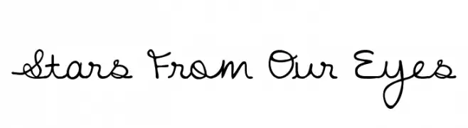
A playful handwritten font with fluid, connected letterforms and a casual aesthetic.
![Stars From Our Eyes Frei Schriftart Herunterladen]() Herunterladen 669 Downloads@WebFont
Herunterladen 669 Downloads@WebFont -
( Fonts by www.twopeasinabucket.com )
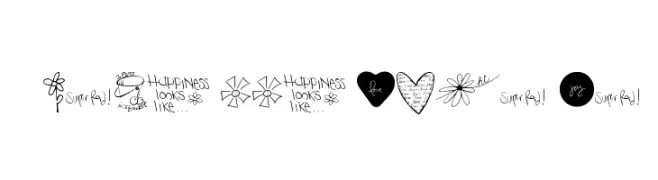
A playful and whimsical collection of hand-drawn doodles and handwritten elements.
![2Peas GGs Love Me Frei Schriftart Herunterladen]() Herunterladen 669 Downloads@WebFont
Herunterladen 669 Downloads@WebFont -
Schriftart von fontone. For commercial use please contact the owner.
![Right Round Frei Schriftart Herunterladen]() Herunterladen 669 Downloads@WebFont
Herunterladen 669 Downloads@WebFont -
( Fonts by Bartek Nowak - www.nowak.tv/fontoholic/ )
No valid font is present; the image consists of football club logos and symbols.
![premiership Frei Schriftart Herunterladen]() Herunterladen 669 Downloads@WebFont
Herunterladen 669 Downloads@WebFont -
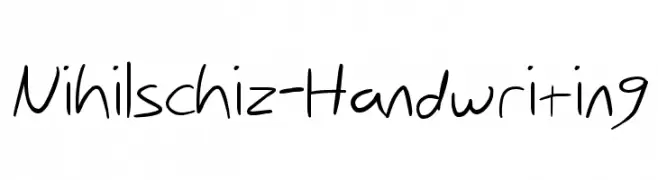
![Nihilschiz-Handwriting Frei Schriftart Herunterladen]() Herunterladen 669 Downloads@WebFont
Herunterladen 669 Downloads@WebFont -
( Fonts by Pennyzine - www.thedevilinjasonramirez.com - Free for personal use )
An ornate Blackletter font with distressed, vintage appeal.
![Made Frei Schriftart Herunterladen]() Herunterladen 669 Downloads@WebFont
Herunterladen 669 Downloads@WebFont -
![V5 Cuadra2 Round Frei Schriftart Herunterladen]() Herunterladen 669 Downloads@WebFont
Herunterladen 669 Downloads@WebFont -
( Fonts by www.peter-wiegel.de. Personal-use only. For commercial use please contact owner. )
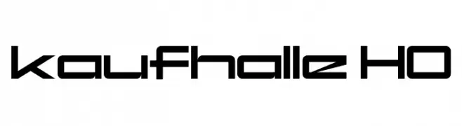
A futuristic, geometric font with bold, clean lines and a modern aesthetic.
![kaufhalle HO Frei Schriftart Herunterladen]() Herunterladen 669 Downloads@WebFont
Herunterladen 669 Downloads@WebFont -
( Fonts by DeNada Industries - Mike Allard )
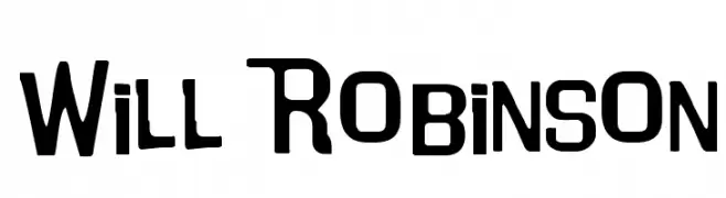
A bold, geometric font with a modern and slightly condensed style.
![Will Robinson Frei Schriftart Herunterladen]() Herunterladen 669 Downloads@WebFont
Herunterladen 669 Downloads@WebFont -
( Fonts by Fontfabric - Svetoslav Simov - Personal-use only. For commercial use please contact owner. )
A modern, geometric sans-serif font with a clean and professional look.
![Uni Neue-Trial Regular Frei Schriftart Herunterladen]() Herunterladen 668 Downloads@WebFont
Herunterladen 668 Downloads@WebFont -
( Fonts by RaisProject )
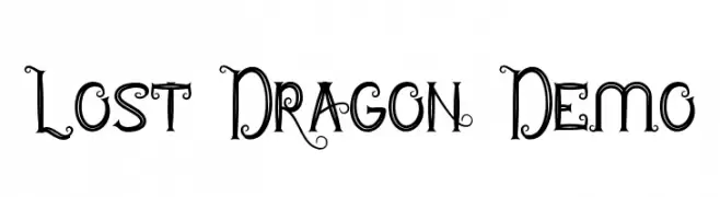
A whimsical and decorative font with playful curls and loops, perfect for fantasy-themed projects.
![Lost Dragon Demo Frei Schriftart Herunterladen]() Herunterladen 668 Downloads@WebFont
Herunterladen 668 Downloads@WebFont -
( Fonts by Vladimir Nikolic - www.creativefabrica.com/designer/vladimirnikolic/ - Personal-use only. For commercial use please contact owner. )
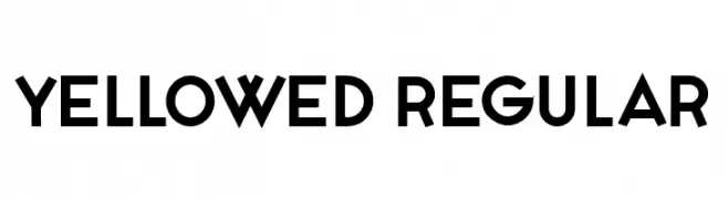
A bold, geometric sans-serif font with a modern and minimalistic design.
![Yellowed Regular Frei Schriftart Herunterladen]() Herunterladen 668 Downloads@WebFont
Herunterladen 668 Downloads@WebFont -
( Fonts by Calligraphy Fonts )
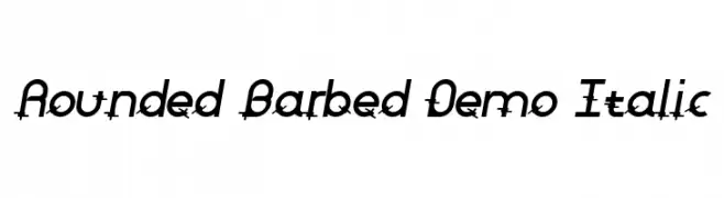
A modern italic font with rounded and barbed accents, offering a dynamic and edgy style.
![Rounded Barbed Demo Italic Frei Schriftart Herunterladen]() Herunterladen 668 Downloads@WebFont
Herunterladen 668 Downloads@WebFont -
( Fonts by deFharo )
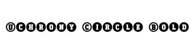
A bold, circular-enclosed font with a modern and striking appearance.
![Uchrony Circle Bold Frei Schriftart Herunterladen]() Herunterladen 668 Downloads@WebFont
Herunterladen 668 Downloads@WebFont -
( Fonts by Rochadi Sudarma [Rochart Studio] - Personal-use only. For commercial use please contact owner. )
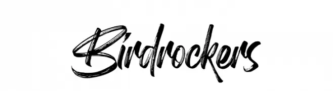
A bold, brush-style font with dynamic, handwritten flair.
![Birdrockers Frei Schriftart Herunterladen]() Herunterladen 668 Downloads@WebFont
Herunterladen 668 Downloads@WebFont -
( Fonts by Youssef Habchi - Personal-use only. For commercial use please contact owner. )
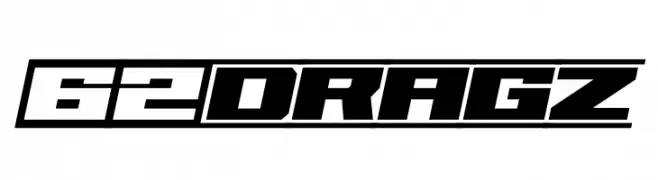
A bold, geometric font with an industrial, futuristic style.
![62DRAGZ Frei Schriftart Herunterladen]() Herunterladen 668 Downloads@WebFont
Herunterladen 668 Downloads@WebFont -
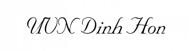
![UVN Dinh Hon Frei Schriftart Herunterladen]() Herunterladen 668 Downloads@WebFont
Herunterladen 668 Downloads@WebFont -
( Zetafonts - www.zetafonts.com )
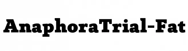
A bold, robust font with thick strokes, perfect for impactful headlines.
![AnaphoraTrial-Fat Frei Schriftart Herunterladen]() Herunterladen 668 Downloads@WebFont
Herunterladen 668 Downloads@WebFont -
( jaydegarrow.wix.com/jaydefonts )
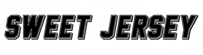
A bold, athletic font with a three-dimensional, shadowed effect.
![Sweet Jersey Frei Schriftart Herunterladen]() Herunterladen 668 Downloads@WebFont
Herunterladen 668 Downloads@WebFont -
( Copyright (c) 2014, Girish Dalvi, Ek Type. All rights reserved. )
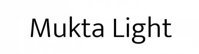
A modern, light sans-serif font with excellent readability and a clean design.
![Mukta Light Frei Schriftart Herunterladen]() Herunterladen 668 Downloads@WebFont
Herunterladen 668 Downloads@WebFont -
( Fonts by Jovanny Lemonad - typetype.ru - Personal-use only. For commercial use please contact owner. )
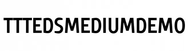
A modern, bold sans-serif font with clean lines and excellent legibility.
![TTTedsMediumDEMO Frei Schriftart Herunterladen]() Herunterladen 668 Downloads@WebFont
Herunterladen 668 Downloads@WebFont -
( Fonts by a Typeface Leone - www.tipografialeone.net. Personal-use only. For commercial use please contact owner. )
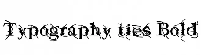
A bold, decorative font with intricate vine-like embellishments.
![Typography ties Bold Frei Schriftart Herunterladen]() Herunterladen 668 Downloads@WebFont
Herunterladen 668 Downloads@WebFont -
( Fonts by Sam Wang )
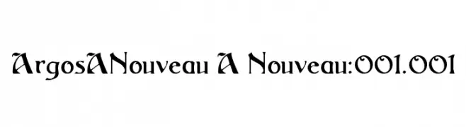
A bold, elegant font with sharp serifs and flowing curves, ideal for creative projects.
![ArgosANouveau A Nouveau:001.001 Frei Schriftart Herunterladen]() Herunterladen 668 Downloads@WebFont
Herunterladen 668 Downloads@WebFont -
( Font by Jonathan Harris - www.tattoowoo.com )
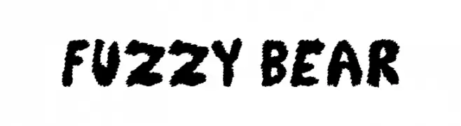
A playful, bold font with a fuzzy texture and lively appearance.
![Fuzzy Bear Frei Schriftart Herunterladen]() Herunterladen 668 Downloads@WebFont
Herunterladen 668 Downloads@WebFont -
( - www.vnbc.fr )
A fragmented, distressed font with a bold and chaotic design.
![aerial demented Frei Schriftart Herunterladen]() Herunterladen 668 Downloads@WebFont
Herunterladen 668 Downloads@WebFont -
( Copyright (c) 2010, Danh Hong (khmertype.blogspot.com) )
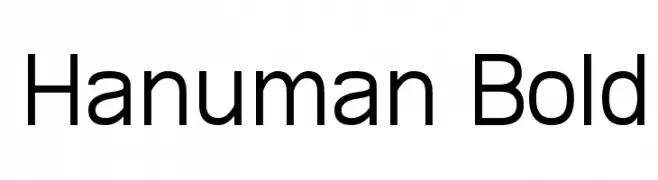
A bold, modern sans-serif font with excellent legibility and balanced character spacing.
![Hanuman Bold Frei Schriftart Herunterladen]() Herunterladen 668 Downloads@WebFont
Herunterladen 668 Downloads@WebFont -
( Fonts by weknow - Wino S Kadir )
A modern, geometric font with rounded edges and a sleek, minimalistic style.
![gembira Frei Schriftart Herunterladen]() Herunterladen 668 Downloads@WebFont
Herunterladen 668 Downloads@WebFont -
![Chaya Bold Frei Schriftart Herunterladen]() Herunterladen 668 Downloads
Herunterladen 668 Downloads -
![ESRI Weather Frei Schriftart Herunterladen]() Herunterladen 668 Downloads@WebFont
Herunterladen 668 Downloads@WebFont -
( Frogii`s Fonts )
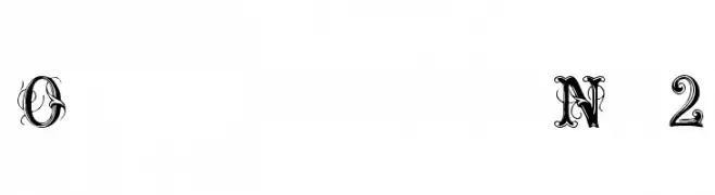
An ornate and decorative font with intricate swirls and embellishments.
![OrnamentalNo2 Frei Schriftart Herunterladen]() Herunterladen 668 Downloads@WebFont
Herunterladen 668 Downloads@WebFont


Welche Schriften sind gerade am populärsten?
Poppins, Roboto, Montserrat, Open Sans und Lato sind wegen ihrer klaren Formen und breiten Einsetzbarkeit sehr gefragt – von Markenauftritt über Landingpages bis hin zu Postern.
Welche Fonts eignen sich für Logos?
Geometrische Sans‑Serifs (z. B. Poppins, Familien im Gotham‑Stil) sind ein häufiger Griff für sauberes, skalierbares Branding. Für eine persönlichere Note bleiben Scripts und Handschrift‑Stile beliebt. Kombinieren Sie einen prägnanten Headline‑Font mit einer neutralen Brotschrift für Wiedererkennung und Harmonie.
Wie oft wird die Top‑Liste aktualisiert?
Regelmäßig – basierend auf realen Downloads und Interaktionen. Schauen Sie öfter vorbei, um aufstrebende Favoriten früh zu entdecken.
💡 Tipp: Seite bookmarken – Trends wechseln schnell, und heutige Top‑Schriften inspirieren morgen vielleicht das Rebranding.