Willkommen bei den Top‑Schriften – hier treffen Beliebtheit und Qualität aufeinander. Das sind die in diesem Jahr am häufigsten heruntergeladenen und genutzten Fonts. Wenn Sie sichere Optionen für Logo, Web oder Social suchen, starten Sie hier.
Jeder Top‑Font überzeugt durch Balance, Lesbarkeit und Vielseitigkeit. Sie finden moderne Sans‑Serifs, elegante Scripts, Vintage‑Serifs und minimalistische Displays.
-
Schriftart von danny91194. For commercial use please contact the owner.
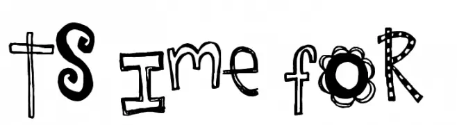
( tricky )
A playful, hand-drawn font with whimsical patterns and decorative elements.
 Herunterladen 144 Downloads@WebFont
 -
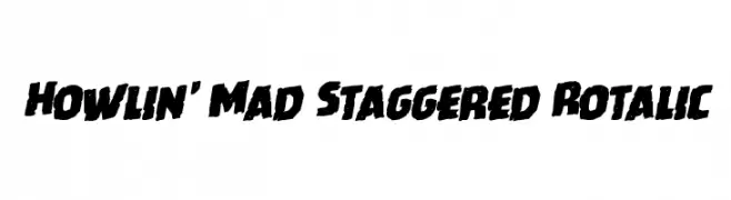
( Iconian Fonts - Daniel Zadorozny - www.iconian.com )
A bold, staggered, and italicized font with a dynamic and edgy style.
![Howlin' Mad Staggered Rotalic Frei Schriftart Herunterladen]() Herunterladen 144 Downloads@WebFont
Herunterladen 144 Downloads@WebFont -
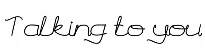
![Talking to you Frei Schriftart Herunterladen]() Herunterladen 144 Downloads@WebFont
Herunterladen 144 Downloads@WebFont -
![I SEE SPIRALS EVERYWHERE Frei Schriftart Herunterladen]() Herunterladen 144 Downloads
Herunterladen 144 Downloads -
( Fonts by Youssef Habchi )
A playful, rounded handwritten font with smooth curves and consistent strokes.
![FishesFriends Frei Schriftart Herunterladen]() Herunterladen 144 Downloads@WebFont
Herunterladen 144 Downloads@WebFont -
-
( Fonts by CannotIntoSpaceFonts - KineticPlasma Fonts - Personal-use only. For commercial use please contact owner. )
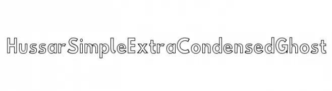
A modern, extra condensed outline font with a geometric structure.
![Hussar Simple ExtraCondensed Ghost Frei Schriftart Herunterladen]() Herunterladen 144 Downloads@WebFont
Herunterladen 144 Downloads@WebFont -
( Fonts by Raina )
A bold, decorative font with exaggerated curves and thick strokes.
![Smooth Gracier Personal Use Frei Schriftart Herunterladen]() Herunterladen 144 Downloads@WebFont
Herunterladen 144 Downloads@WebFont -
( Fonts by www.houseoflime.com )
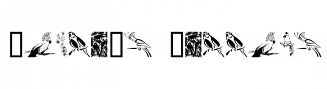
A decorative set of parrot illustrations replacing traditional font characters.
![Moyra's Parrots Frei Schriftart Herunterladen]() Herunterladen 144 Downloads@WebFont
Herunterladen 144 Downloads@WebFont -
( Fonts by K26 Fonts )
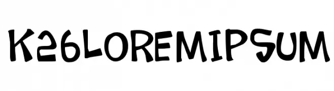
A playful, hand-drawn font with bold, rounded characters and a dynamic tilt.
![K26LoremIpsum Frei Schriftart Herunterladen]() Herunterladen 144 Downloads@WebFont
Herunterladen 144 Downloads@WebFont -
( Fonts by Graham Meade - GemFonts )
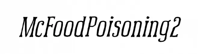
A dynamic, slanted serif-script hybrid with medium contrast and bold strokes.
![McFoodPoisoning2 Frei Schriftart Herunterladen]() Herunterladen 144 Downloads@WebFont
Herunterladen 144 Downloads@WebFont


Welche Schriften sind gerade am populärsten?
Poppins, Roboto, Montserrat, Open Sans und Lato sind wegen ihrer klaren Formen und breiten Einsetzbarkeit sehr gefragt – von Markenauftritt über Landingpages bis hin zu Postern.
Welche Fonts eignen sich für Logos?
Geometrische Sans‑Serifs (z. B. Poppins, Familien im Gotham‑Stil) sind ein häufiger Griff für sauberes, skalierbares Branding. Für eine persönlichere Note bleiben Scripts und Handschrift‑Stile beliebt. Kombinieren Sie einen prägnanten Headline‑Font mit einer neutralen Brotschrift für Wiedererkennung und Harmonie.
Wie oft wird die Top‑Liste aktualisiert?
Regelmäßig – basierend auf realen Downloads und Interaktionen. Schauen Sie öfter vorbei, um aufstrebende Favoriten früh zu entdecken.
💡 Tipp: Seite bookmarken – Trends wechseln schnell, und heutige Top‑Schriften inspirieren morgen vielleicht das Rebranding.