Willkommen bei den Top‑Schriften – hier treffen Beliebtheit und Qualität aufeinander. Das sind die in diesem Jahr am häufigsten heruntergeladenen und genutzten Fonts. Wenn Sie sichere Optionen für Logo, Web oder Social suchen, starten Sie hier.
Jeder Top‑Font überzeugt durch Balance, Lesbarkeit und Vielseitigkeit. Sie finden moderne Sans‑Serifs, elegante Scripts, Vintage‑Serifs und minimalistische Displays.
-
 Herunterladen 6501 Downloads@WebFont
 -
![SoftMicro Frei Schriftart Herunterladen]() Herunterladen 6499 Downloads@WebFont
Herunterladen 6499 Downloads@WebFont -
( Fonts by Francis John - Francis Studio - Personal-use only. For commercial use please contact owner. )
A bold, handwritten font with a playful and energetic style.
![Beauty and the Beast Frei Schriftart Herunterladen]() Herunterladen 6497 Downloads@WebFont
Herunterladen 6497 Downloads@WebFont -
![NCAA Arizona Wildcats Tucson Bold Frei Schriftart Herunterladen]() Herunterladen 6497 Downloads@WebFont
Herunterladen 6497 Downloads@WebFont -
( Fonts by typies.blogspot.com.es )
A bold, slab serif font with high contrast and a modern yet classic style.
![Romeral Frei Schriftart Herunterladen]() Herunterladen 6496 Downloads@WebFont
Herunterladen 6496 Downloads@WebFont -
( Fonts by Zetafonts - Personal-use only. For commercial use please contact owner. )
A bold, modern typeface perfect for impactful headlines.
![Heading Now Trial 67 Extrabold Frei Schriftart Herunterladen]() Herunterladen 6493 Downloads@WebFont
Herunterladen 6493 Downloads@WebFont -
( Fonts by www.studiotypo.com - Personal-use only. For commercial use please contact owner. )
A bold, modern sans-serif font with geometric lines and high readability.
![Mayeka Bold Demo Frei Schriftart Herunterladen]() Herunterladen 6493 Downloads@WebFont
Herunterladen 6493 Downloads@WebFont -
![ATROX normal Frei Schriftart Herunterladen]() Herunterladen 6492 Downloads@WebFont
Herunterladen 6492 Downloads@WebFont -
( Fonts by Castcraft Software - opti.netii.net - check the website before use )
A bold, modern font with geometric shapes and clean lines.
![NissanOpti Frei Schriftart Herunterladen]() Herunterladen 6488 Downloads@WebFont
Herunterladen 6488 Downloads@WebFont -
![Batik Regular Frei Schriftart Herunterladen]() Herunterladen 6488 Downloads
Herunterladen 6488 Downloads -
![Upper-EastSide Regular Frei Schriftart Herunterladen]() Herunterladen 6487 Downloads@WebFont
Herunterladen 6487 Downloads@WebFont -
( Fonts by Cristiano Sobral - Personal-use only. For commercial use please contact owner. )
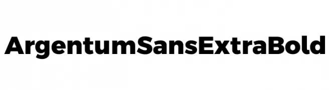
A bold, modern sans-serif font with thick strokes and strong presence.
![Argentum Sans ExtraBold Frei Schriftart Herunterladen]() Herunterladen 6486 Downloads@WebFont
Herunterladen 6486 Downloads@WebFont -
( Fonts by Denise Bentulan - douxiegirl.com. Personal-use only. For commercial use please contact owner. )
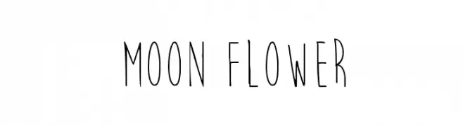
A whimsical, handwritten font with tall, narrow letters and thin strokes.
![Moon Flower Frei Schriftart Herunterladen]() Herunterladen 6486 Downloads@WebFont
Herunterladen 6486 Downloads@WebFont -
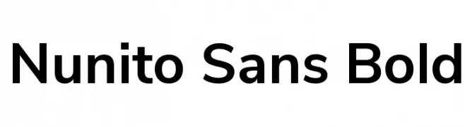
( Copyright 2016 The Nunito Project Authors (contact@sansoxygen.com) )
A modern sans-serif font with rounded terminals and balanced proportions.
![Nunito Sans Bold Frei Schriftart Herunterladen]() Herunterladen 6484 Downloads@WebFont
Herunterladen 6484 Downloads@WebFont -
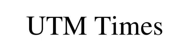
![UTM Times Frei Schriftart Herunterladen]() Herunterladen 6483 Downloads@WebFont
Herunterladen 6483 Downloads@WebFont -
( Google Web Fonts )
A casual, handwritten font with a lively and organic feel.
![Rock Salt Frei Schriftart Herunterladen]() Herunterladen 6483 Downloads@WebFont
Herunterladen 6483 Downloads@WebFont -
( Fonts by Gyom Seguin - last-soundtrack.daportfolio.com )
A bold, distressed sans-serif font with a modern, edgy look.
![BIRTH OF A HERO Frei Schriftart Herunterladen]() Herunterladen 6483 Downloads@WebFont
Herunterladen 6483 Downloads@WebFont -
( Copyright (c) 2011 by LatinoType Limitada (luciano@latinotype.com) )
A playful and whimsical script font with rounded, flowing characters.
![Sofia Frei Schriftart Herunterladen]() Herunterladen 6482 Downloads@WebFont
Herunterladen 6482 Downloads@WebFont -
( Fonts by HPLHS Prop Fonts - Andrew H. Leman http://www.cthulhulives.org/toybox/propdocs/propfonts.html )
A bold, impactful typeface with thick, uniform strokes ideal for headlines.
![Headline One HPLHS Frei Schriftart Herunterladen]() Herunterladen 6482 Downloads@WebFont
Herunterladen 6482 Downloads@WebFont -
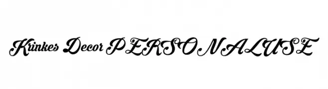
( Fonts by Måns Grebäck )
An elegant and decorative script font with flowing, interconnected letterforms.
![Krinkes Decor PERSONAL USE Frei Schriftart Herunterladen]() Herunterladen 6481 Downloads@WebFont
Herunterladen 6481 Downloads@WebFont -
![EnglishTowne-Normal Frei Schriftart Herunterladen]() Herunterladen 6479 Downloads
Herunterladen 6479 Downloads -
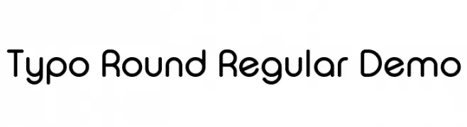
![Typo Round Regular Demo Frei Schriftart Herunterladen]() Herunterladen 6473 Downloads@WebFont
Herunterladen 6473 Downloads@WebFont -
( Fonts by a www.fontfabric.com. Personal-use only. For commercial use please contact owner. )
A modern, rounded sans-serif font with medium weight and excellent readability.
![Blogger Sans Medium Frei Schriftart Herunterladen]() Herunterladen 6467 Downloads@WebFont
Herunterladen 6467 Downloads@WebFont -
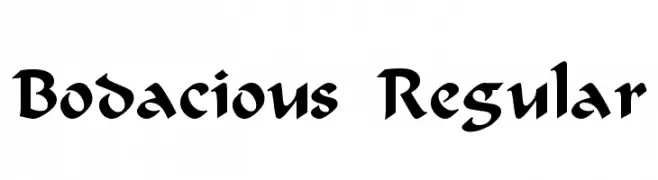
![Bodacious Regular Frei Schriftart Herunterladen]() Herunterladen 6467 Downloads@WebFont
Herunterladen 6467 Downloads@WebFont -
( Fonts by www.ajpaglia.com - FREE for personal or commercial usage )
A bold, geometric font with strong, angular characters ideal for impactful designs.
![Alley-Oop Frei Schriftart Herunterladen]() Herunterladen 6466 Downloads@WebFont
Herunterladen 6466 Downloads@WebFont -
( Fonts by Castcraft Software - OPTI Fonts Archive - opti.netii.net - Personal-use only. For commercial use please contact owner. )
A bold, semi-bold font with strong, well-defined characters and slight stroke contrast.
![OPTIOptionSemiBold Frei Schriftart Herunterladen]() Herunterladen 6463 Downloads@WebFont
Herunterladen 6463 Downloads@WebFont -
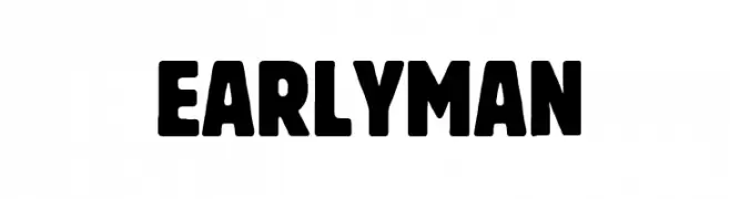
( Fonts by Fran Fernandez - Personal-use only. For commercial use please contact owner. )
A bold, rounded font with a strong, impactful presence.
![Early Man Frei Schriftart Herunterladen]() Herunterladen 6456 Downloads@WebFont
Herunterladen 6456 Downloads@WebFont -
( Fonts by Zetafonts - Personal-use only. For commercial use please contact owner. )
A bold, modern font with thick strokes and tight spacing, perfect for impactful headlines.
![Heading Now Trial 37 Extrabold Frei Schriftart Herunterladen]() Herunterladen 6455 Downloads@WebFont
Herunterladen 6455 Downloads@WebFont -
![Danley Frei Schriftart Herunterladen]() Herunterladen 6453 Downloads@WebFont
Herunterladen 6453 Downloads@WebFont -
( Fonts by PremiereGraphics )
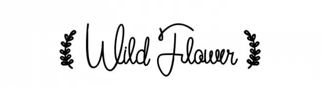
A whimsical, handwritten cursive font with a playful and fluid style.
![( Wild Flower ) Frei Schriftart Herunterladen]() Herunterladen 6450 Downloads@WebFont
Herunterladen 6450 Downloads@WebFont -
( Fonts by Almaz Studio )
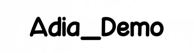
A playful, rounded font with bold, smooth curves and consistent spacing.
![Adia_Demo Frei Schriftart Herunterladen]() Herunterladen 6448 Downloads@WebFont
Herunterladen 6448 Downloads@WebFont -
( Fonts by a Situjuh Nazara - c7n1.wordpress.com. Personal-use only. For commercial use please contact owner. )
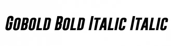
A bold, italicized font with a dynamic and modern style.
![Gobold Bold Italic Italic Frei Schriftart Herunterladen]() Herunterladen 6448 Downloads@WebFont
Herunterladen 6448 Downloads@WebFont -
( گالری فانت فارسی پژوهش آريانا - only compatible with Farsi and Arabic )
A flowing, elegant script font with artistic curves.
![Lotus Frei Schriftart Herunterladen]() Herunterladen 6447 Downloads@WebFont
Herunterladen 6447 Downloads@WebFont -
( Fonts by Mario Arturo - marioarturo.com. Personal-use only. For commercial use please contact owner. Contact the owner for a donation. )
An elegant script font with flowing, connected letters and a sophisticated style.
![Angelface Frei Schriftart Herunterladen]() Herunterladen 6446 Downloads@WebFont
Herunterladen 6446 Downloads@WebFont -
( Fonts by Bright Ideas )
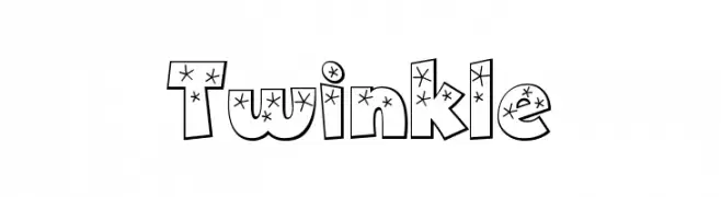
A bold, playful font with star decorations inside each character.
![Twinkle Frei Schriftart Herunterladen]() Herunterladen 6445 Downloads@WebFont
Herunterladen 6445 Downloads@WebFont


Welche Schriften sind gerade am populärsten?
Poppins, Roboto, Montserrat, Open Sans und Lato sind wegen ihrer klaren Formen und breiten Einsetzbarkeit sehr gefragt – von Markenauftritt über Landingpages bis hin zu Postern.
Welche Fonts eignen sich für Logos?
Geometrische Sans‑Serifs (z. B. Poppins, Familien im Gotham‑Stil) sind ein häufiger Griff für sauberes, skalierbares Branding. Für eine persönlichere Note bleiben Scripts und Handschrift‑Stile beliebt. Kombinieren Sie einen prägnanten Headline‑Font mit einer neutralen Brotschrift für Wiedererkennung und Harmonie.
Wie oft wird die Top‑Liste aktualisiert?
Regelmäßig – basierend auf realen Downloads und Interaktionen. Schauen Sie öfter vorbei, um aufstrebende Favoriten früh zu entdecken.
💡 Tipp: Seite bookmarken – Trends wechseln schnell, und heutige Top‑Schriften inspirieren morgen vielleicht das Rebranding.