Willkommen bei den Top‑Schriften – hier treffen Beliebtheit und Qualität aufeinander. Das sind die in diesem Jahr am häufigsten heruntergeladenen und genutzten Fonts. Wenn Sie sichere Optionen für Logo, Web oder Social suchen, starten Sie hier.
Jeder Top‑Font überzeugt durch Balance, Lesbarkeit und Vielseitigkeit. Sie finden moderne Sans‑Serifs, elegante Scripts, Vintage‑Serifs und minimalistische Displays.
-
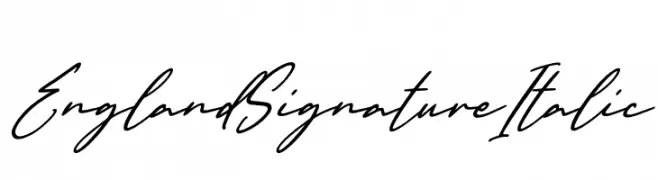
( Fonts by Kong Font - https://fontkong.com/ - Personal-use only. For commercial use please contact owner. )
A flowing, cursive script font with an elegant, italic style.
 Herunterladen 654 Downloads@WebFont
 -
( Fonts by Ben Nathan )
A bold, distressed font with jagged edges and a chaotic style.
![BN-NoFear Frei Schriftart Herunterladen]() Herunterladen 654 Downloads@WebFont
Herunterladen 654 Downloads@WebFont -
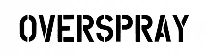
( Tension Type - Michael Tension - www.TensionType.com )
A bold, stencil-style font with an industrial, urban aesthetic.
![Overspray Frei Schriftart Herunterladen]() Herunterladen 654 Downloads@WebFont
Herunterladen 654 Downloads@WebFont -
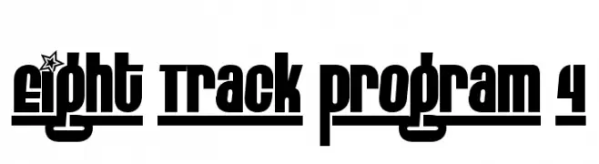
( Fonts by www.fontalicious.com )
A bold, modern font with blocky letters and decorative star motifs.
![Eight Track program 4 Frei Schriftart Herunterladen]() Herunterladen 654 Downloads@WebFont
Herunterladen 654 Downloads@WebFont -
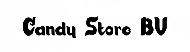
( Fonts by Blue Vinyl - Jess Latham - www.bvfonts.com )
A bold, playful font with rounded characters and a vintage flair.
![Candy Store BV Frei Schriftart Herunterladen]() Herunterladen 654 Downloads@WebFont
Herunterladen 654 Downloads@WebFont -
( Roland Huse Design - Roland Huse - rolandhuse.com )
A playful and whimsical font with bold strokes and decorative elements.
![Personalitype Demo Regular Regular Frei Schriftart Herunterladen]() Herunterladen 654 Downloads@WebFont
Herunterladen 654 Downloads@WebFont -
( Fonts by Daniel Zadorozny - www.iconian.com - Free for personal use )
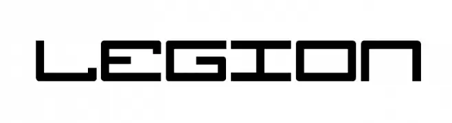
A futuristic, geometric font with angular shapes and consistent stroke width.
![Legion Frei Schriftart Herunterladen]() Herunterladen 654 Downloads@WebFont
Herunterladen 654 Downloads@WebFont -
![AlphaBizzyBee Frei Schriftart Herunterladen]() Herunterladen 654 Downloads@WebFont
Herunterladen 654 Downloads@WebFont -
( Fonts by Daniel Zadorozny - www.iconian.com - Free for personal use )
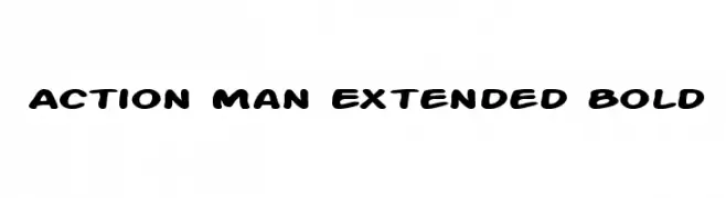
A bold, playful font with rounded edges and a cohesive, friendly style.
![Action Man Extended Bold Frei Schriftart Herunterladen]() Herunterladen 654 Downloads@WebFont
Herunterladen 654 Downloads@WebFont -
( MaxiGamer )
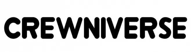
A bold, rounded font with a playful and friendly style.
![Crewniverse Frei Schriftart Herunterladen]() Herunterladen 654 Downloads@WebFont
Herunterladen 654 Downloads@WebFont -
( Fonts by CannotIntoSpaceFonts - KineticPlasma Fonts - Personal-use only. For commercial use please contact owner. )
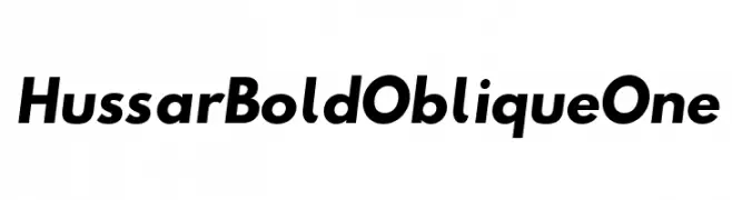
A bold, oblique font with strong, dynamic strokes and a cohesive design.
![Hussar Bold Oblique One Frei Schriftart Herunterladen]() Herunterladen 654 Downloads@WebFont
Herunterladen 654 Downloads@WebFont -
![Nickelodeon Playoffs Frei Schriftart Herunterladen]() Herunterladen 654 Downloads@WebFont
Herunterladen 654 Downloads@WebFont -
( Free Football Font - freefootballfont.blogspot.com )
A bold, outlined font with a modern and impactful style.
![Verona FFF Frei Schriftart Herunterladen]() Herunterladen 654 Downloads@WebFont
Herunterladen 654 Downloads@WebFont -
( Fonts by Daniel Zadorozny - www.iconian.com )
Bold, italicized stencil-style font with a modern, impactful design.
![From BOND With Love Italic Frei Schriftart Herunterladen]() Herunterladen 654 Downloads@WebFont
Herunterladen 654 Downloads@WebFont -
( Fonts by David Rakowski )
A decorative ribbon-style font with a three-dimensional effect.
![DavysRibbons Frei Schriftart Herunterladen]() Herunterladen 654 Downloads@WebFont
Herunterladen 654 Downloads@WebFont -
( Fonts by a Neale Davidson - www.pixelsagas.com. Personal-use only. For commercial use please contact owner. )
A modern, italicized font with a sleek, geometric design.
![2015 Cruiser Italic Frei Schriftart Herunterladen]() Herunterladen 654 Downloads@WebFont
Herunterladen 654 Downloads@WebFont -
( Copyright (c) 2005-2017 FONTRIX. All Rights Reserved. )
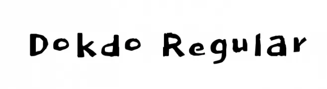
A playful, handwritten-style font with irregular strokes and a casual appearance.
![Dokdo Regular Frei Schriftart Herunterladen]() Herunterladen 654 Downloads@WebFont
Herunterladen 654 Downloads@WebFont -
( Fonts by yujikung - yujikung passawee - Personal-use only. For commercial use please contact owner. )
A playful, bold font with rounded, bubbly characters.
![Cookie Frei Schriftart Herunterladen]() Herunterladen 654 Downloads@WebFont
Herunterladen 654 Downloads@WebFont -
( Fonts by Tobias Benjamin Kohler - www.uncia.de )
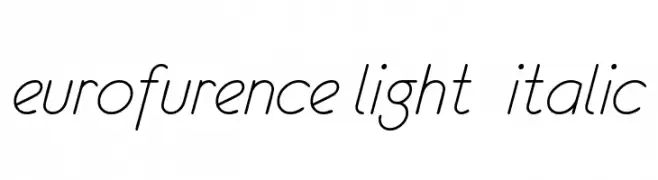
A sleek, modern, light italic font with elegant curves and minimal contrast.
![eurofurence light italic Frei Schriftart Herunterladen]() Herunterladen 654 Downloads@WebFont
Herunterladen 654 Downloads@WebFont -
![Firebug Caps SSi Frei Schriftart Herunterladen]() Herunterladen 654 Downloads
Herunterladen 654 Downloads -
( Fonts by Antipixel )
A bold, distressed sans-serif font with a vintage, stamped look.
![AustralSansStamp-Regular Frei Schriftart Herunterladen]() Herunterladen 654 Downloads@WebFont
Herunterladen 654 Downloads@WebFont -
![High Octane Frei Schriftart Herunterladen]() Herunterladen 654 Downloads@WebFont
Herunterladen 654 Downloads@WebFont -
( Fonts by www.woodcutter.es - woodcutter Manero - Personal-use only. For commercial use please contact owner. )
A festive icon set font with birthday and celebration motifs.
![Happy Birthday Frei Schriftart Herunterladen]() Herunterladen 654 Downloads@WebFont
Herunterladen 654 Downloads@WebFont -
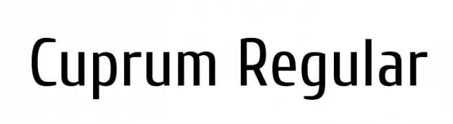
( Copyright 2010 The Cuprum Project Authors (lemonad@jovanny.ru), with Reserved Font Name "Cuprum". )
A modern, clean sans-serif font with a slightly condensed style.
![Cuprum Regular Frei Schriftart Herunterladen]() Herunterladen 654 Downloads@WebFont
Herunterladen 654 Downloads@WebFont -
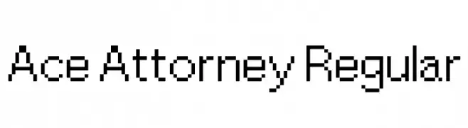
( Fonts by a David Fens. Personal-use only. For commercial use please contact owner. )
A pixelated, monospaced font with a retro digital style.
![Ace Attorney Regular Frei Schriftart Herunterladen]() Herunterladen 654 Downloads@WebFont
Herunterladen 654 Downloads@WebFont -
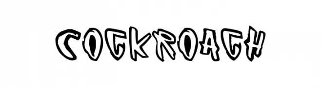
( Fonts by www.junkohanhero.com )
A bold, graffiti-inspired font with a playful and edgy style.
![Cockroach Frei Schriftart Herunterladen]() Herunterladen 654 Downloads@WebFont
Herunterladen 654 Downloads@WebFont -
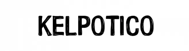
( Carrot Rope - typewhatyouloveandletitkillyou.tumblr.com/ )
A bold, hand-drawn font with a playful and informal style.
![Kelpotico Frei Schriftart Herunterladen]() Herunterladen 654 Downloads@WebFont
Herunterladen 654 Downloads@WebFont -
( Fonts by Zetafonts - Personal-use only. For commercial use please contact owner. )
A modern, rounded font with a clean and smooth appearance.
![Arista Pro Alternate Light Frei Schriftart Herunterladen]() Herunterladen 654 Downloads@WebFont
Herunterladen 654 Downloads@WebFont -
![Undercut Frei Schriftart Herunterladen]() Herunterladen 654 Downloads@WebFont
Herunterladen 654 Downloads@WebFont -
( Fonts by Omnibus Type )
A bold, modern font with elegant curves and strong character presence.
![Sansita Bold Frei Schriftart Herunterladen]() Herunterladen 654 Downloads@WebFont
Herunterladen 654 Downloads@WebFont -
![MobitaleCnd Frei Schriftart Herunterladen]() Herunterladen 654 Downloads@WebFont
Herunterladen 654 Downloads@WebFont -
( Fonts by Daniel Zadorozny - www.iconian.com - Free for personal use )
Decorative silhouette figure font featuring women in multiple poses.
![QT's Frei Schriftart Herunterladen]() Herunterladen 654 Downloads@WebFont
Herunterladen 654 Downloads@WebFont -
( Copyright (c) 2012 by Carolina Giovagnoli (huertatipografica.com.ar). All rights reserved. )
Bold, italic serif font with medium contrast and classic elegance.
![Andada SC Bold Italic Frei Schriftart Herunterladen]() Herunterladen 654 Downloads@WebFont
Herunterladen 654 Downloads@WebFont -
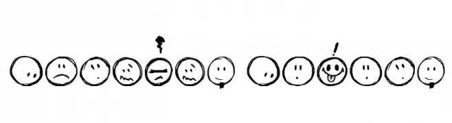
( Fonts by David Kerkhoff - www.hanodedphotography.com )
A playful set of hand-drawn smiley faces with various expressive emotions.
![Sketchy Smiley Frei Schriftart Herunterladen]() Herunterladen 653 Downloads@WebFont
Herunterladen 653 Downloads@WebFont -
Schriftart von JamboFonts. For commercial use please contact the owner.
![UrbanElegance-Bold Frei Schriftart Herunterladen]() Herunterladen 653 Downloads@WebFont
Herunterladen 653 Downloads@WebFont


Welche Schriften sind gerade am populärsten?
Poppins, Roboto, Montserrat, Open Sans und Lato sind wegen ihrer klaren Formen und breiten Einsetzbarkeit sehr gefragt – von Markenauftritt über Landingpages bis hin zu Postern.
Welche Fonts eignen sich für Logos?
Geometrische Sans‑Serifs (z. B. Poppins, Familien im Gotham‑Stil) sind ein häufiger Griff für sauberes, skalierbares Branding. Für eine persönlichere Note bleiben Scripts und Handschrift‑Stile beliebt. Kombinieren Sie einen prägnanten Headline‑Font mit einer neutralen Brotschrift für Wiedererkennung und Harmonie.
Wie oft wird die Top‑Liste aktualisiert?
Regelmäßig – basierend auf realen Downloads und Interaktionen. Schauen Sie öfter vorbei, um aufstrebende Favoriten früh zu entdecken.
💡 Tipp: Seite bookmarken – Trends wechseln schnell, und heutige Top‑Schriften inspirieren morgen vielleicht das Rebranding.