Willkommen bei den Top‑Schriften – hier treffen Beliebtheit und Qualität aufeinander. Das sind die in diesem Jahr am häufigsten heruntergeladenen und genutzten Fonts. Wenn Sie sichere Optionen für Logo, Web oder Social suchen, starten Sie hier.
Jeder Top‑Font überzeugt durch Balance, Lesbarkeit und Vielseitigkeit. Sie finden moderne Sans‑Serifs, elegante Scripts, Vintage‑Serifs und minimalistische Displays.
-
( Fonts by Graham Meade - GemFonts )
A sleek, modern font with thin, geometric lines and a minimalist style.
 Herunterladen 653 Downloads@WebFont
 -
( Fonts by Douglas Vitkauskas - www.vtksdesign.com. Personal-use only. For commercial use please contact owner. )
A decorative font with elaborate swirls and gothic-inspired embellishments.
![Vtks Focus Frei Schriftart Herunterladen]() Herunterladen 653 Downloads@WebFont
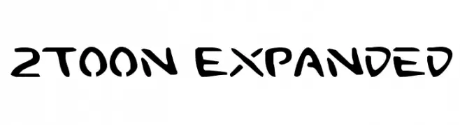
Herunterladen 653 Downloads@WebFont -
![2Toon Expanded Frei Schriftart Herunterladen]() Herunterladen 653 Downloads@WebFont
Herunterladen 653 Downloads@WebFont -
( Fonts by Graham Meade - GemFonts )
A modern, geometric font with a 3D outline effect, offering a unique and bold appearance.
![Labtop 3D Frei Schriftart Herunterladen]() Herunterladen 653 Downloads@WebFont
Herunterladen 653 Downloads@WebFont -
( Fonts by BrandSemut )
A playful, bold font with a hand-drawn, whimsical style.
![Cutline Frei Schriftart Herunterladen]() Herunterladen 653 Downloads@WebFont
Herunterladen 653 Downloads@WebFont -
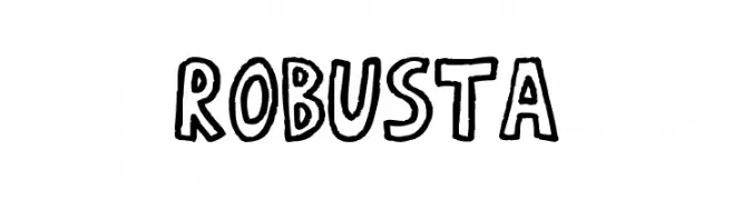
( Fonts by Dibujado )
A bold, hand-drawn font with a playful and cartoonish style.
![RobustA Frei Schriftart Herunterladen]() Herunterladen 653 Downloads@WebFont
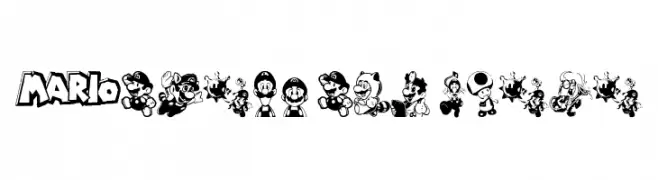
Herunterladen 653 Downloads@WebFont -
![Mario and Luigi Frei Schriftart Herunterladen]() Herunterladen 653 Downloads@WebFont
Herunterladen 653 Downloads@WebFont -
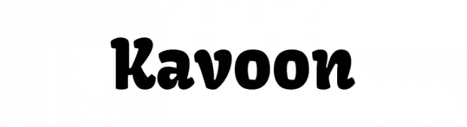
( Copyright (c) 2011-2012, Sorkin Type Co (www.sorkintype.com) with Reserved Font Name 'Kavoon' )
A bold, playful font with rounded, whimsical characters.
![Kavoon Frei Schriftart Herunterladen]() Herunterladen 653 Downloads@WebFont
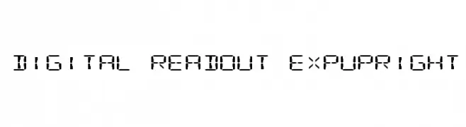
Herunterladen 653 Downloads@WebFont -
![Digital Readout ExpUpright Frei Schriftart Herunterladen]() Herunterladen 653 Downloads@WebFont
Herunterladen 653 Downloads@WebFont -
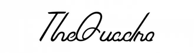
( Fonts by welovefont@gmail.com welovefont - Personal-use only. For commercial use please contact owner. )
A flowing, cursive font with elegant, elongated strokes and a modern calligraphic style.
![The Quadro Frei Schriftart Herunterladen]() Herunterladen 652 Downloads@WebFont
Herunterladen 652 Downloads@WebFont -
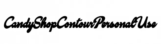
( Fonts by Billy Argel - www.billyargel.com - Personal-use only. For commercial use please contact owner. )
A bold, dynamic script font with interconnected letters and a playful style.
![Candy Shop Contour Personal Use Frei Schriftart Herunterladen]() Herunterladen 652 Downloads@WebFont
Herunterladen 652 Downloads@WebFont -
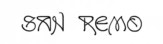
( Fonts by Dieter Steffmann )
An ornate and decorative font with artistic curves and flourishes.
![San Remo Frei Schriftart Herunterladen]() Herunterladen 652 Downloads@WebFont
Herunterladen 652 Downloads@WebFont -
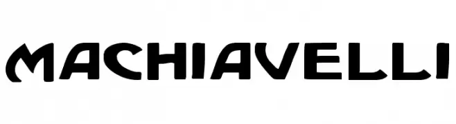
( Fonts by Daniel Zadorozny - www.iconian.com )
A bold, modern font with geometric shapes and dynamic curves.
![Machiavelli Frei Schriftart Herunterladen]() Herunterladen 652 Downloads@WebFont
Herunterladen 652 Downloads@WebFont -
![linka Frei Schriftart Herunterladen]() Herunterladen 652 Downloads@WebFont
Herunterladen 652 Downloads@WebFont -
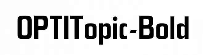
( Fonts by Castcraft Software - OPTI Fonts Archive - opti.netii.net - Personal-use only. For commercial use please contact owner. )
A bold, modern font with strong geometric shapes and clean lines.
![OPTITopic-Bold Frei Schriftart Herunterladen]() Herunterladen 652 Downloads@WebFont
Herunterladen 652 Downloads@WebFont -
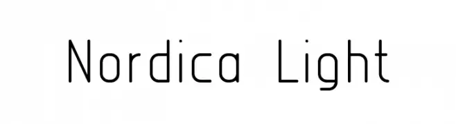
( Font by Sven Stuber - www.superlooper.de )
A modern, light sans-serif font with a geometric influence and clean lines.
![Nordica Light Frei Schriftart Herunterladen]() Herunterladen 652 Downloads@WebFont
Herunterladen 652 Downloads@WebFont -
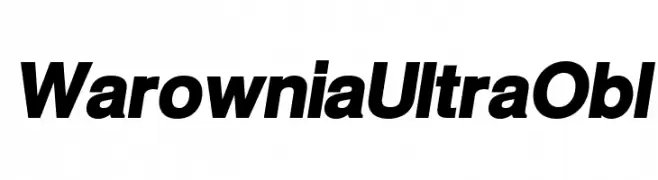
( Fonts by CannotIntoSpaceFonts - KineticPlasma Fonts - Personal-use only. For commercial use please contact owner. )
A bold, italicized font with high contrast and a modern style.
![Warownia Ultra Obl Frei Schriftart Herunterladen]() Herunterladen 652 Downloads@WebFont
Herunterladen 652 Downloads@WebFont -
( Fonts by Apostrophic Lab )
A modern, geometric sans-serif font with uniform width and clear readability.
![Florencesans Comp Frei Schriftart Herunterladen]() Herunterladen 652 Downloads@WebFont
Herunterladen 652 Downloads@WebFont -
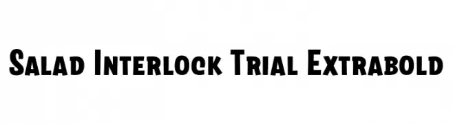
( Fonts by Zetafonts )
A bold, robust font with thick strokes and a playful touch.
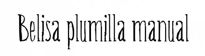
![Salad Interlock Trial Extrabold Frei Schriftart Herunterladen]() Herunterladen 652 Downloads@WebFont
Herunterladen 652 Downloads@WebFont -
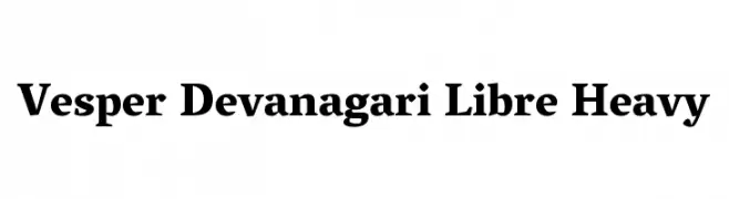
![Belisa plumilla manual Frei Schriftart Herunterladen]() Herunterladen 652 Downloads@WebFont
Herunterladen 652 Downloads@WebFont -
![Vesper Devanagari Libre Heavy Frei Schriftart Herunterladen]() Herunterladen 652 Downloads@WebFont
Herunterladen 652 Downloads@WebFont -
( Fonts by Vanessa Bays - bythebutterfly.com )
A playful, handwritten-style font with rounded edges and a casual feel.
![Caffeine Frei Schriftart Herunterladen]() Herunterladen 652 Downloads@WebFont
Herunterladen 652 Downloads@WebFont -
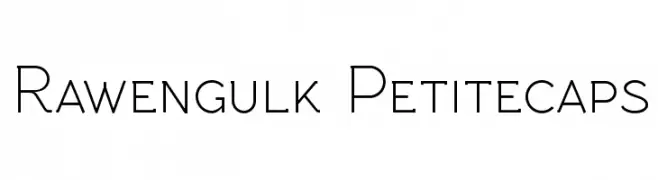
( Fonts by Grzegorz l - www.glukfonts.pl )
A modern, clean font with thin, geometric strokes and high readability.
![Rawengulk Petitecaps Frei Schriftart Herunterladen]() Herunterladen 652 Downloads@WebFont
Herunterladen 652 Downloads@WebFont -
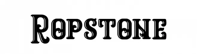
( Graptail Type Studio - creativemarket.com/graptail )
A bold, decorative font with vintage cut-out details.
![Ropstone Frei Schriftart Herunterladen]() Herunterladen 652 Downloads@WebFont
Herunterladen 652 Downloads@WebFont -
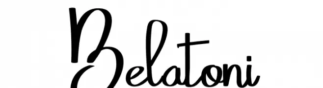
( Fonts by Eknoji Studio - www.eknojistudio.com - Personal-use only. For commercial use please contact owner. )
A dynamic and fluid script font with elegant, flowing letterforms.
![Belatoni Frei Schriftart Herunterladen]() Herunterladen 652 Downloads@WebFont
Herunterladen 652 Downloads@WebFont -
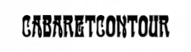
( Fonts by Dieter Steffmann )
A bold, decorative font with contour outlines and playful curves.
![CabaretContour Frei Schriftart Herunterladen]() Herunterladen 652 Downloads@WebFont
Herunterladen 652 Downloads@WebFont -
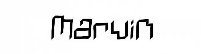
( Fonts by Smart Designs - Personal-use only. For commercial use please contact owner. )
A futuristic, angular font with sharp geometric lines.
![Marvin Frei Schriftart Herunterladen]() Herunterladen 652 Downloads@WebFont
Herunterladen 652 Downloads@WebFont -
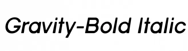
![Gravity-Bold Italic Frei Schriftart Herunterladen]() Herunterladen 652 Downloads@WebFont
Herunterladen 652 Downloads@WebFont -
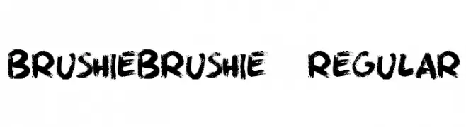
( Fonts by Alex Tomlinson - Skyhaven Fonts - shfonts.com )
A bold, brush-stroke style font with dynamic and artistic flair.
![BrushieBrushie-Regular Frei Schriftart Herunterladen]() Herunterladen 652 Downloads@WebFont
Herunterladen 652 Downloads@WebFont -
( Fonts by weknow - Wino S Kadir )
An elegant script font with flowing, graceful curves and dynamic slant.
![Beauty And The Best Frei Schriftart Herunterladen]() Herunterladen 652 Downloads@WebFont
Herunterladen 652 Downloads@WebFont -
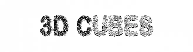
( Fonts by Vidkä© Foundry )
A bold, 3D cube-themed font with intricate, textured characters.
![3D Cubes Frei Schriftart Herunterladen]() Herunterladen 652 Downloads@WebFont
Herunterladen 652 Downloads@WebFont -
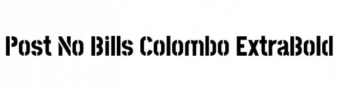
( Copyright (c) 2013-2015 Post No Bills Project Authors (https://github.com/mooniak/post-no-bills-font). )
A bold, geometric font with a modern, industrial feel.
![Post No Bills Colombo ExtraBold Frei Schriftart Herunterladen]() Herunterladen 652 Downloads@WebFont
Herunterladen 652 Downloads@WebFont -
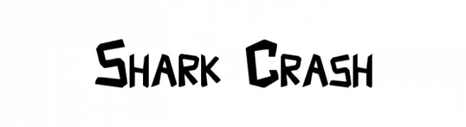
( Fonts by Aryel Filipe )
A bold, angular font with a dynamic and edgy style.
![Shark Crash Frei Schriftart Herunterladen]() Herunterladen 652 Downloads@WebFont
Herunterladen 652 Downloads@WebFont -
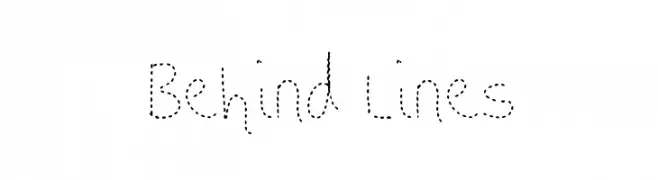
![Behind Lines Frei Schriftart Herunterladen]() Herunterladen 652 Downloads@WebFont
Herunterladen 652 Downloads@WebFont -
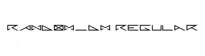
( Fonts by Yves Pauwels )
A geometric and angular font with a futuristic and edgy design.
![RANDOM_DM Regular Frei Schriftart Herunterladen]() Herunterladen 652 Downloads@WebFont
Herunterladen 652 Downloads@WebFont


Welche Schriften sind gerade am populärsten?
Poppins, Roboto, Montserrat, Open Sans und Lato sind wegen ihrer klaren Formen und breiten Einsetzbarkeit sehr gefragt – von Markenauftritt über Landingpages bis hin zu Postern.
Welche Fonts eignen sich für Logos?
Geometrische Sans‑Serifs (z. B. Poppins, Familien im Gotham‑Stil) sind ein häufiger Griff für sauberes, skalierbares Branding. Für eine persönlichere Note bleiben Scripts und Handschrift‑Stile beliebt. Kombinieren Sie einen prägnanten Headline‑Font mit einer neutralen Brotschrift für Wiedererkennung und Harmonie.
Wie oft wird die Top‑Liste aktualisiert?
Regelmäßig – basierend auf realen Downloads und Interaktionen. Schauen Sie öfter vorbei, um aufstrebende Favoriten früh zu entdecken.
💡 Tipp: Seite bookmarken – Trends wechseln schnell, und heutige Top‑Schriften inspirieren morgen vielleicht das Rebranding.