Willkommen bei den Top‑Schriften – hier treffen Beliebtheit und Qualität aufeinander. Das sind die in diesem Jahr am häufigsten heruntergeladenen und genutzten Fonts. Wenn Sie sichere Optionen für Logo, Web oder Social suchen, starten Sie hier.
Jeder Top‑Font überzeugt durch Balance, Lesbarkeit und Vielseitigkeit. Sie finden moderne Sans‑Serifs, elegante Scripts, Vintage‑Serifs und minimalistische Displays.
-
( Fonts by Apostrophic Lab )
A modern, geometric sans-serif font with uniform width and clear readability.
 Herunterladen 652 Downloads@WebFont
 -
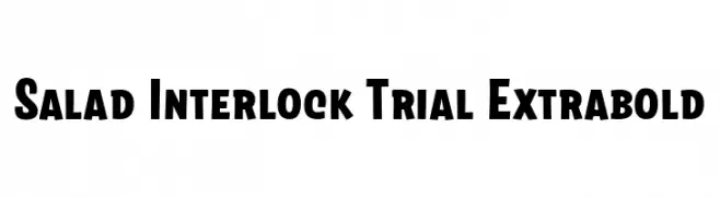
( Fonts by Zetafonts )
A bold, robust font with thick strokes and a playful touch.
![Salad Interlock Trial Extrabold Frei Schriftart Herunterladen]() Herunterladen 652 Downloads@WebFont
Herunterladen 652 Downloads@WebFont -
( Fonts by BNF Type Foundry / Dogu Kaya - bnftype.com - Personal-use only. For commercial use please contact owner. )
A bold, geometric font with a digital, pixelated style.
![Type03 Frei Schriftart Herunterladen]() Herunterladen 652 Downloads@WebFont
Herunterladen 652 Downloads@WebFont -
( Copyright (c) 2015, Cadson Demak (info@cadsondemak.com) )
A bold, classic serif font with strong, defined strokes and elegant serifs.
![Trirong ExtraBold Frei Schriftart Herunterladen]() Herunterladen 652 Downloads@WebFont
Herunterladen 652 Downloads@WebFont -
( Fonts by Vanessa Bays - bythebutterfly.com )
A playful, handwritten-style font with rounded edges and a casual feel.
![Caffeine Frei Schriftart Herunterladen]() Herunterladen 652 Downloads@WebFont
Herunterladen 652 Downloads@WebFont -
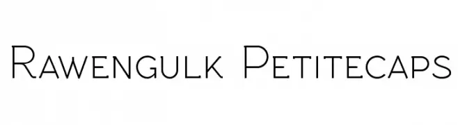
( Fonts by Grzegorz l - www.glukfonts.pl )
A modern, clean font with thin, geometric strokes and high readability.
![Rawengulk Petitecaps Frei Schriftart Herunterladen]() Herunterladen 652 Downloads@WebFont
Herunterladen 652 Downloads@WebFont -
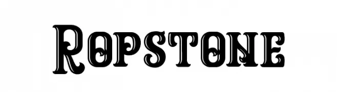
( Graptail Type Studio - creativemarket.com/graptail )
A bold, decorative font with vintage cut-out details.
![Ropstone Frei Schriftart Herunterladen]() Herunterladen 652 Downloads@WebFont
Herunterladen 652 Downloads@WebFont -
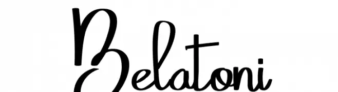
( Fonts by Eknoji Studio - www.eknojistudio.com - Personal-use only. For commercial use please contact owner. )
A dynamic and fluid script font with elegant, flowing letterforms.
![Belatoni Frei Schriftart Herunterladen]() Herunterladen 652 Downloads@WebFont
Herunterladen 652 Downloads@WebFont -
( Fonts by Dieter Steffmann )
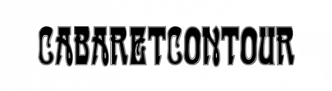
A bold, decorative font with contour outlines and playful curves.
![CabaretContour Frei Schriftart Herunterladen]() Herunterladen 652 Downloads@WebFont
Herunterladen 652 Downloads@WebFont -
( Fonts by Alex Tomlinson - Skyhaven Fonts - shfonts.com )
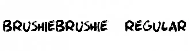
A bold, brush-stroke style font with dynamic and artistic flair.
![BrushieBrushie-Regular Frei Schriftart Herunterladen]() Herunterladen 652 Downloads@WebFont
Herunterladen 652 Downloads@WebFont -
( Fonts by weknow - Wino S Kadir )
An elegant script font with flowing, graceful curves and dynamic slant.
![Beauty And The Best Frei Schriftart Herunterladen]() Herunterladen 652 Downloads@WebFont
Herunterladen 652 Downloads@WebFont -
![Suitcase Frei Schriftart Herunterladen]() Herunterladen 652 Downloads@WebFont
Herunterladen 652 Downloads@WebFont -
( Fonts by Vidkä© Foundry )
A bold, 3D cube-themed font with intricate, textured characters.
![3D Cubes Frei Schriftart Herunterladen]() Herunterladen 652 Downloads@WebFont
Herunterladen 652 Downloads@WebFont -
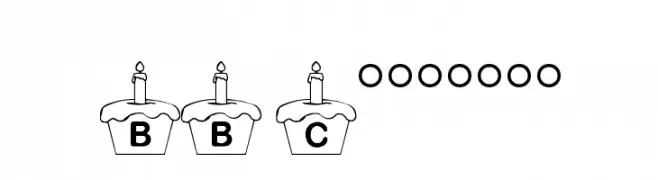
( Fonts by Loraine Wauer Ferus www.billybear4kids.com )
A playful font with letters and numbers inside cupcake designs, ideal for festive projects.
![BB Cupcakes Frei Schriftart Herunterladen]() Herunterladen 652 Downloads@WebFont
Herunterladen 652 Downloads@WebFont -
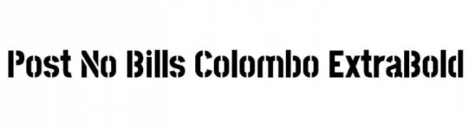
( Copyright (c) 2013-2015 Post No Bills Project Authors (https://github.com/mooniak/post-no-bills-font). )
A bold, geometric font with a modern, industrial feel.
![Post No Bills Colombo ExtraBold Frei Schriftart Herunterladen]() Herunterladen 652 Downloads@WebFont
Herunterladen 652 Downloads@WebFont -
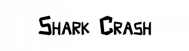
( Fonts by Aryel Filipe )
A bold, angular font with a dynamic and edgy style.
![Shark Crash Frei Schriftart Herunterladen]() Herunterladen 652 Downloads@WebFont
Herunterladen 652 Downloads@WebFont -
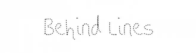
![Behind Lines Frei Schriftart Herunterladen]() Herunterladen 652 Downloads@WebFont
Herunterladen 652 Downloads@WebFont -
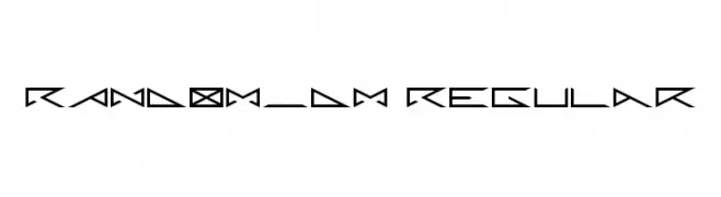
( Fonts by Yves Pauwels )
A geometric and angular font with a futuristic and edgy design.
![RANDOM_DM Regular Frei Schriftart Herunterladen]() Herunterladen 652 Downloads@WebFont
Herunterladen 652 Downloads@WebFont -
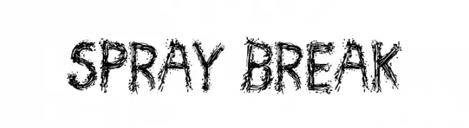
( Font by Jonathan Harris - www.tattoowoo.com )
A bold, textured font with a graffiti-like, distressed style.
![Spray Break Frei Schriftart Herunterladen]() Herunterladen 652 Downloads@WebFont
Herunterladen 652 Downloads@WebFont -
![SpookShow Undead Frei Schriftart Herunterladen]() Herunterladen 652 Downloads@WebFont
Herunterladen 652 Downloads@WebFont -
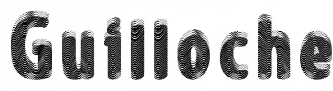
![Guilloche Frei Schriftart Herunterladen]() Herunterladen 652 Downloads@WebFont
Herunterladen 652 Downloads@WebFont -
![Wab Frei Schriftart Herunterladen]() Herunterladen 652 Downloads@WebFont
Herunterladen 652 Downloads@WebFont -
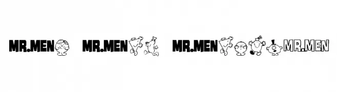
Schriftart von KiddieFonts. For commercial use please contact the owner.
![Mr Men Medium Frei Schriftart Herunterladen]() Herunterladen 652 Downloads@WebFont
Herunterladen 652 Downloads@WebFont -
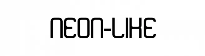
( Fonts by SnailFonts )
A modern, neon-inspired font with rounded edges and geometric structure.
![neon-like Frei Schriftart Herunterladen]() Herunterladen 652 Downloads@WebFont
Herunterladen 652 Downloads@WebFont -
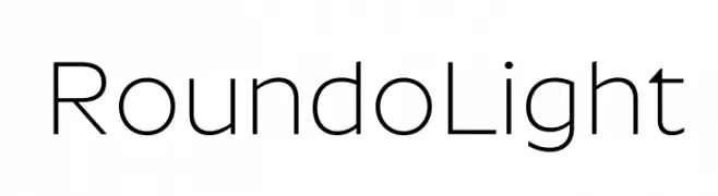
( Fonts by Indian Type Foundry - Personal-use only. For commercial use please contact owner. )
A modern, light sans-serif font with rounded edges and uniform stroke width.
![Roundo Light Frei Schriftart Herunterladen]() Herunterladen 652 Downloads@WebFont
Herunterladen 652 Downloads@WebFont -
( Fonts by wep )
A bold, distressed font with a textured, grunge appearance.
![Bata Merah Frei Schriftart Herunterladen]() Herunterladen 652 Downloads@WebFont
Herunterladen 652 Downloads@WebFont -
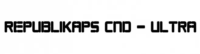
( Fonts by Apostrophic Lab )
A bold, geometric font with rounded corners and a modern style.
![Republikaps Cnd - Ultra Frei Schriftart Herunterladen]() Herunterladen 652 Downloads@WebFont
Herunterladen 652 Downloads@WebFont -
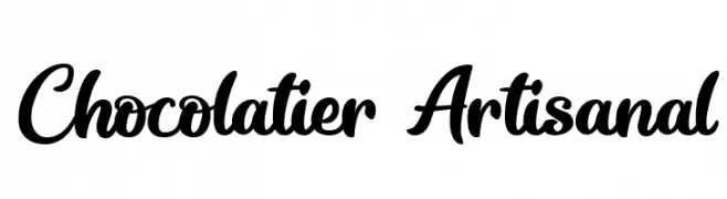
( Fonts by Octotype - www.foundmyfont.com - Personal-use only. For commercial use please contact owner. )
A flowing, cursive font with elegant and interconnected letters.
![Chocolatier Artisanal Frei Schriftart Herunterladen]() Herunterladen 652 Downloads@WebFont
Herunterladen 652 Downloads@WebFont -
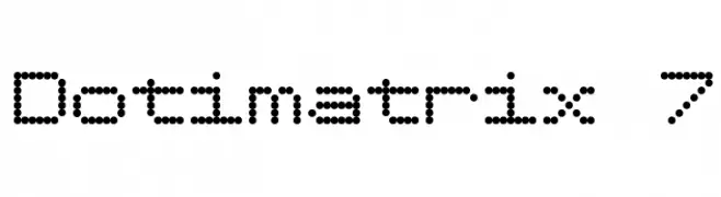
( Fonts by www.tepidmonkey.net )
A dot matrix font with a retro digital display style.
![Dotimatrix 7 Frei Schriftart Herunterladen]() Herunterladen 652 Downloads@WebFont
Herunterladen 652 Downloads@WebFont -
( Fonts by Rizky Andyno Ramadhan - Dichi. Personal-use only. For commercial use please contact owner. )
A bold, modern sans-serif font with clean lines and strong presence.
![De Luxe Next Bold Frei Schriftart Herunterladen]() Herunterladen 652 Downloads@WebFont
Herunterladen 652 Downloads@WebFont -
![Cheq Frei Schriftart Herunterladen]() Herunterladen 652 Downloads@WebFont
Herunterladen 652 Downloads@WebFont -
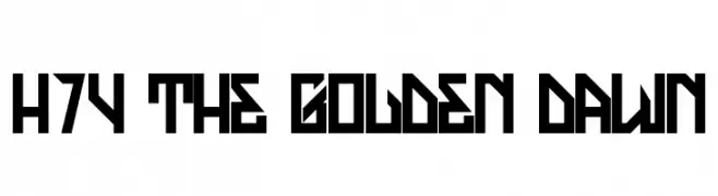
( Fonts by www.legacyofdefeat.com )
A bold, geometric font with sharp angles and a futuristic style.
![H74 The Golden Dawn Frei Schriftart Herunterladen]() Herunterladen 652 Downloads@WebFont
Herunterladen 652 Downloads@WebFont -
![Mf Queen Leela Frei Schriftart Herunterladen]() Herunterladen 651 Downloads@WebFont
Herunterladen 651 Downloads@WebFont -
![CryOneDUC Plain Frei Schriftart Herunterladen]() Herunterladen 651 Downloads@WebFont
Herunterladen 651 Downloads@WebFont -
![TrapOne-Regular Frei Schriftart Herunterladen]() Herunterladen 651 Downloads@WebFont
Herunterladen 651 Downloads@WebFont


Welche Schriften sind gerade am populärsten?
Poppins, Roboto, Montserrat, Open Sans und Lato sind wegen ihrer klaren Formen und breiten Einsetzbarkeit sehr gefragt – von Markenauftritt über Landingpages bis hin zu Postern.
Welche Fonts eignen sich für Logos?
Geometrische Sans‑Serifs (z. B. Poppins, Familien im Gotham‑Stil) sind ein häufiger Griff für sauberes, skalierbares Branding. Für eine persönlichere Note bleiben Scripts und Handschrift‑Stile beliebt. Kombinieren Sie einen prägnanten Headline‑Font mit einer neutralen Brotschrift für Wiedererkennung und Harmonie.
Wie oft wird die Top‑Liste aktualisiert?
Regelmäßig – basierend auf realen Downloads und Interaktionen. Schauen Sie öfter vorbei, um aufstrebende Favoriten früh zu entdecken.
💡 Tipp: Seite bookmarken – Trends wechseln schnell, und heutige Top‑Schriften inspirieren morgen vielleicht das Rebranding.