Willkommen bei den Top‑Schriften – hier treffen Beliebtheit und Qualität aufeinander. Das sind die in diesem Jahr am häufigsten heruntergeladenen und genutzten Fonts. Wenn Sie sichere Optionen für Logo, Web oder Social suchen, starten Sie hier.
Jeder Top‑Font überzeugt durch Balance, Lesbarkeit und Vielseitigkeit. Sie finden moderne Sans‑Serifs, elegante Scripts, Vintage‑Serifs und minimalistische Displays.
-
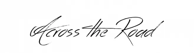
( www.tattoowoo.com )
A dynamic, handwritten-style font with fluid strokes and artistic flair.
 Herunterladen 6440 Downloads@WebFont
 -
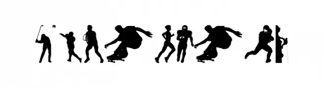
( Fonts by www.4yeo.com )
Silhouette-based display font featuring sports figures.
![4YEOSPORT Frei Schriftart Herunterladen]() Herunterladen 6440 Downloads@WebFont
Herunterladen 6440 Downloads@WebFont -
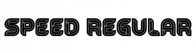
( Fonts by Vladimir Nikolic - https://www.creativefabrica.com/product/educated-deers/ref/144265/ - Personal-use only. For commercial use please contact owner. )
A bold, geometric font with a three-dimensional, retro-futuristic style.
![Speed Regular Frei Schriftart Herunterladen]() Herunterladen 6438 Downloads@WebFont
Herunterladen 6438 Downloads@WebFont -
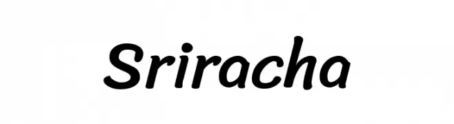
( Copyright (c) 2015, Cadson Demak (info@cadsondemak.com), )
A lively, handwritten script font with smooth, rounded strokes and a playful touch.
![Sriracha Frei Schriftart Herunterladen]() Herunterladen 6438 Downloads@WebFont
Herunterladen 6438 Downloads@WebFont -
![Truetypewriter PolyglOTT Frei Schriftart Herunterladen]() Herunterladen 6438 Downloads@WebFont
Herunterladen 6438 Downloads@WebFont -
![BODIDLYbold Frei Schriftart Herunterladen]() Herunterladen 6438 Downloads
Herunterladen 6438 Downloads -
( Fonts by Zetafonts - Personal-use only. For commercial use please contact owner. )
A bold, modern font with thick strokes and tight spacing, perfect for impactful headlines.
![Heading Now Trial 37 Extrabold Frei Schriftart Herunterladen]() Herunterladen 6436 Downloads@WebFont
Herunterladen 6436 Downloads@WebFont -
( Fonts by junkohanhero )
A bold, condensed font with a modern and impactful style.
![Kirkuvanpunainen kirsikka Frei Schriftart Herunterladen]() Herunterladen 6434 Downloads@WebFont
Herunterladen 6434 Downloads@WebFont -
![Squealer Frei Schriftart Herunterladen]() Herunterladen 6434 Downloads@WebFont
Herunterladen 6434 Downloads@WebFont -
( Fonts by Castcraft Software - opti.netii.net - check the website before use )
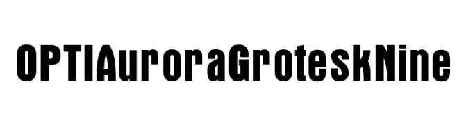
A bold, modern font with strong, uniform strokes for impactful design.
![OPTIAuroraGroteskNine Frei Schriftart Herunterladen]() Herunterladen 6431 Downloads@WebFont
Herunterladen 6431 Downloads@WebFont -
( Fonts by a Hayd. Personal-use only. For commercial use please contact owner. )
A bold, geometric font with a modern and impactful design.
![Schluber Frei Schriftart Herunterladen]() Herunterladen 6429 Downloads@WebFont
Herunterladen 6429 Downloads@WebFont -
( Fonts by a Situjuh Nazara - c7n1.wordpress.com. Personal-use only. For commercial use please contact owner. )
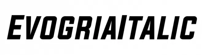
A bold, italicized font with a modern and dynamic style.
![Evogria Italic Frei Schriftart Herunterladen]() Herunterladen 6429 Downloads@WebFont
Herunterladen 6429 Downloads@WebFont -
( Copyright (c) 2010, 2011 Georg Duffner (http://www.georgduffner.at) )
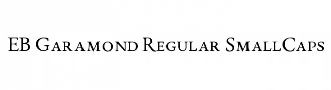
A classic serif font with elegant small caps and refined detailing.
![EB Garamond Regular SmallCaps Frei Schriftart Herunterladen]() Herunterladen 6423 Downloads@WebFont
Herunterladen 6423 Downloads@WebFont -
![Bleach Frei Schriftart Herunterladen]() Herunterladen 6422 Downloads@WebFont
Herunterladen 6422 Downloads@WebFont -
( Fonts by ShyFonts )
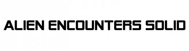
A bold, geometric font with a futuristic and digital aesthetic.
![Alien Encounters Solid Frei Schriftart Herunterladen]() Herunterladen 6422 Downloads@WebFont
Herunterladen 6422 Downloads@WebFont -
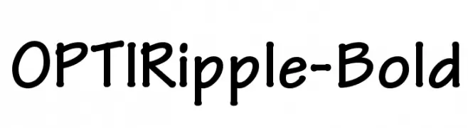
( Fonts by Castcraft Software - OPTI Fonts Archive - opti.netii.net - Personal-use only. For commercial use please contact owner. )
A bold, rounded font with a playful and friendly style.
![OPTIRipple-Bold Frei Schriftart Herunterladen]() Herunterladen 6420 Downloads@WebFont
Herunterladen 6420 Downloads@WebFont -
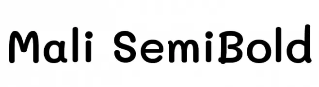
( Copyright 2018 The Mali Project Authors (https://github.com/cadsondemak/Mali) )
A playful, rounded font with a semi-bold weight and smooth curves.
![Mali SemiBold Frei Schriftart Herunterladen]() Herunterladen 6417 Downloads@WebFont
Herunterladen 6417 Downloads@WebFont -
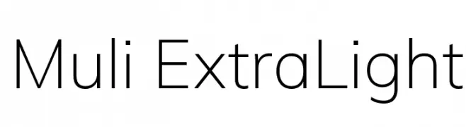
( Copyright (c) 2016 The Muli Project Authors (contact@sansoxygen.com) )
A clean, modern sans-serif font with a minimalist design.
![Muli ExtraLight Frei Schriftart Herunterladen]() Herunterladen 6416 Downloads@WebFont
Herunterladen 6416 Downloads@WebFont -
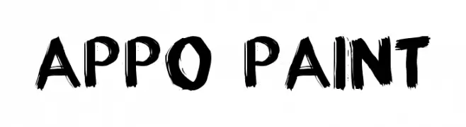
( Fonts by Grafito Design - dibujosenlinea.ideasintegrales.net )
A bold, brushstroke font with an artistic and dynamic style.
![appo paint Frei Schriftart Herunterladen]() Herunterladen 6415 Downloads@WebFont
Herunterladen 6415 Downloads@WebFont -
( Fonts by Castcraft Software - OPTI Fonts Archive - opti.netii.net - Personal-use only. For commercial use please contact owner. )
A classic serif font with elegant, well-proportioned characters and distinct serifs.
![OPTITimes-Roman Frei Schriftart Herunterladen]() Herunterladen 6414 Downloads@WebFont
Herunterladen 6414 Downloads@WebFont -
![dearJoe 1 M&S Frei Schriftart Herunterladen]() Herunterladen 6411 Downloads@WebFont
Herunterladen 6411 Downloads@WebFont -
Schriftart von PsychedelicType. For commercial use please contact the owner.
![Psychedelia HM Frei Schriftart Herunterladen]() Herunterladen 6410 Downloads@WebFont
Herunterladen 6410 Downloads@WebFont -
![Blockschrift-f-r-Flugzeuge Frei Schriftart Herunterladen]() Herunterladen 6408 Downloads@WebFont
Herunterladen 6408 Downloads@WebFont -
![WLM Idea Alt Frei Schriftart Herunterladen]() Herunterladen 6407 Downloads@WebFont
Herunterladen 6407 Downloads@WebFont -
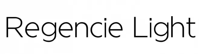
( Fonts by Alvaro Thomaz - alvarothomaz.com )
A modern, elegant font with clean lines and consistent stroke width.
![Regencie Light Frei Schriftart Herunterladen]() Herunterladen 6404 Downloads@WebFont
Herunterladen 6404 Downloads@WebFont -
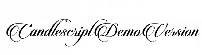
![CandlescriptDemoVersion Frei Schriftart Herunterladen]() Herunterladen 6399 Downloads@WebFont
Herunterladen 6399 Downloads@WebFont -
( Copyright (c) 2011, BrownFox (gayaneh.b@gmail.com|www.brownfox.org) )
A whimsical and playful font with exaggerated curves and dynamic strokes.
![HennyPenny-Regular Frei Schriftart Herunterladen]() Herunterladen 6399 Downloads@WebFont
Herunterladen 6399 Downloads@WebFont -
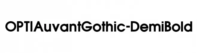
( Fonts by Castcraft Software - opti.netii.net - check the website before use )
A bold, modern sans-serif font with geometric influences and excellent readability.
![OPTIAuvantGothic-DemiBold Frei Schriftart Herunterladen]() Herunterladen 6398 Downloads@WebFont
Herunterladen 6398 Downloads@WebFont -
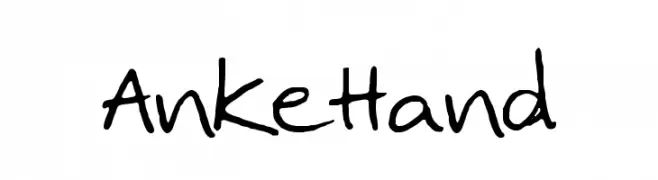
![AnkeHand Frei Schriftart Herunterladen]() Herunterladen 6386 Downloads@WebFont
Herunterladen 6386 Downloads@WebFont -
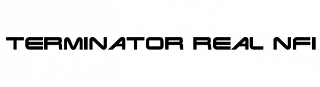
( Fonts by www.norfok.com - Norfok® Incredible Font Design - Thomas W. Otto )
A bold, futuristic font with geometric and angular letterforms.
![Terminator Real NFI Frei Schriftart Herunterladen]() Herunterladen 6385 Downloads@WebFont
Herunterladen 6385 Downloads@WebFont -
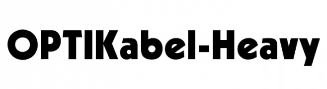
( Fonts by Castcraft Software - opti.netii.net - check the website before use )
A bold, geometric font with thick strokes and strong visual impact.
![OPTIKabel-Heavy Frei Schriftart Herunterladen]() Herunterladen 6384 Downloads@WebFont
Herunterladen 6384 Downloads@WebFont -
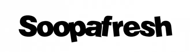
( THESE ARE SHAREWARE FONTS ! NOT FREEWARE ! PLEASE VISIT www.fuelfonts.com )
A bold, playful font with rounded, exaggerated curves and a dynamic style.
![Soopafresh Frei Schriftart Herunterladen]() Herunterladen 6379 Downloads@WebFont
Herunterladen 6379 Downloads@WebFont -
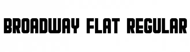
( Vladimir Nikolic - www.coroflot.com/vladimirnikolic )
A bold, decorative typeface with geometric shapes and a theatrical style.
![Broadway Flat Regular Frei Schriftart Herunterladen]() Herunterladen 6378 Downloads@WebFont
Herunterladen 6378 Downloads@WebFont -
Schriftart von samanthaevans. For commercial use please contact the owner.
![FatCow Frei Schriftart Herunterladen]() Herunterladen 6376 Downloads@WebFont
Herunterladen 6376 Downloads@WebFont -
( Fonts by URW++ - Personal-use only. For commercial use please contact owner. )
A modern sans-serif font with clean, balanced letterforms and excellent readability.
![NimbusSanL-Reg Frei Schriftart Herunterladen]() Herunterladen 6372 Downloads@WebFont
Herunterladen 6372 Downloads@WebFont


Welche Schriften sind gerade am populärsten?
Poppins, Roboto, Montserrat, Open Sans und Lato sind wegen ihrer klaren Formen und breiten Einsetzbarkeit sehr gefragt – von Markenauftritt über Landingpages bis hin zu Postern.
Welche Fonts eignen sich für Logos?
Geometrische Sans‑Serifs (z. B. Poppins, Familien im Gotham‑Stil) sind ein häufiger Griff für sauberes, skalierbares Branding. Für eine persönlichere Note bleiben Scripts und Handschrift‑Stile beliebt. Kombinieren Sie einen prägnanten Headline‑Font mit einer neutralen Brotschrift für Wiedererkennung und Harmonie.
Wie oft wird die Top‑Liste aktualisiert?
Regelmäßig – basierend auf realen Downloads und Interaktionen. Schauen Sie öfter vorbei, um aufstrebende Favoriten früh zu entdecken.
💡 Tipp: Seite bookmarken – Trends wechseln schnell, und heutige Top‑Schriften inspirieren morgen vielleicht das Rebranding.